
Add to collection


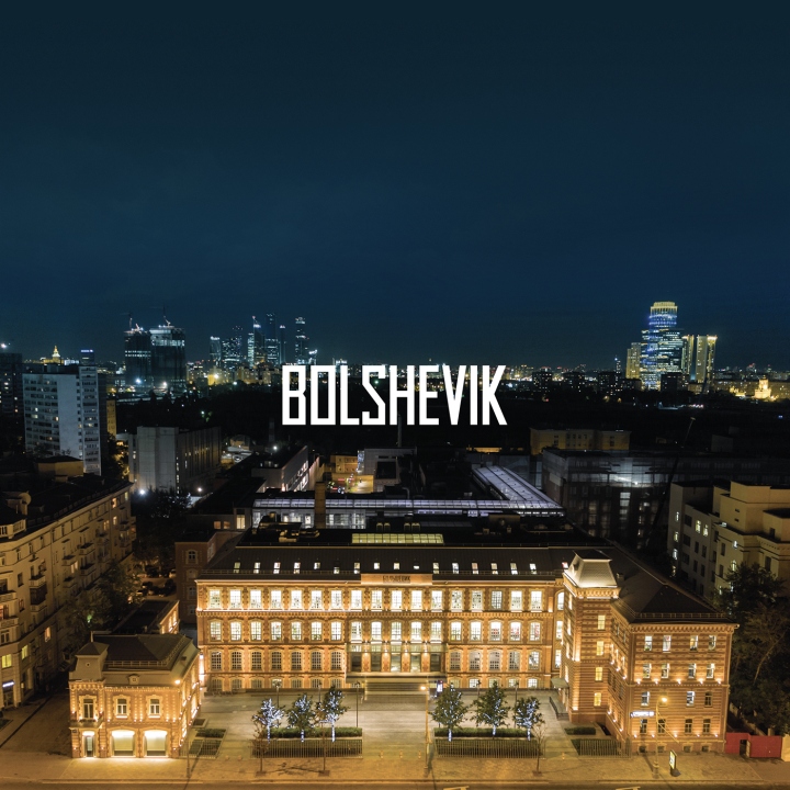
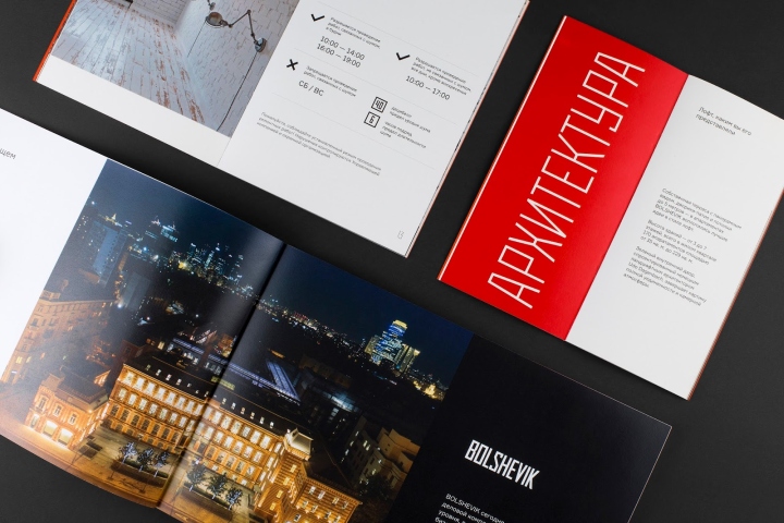
BOLSHEVIK is a world class complex of business, cultural and residential buildings in Moscow historical center, which bundled history of two centuries and dynamics of our days. The complex consists of class A business-center, Museum of Russian impressionism and premium residential compound, which reflects peculiar industrial style of confectionery factory “Bolshevik” and avant-garde architecture aesthetics.

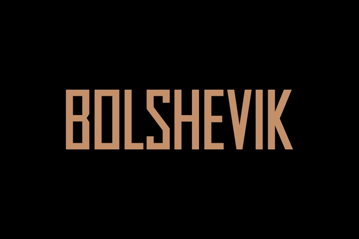
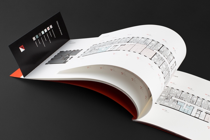
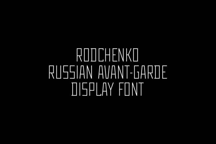
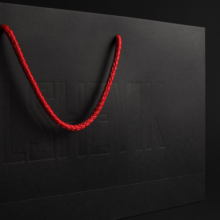
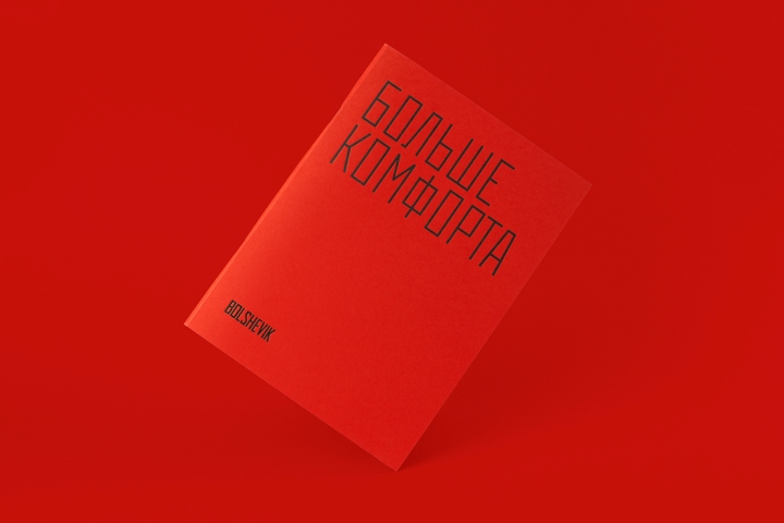
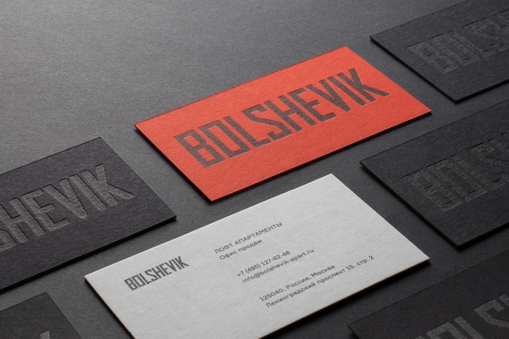
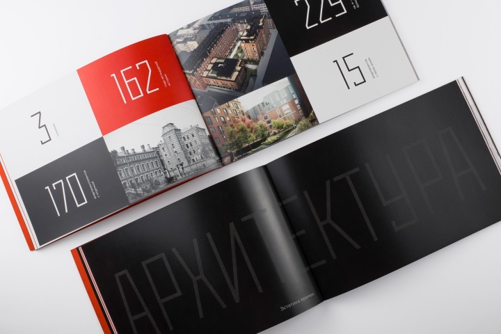
Keeping in mind high level of residential compound, Apus Agency took a new look at BOLSHEVIK identity and offered redefined design for print materials in sales office. The team rejected from decorative elements and focused on avant-garde layout and high-quality print on good paper. Designers used display “poster” font, which was inspired with works of Russian constructivist artists of 1920-30th.

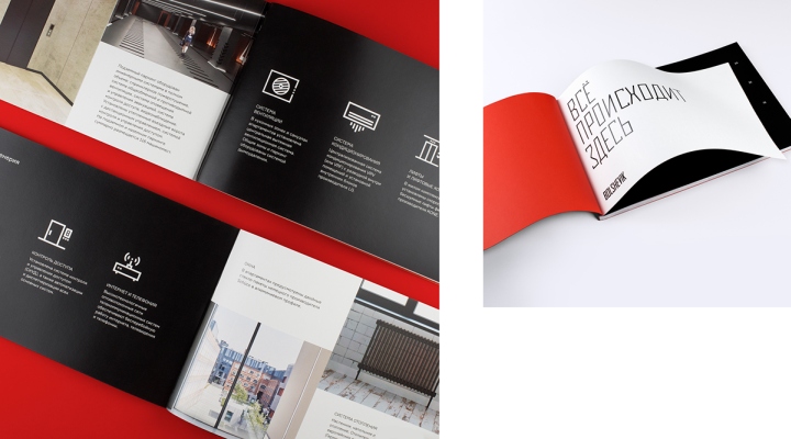
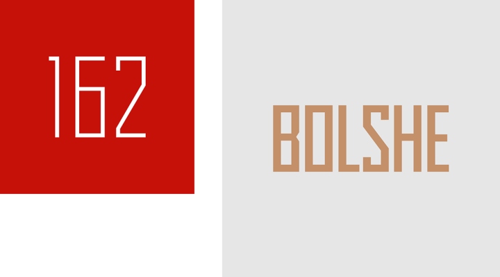
Brand main colours became open red and black – as reference to post-revolutionary posters graphic. Coppery-gold tone on black field fleshed graphics out. As a result, Apus Agency obtained chastity and laconism, which were clear to their target audience, and continued rich familiar image of historical place.
Designed by Apus Agency

https://www.packagingoftheworld.com/2018/04/bolshevik.html


Add to collection