

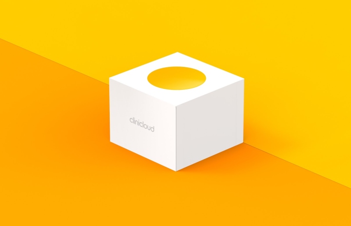
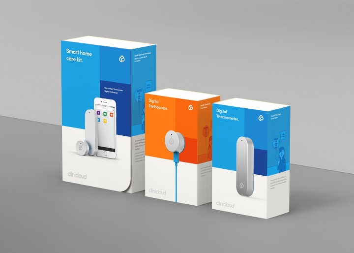
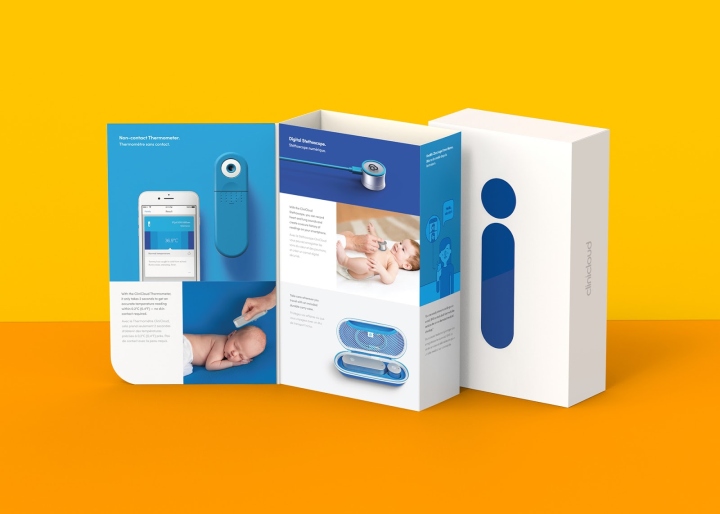
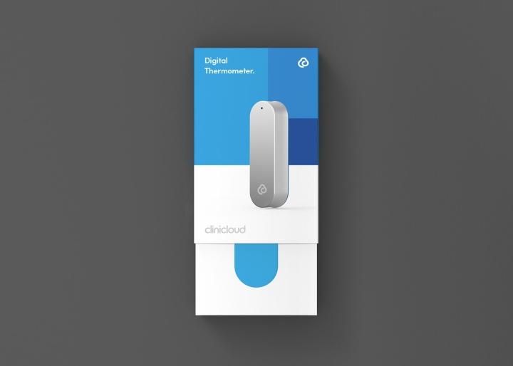
The online packaging range was designed around two of the brand’s core principles honesty and clarity. The coloured silhouettes reflect the product inside, as a simple and honest indication of the box’s contents on the back of the boxes, clear typography present information without complication or distraction. For CliniCloud ‘s retail packaging a sleeve is attached over the existing online packaging. A clear hierarchy is established using the brand design tools: golden ratio, pathways, framing and colour (mentioned in the ‘CliniCloud Brand Update’ project), which guide the viewer and provide clear and easy to absorb information to reinforce the retail sale.
Creative Direction: Elmarvcn Zyl
Sleeve Die Design, Sleeve interior Layout, Product Rendering, Protoyping: Alex Darkovski
Illustration, Image Retouching, Print Preparation, File Management: Holly Chen



https://www.packagingoftheworld.com/2018/04/clinicloud.html


Add to collection


