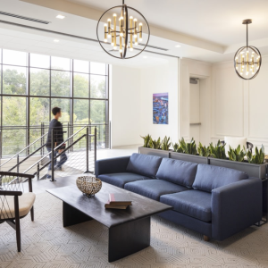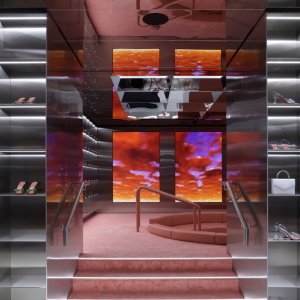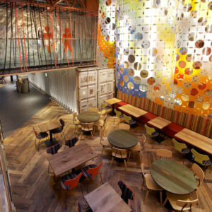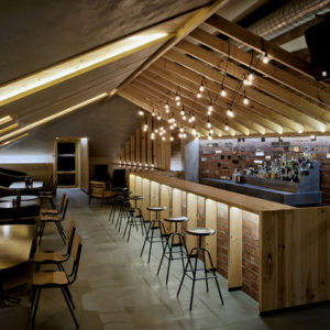

The goal for this design was to construct a space suitable for creative work. In analyzing people’s everyday lives, Studio In2 found that two thirds of our time is spent working, while one third is spent resting. The inspiration and creativity that we generate during the time we spend resting is injected into our work, forming a creative cycle of positive reinforcement.

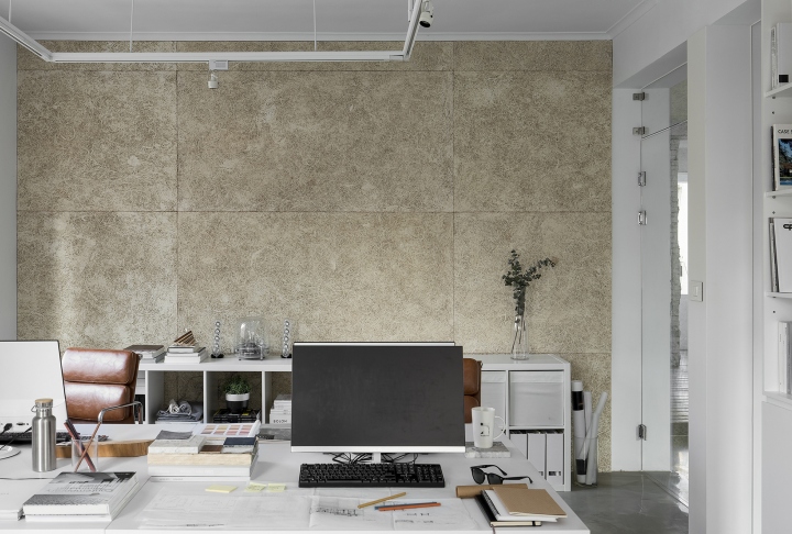
Howard Yu and William Sun, art directors of Studio In2 have transferred these temporal ratios to the space itself, where we have constructed two types of functional areas: two thirds of the space serves as a work area, and one third of the space serves as a place of inspiration.

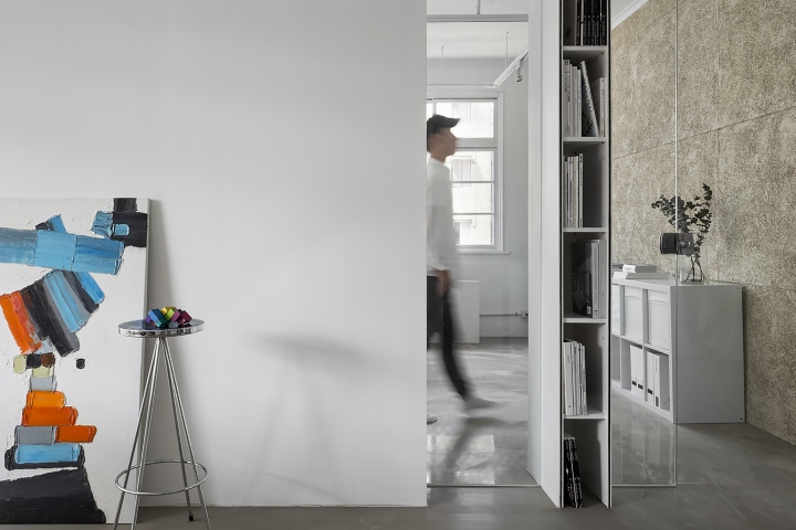
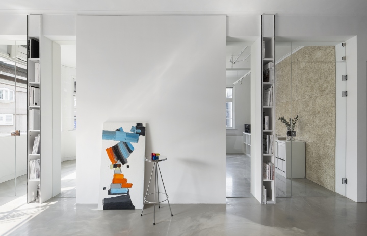
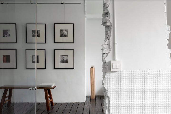
The pure space resembles a blank white canvas, where any color can be freely expressed. Furthermore, it is our hope that ambiguous spatial relationship and circulation with multiple openings will allow users to experience a greater variety of everyday discoveries and develop different attitude towards the same space. As time passes and experience grows, the space is not restricted by the past; its simple and white elements give it outstanding flexibility for change.

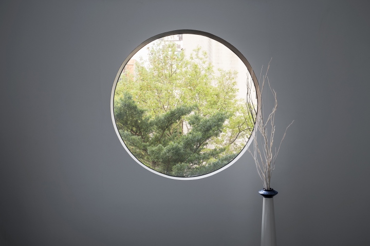
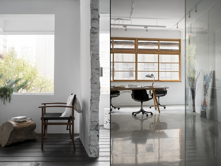
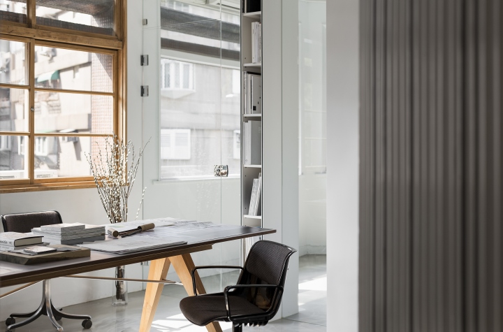
In order to strengthen the advantageous conditions of the site itself, penetrating links are established with outdoor scenery and sunlight along the length and width of the space. Transition areas between various functional spaces are identified using visually penetrative design to generate different levels of expression among treescapes, light, and people within the space.

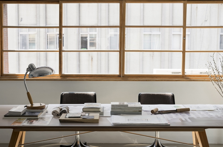
In order to reveal the original appearance of the forty-year-old traditional Taiwanese wooden windows, their paint was dissolved, and their surfaces were smoothed, adding an element of the unique original style of the space’s location and preserving its heritage. In changing the layout of the space, a portion of the original wall was deliberately retained to prevent wasting building materials. By whitewashing the old wall, the mottled ceramic tiles and red brick walls are given a fresh face. This reminds users of the caring, respectful, and lasting relationship that they share with the old building.
Designed by Howard Yu, William Sun / Studio In2
Photography by Jackal Liu
