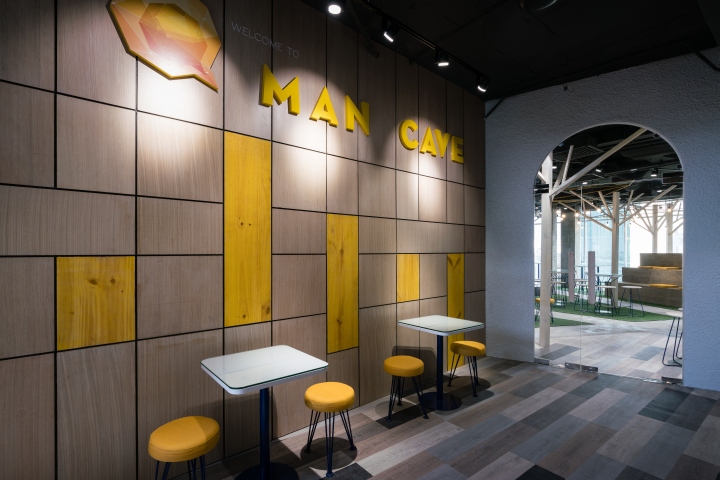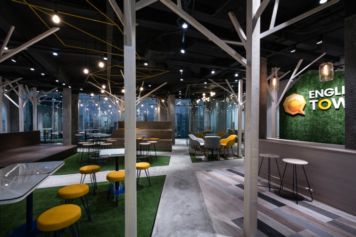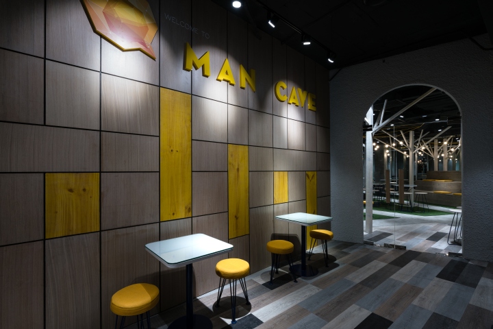

The English town English Center design concept is driven by the demand for performance. We have come up with a rather dreamy idea but it still being presented in an orderly and effective way. With an area of 350 square meters in the 5th floor of the Sumikura building, the owner wants a space to teach communicating English for people of high school age and older, especially those who work and not have a lot of free time. With the purpose is to provide communicating skills for students, owner do not want teaching space would be limited in rigid style or school style as people still imagine. Breaking and interacting is promoted.

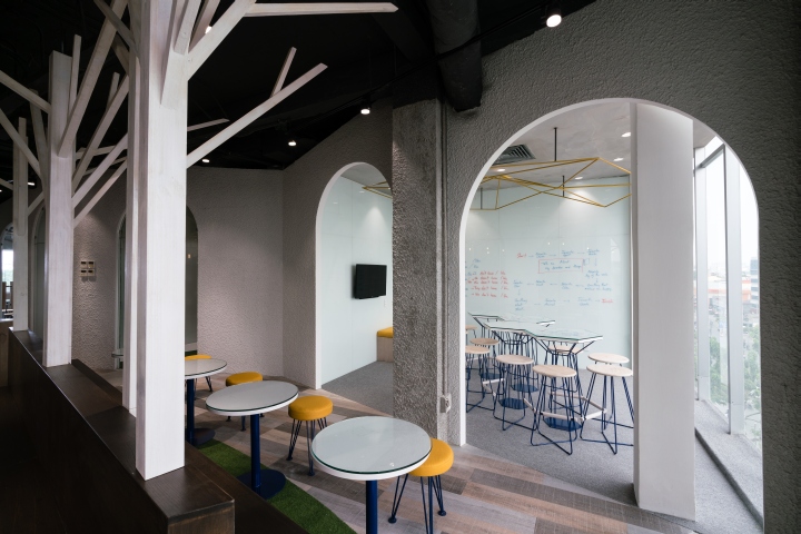
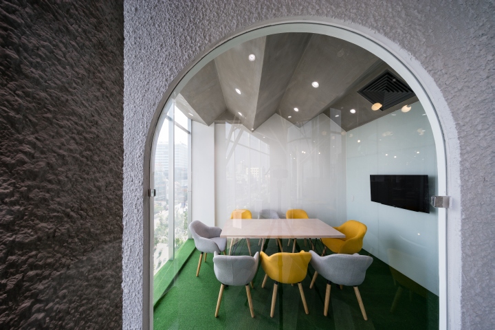
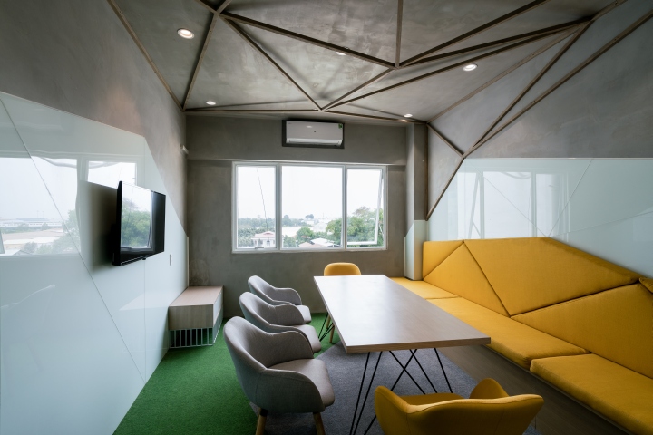
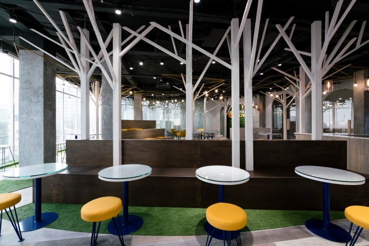
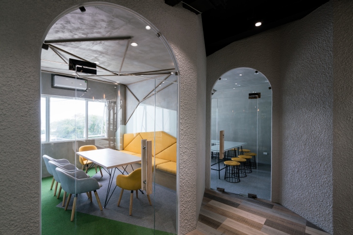
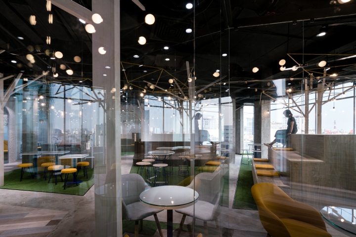
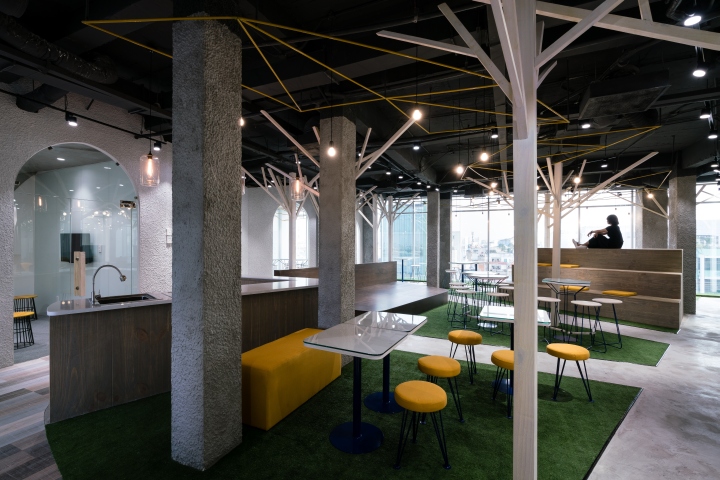
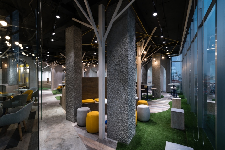
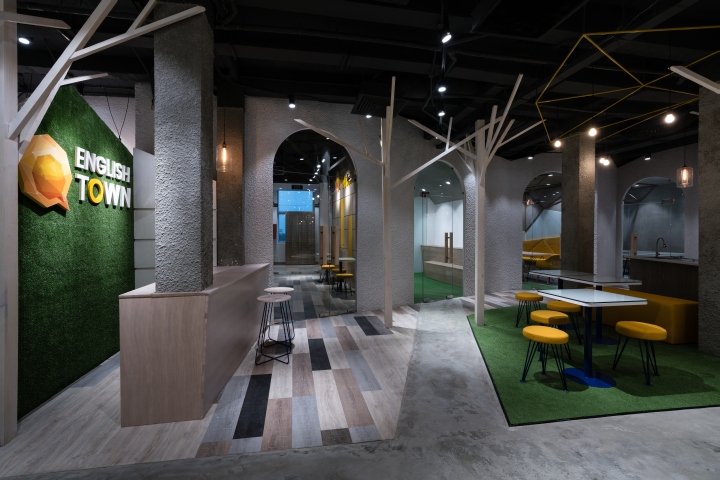
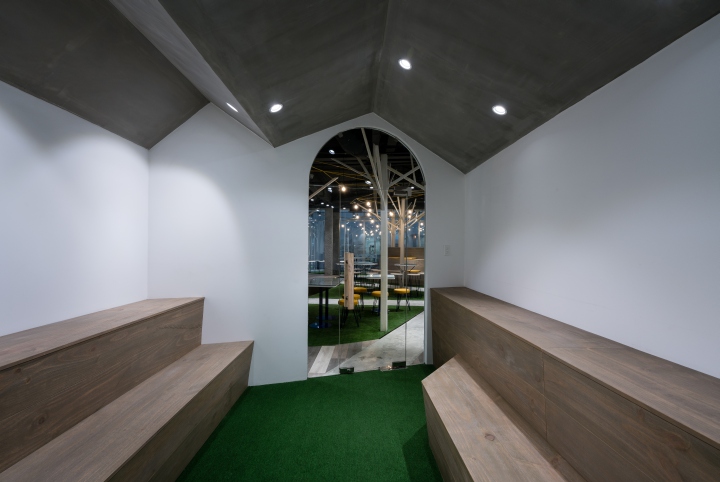
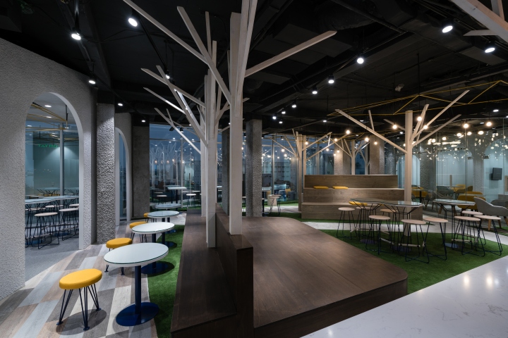
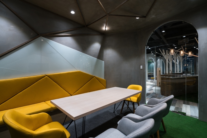
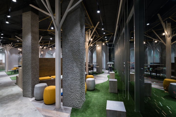
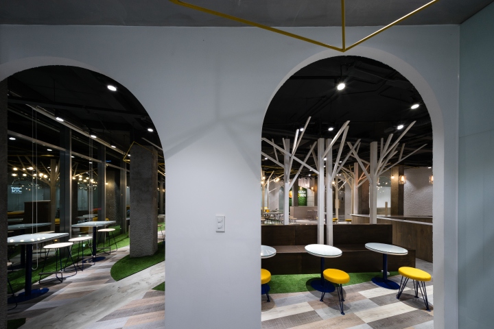
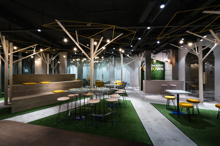
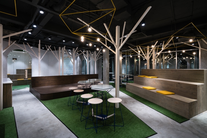
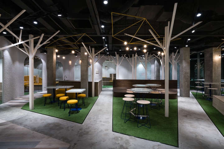
Communication is a necessity and has been formed since humans were in the cave, in the forest, so why not borrow those communication spaces from that primordial time into the current design. We divide the classroom space into nine large and small caves, and from that nine small caves, students can radiate communicate in a larger space in the forest. We just need a few chairs, a table in every area to form a class. So when needed, the whole space/ the forest will become a big classroom for around a hundred students.

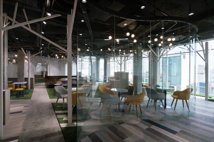
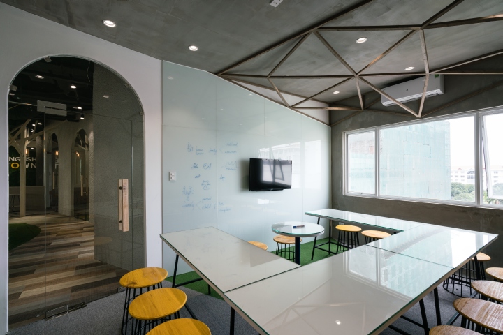
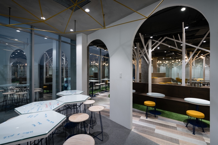
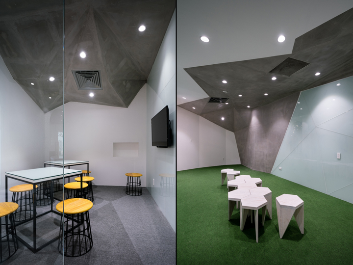
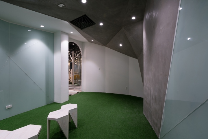
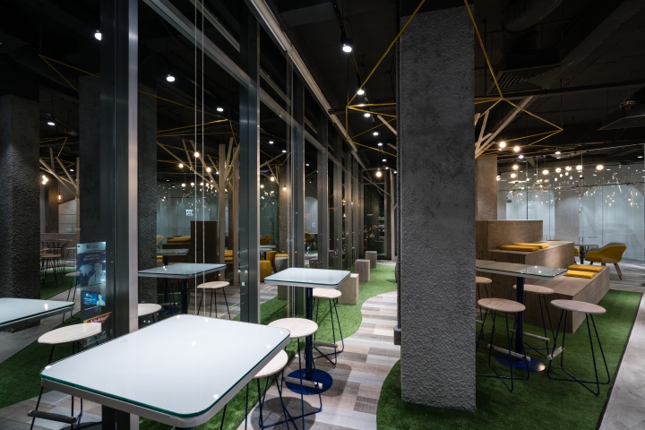
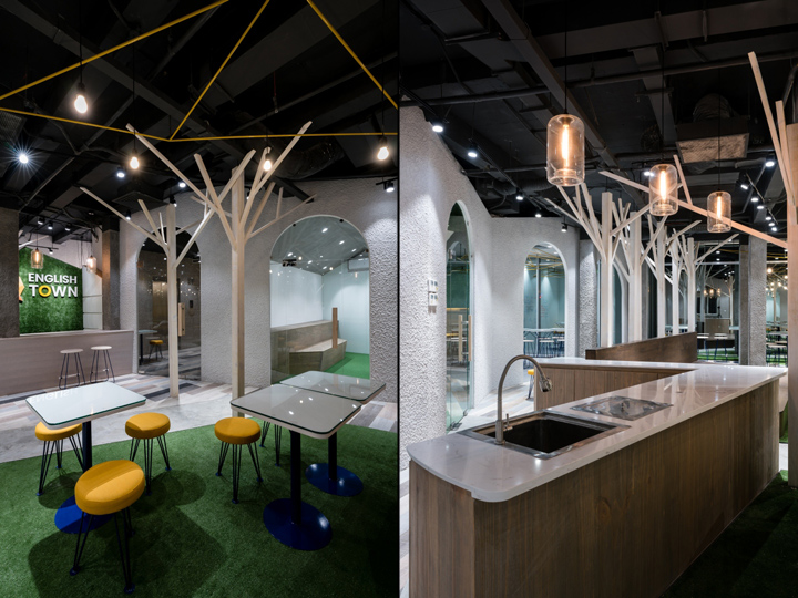
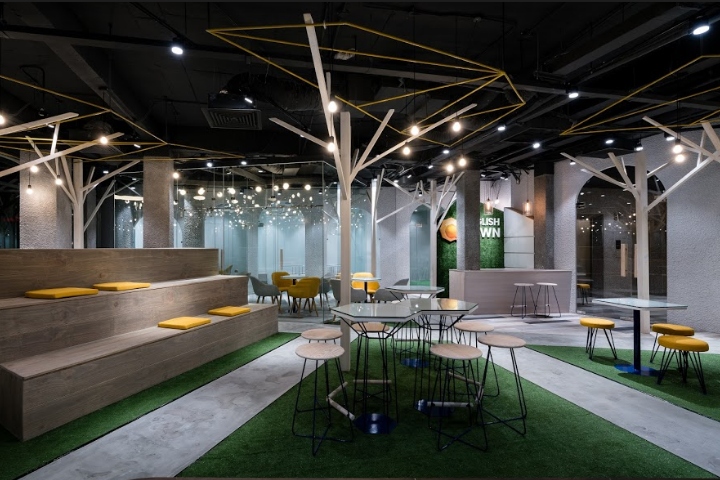
Each cave is used in a different form, with different shapes and details of decoration, which makes students feel fresh and new whenever step into. Besides that, when students step out of the cave, the interactive space will be forest with trails, canopy, grass carpet … all expressed in stylized language, through materials, shapes, light. The circle divide the space in the classroom is the cave while the outside will be the space of the forest.

The technique of spray painting to describe the roughness of the cave while the green carpet and the wooden pillars from the floor to the ceiling are branched, forming canopy yards, organized light to create dense dark areas interleaved. Everything is calculated for students to feel like studying in the forest. Focusing on communicating, speaking more, writing less, the interior/the furnish also has the flexibility to compact, easy to turn around, make a lot of different combinations, tables and walls are made by glass in order to easily write or erase.
Designed by Red5 Studio
Photography by Quang Tran
