
KKeC gift shop by Jeanne Dekkers Architectuur, Rotterdam – The Netherlands
posted by ZOETMULDER on 2018-05-26
Rotterdam
Add to collection

Assignment
In the centre of Rotterdam’s shopping district ‘Beurstraverne’ the gift store KKeC is situated. Designer duo Elise & Anton Zoetmulder (in corporation with Jeanne Dekkers Architectuur) came up with a new identity for KKeC. In Dutch the name KKeC is an abbreviation for Kunst, Kaarten en Cadeaus (Art, Cards and Gifts). The store’s supply exists of a diversity of luxury as well as affordable presents, cards and a unique framing department. Showing this diversity while creating a new unity is the base of the assignment.
Concept
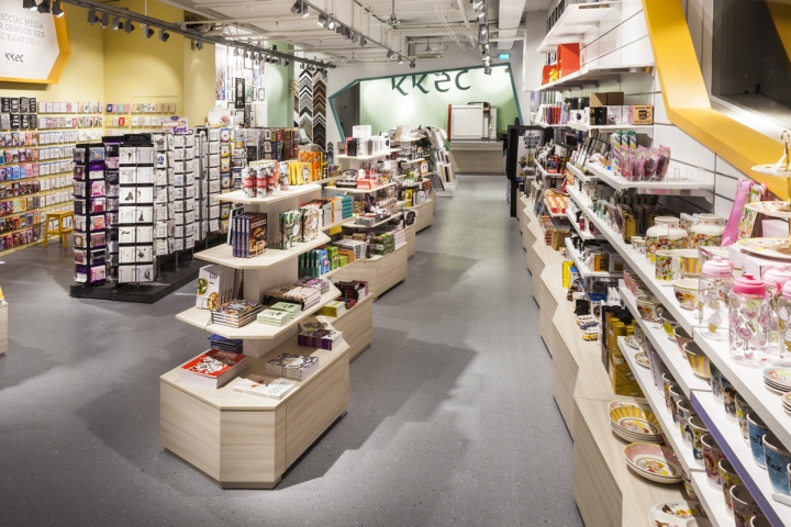
We wanted to obtain a serene and balanced background in which the offered items flourish. Clear sightlines with a simple routing and neutral colours form the basis. By subdividing the great diversity of products into three worlds a natural orderliness arises, which makes the store legible. The worlds are separately recognizable by three playful colours and they are connected through sightlines and materialization.
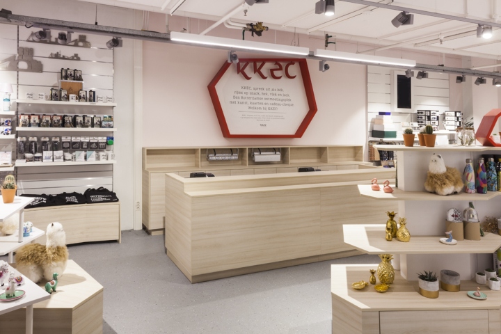
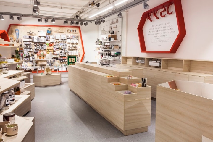
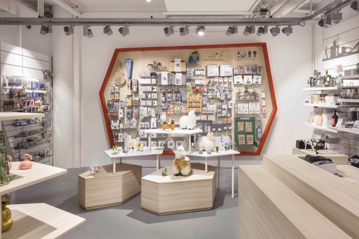
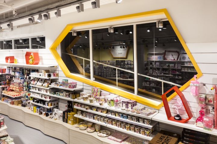
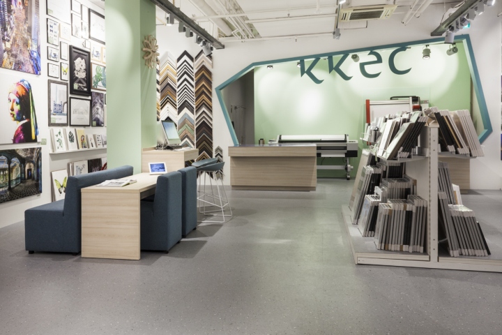
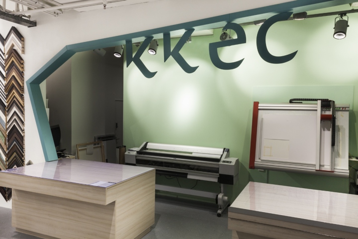
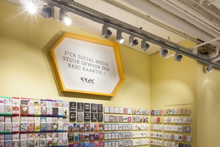
The luxury-world is red, the fun-world is yellow and the frame-world is green. Every world has its own centre in the form of a big coloured diamond shape. The unique character of the store gets its identity through the form of a hexagonal diamond shape, which returns in different places in the shop. This form determinates everything, from the contours of the new furniture to the graphic design. The playful colour palette is kept together by a neutral palette of light wooden furniture, bright lightning and a grey floor. This makes sure the store is a unique experience for the customers and it creates the form and identity of KKeC.
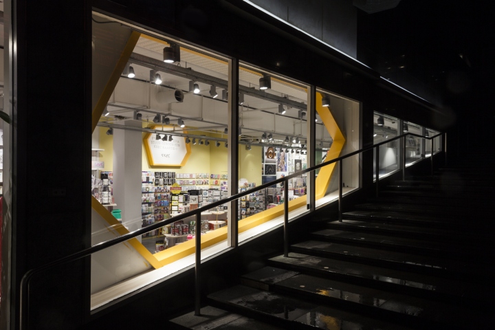
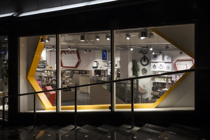
Outside-inside connection
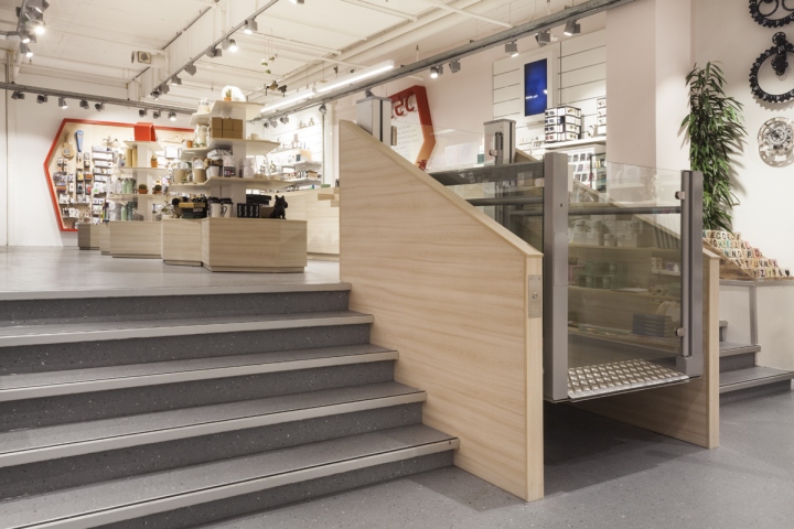
The shop is directly situated next to the stairs, which let shoppers descend into the so called ‘Rotterdamse koopgoot’ (shopping street below ground level), the store is visible while moving. Descending the stairs the playful interior of KKeC is visible through the orange diamond shaped framework of the shop’s window. From the entrance you have a direct view towards the red diamond shape above the cash desk. The first step one makes into the store, reveals a sightline towards the green diamond shape in the back. In this sequence of arrival in KKeC, the whole story of the shop is legible.
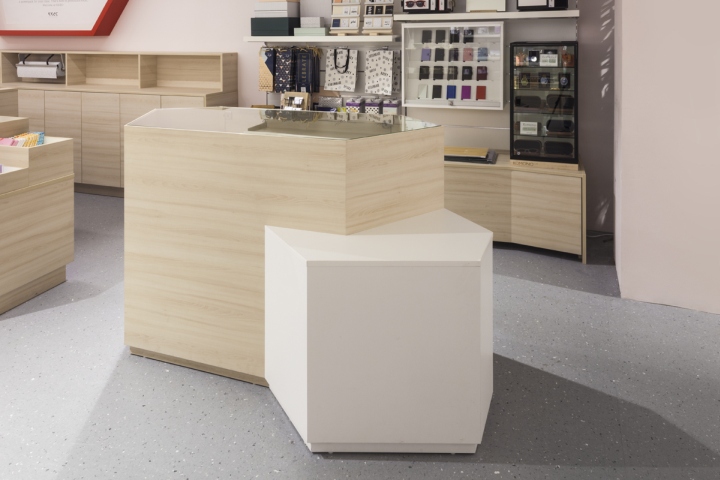
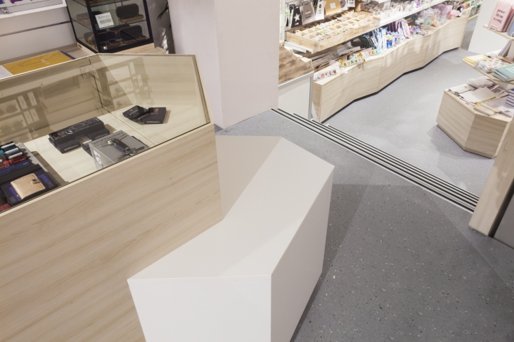
Custom-made furniture
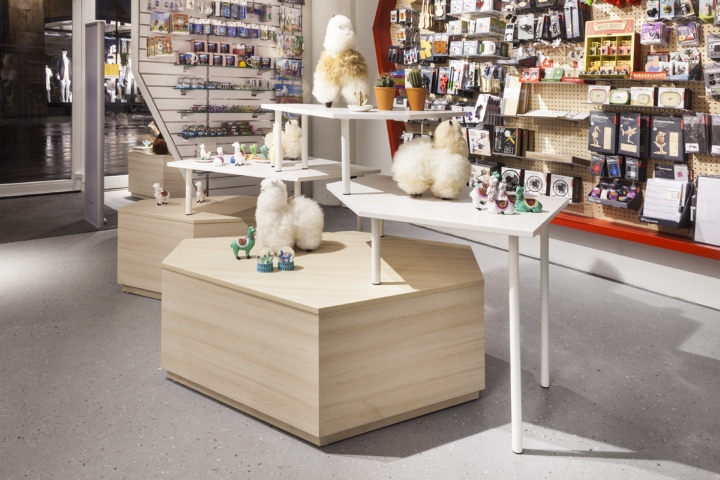
The custom-made furniture is designed especially to fit the concept of the shop. The pieces of furniture have a playful appearance and are modular in use. A sustainable high quality HPL finish is used in wood-look and white. At the entrance the Modular Display Furniture is located. This consists of a wooden diamond shaped block on which high white tables can be placed in different manners. This piece of furniture can be positioned in infinite ways so the products are displayed in a playful way.
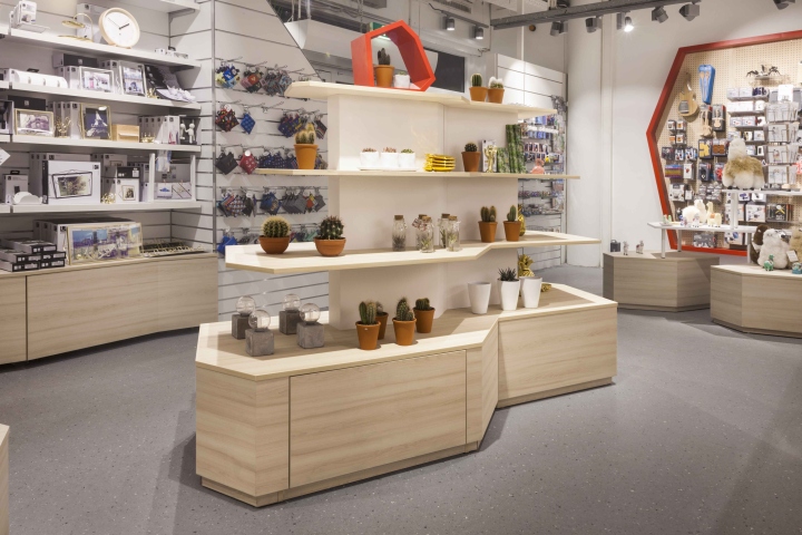
In the whole store the pyramid furniture is used. Located next to walk- and sightlines, this unique piece of diamond shaped furniture gives a playful character to the store. The stepped shelves gives space to display many products and in the bottom there is a drawer on wheels for extra storage. In this same character the wall cabinets are designed with a kinked bottom cabinet. The kink in the bottom cabinet ensures a flowing line in the closet wall, this makes them connected to the total design. Moveable diamond shaped frames, coloured in the three colours of the different product groups, can be placed flexibly on the shelves to highlight this special products.
Designed by Elise Zoetmulder & Anton Zoetmulder / Jeanne Dekkers Architectuur
Photography by Roza Schous


Add to collection