Add to collection

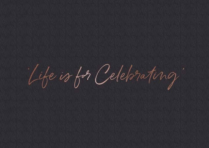
Ridgeview, one of the first wineries dedicated to the production of English sparkling wine, have led the way for over 20 years in national and international development of the category. CookChick were commissioned to move away from the existing traditional packaging to a contemporary, vibrant and proudly English design. The new look has a celebratory theme at its heart, inspired by founders Mike and Christine Roberts original strap line ‘Life is for Celebrating’.
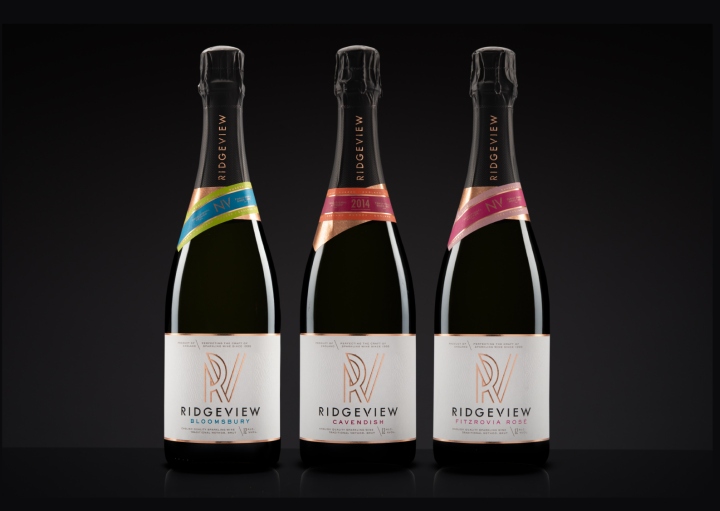
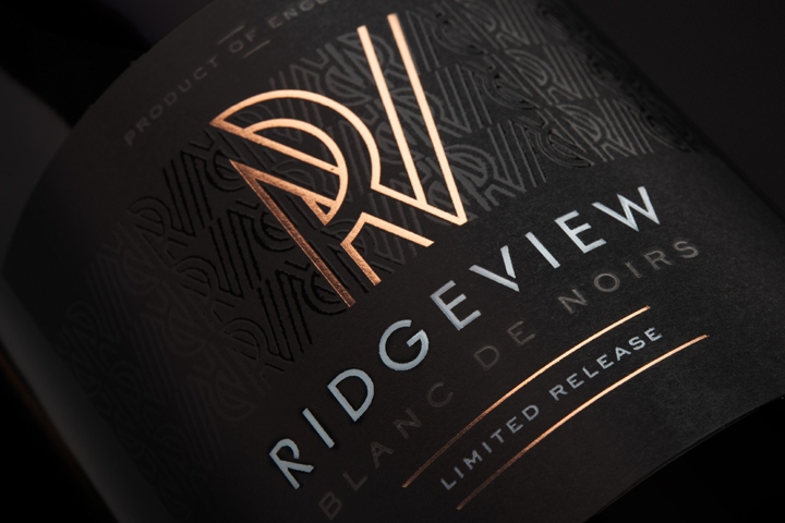
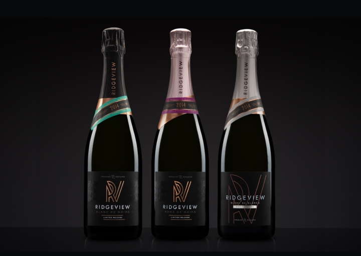
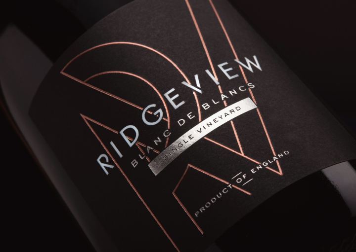
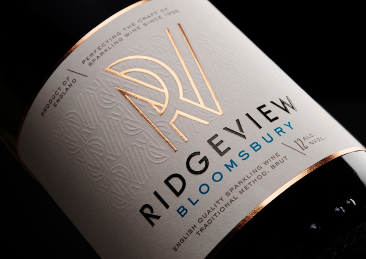
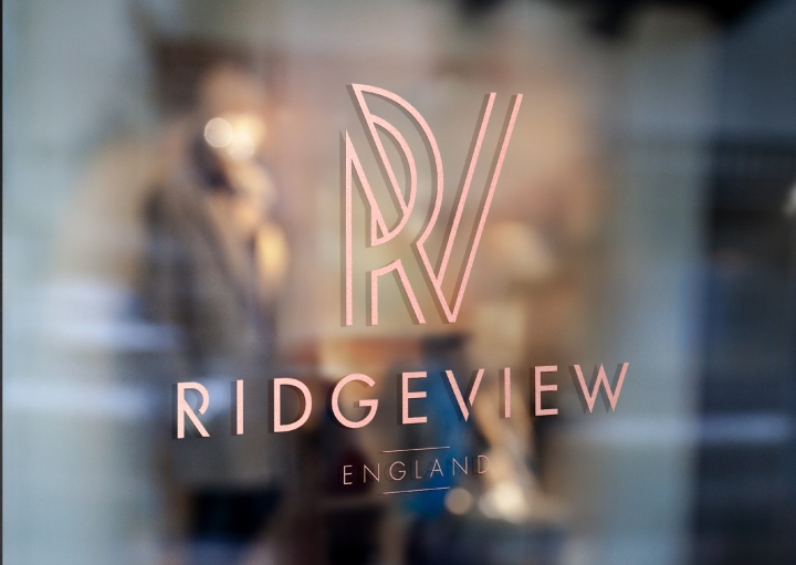
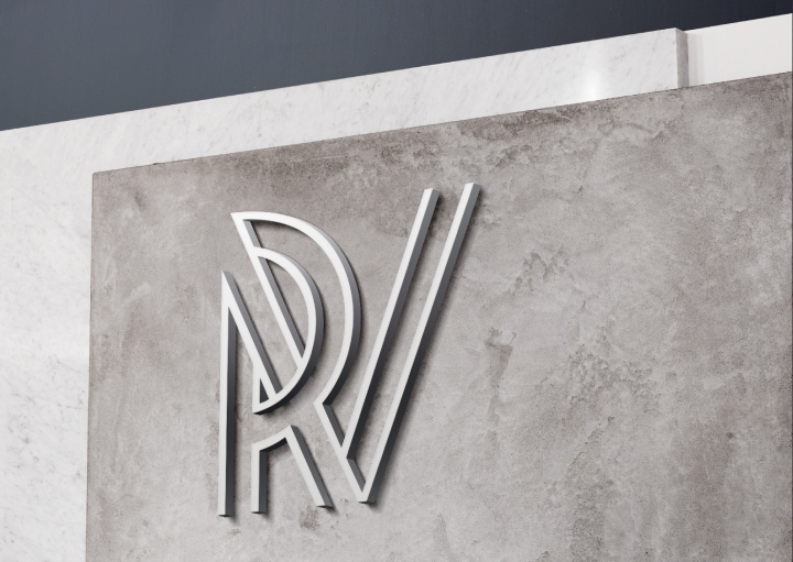
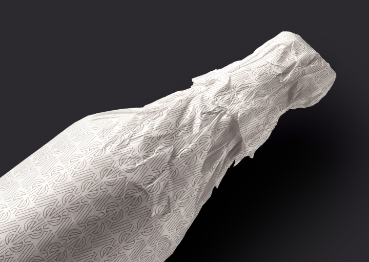
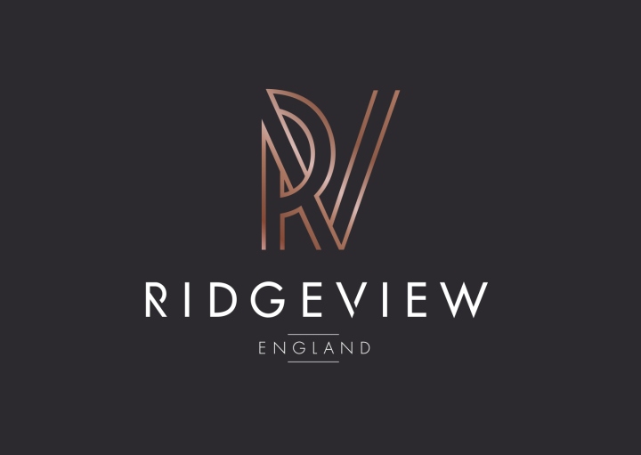
The new logo highlights the inspiration behind Ridgeview’s name, the glorious view of the South Downs Ridge from the tasting room. The R wraps around the V in celebration of life, family and the beautiful location. All of Ridgeview’s sparkling wines are traditionally fermented in one of England’s only underground specialists wine cellars. The vibrant colour palate used across the range of neck ribbon labels were inspired by the bottle caps that seal the wines whilst resting in the cellar. The signature wine ‘Bloomsbury’ also contains the colours of a blue and green wrap, where the vineyard and the South Downs meet the blue skies.
Co-Founder & Director Lee Cook comments:
“Being the most respected English Sparkling wine brand we were honoured to be the chosen agency for this exciting project. The objective was very simple…
‘To create category leading packaging to match their industry leading and multi award winning wines’.
Ridgeview’s founder Mike Roberts ethos “Life is for Celebrating” defined the pivotal core of this project brief and one we were proud to have visually imbued in the big idea and the intricate details throughout the brand identity and packaging”.
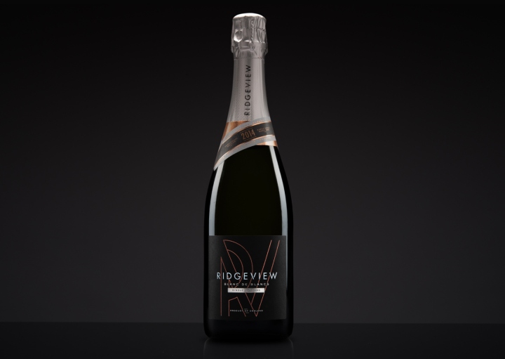
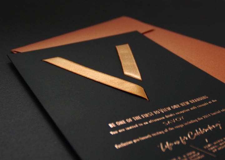
There is incredible detail and thought behind every element of the design, the wrapping theme is even used in the launch invite where a rose gold ribbon creates part of the logotype, eluding to the new branding before the official launch. The labels use many different print techniques to enhance the finish of the design, needed to match the quality of the award winning wines. These included rose gold hot foiling, tactile varnish and embossing.
Designed by CookChick Design

https://www.packagingoftheworld.com/2018/05/ridgeview.html


Add to collection