Dancing Calligraphy boutique by David Ho Design Studio, Taipei – Taiwan
posted by retail design blog on 2018-06-27
New Taipei City
Add to collection

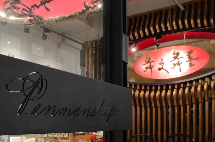
Beijing-based architecture and interior design studio, David Ho Design Studio, has recently completed a new stationery boutique: ‘Dancing Calligraphy’ in Taipei, Taiwan. ‘Calligraphy’ comes from the Greek ‘καλλιγραφία’. This word can be divided into two parts: ‘calli’, meaning ‘beautiful’, and ‘graphy’, meaning ‘written’. Put together, ‘calligraphy’ means ‘beautiful text’. In English there is another term similar to Calligraphy: Penmanship. Penmanship pertains more to areas of writing that are well-disciplined and have specific fonts to write in.
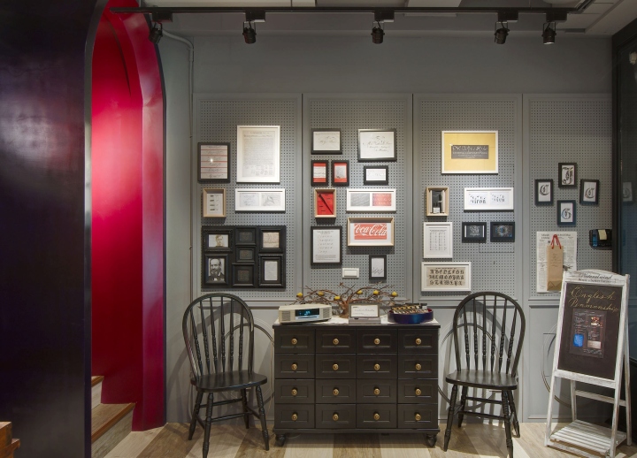
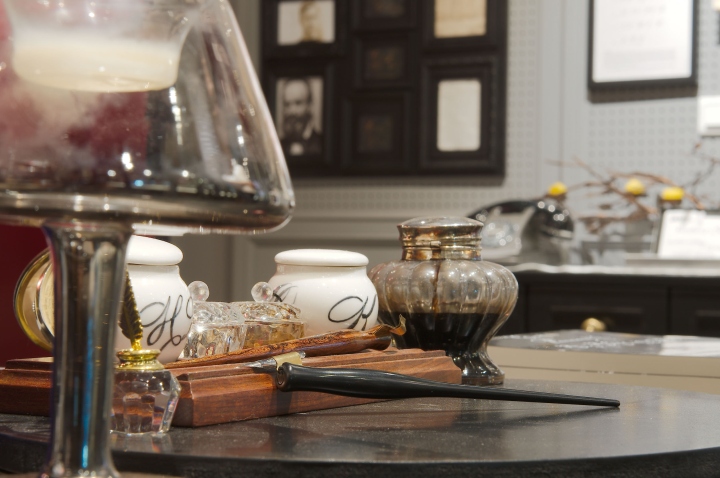
The Spencerian Script Spencer font, which is popular among dozens of English fonts for its easy-to-learn and easy-to-use strokes, appeared in the 1850s and was only popularized around 1925. Invented by the American, Platt Rogers Spencer, it was widely used in business contacts and personal letters. This font quickly became the standard font for U.S. business communications and was not replaced until after the invention of typewriters in the 1920s. The logo of Coca Cola, the most famous brand in the world, is written in the Spencer font. ‘Dancing Calligraphy’ Studio was established to promote English handwriting, especially Spencerian Script Spencer fonts. The aim of the design was to arouse people’s interest in the fading calligraphic penmanship, as well as to give the Spencer font its well-deserved exposure.
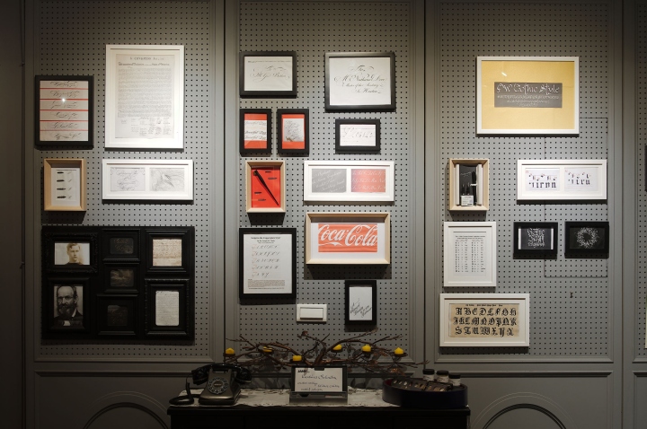
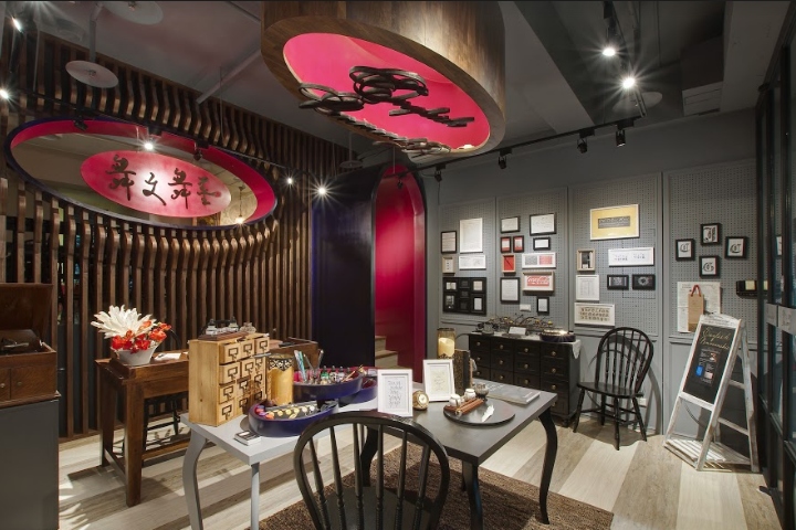
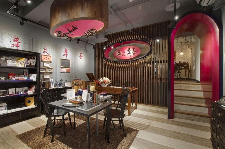
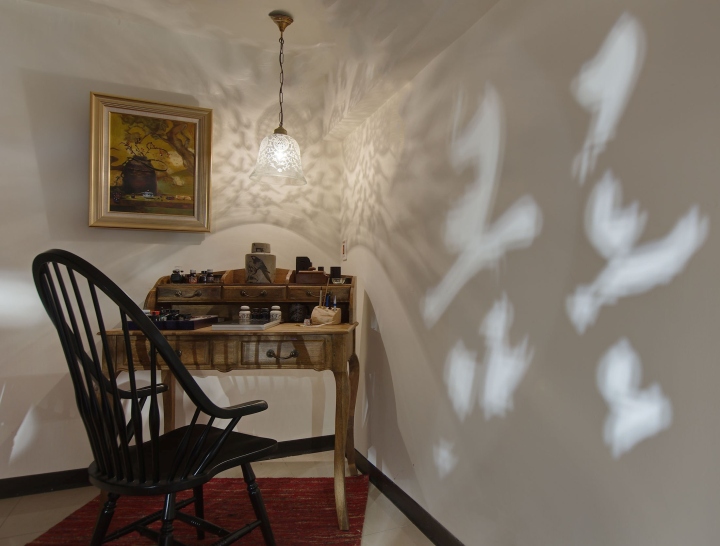
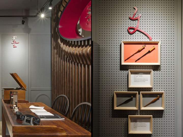
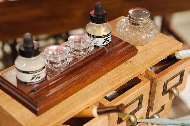
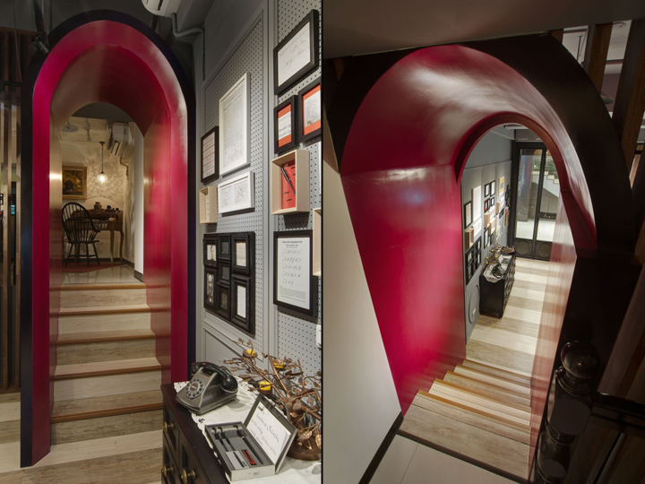
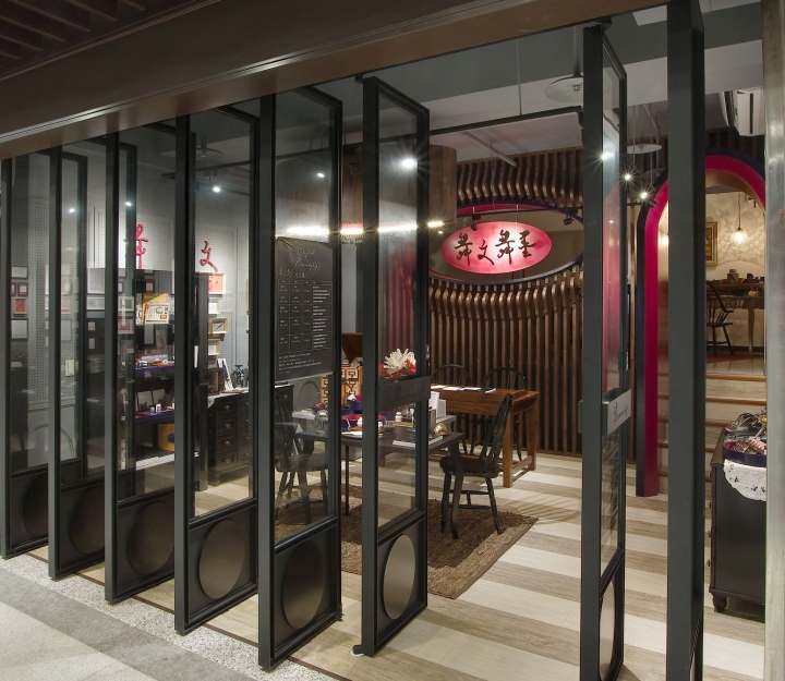
The studio is a 1: 3 rectangular plane with a 120 cm height difference between the front and rear sections. In order to adapt to this structure, designer David Ho split the space into three: boutique, workshop, and restroom and storage space. The frontal area is set as a writing stationery boutique sales area with 8 pivoting doors facing the street. As the retail space is only 4.6 meters wide, David wittingly utilized the walls as a display case for the abundant stationery items. The wall, with its dark gray color, creates a unique backdrop for the colorful pens and hand writing samples, and allow for a variety of color-organized products to be displayed.
A set of 120cm stairs connect the boutique and workshop. The workshop will be an inclusive hub for making, teaching, and meeting, with a large working table in the heart of the space for hosting a regular program of events and writing classes, which ranges from crafting to writing skills. The final one third of the area is the restroom and storage space.
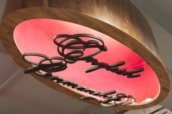
The Spencer font has existed since the mid-19th century; at the same time, the Neoclassical architecture era was at its peak of grandeur and popularity. Oval shapes and burgundy velvet colors often found in Neoclassical buildings are also used as the main form and color in the design. The sales areas and calligraphy classrooms are separated by wooden grilles to maintain visual connection, and it also serves as a backdrop to the Chinese studio name logo.
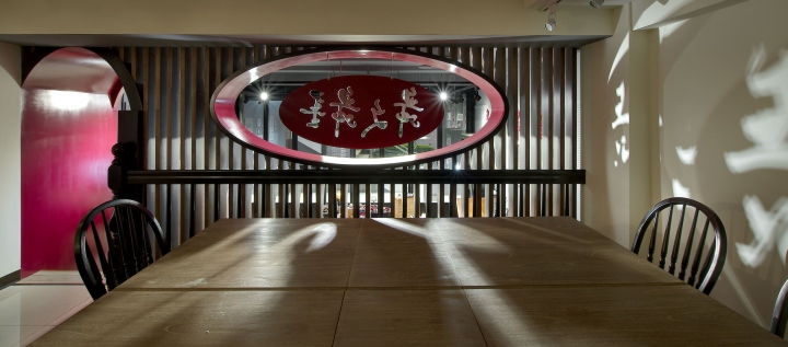
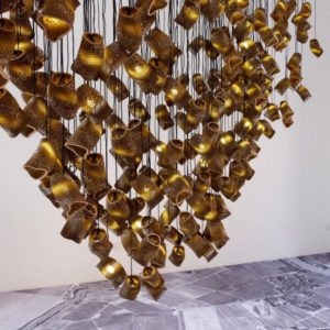
Made by spotlights, the shadow of ‘Dancing Calligraphy ‘ flits around the walls and desks, which, when combined with the artistically designed studio space and the contextual calligraphic Spencer font, blends the interior into one breathing, dancing, beautiful screen.
Designed by David Ho Design Studio
Photography by Blake Wang / Xiang Studio


Add to collection