
Background & Challenge
HarmanHouse specializes in premium audio brands ranging from hi-tech speakers to home theatre systems and quality headphones and was looking to relocate one of its retail stores in Dubai Mall from a bigger space to a smaller space. Facing stiff competition from other bigger competitors in the mall, they wanted to find a unique design approach that would appeal to young trendy millennials with a love for music. Given the limited space and the odd asymmetrical layout of the store, our challenge was to showcase the collection of audio brands in a minimalistic way, while finding the right balance of creating a memorable experience for audiophiles.
Concept
Music was the focal point of our idea. We wanted to build a concept shop that created a more personal experience for audiophiles. So instead of basing our shop design around featuring just products, we came up with a design philosophy that was centered on creating an immersive environment where audiophiles can engage and experience the music they love. This philosophy combined two elements of space – the physical space and the conceptual space. The physical space consisted of harnessing technology, colours and shapes to create a visually impactful space that was minimalistic and futuristic. The conceptual space consisted of creating an emotional and artistic connection with audiophiles by fusing music with art – a visual treat for the eyes and an audio symphony for the ears.

Execution
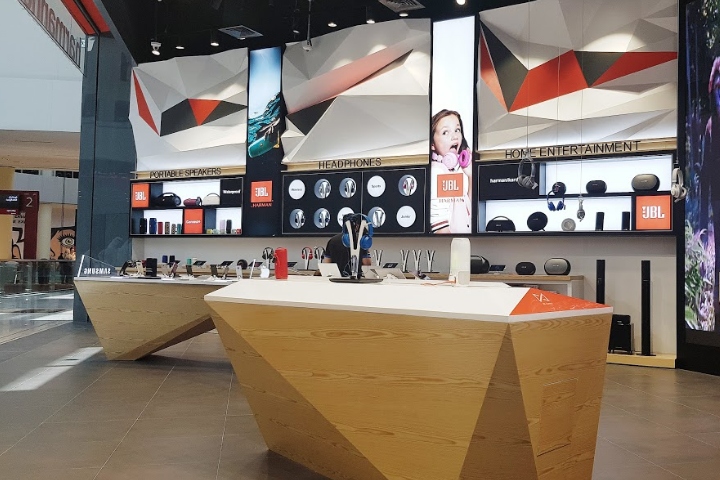
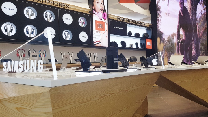
Drawing inspiration from the odd triangular asymmetrical layout, we fabricated a 3D geometric wall to give the shop its futuristic and minimalistic look. These geometric shapes worked not only to enhance the acoustics within the space, they also acted as a functional barrier to soundproof the shop – enabling music played inside the shop to be amplified, while preventing the music from disrupting the world outside. Besides extending this geometric pattern to the design of our display installations, we also customized the lighting within the shop to accentuate the 3D patterns and used a minimalistic colour palette on the ceiling, wall, furnishings and floor tiles to create a conducive clutter-free environment.

Adding to the ambience, we infused technology into our design by having a massive 4m x 2m LED wall showcasing abstract motion graphics that would react to, and complement the music being played. This artistic display was further enhanced by hanging headphones from the ceiling where audiophiles could experience the different brands of headphones and listen to music at their own leisure. And instead of displaying the full range of audio brands, we minimized our displays and featured only core products. By creating a space where audiophiles could first and foremost engage with, and experience the music they love, this unobtrusive freedom allows them to explore the products and spark interest, leading them to a natural progression of wanting to know more about the full range of products, which they can do so on customized iPads or ask for assistance.
Designed by Cheil MENA


Add to collection
