
Agrohub Winery identity by BRID
posted by retail design blog on 2018-07-10
Add to collection
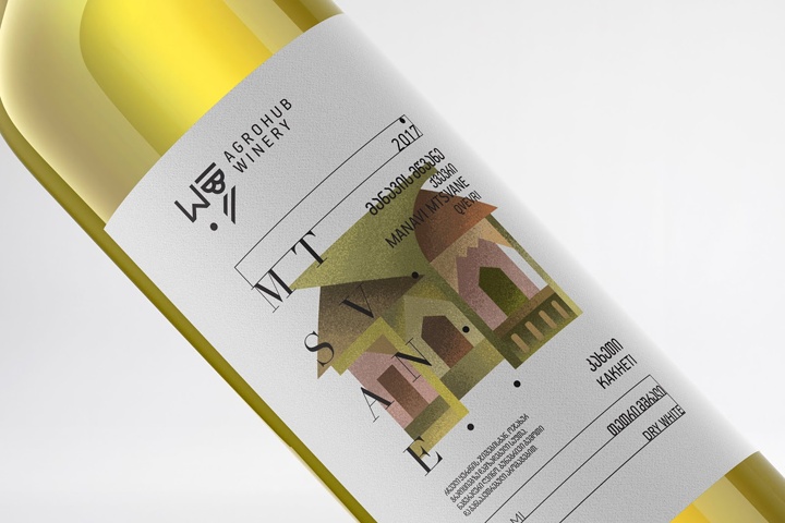

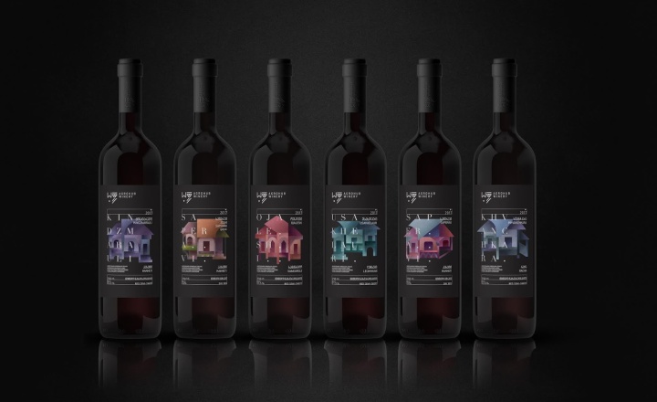
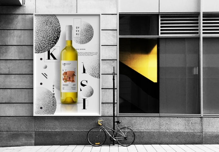
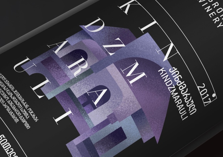
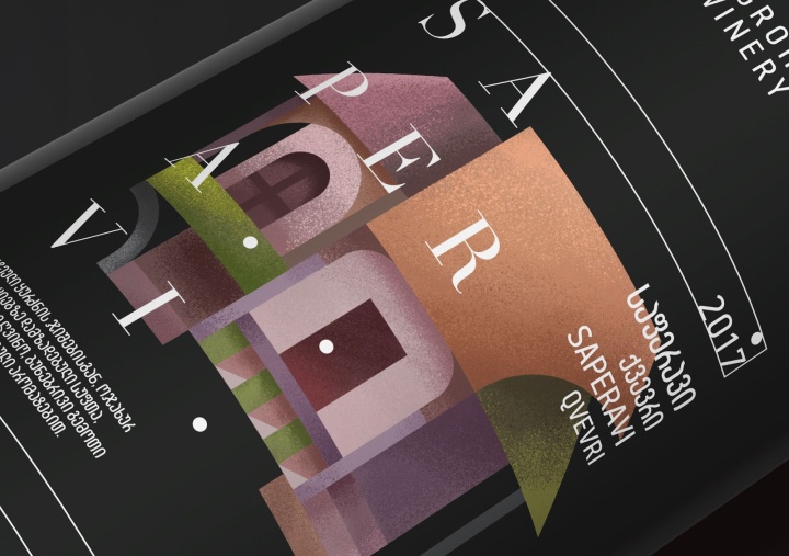
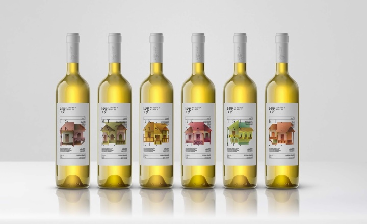
Agrohub is a hypermarket in Georgia/Tbilisi, which supports traditional eco agriculture development. It provides customers with 100% natural and high quality goods. Agrohub Winery is one of the sub companies of Agrohub, which produces 12 different kinds of wine. While using modern technology, Agrohub Winery also preserves Georgian traditional winemaking culture. BRID was entrusted to design the brand identity and package design for Agrohub Winery. Customer wanted us to create a strong and memorable design, which could represent their issue and quality.
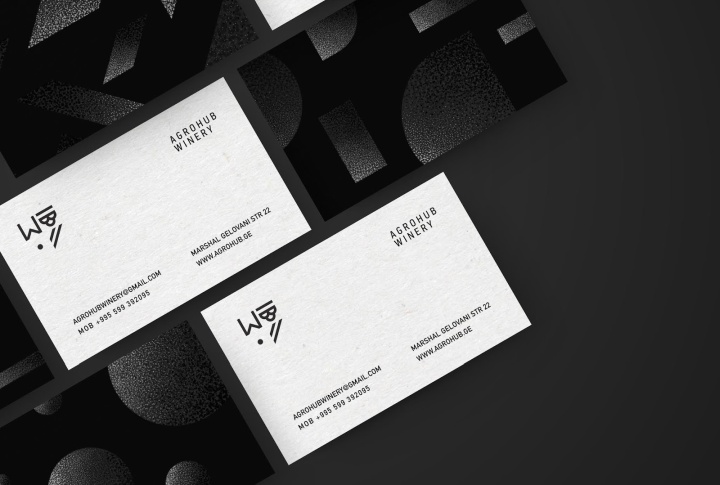
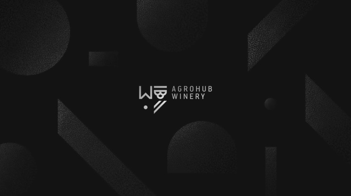
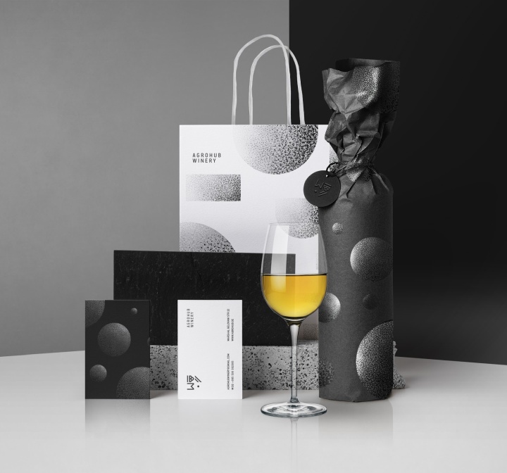
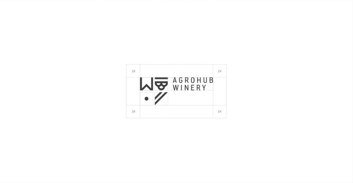
Logo
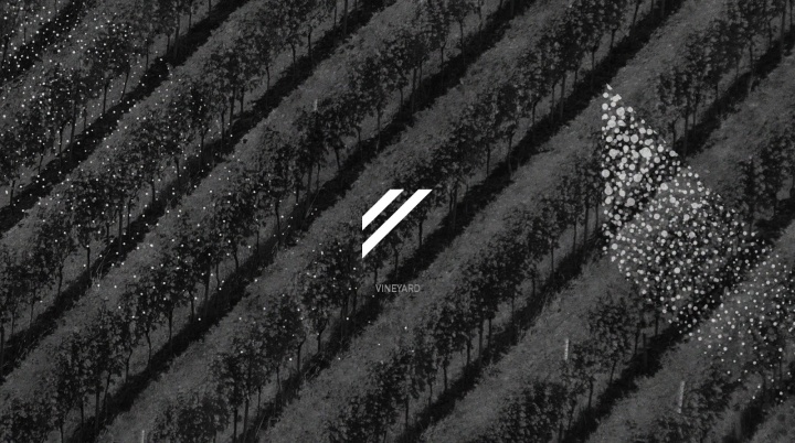
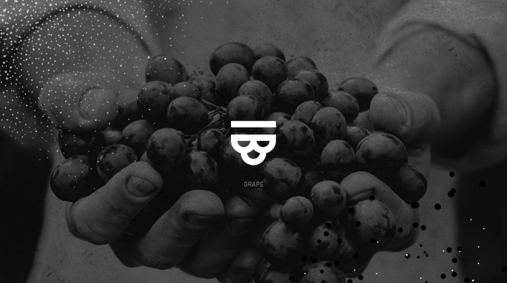
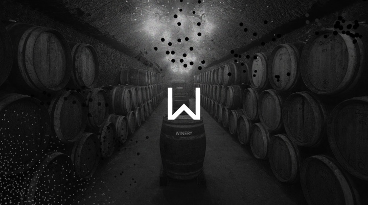
Our logo synthesizes simple shapes of the sun, vineyard, grapes and the first letter of the word- winery. Logotype also repeats the outline of coat of arms. Our design is based on simple, yet very strong forms, which underline the quality of the product. The concept for our logo became the way a grape goes through till it comes to us; As well treated vineyard, sunlight, and the right technology of winemaking is what you need to get a natural, high quality and delicious wine.
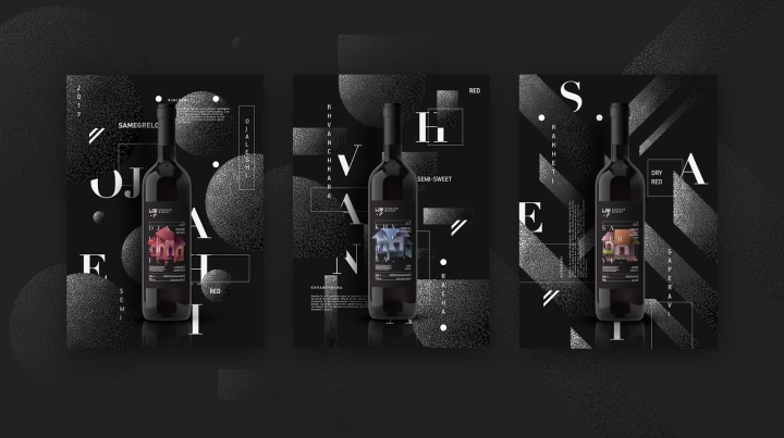
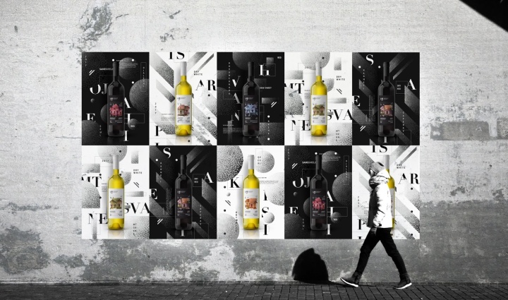
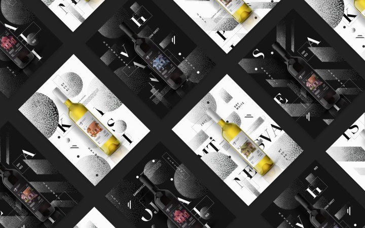
Patterns
We created the whole brand identity for Agrohub Winery. The shapes from our logo become our inspiration for creating minimalistic patterns. By applying the same texture on the patterns and on the label design, we linked brand identity to package design.
Designed by BRID


https://www.packagingoftheworld.com/2018/07/agrohub-winery.html


Add to collection