IQ Studio completed the design for the new Alma Bank offices located in Moscow, Russia. Moscow City is a place with high active energy. High technologies, numerous business processes form a constant flow of people and information. With all the advantages, such clusters of megacities have a number of side effects, such as excessive technogenic environment, lack of landscaping, a sense of constant haste. The result is an emotional overload and a fall of productivity.
The design of the new head office of Alma Bank is based on the combination of high technologies, the latest trends in modern design and creating a sense of nature, emotional “heat” of natural materials. The formation of such a comfortable environment, in turn, increases the psychological comfort of employees within the company as a result of increased productivity. For the client, such a “warm” environment subconsciously means that his needs are taken care of, here you can stop, relax, and make decisions. As a result, there is trust in the company.
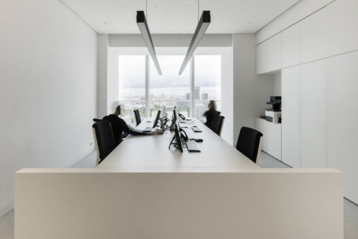
On the provided floor of the Mercury tower it was necessary to locate the back office rooms, the lobby for the reception of VIP guests, meeting rooms, technical areas, security service, areas of the Bank’s management, including the office of the Chairman of the Board. The general status of the office is “upper middle class”.
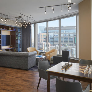
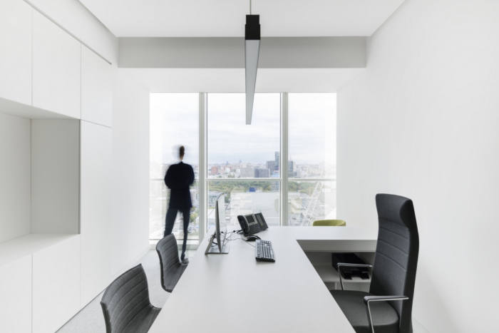
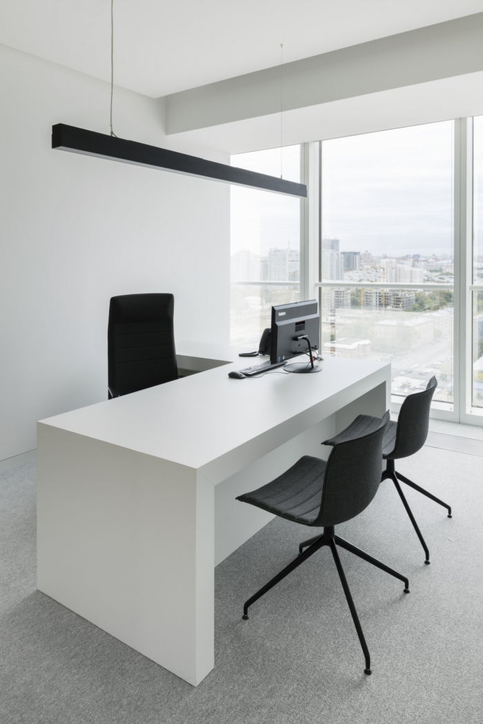
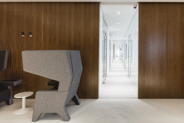
The office is located on the 16th floor. The occupied area is 1700m2. To improve the comfort of employees and management, large and small kitchens, wardrobe areas, private areas, recreational spaces with furniture creating acoustic comfort were provided. Each of 3 receptions was provided with coffee points.
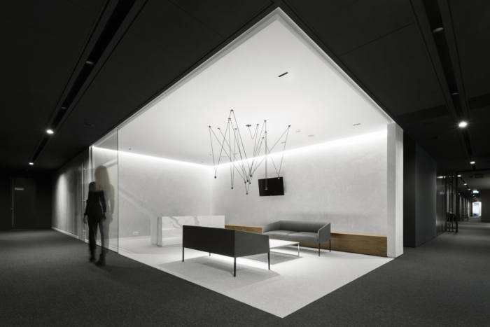
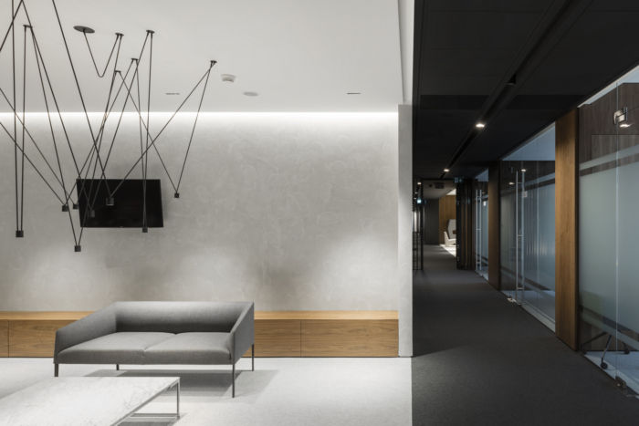
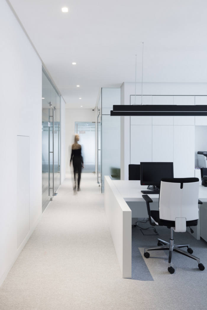
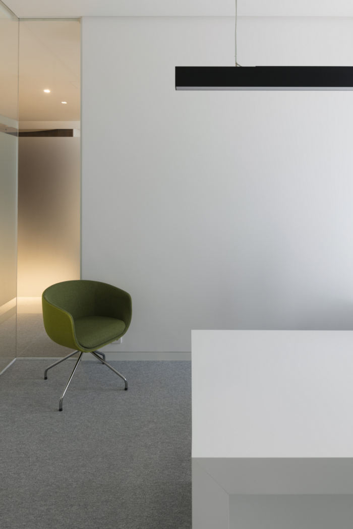
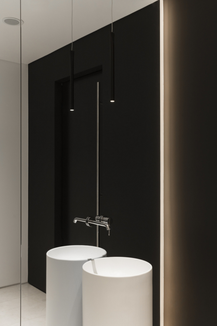
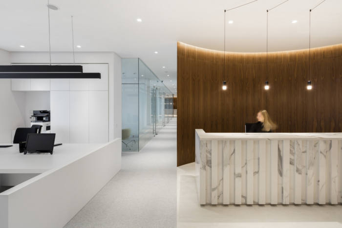
We tried to offer the out of time concept, timeless solutions, where functionalism and even some pragmatism combined with unexpected at first glance solutions and natural materials. Despite the overall high status of the office, cost-effectiveness of solutions was extremely important for the customer. In this regard, the core and all corridors were painted in black, for ease of use, all utilities are passed through these areas, and only fragmentary we included natural wood, marble and granite surfaces. This set of materials, in addition to solving aesthetic problems, brings a sense of nature in the urban, sometimes cold and over-rational environment of the city. We did not try to make a direct quotation of customer’s logos or style. Rather, we worked with a set of feelings relevant to the customer: strictly, status, with transparency. In this regard, almost all rooms are made in sound-proof glass partitions.
The space is permeated with light, opens gradually, multi-faceted. All “art” solutions result either from functional problems or from the peculiarities of the building geometry. For example, on 16th and several other floors in the Mercury tower there is an extended blind inclined wall. In this zone we have located the main meeting room, and the inclined wall was turned into a semicircular half-dome illuminated by a washing lamp.






Add to collection


