Add to collection
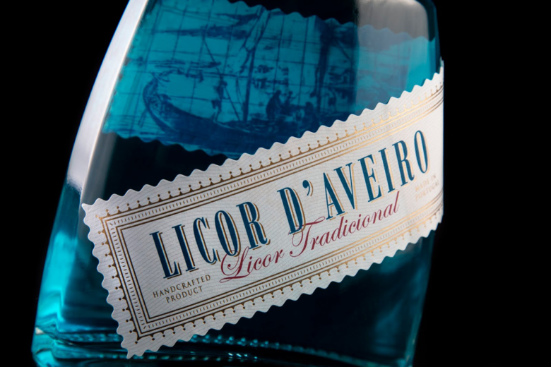
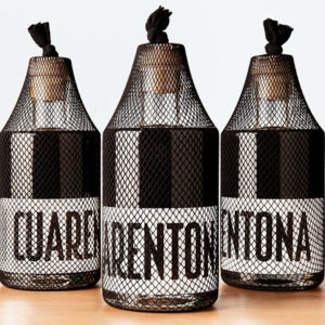
This project was the rebranding of a tradition liquor from the city of Aveiro, Portugal. The client wanted the packaging to look premium but still traditional and authentic, this was achieved with the ornamented label shape, the traditional Portuguese tiles picture in the background, and the stamping foil finishing.
What’s Unique?
The label is just a stripe that goes from the front to the back and has an image printed in flexography on the inside of the back side of the stripe, visible from the front. The label shape, label position and image that can be seen through the liquid makes this bottle interesting to look at.
Designed by ThinkBoldStudio


Add to collection