In 2010, up-market leather-goods company Mulberry launched a concept store in London. Responsible for the interior of the New Bond Street establishment, which featured a dry-stone wall to emphasize the luxury brand’s British provenance, was Universal Design Studio. Eight years on, Mulberry’s creative director, Johnny Coca, commissioned Faye Toogood to come up with a new retail concept. The result – her design for the Regent Street flagship – suggests that the nation’s identity is impossible to pigeonhole. Whereas Universal elected to focus on traditional craft, Shoreditch-based Toogood drew inspiration from brutalism, a controversial style of architecture pioneered in the UK by the Smithsons and Denys Lasdun.
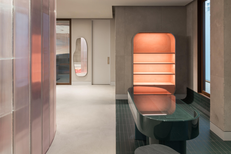
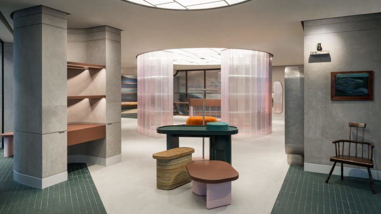
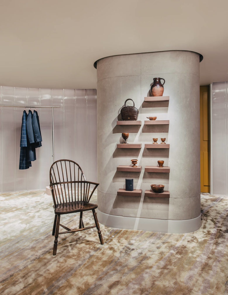
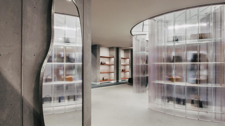
Toogood and her team juxtaposed concrete walls with a rich array of materials: gloss and textured green ceramic tiles, cast resin, polished pink plaster, digitally printed wallpaper, brushed stainless steel and patinated bronze – a selection that effectively softens the two-storey space. Hand-tufted rugs and ceramic pieces give the store a cosy feel. Toogood aimed for a contrast between the countryside, where Mulberry’s factory is located, and the UK’s grittier side.
‘It’s a company that grew up in Somerset but now is very much seen as a British-contemporary urban brand,’ says Toogood. ‘However, I didn’t want anyone to forget where it had come from. Looking at British brutalist architecture, I felt I needed the verdant landscape of Somerset combined with more contemporary surroundings. I needed to explain what’s happening now.’
Coca wanted the new Mulberry stores to be ‘immersive environments with the comfort of home – places for exploring the brand’s modern British identity’.
The project sees Toogood’s practice step into new territory. There are other flagship stores planned – New York is up next – and the full global roll-out includes a 10-sq-m concession area. ‘That’s the biggest challenge,’ she says, ‘because it’s a scale we don’t usually work with. Designing something from the macro to the micro is new for us.’ She points out that most of her commissions are for one-off interiors.
If the Regent Street store is anything to go by, it’s a test her practice has passed with aplomb.
Designed by Faye Toogood
Photography by French+Tye and Genevieve Lutkin

Add to collection
