![](https://retaildesignblog.net/wp-content/uploads/2017/01/Beanberry-Roastery-by-Liqui-Design-London-UK-300x300.jpg)
![](https://retaildesignblog.net/wp-content/uploads/2019/02/Jomoo_luca-rotondo-2018_07mod-camilla-780x568.jpg)
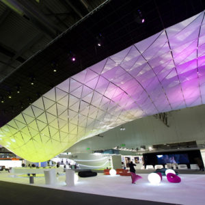
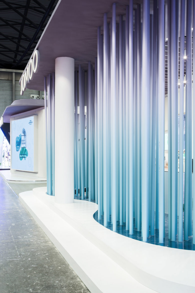
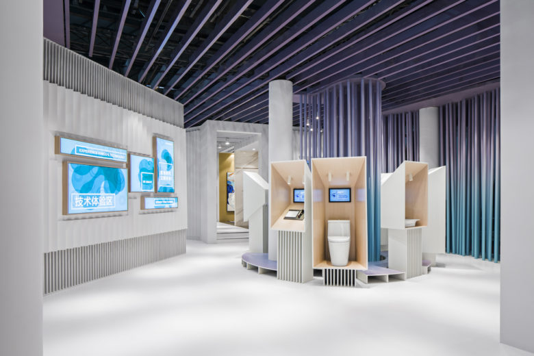
Jomoo is a kitchen and bathroom manufacturer with a dominating position in the Chinese market. Its operations directly cope with the growing demand for residential interior design coming from a rising young Chinese middle class.
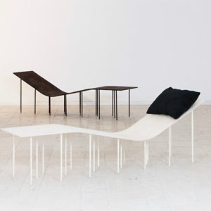
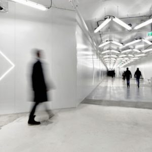
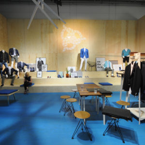
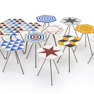
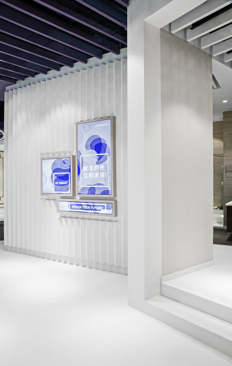
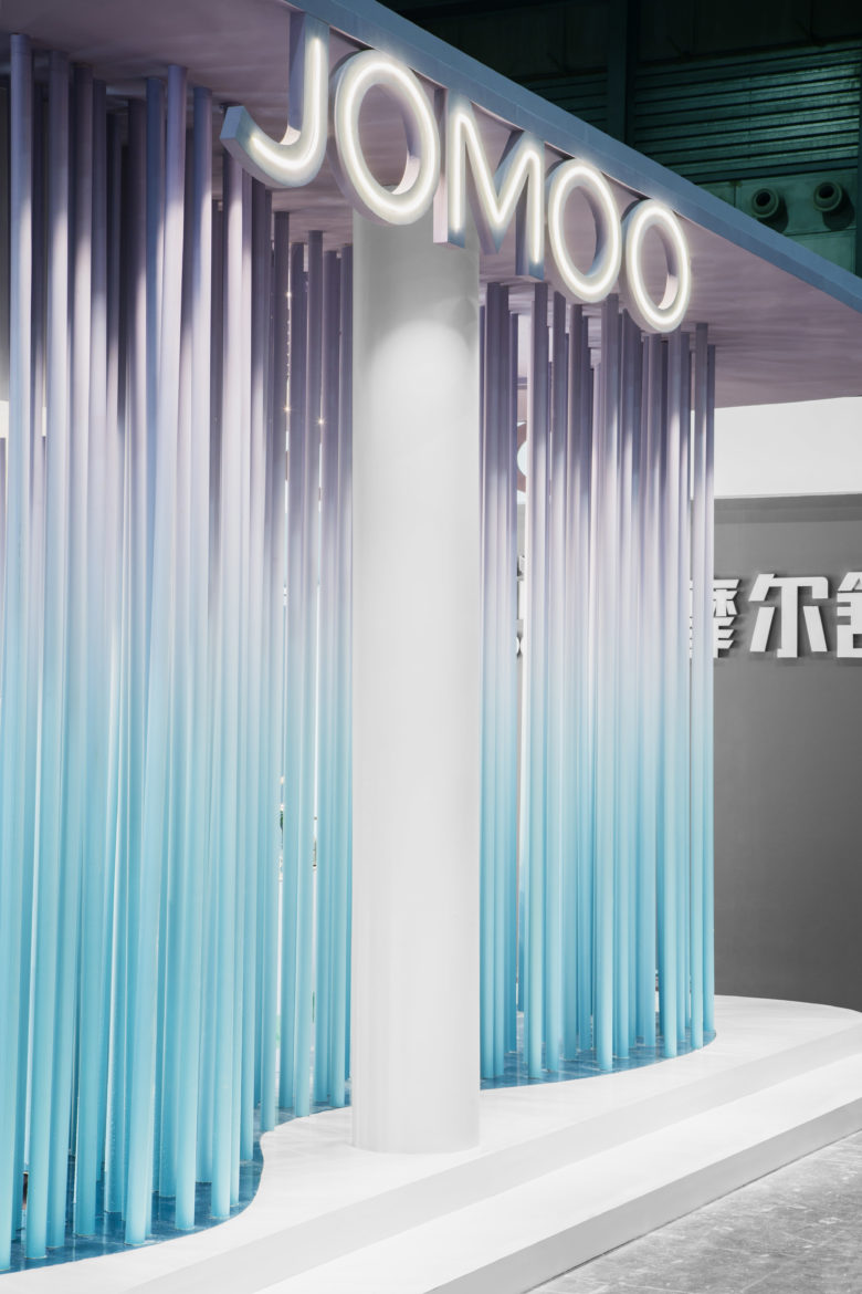
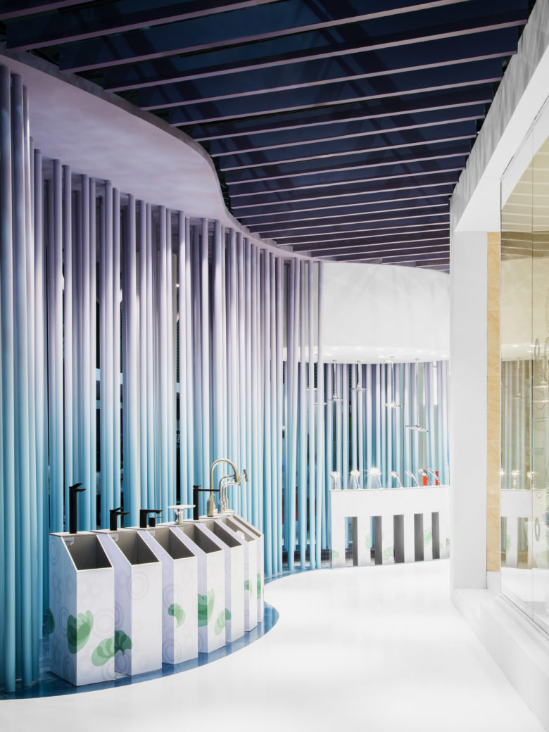
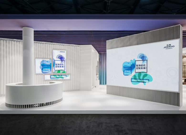
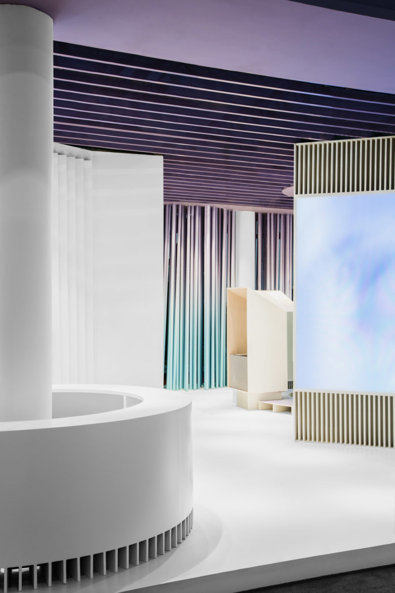
Enhancing this aspect we chose to design a unexpected space, more symbolic than advertising, more narrative than descriptive. Vibrant degrade colors on a total white background and some abstract architecture contribute to an immersive exhibition, giving life to a playground for adults.
An abstract landscape frames four different buildings and experience areas. Around them, clear and simple visual design helps to establish a connection with the topics of the exhibition: purity, simplicity, health, quality of life.
creative direction | paolo cesaretti firenze milano
design team | paolo cesaretti | marianna cristofaro | camilla vallini
visual design | claudia astarita firenze
photo | luca rotondo milano
![](https://retaildesignblog.net/wp-content/uploads/2019/02/Senza-titolo3-copia-780x1169.jpg)
![](https://retaildesignblog.net/wp-content/uploads/2019/02/Senza-titolo1eg-copia-copia-mod-camilla-780x1226.jpg)
![](https://retaildesignblog.net/wp-content/uploads/2019/02/Jomoo_luca-rotondo-2018_09-780x1170.jpg)
![](https://retaildesignblog.net/wp-content/uploads/2019/02/Jomoo_luca-rotondo-2018_08-780x1040.jpg)
![](https://retaildesignblog.net/wp-content/uploads/2019/02/Jomoo_luca-rotondo-2018_07mod-camilla1-780x568.jpg)
![](https://retaildesignblog.net/wp-content/uploads/2019/02/Jomoo_luca-rotondo-2018_06-780x1170.jpg)
![](https://retaildesignblog.net/wp-content/uploads/2019/02/Jomoo_luca-rotondo-2018_04-780x520.jpg)
![](https://retaildesignblog.net/wp-content/uploads/2019/02/Jomoo_luca-rotondo-2018_03-780x1170.jpg)