Search for the origins of the London-based eyewear brand For Art’s Sake and at the top, you’ll find an article with the details of an outfit that Beyoncé recently wore to a birthday party for Michael B. Jordan. For Art’s Sake frames were her first optical look that night; apparently she later changed into others. But this gives an idea of the company’s PR standing: For Art’s Sake started in 2016 on social media, and they since have grown to be a darling for the fashion-weekers and genetically blessed of the world.
The fact that For Art’s Sake frames now have a place on the bridge of the nose of one of – if not the – most beloved celebrities of all time is more than just a superficial observation, it indicates their upward path of trajectory as an industry player. The spatial strategy for the brand’s first physical flagship in London and the follow-up location in Shanghai, both designed by Aleksa Studio, is entirely dependent on what made them successful in the first place: Instagram.
The sharing economy – and, as explored in this piece about a Melbourne-based optical retailer, the growing dependence on the fashion industry – is responsible for the way the Covent Garden shop looks. To get a better idea of why, just pay attention to a keyword: curated. Carefully curated are the angled mirrors and Instagram spots within the space. It’s a favoured adjective in Insta-biographies of influencers everywhere, and its use says a lot about the kind of visibility culture that social media promotes. Participants within that culture are For Art’s Sake target audience – in their words, the ‘style-conscious digital generation.’
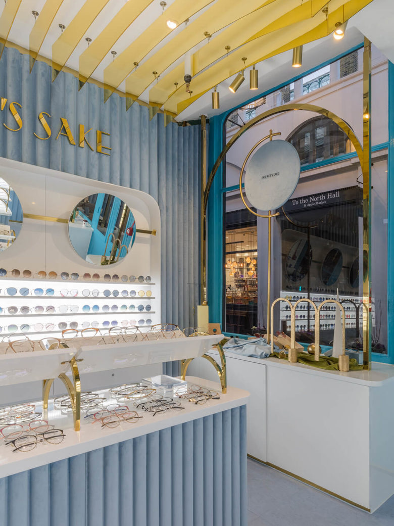
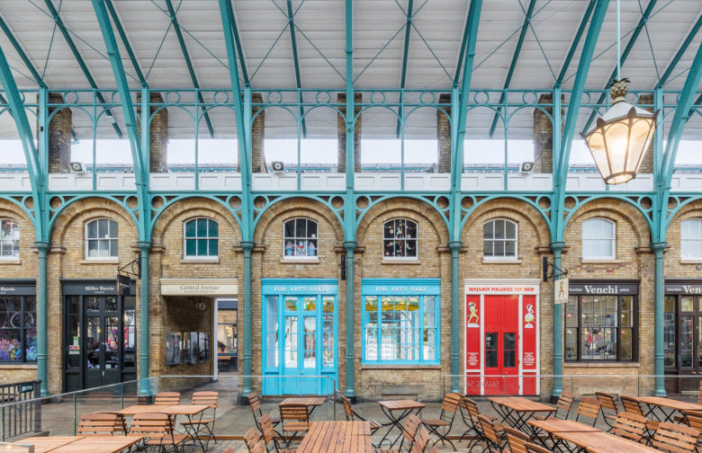
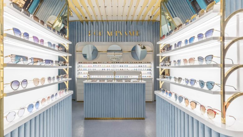
One of the exterior shots of the vibrantly turquoise For Art’s Sake flagship, posted just recently on their Instagram account, is captioned ‘Wes Anderson – eat your heart out [heart emoji]’. ‘What’s in store?,’ it continues. ‘Personal shopping, a concierge service, WiFi, our now infamous selfie station and so much more.’
In fact, the filmmaker’s name is used a lot in their social marketing: it wouldn’t be totally impossible to imagine a lobby pop-up in the outtakes of The Grand Budapest Hotel. In any case, images of the store would definitely fit in the grid of the popular @accidentallywesanderson Instagram account that showcases places from all over the globe that look taken out of one his movie sets.
Except accidentally might not be the operative word there.
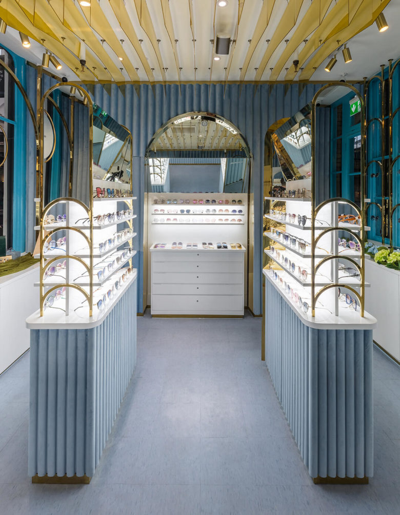
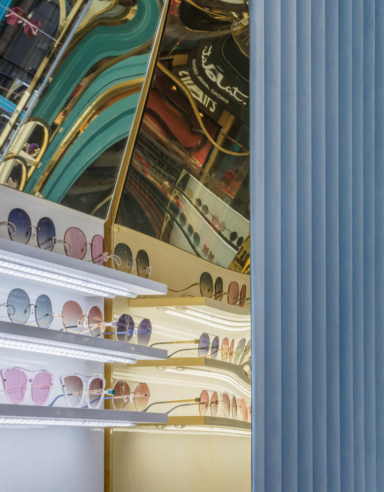
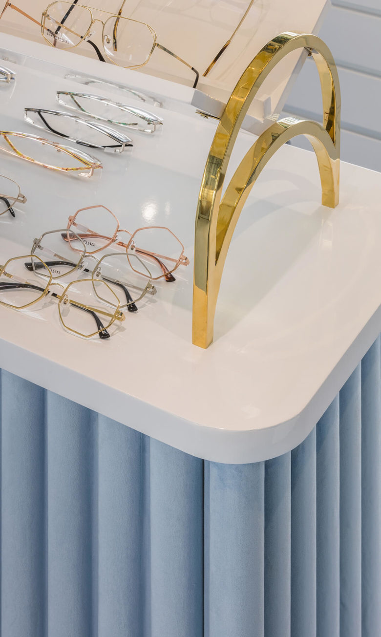
Aleksa achieved Anderson-esque interiors through contrasting materials like blue velvet, mirror polished brass and high-gloss white timber. The velvet is everywhere, from the walls to the display stands to the company’s signature packaging. Bespoke brass arches create flexible window displays and exhibition units are carved into the walls, featuring round mirrors and floating shelves.
One thing’s certain from the looks of Instagram-gone-brick-and-mortar retail shops these days: what the children of the Internet want, the children of the Internet get.
Designed by Aleksa Studio
Photography by Nicholas Worley
