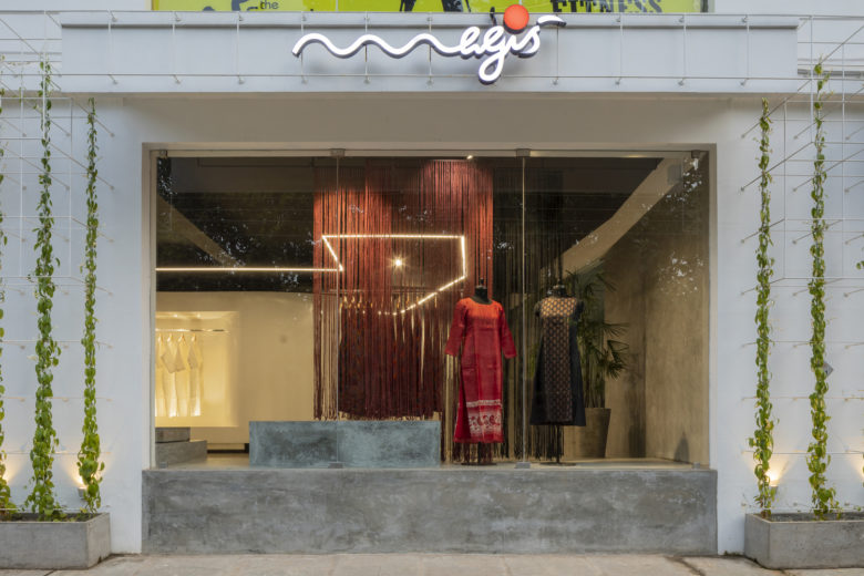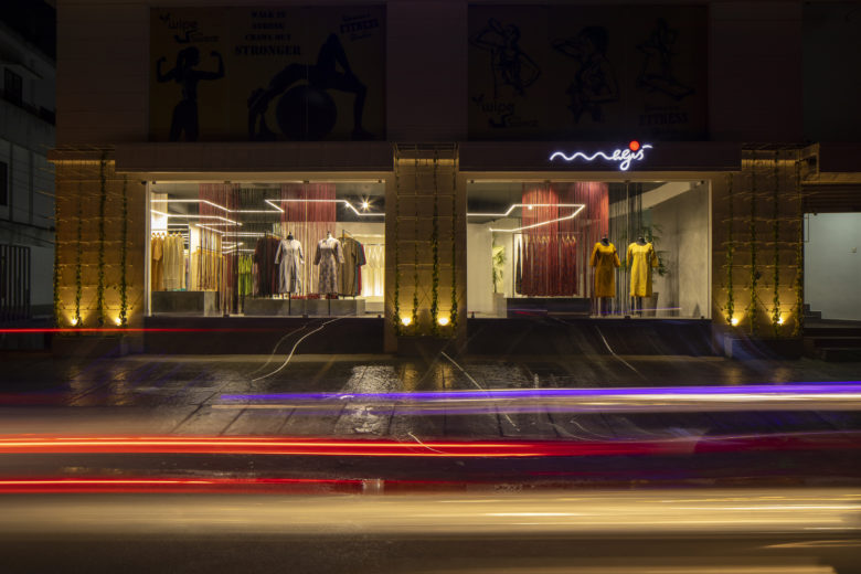
‘Magis’ had etched its way into their clients’ hearts as a popular women’s wear brand in South India for the last 13 years and when it came to hosting their own products, with their flagship store in Thrissur, the owners had wanted the space to reflect the qualities, of their products, that had made them famous. ‘The store between the lines’, as it’s fondly called, was the result of this dream.
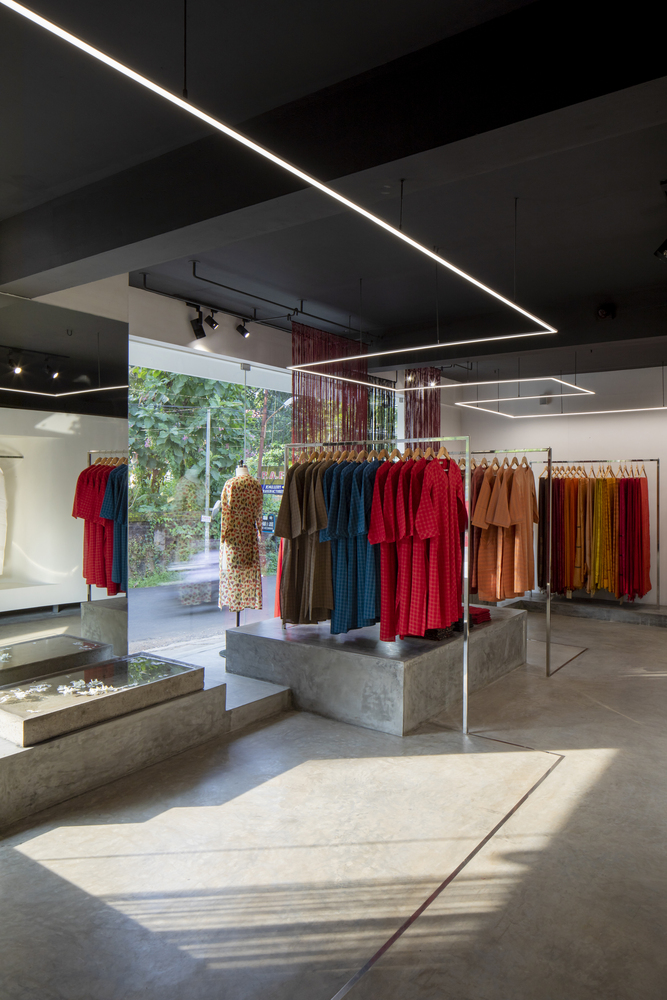
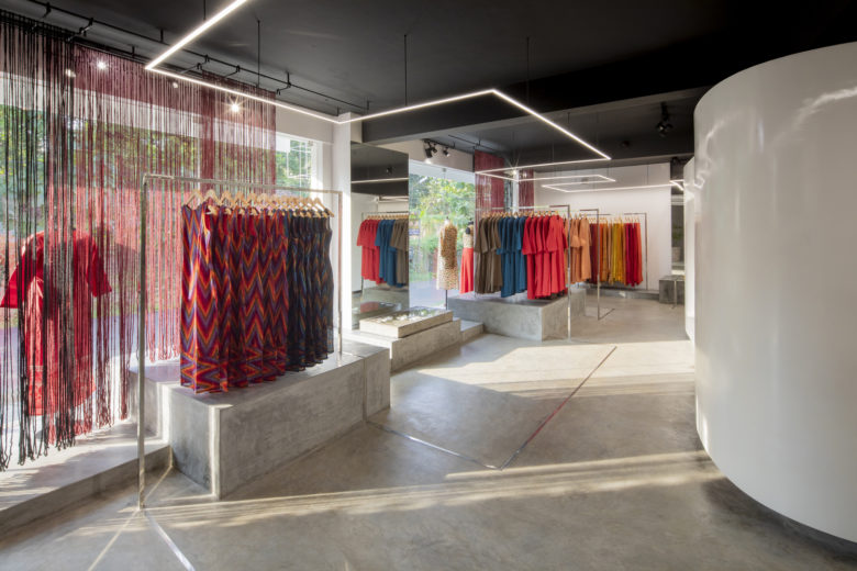
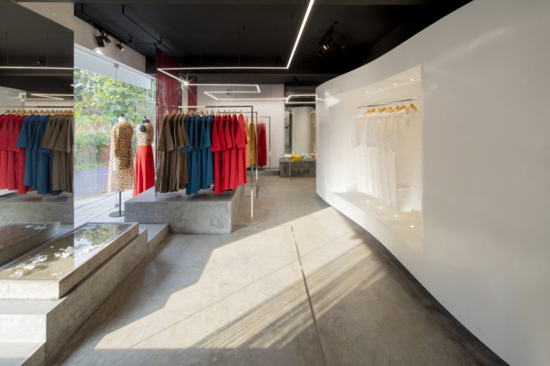
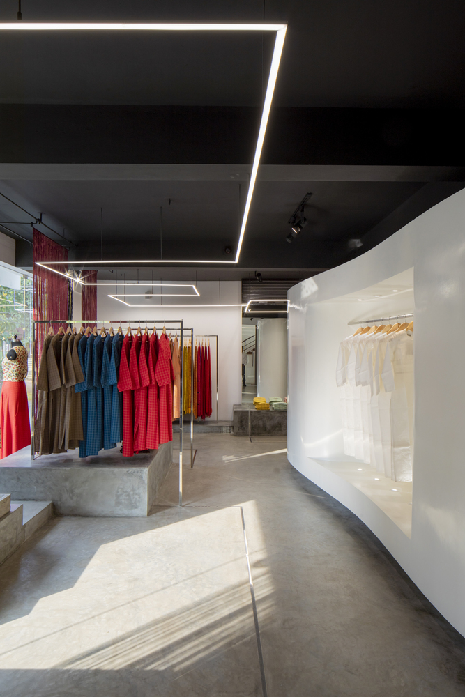
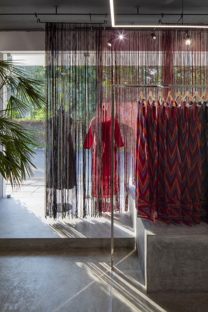
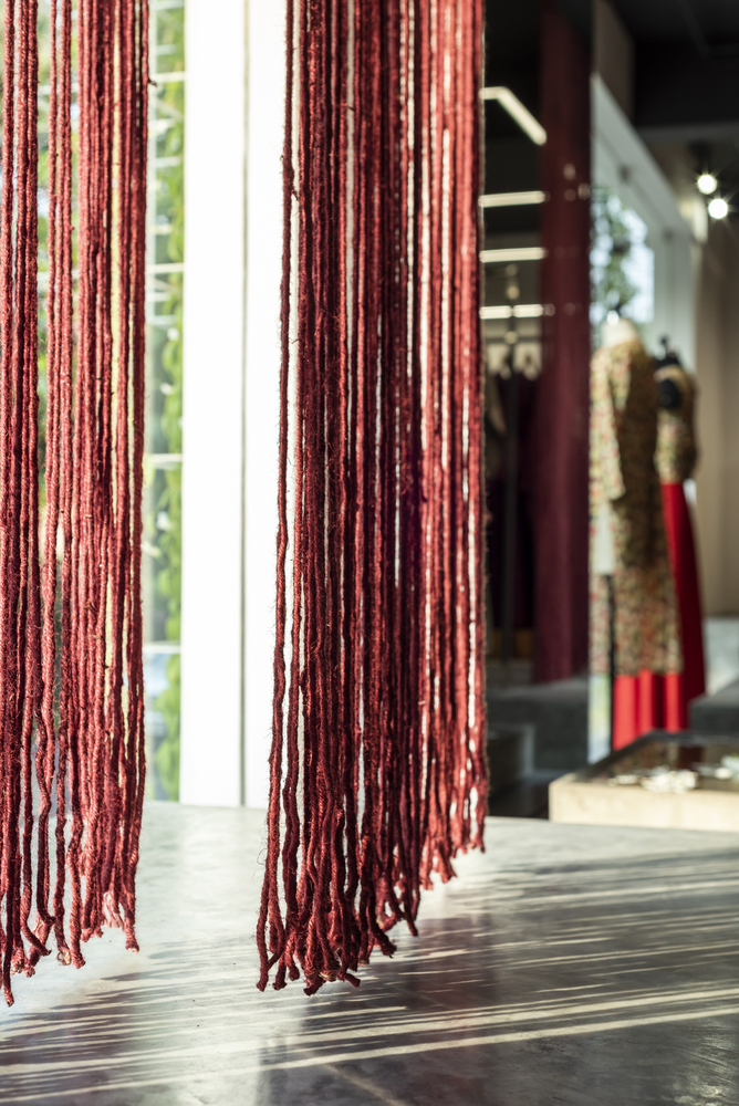
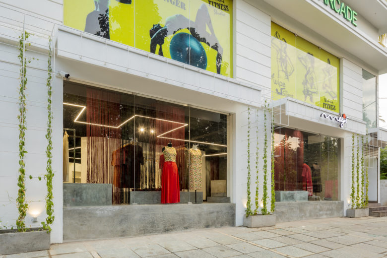
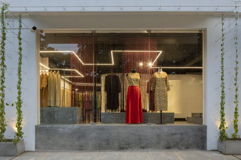
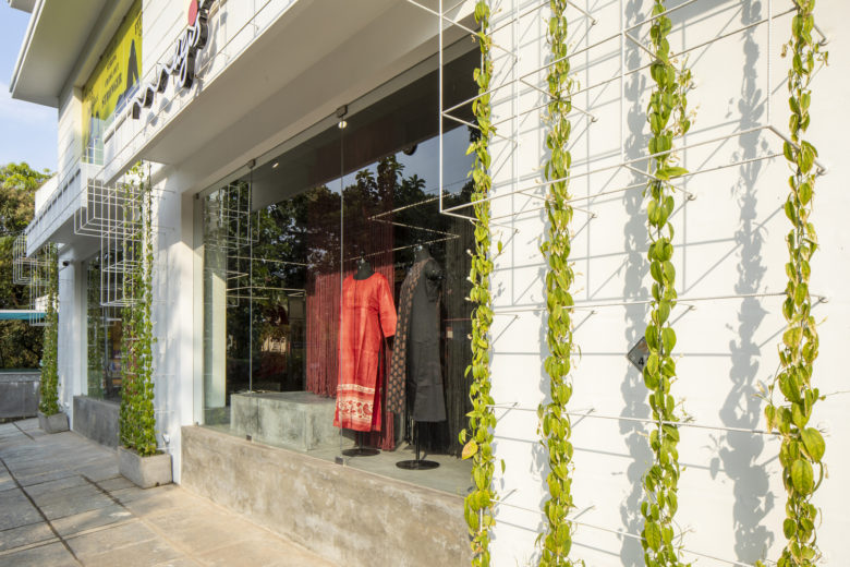
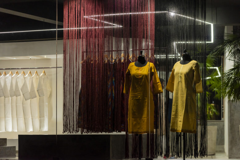
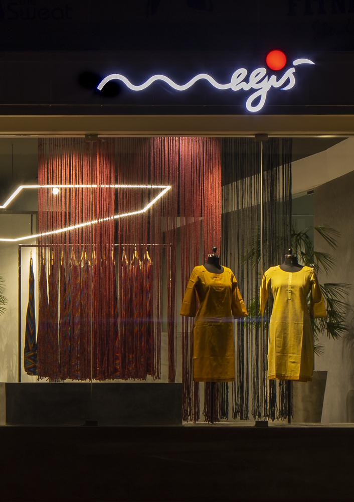
The store takes maximum advantage of the prime location. With its large existing windows to the street side, a certain level of visual translucency is achieved, by strategically orchestrated window display, aiming at giving the passerby a sneak peek into the store prompting them to drop in and explore further. The facade of the store devoid of any major changes from the existing building andis brought together with only a minor intervention by means of painted metal trellis that would connect the various parts of the store front, when the flowering creepers attain its full growth and act as a dynamic frame for the store windows.
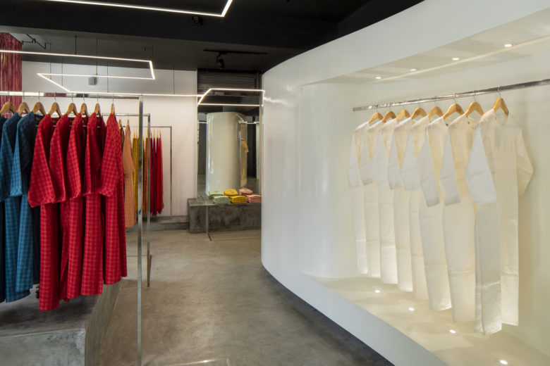
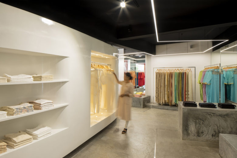
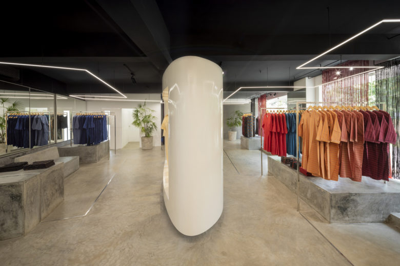
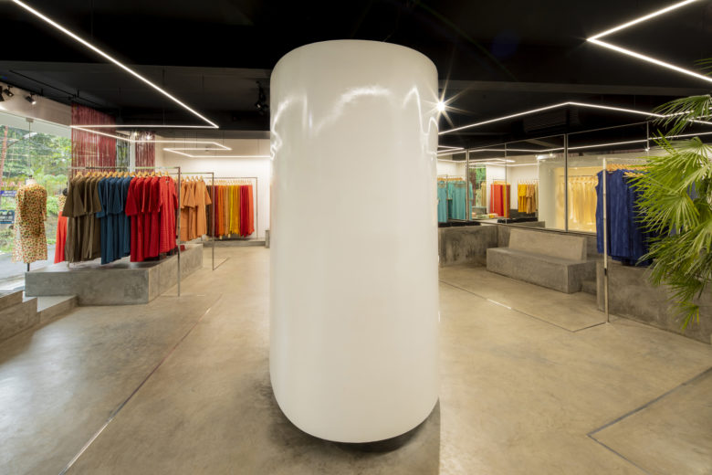
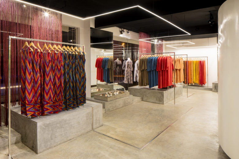
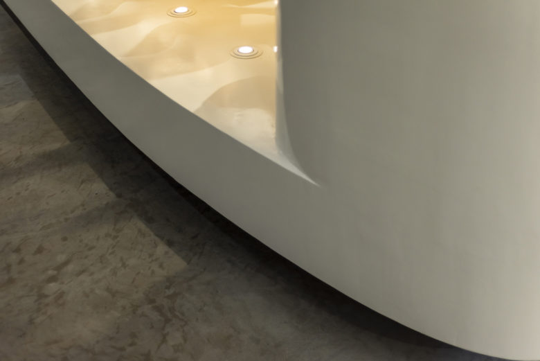
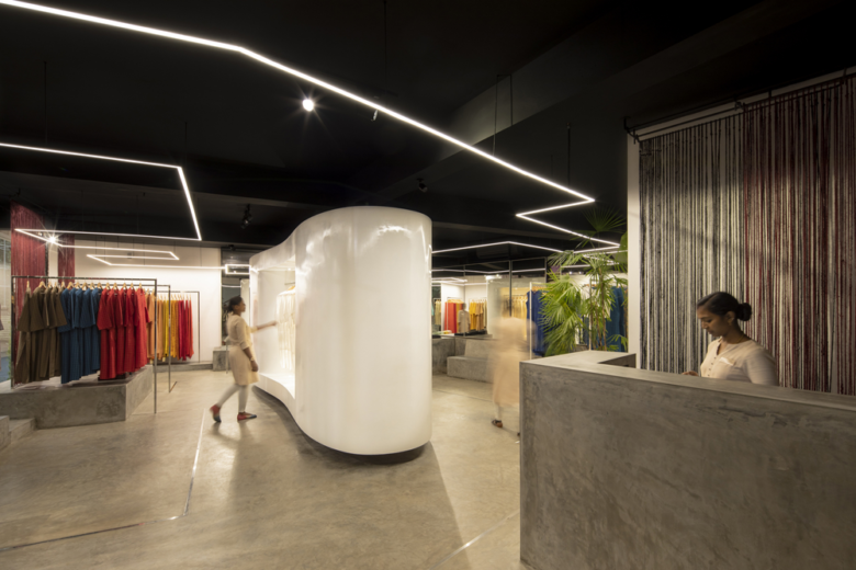
Though the store is designed to create spatial drama, it allows an intimate and tactile experience of the products displayed within it. At the center of the room sits a large white display unit, in glossy automotive paint finish, contrasting the rest of the interiors that creates a display zone for exquisite higher end products. This unit while hiding a central column creates a loop in the layout of the store that prompts the customers to walk around it discovering things, in the store, as they go along.
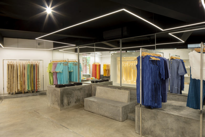
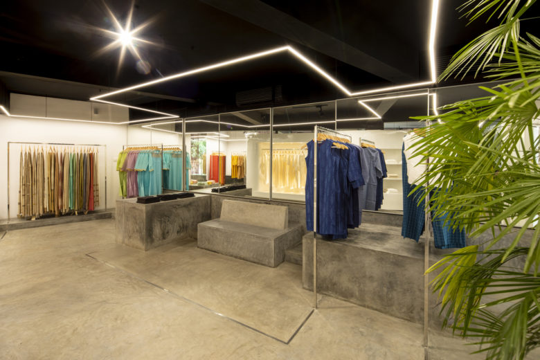
The several cement finished platforms, that scatter about the internal periphery of the store, rise as a continuation of the cement finished flooring, in varying heights and act as a pedestal for stacking the products, accommodate props during seasonal decorations and become a seating for customers or a table for discussions. This allows changes in the general display configuration from time to time, creating interest in their frequent customers.
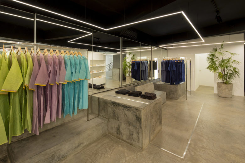
The hanging clothes are accommodated on stainless steel box sections that rise and fall from the platform and the floor in random but controlled continuous loop around the store. The LED strip light, used for the general lighting, is made to look like it’s suspended in midair and reflect the layout of S.S box section in plan and completes the loop.
An entire rear wall has storage cabinets covered by sliding mirror shutters that help double the space visually. These cabinets are used to stack excess products and can be accessed when a customer demands.The neutral shades of grey dominate the overall colour scheme becoming a backdrop for the several colours, shades and textures the Magis designers bring into their collection each season.
The window display too can be changed with ease by means of a simple yet versatile system, developed by the architects, fixed onto the ceiling inside the store, above the display windows. This user friendly system helps those at the store change the display according to their need or seasonal demand, quickly and efficiently. The honesty, the simplicity and the functionality of the store, thus reflects the character of the products that Magis is being admired for.
Architects: LIJO RENY architects
Design Team: Ar. RenyLijo and Ar. Lijo Jos
Photographs: Praveen Mohandas
