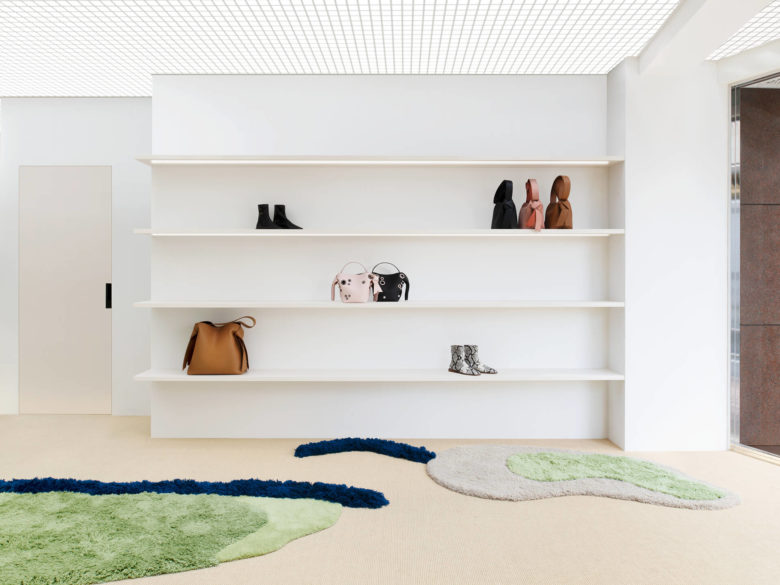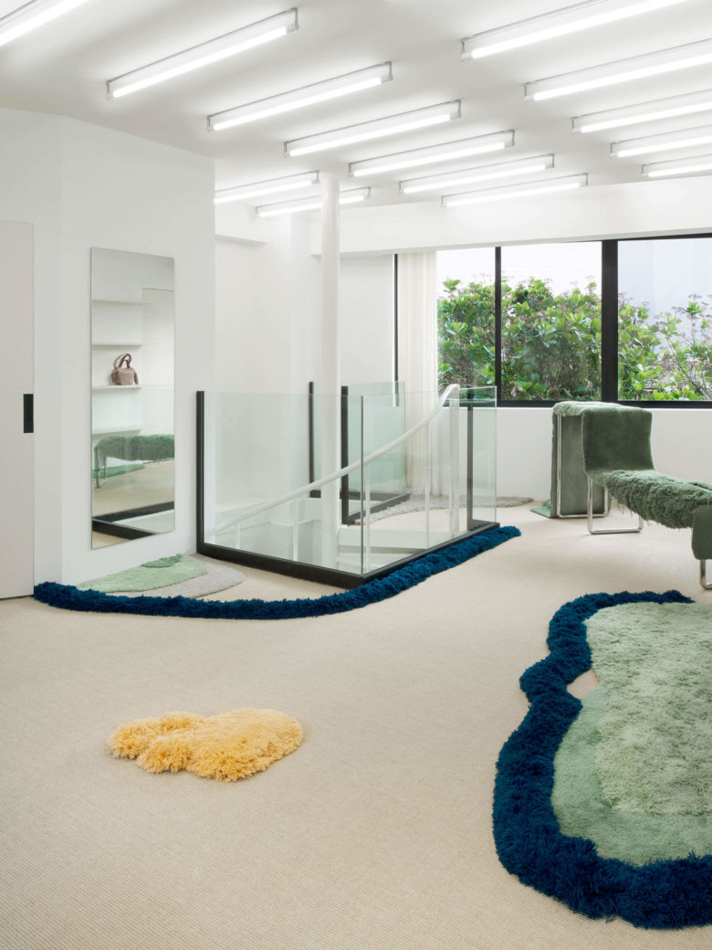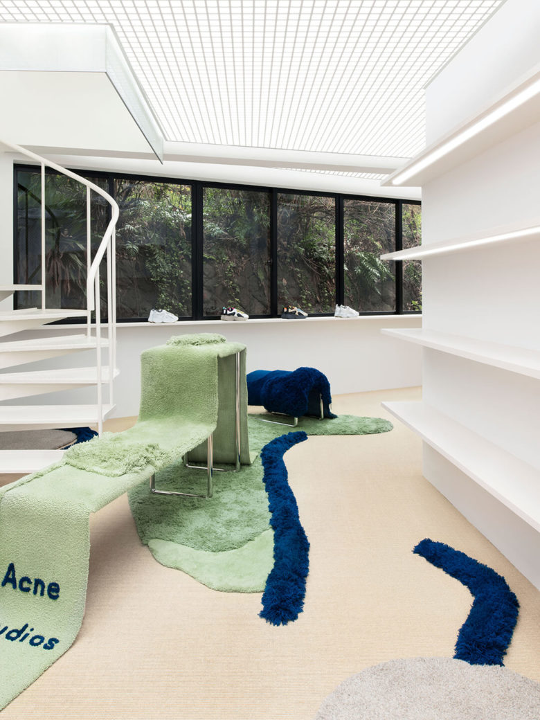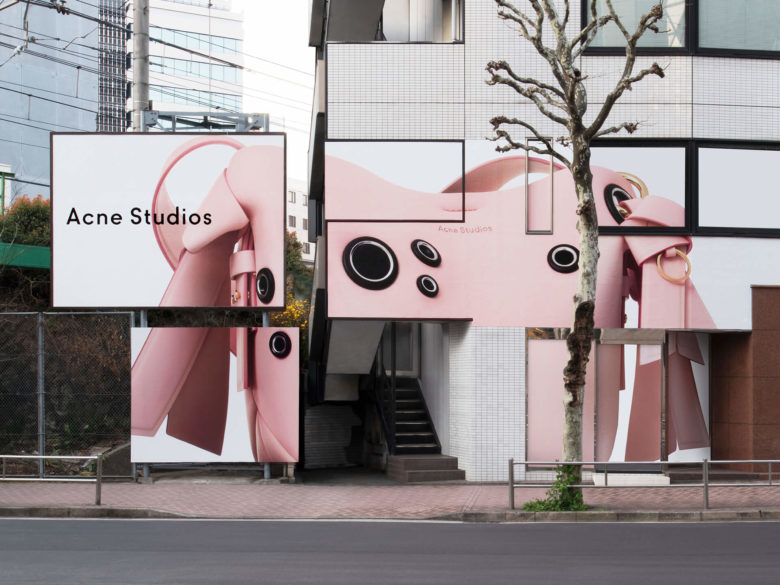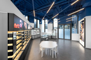
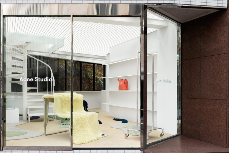
Acne Studios’ Shibuya ‘project’ store – introduced to the Tokyo district in April 2017 – is a one-of-a-kind shop for the Swedish fashion brand. Since its opening, the location has played host to four different interiors, each designed to highlight one specific product range from the company.
As brick-and-mortar shops are increasingly becoming places for brands to sell their ethos and cultural currency over product, Acne’s decision to limit immediate access to stock speaks to the changing role of physical retail. Designed as a white cube gallery – a setting the fashion world is no stranger to emulating – Acne’s Shibuya store gives the in-house design team carte blanche based on creative director Jonny Johansson’s vision. The space’s transience gives the company ample room for experimentation and market research in an ever-mutating industry.
Now, it’s dedicated to the brand’s line of accessories and leather goods. The first time around, a feature on the brand’s iconic, Scandi-cut denim manifested ocean blue carpeting and mirrored carpeting; more recently, Acne’s collaborative collection with Fjällräven resulted in a colour-blocked space with natural elements, apropos to the latter company’s outdoor offerings.
For the accessories-driven interior, Johansson wanted to create a sculptural, tactile environment with seemingly organic structures; every interior rotation is intended to be a reflection and celebration of the products showcased at the time.
Inside, the team found a balance between soft and sculptural, with bespoke display units and custom-made rugs by Swedish rug and textile design company Kasthall. Set against stark white walls and beige carpeting, amorphous, plush patches of colour lift off the ground and make the space – and products – come alive.
‘This space is the first one dedicated to a product range, as opposed to an entire collection or capsule,’ explained the team. ‘Therefore, it was essential to create a distinctive design. In terms of limitations, there are only those subsequent to the white cube space.’
Images Courtesy of Acne Studios
