
Landmark Space Portman House Coworking Offices by Design Command
posted by retail design blog on 2019-07-05
London
Add to collection
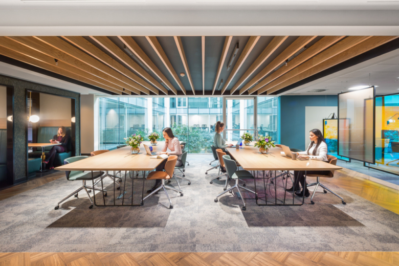
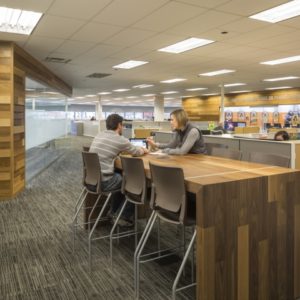
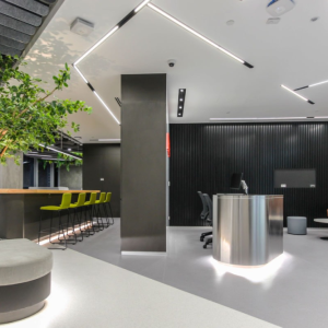
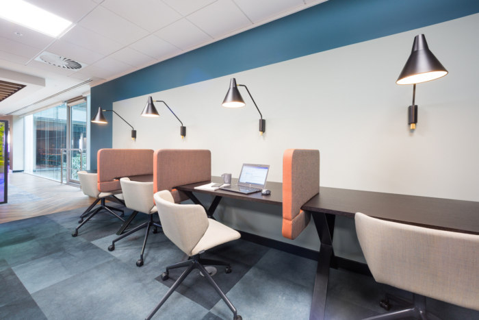
Design Command has completed the interior fit-out for the Landmark Space Portman House coworking offices located in London, England. Landmark provides its clients with a wide range of working environments. The sites are open plan to maximise space, light and flow of movement – enhancing the atmosphere within each site. To differentiate between work spaces, colour palettes are used to divide the space into specific zones for designated tasks.
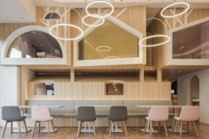
Some work spaces are for focussed, quiet tasks where concentration is essential. Other work spaces are for team discussions and collaborative production. Therefore, some spaces are a relaxed more informal setting while others are more formal and private.
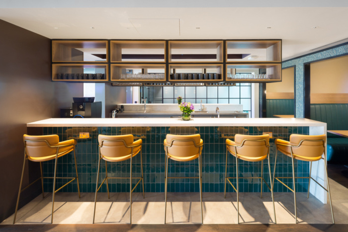
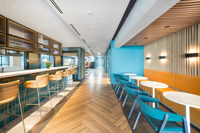
The reception is the welcoming zone therefore lighter, more reflective materials are used to enhance the light and create a bright, open environment.
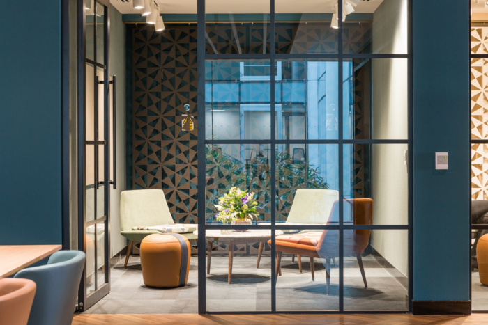
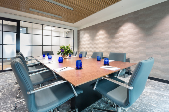
Meeting rooms are a more formal setting used for impressing clients. A more muted, richer palette of colours are used – rich tan leathers and luxurious dark blues with metallic extravagant wallpaper.
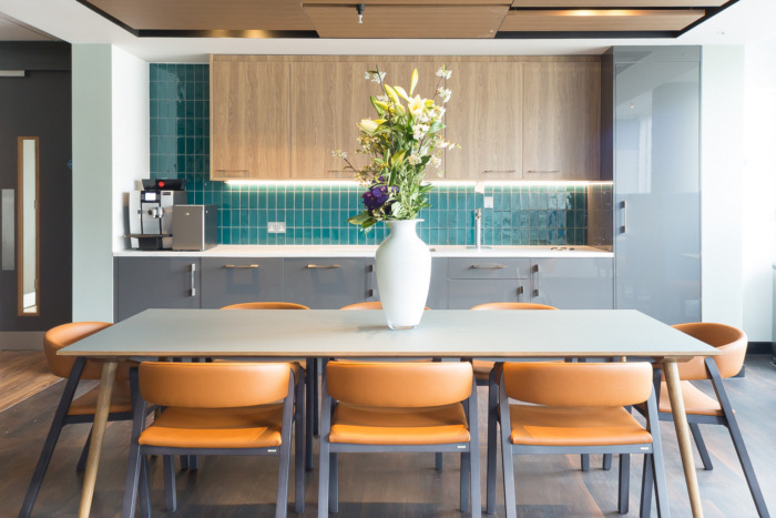
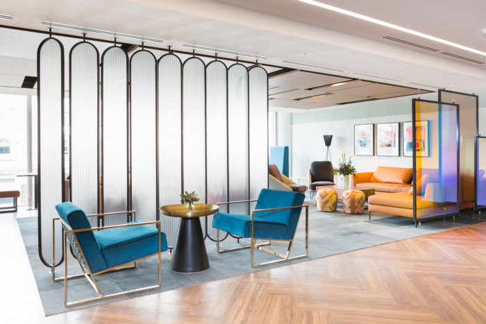
The social zone is designed to mimic a hospitality space. It was designed to be a light and inspiring space using a light backdrop and injections of intense colours. Orange is associated with enthusiasm and warmth. It is thought of as an optimistic and extroverted colour, this was used on site to encourage communication and collaboration. Teal is thought to have tranquil and stability as its colour properties, evoking restfulness and balance. By combining these two colours into the concept, we have created a scheme that enables clients to work together and relax simultaneously in the break out social space.
The private zone is more calming, the colours and tones are more muted to create a peaceful setting. Darker tones are used as they are thought to channel and focus the mind.
Designer: Design Command
Architect: Garnett Netherwood Architects
Contractor: Claremont
Photography: Richard Townshend


Add to collection