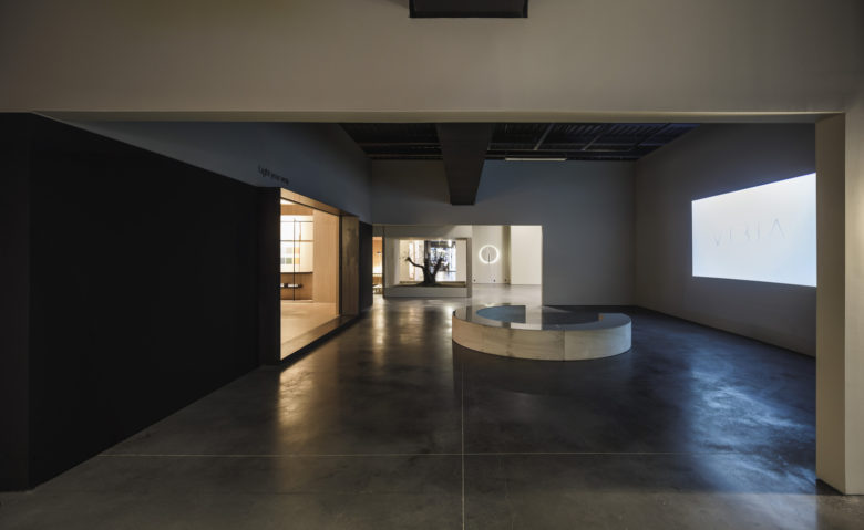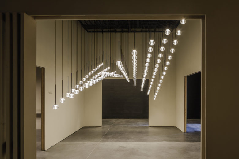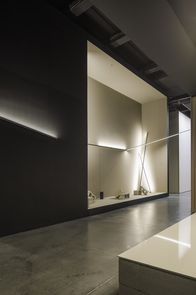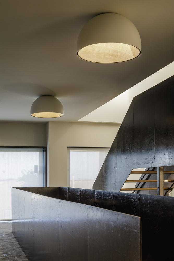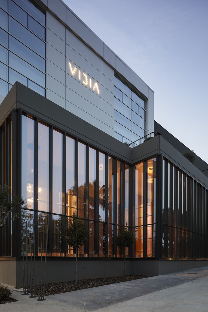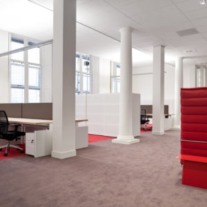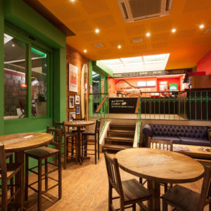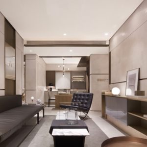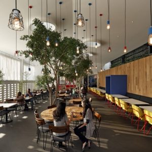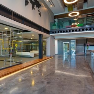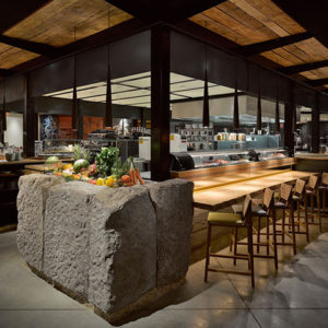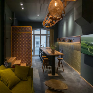
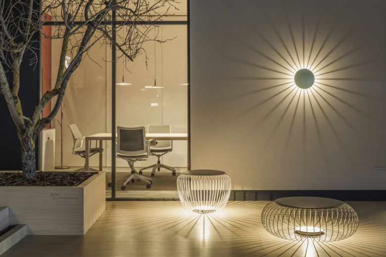
The design of the Vibia’s showroom inside its new headquarters in Gavà, Barcelona, features a series of ideas which we have evolved after several collaborations with the company.The aim was to create a place that, on the one hand, recalls its corporate image in the last trade fairs, and on the other hand, dialogues in a poetic and balanced way with different departments.
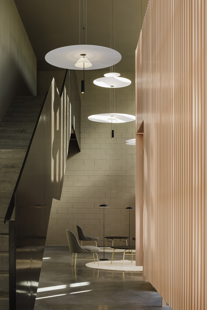
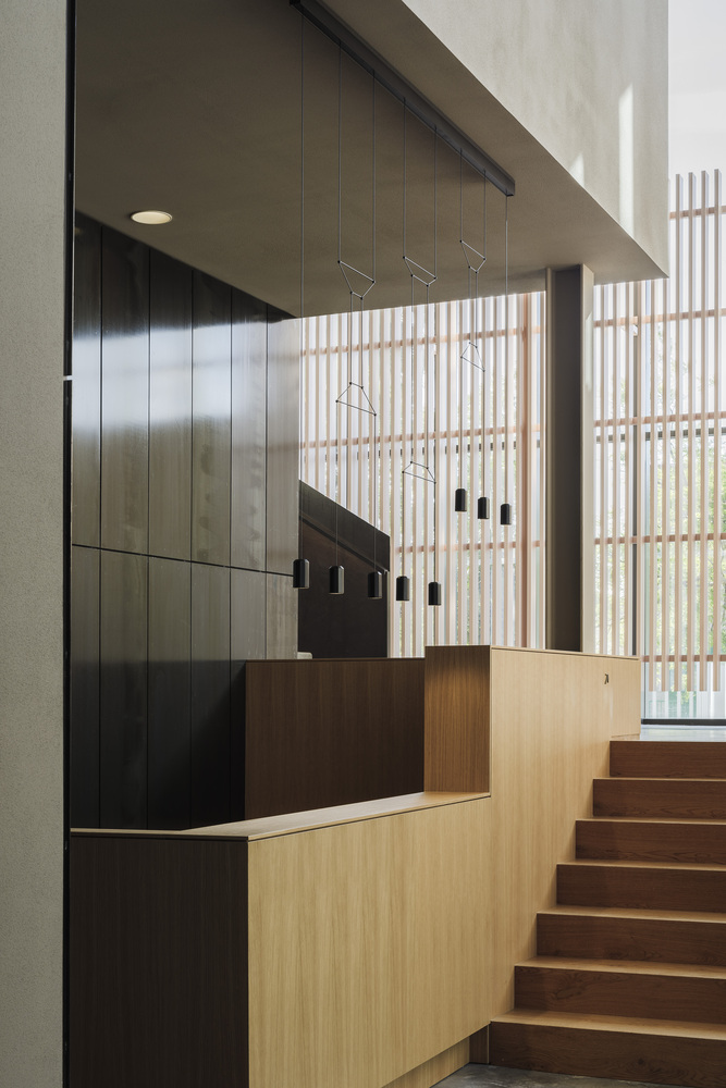
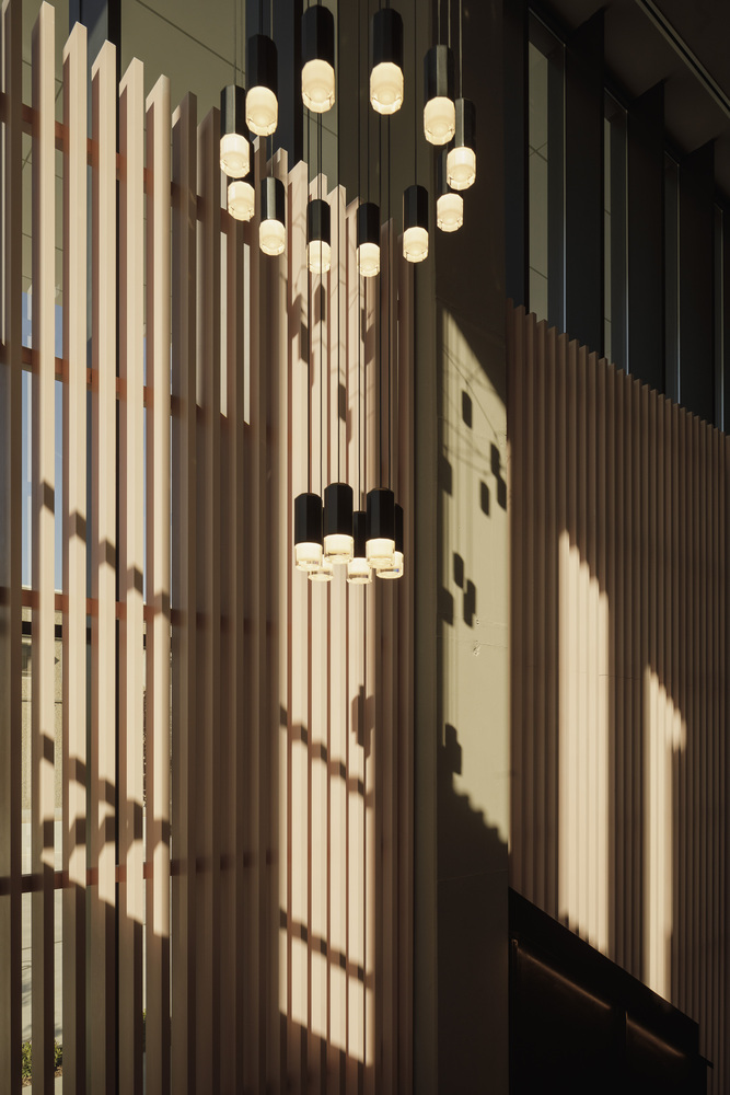
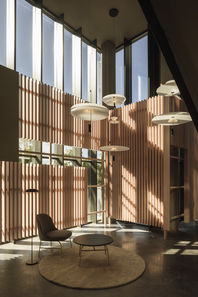
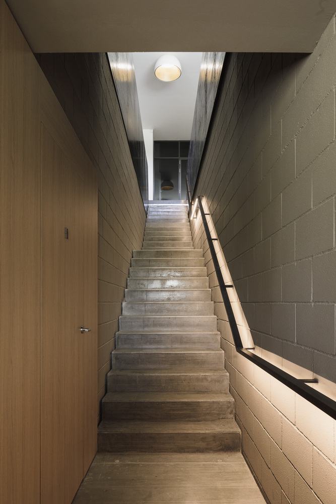
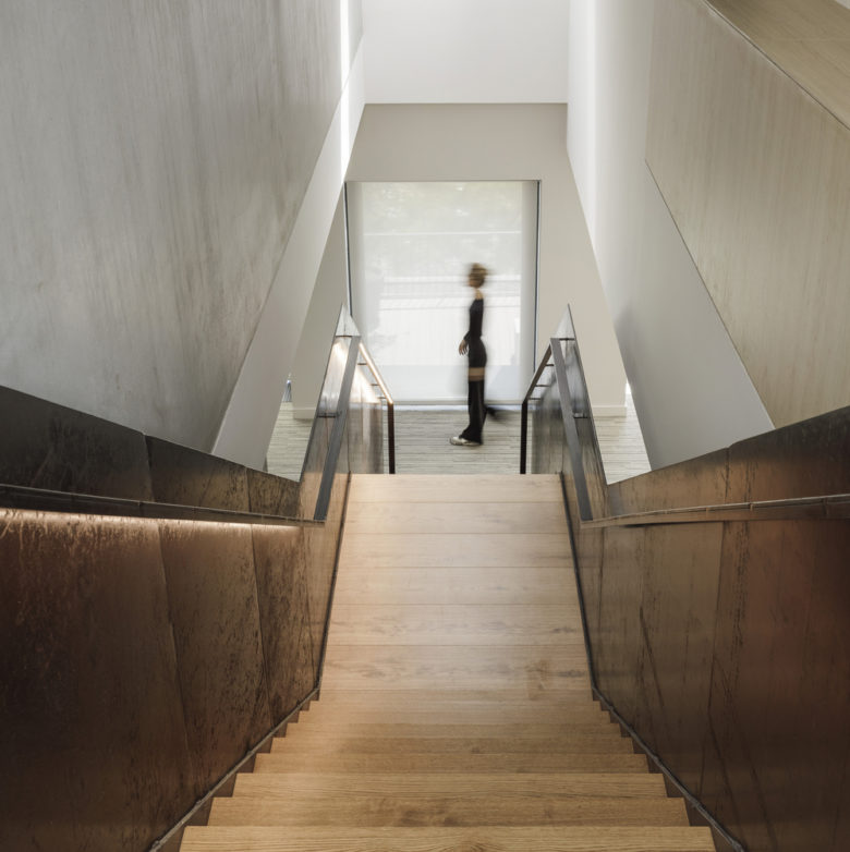
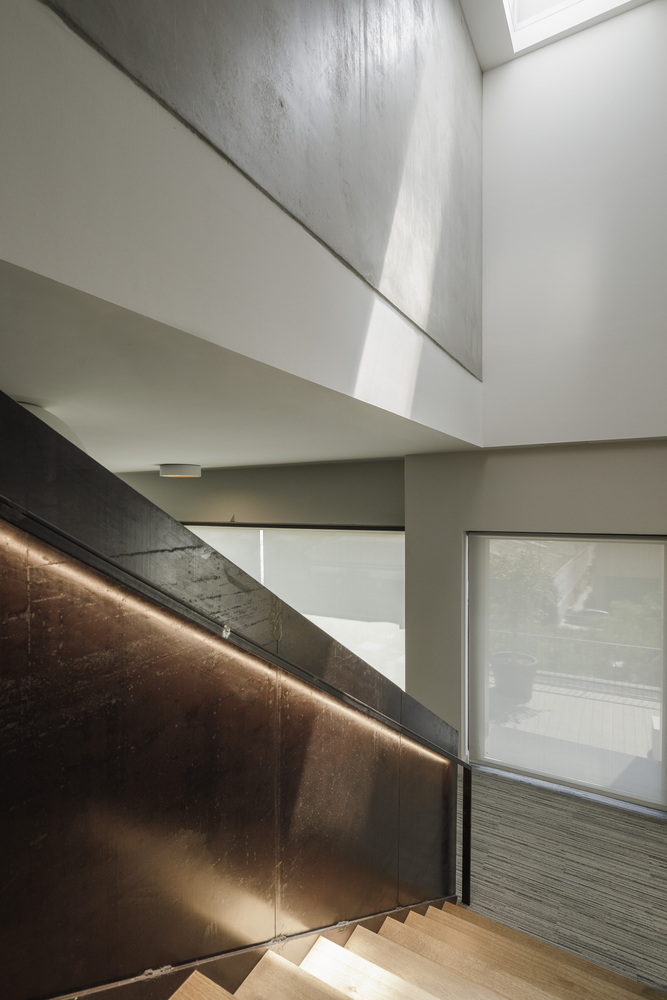
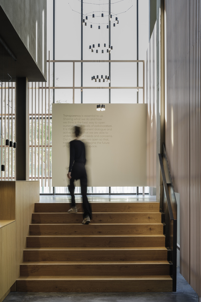
Through an aesthetic language of steel structure and oak wood, the main entrance enveloped in a pink-colored lattice leads to an open space that is used as a welcome area for visitors. Next to the reception, a handrail made in natural steel runs alongside the stair, enriched with LED-lighting to mark the pathway through the floors.
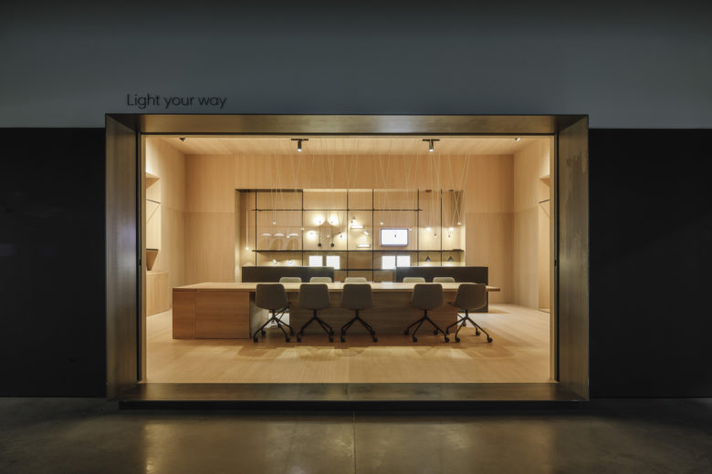
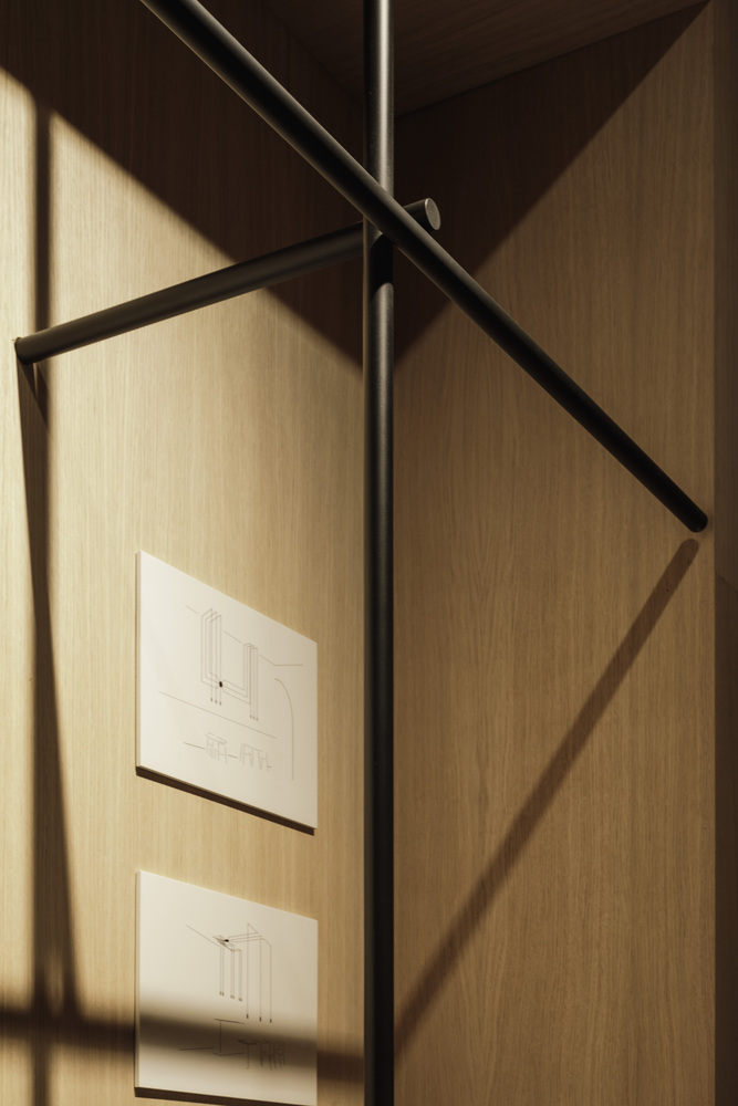
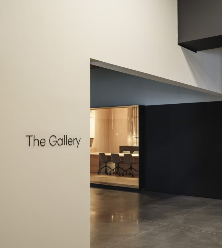
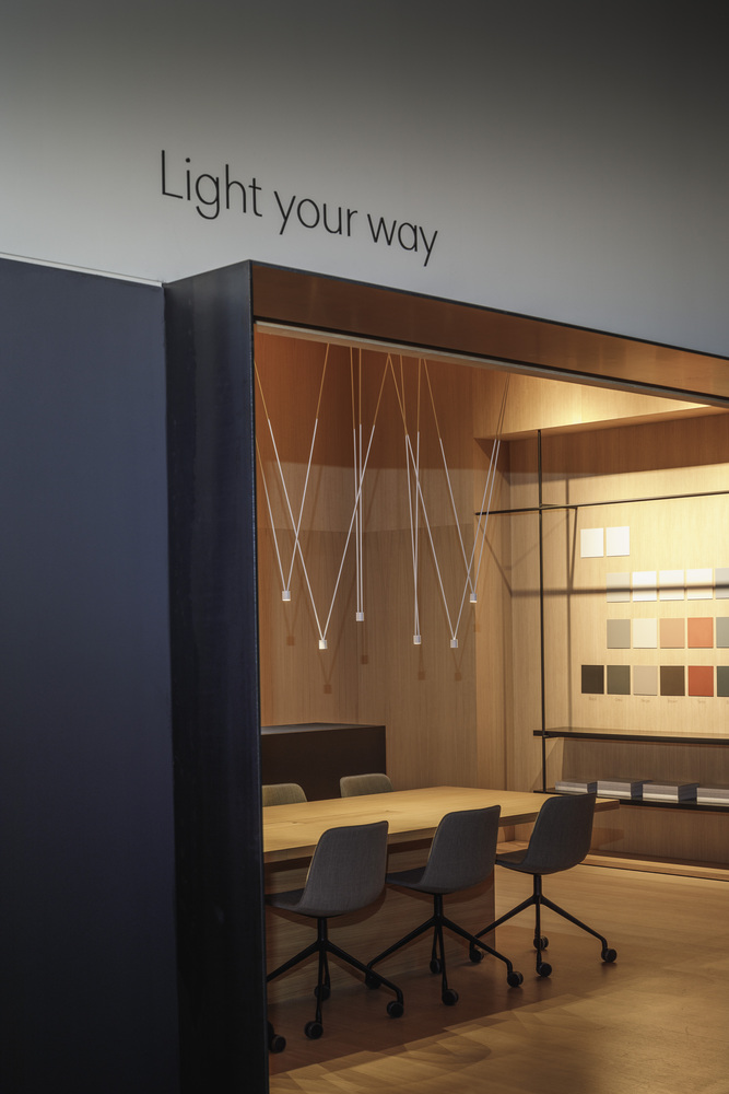
The showroom is set up from the volume “Light your way”, located in the heart of the space, where visitors can interact with the product through sectioned pieces, the brand’s color palette, etc. Its interior has been covered in oak wood evoking the warmth and intimacy of the brand’s light. Facing this is a stage for projections, where to organize performances, talks, and presentations of the new products. It is a sober and neutral multi-purpose area with a big circular bench for seating.
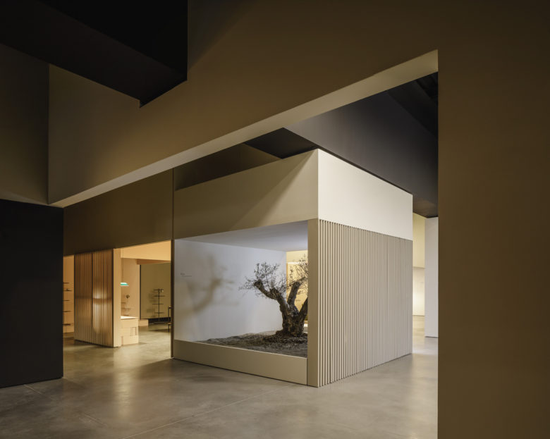
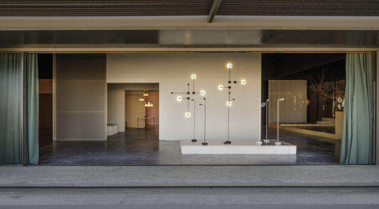
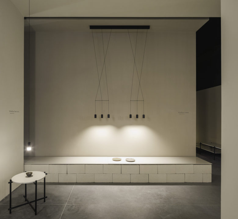
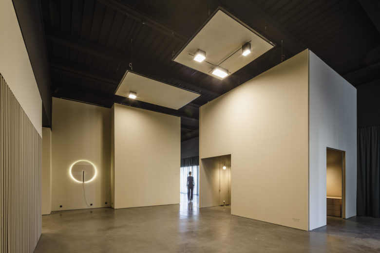
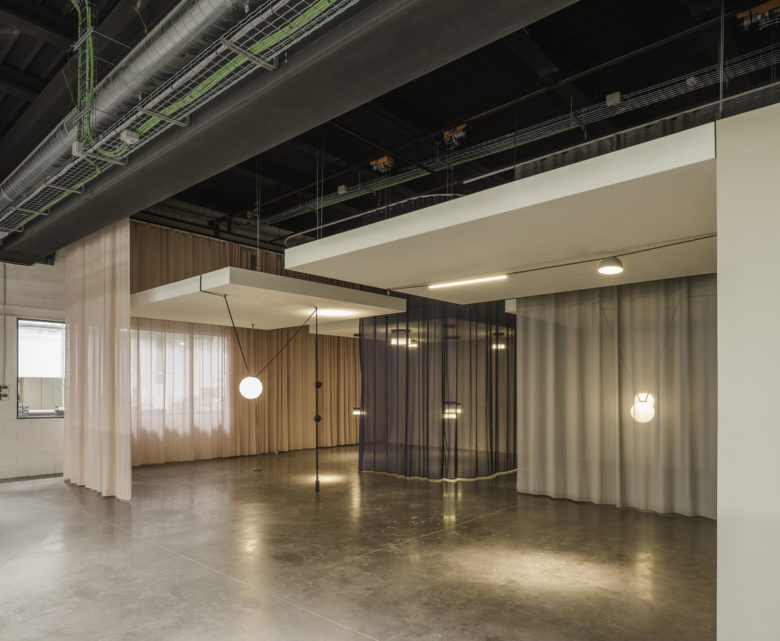
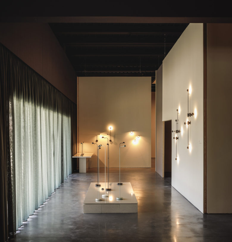
Taking as reference the most recent projects of stand that the studio has designed for the company at Salone del Mobile fair in Milan and Light+Building in Frankfurt, the collections have been distributed through “small architectures” in the form of semi-open volumes. For them, we used the same constructive methods as in the ephemeral projects such as the latticework, the walls made with translucent fabric, the curtains as decorative elements. In this way, lighting proposals have enough independence while environments with a great personality are created. The exhibition area is linked to the kitchen and dining room where to extend the sensorial experience of the visitors.
Without ever losing awareness that it is an industrial building, the roof inclinations have been softened by a longitudinal main beam. Around this element, metallic mesh panels are strategically distributed to order the ceiling and place the electrical installations and suspended luminaires easily.
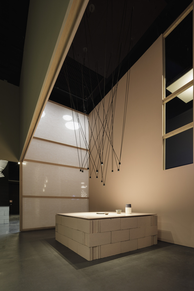
Distributed throughout the showroom, trees give a certain theatricality to the space and concrete blocks, painted in the same palette of colors that the collections, host a selection of ceramic pieces —by Gloria Carrillo from Pols Ceramic— inviting the visitors to adopt a slow perspective of the space.
Architects: Francesc Rifé Studio
Lead Architects: Francesc Rifé, Sònia Pellicer
Design team: Sergio Alfonso, Bruno Benedito, Carlos Fernández Saracibar, Patricia Guridi, Paola Noguera, Núria Pedrós, Stefanos Sideroglou, Jaume Abril, Mauro Federico Egea
Photographs: Fernando Alda
