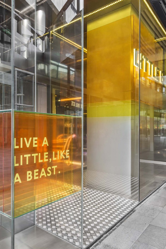
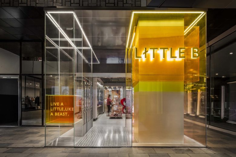
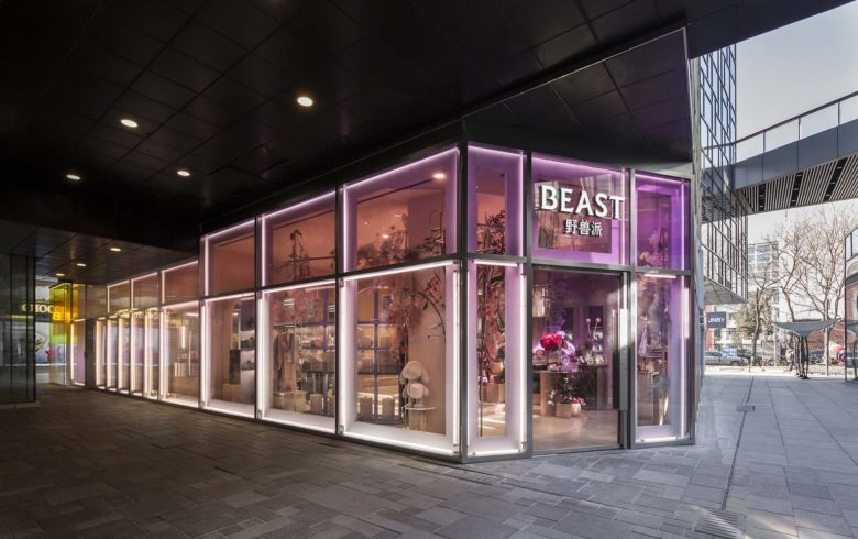
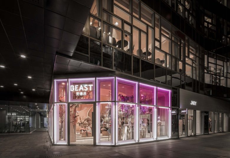
The facade of Beast & Little B Retail Store Taikoo Li Sanlitun Beijing is inspired by American Hard Edge artist Josef Albers. Extracting the expressions in his work, exploring the subtle relationship between color and styling. Through second layer structure, progressive expression of avant-garde attitude and different style between the two brands.
The facade on the first floor is overall soft and tough, starting from purple to pink and finally coming to LITTLE-B’s ginger yellow. The progressive color relationship between the two sister stores also distinguishes between two sister brands, making the entire facade uniform and hierarchical.
With the light, the entire facade is like a luminous box floating in the air, which becomes the visual focus of the whole street. The layered yellow glass reinterprets the hard-edged art from the perspective of space.
Floor 1 – Recreation
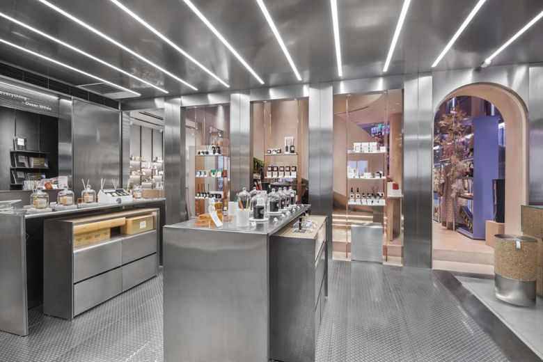
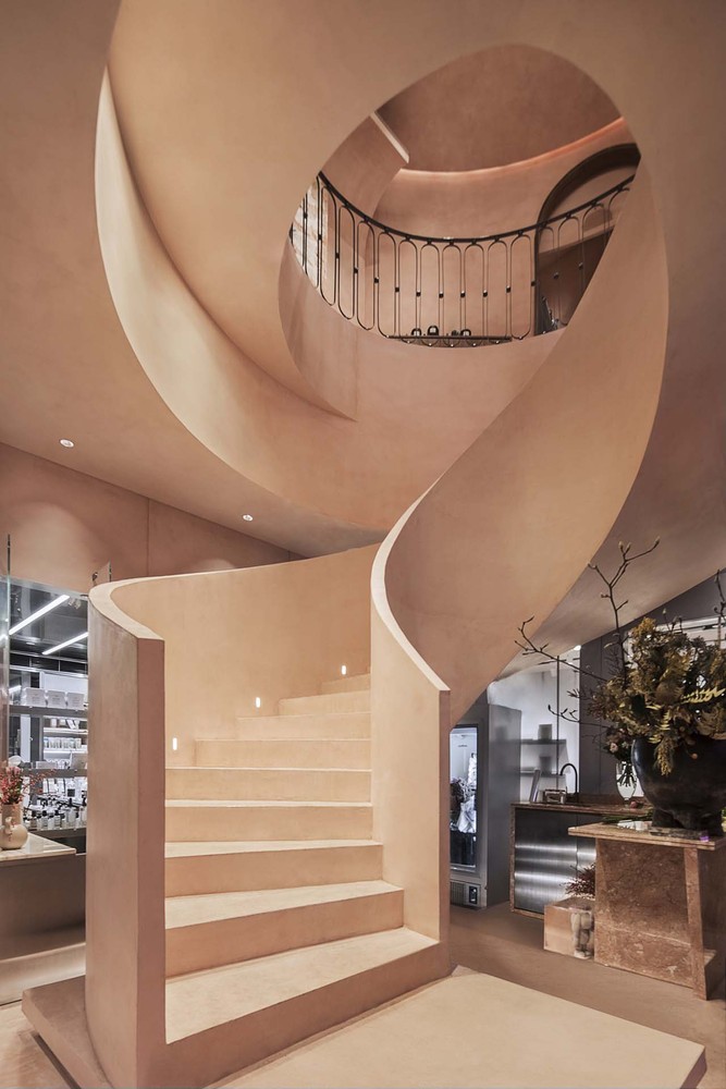
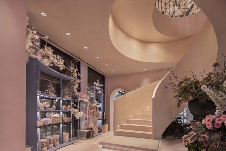
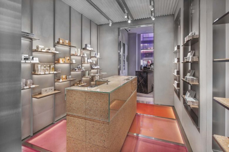
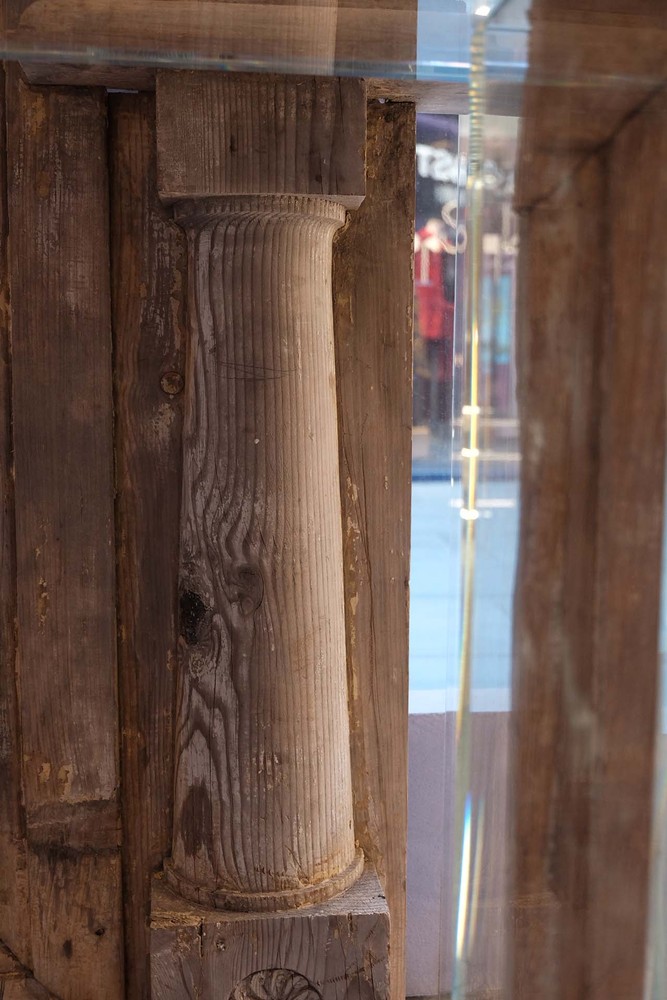
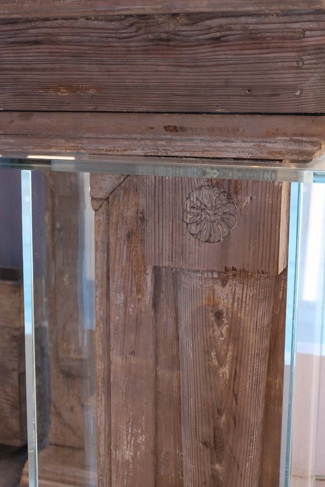
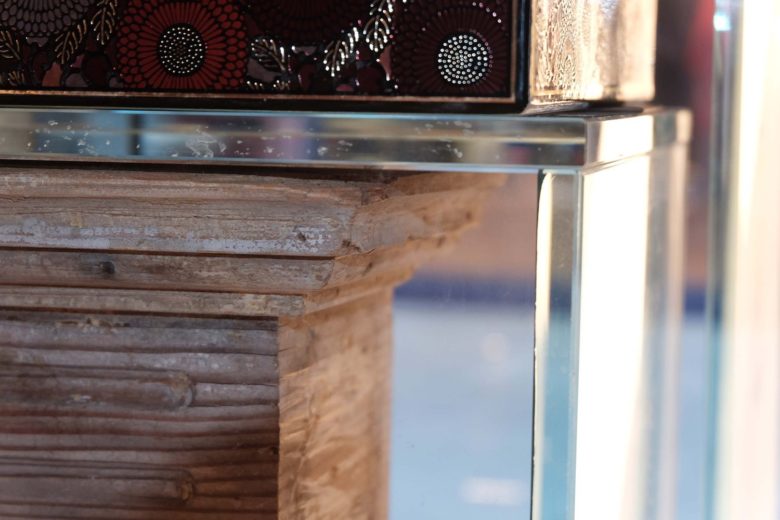
The first floor inherits the avant-garde language of the facade, the jewellery area uses a bold pink-purple collision; the contrast of different materials is used in the details to collide, crushing stone and metal; the old wood fireplace and glass tube with historical memory Combine re-creation. With a pink spiral staircase and floral jewels at the corner, create a fairyland. The adjacent LITTLE B inherits the metal genes that have been used all the time. We added colored cork to the neutral space on the basis of the original, and added some playful warm colors. In the overall spatial planning, the partition wall between the two was opened, shortening the distance between the sister brands, and allowing people to walk freely through two identical modern genes but different styles of space.
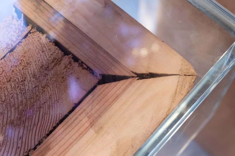
Re-creation is a bold experience in this design, bringing the recycled old wood fireplace to the factory for random cutting, blocking the “memory” in a transparent glass box, and matching the tube to form a clear contrast between new and old.
Floor 2 – New definition
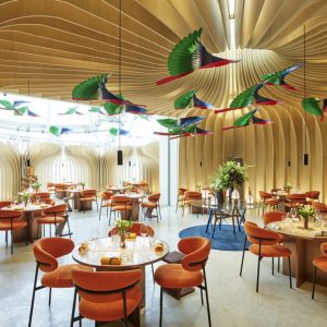
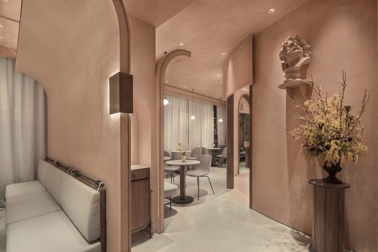
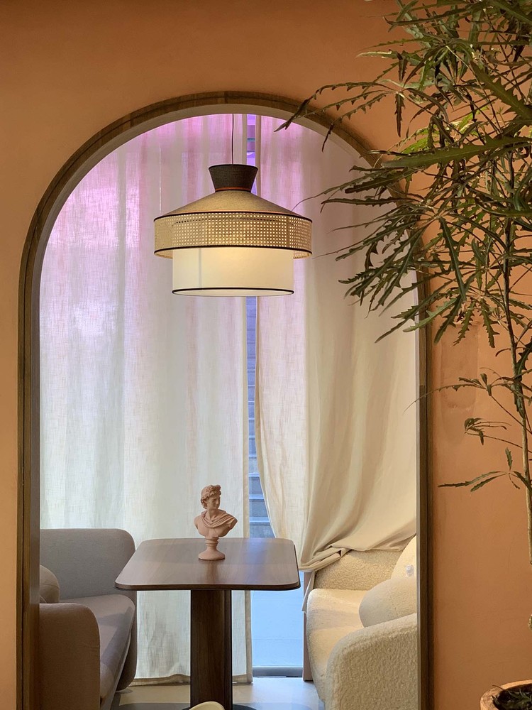
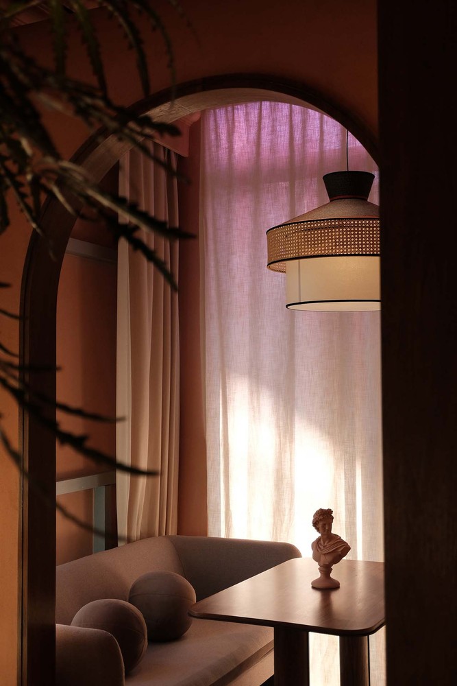
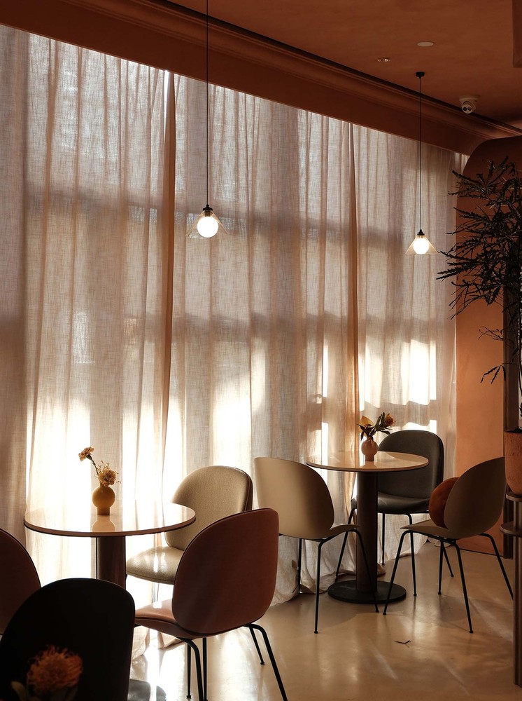
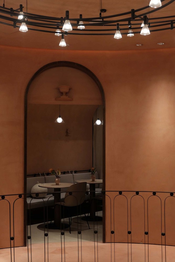
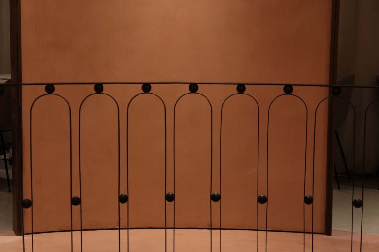
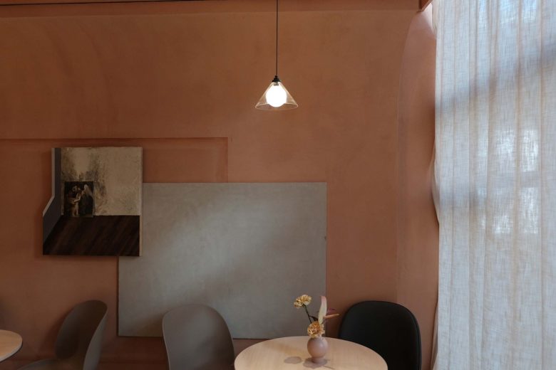
The coffee area on the second floor retains the genes of the past, elegant, classical, calm, and incorporates some surreal elements. In the spatial planning, the layers are re-defined and a new style, which is in sharp contrast with the first floor. The process of going up along the super-swirl stairs seems to walk in the shuttle channel of the parallel space, into another new space, just like the movie “Midnight in Paris”, let us “mistaken” in the last golden age, the film texture The texture and color of the color, we hope to feel the light here, feel the “sentimental feeling”, carry out a “past” afternoon tea.



Add to collection
