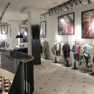
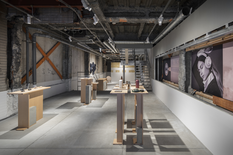
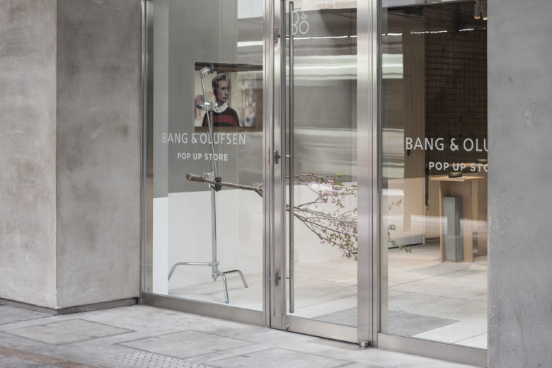
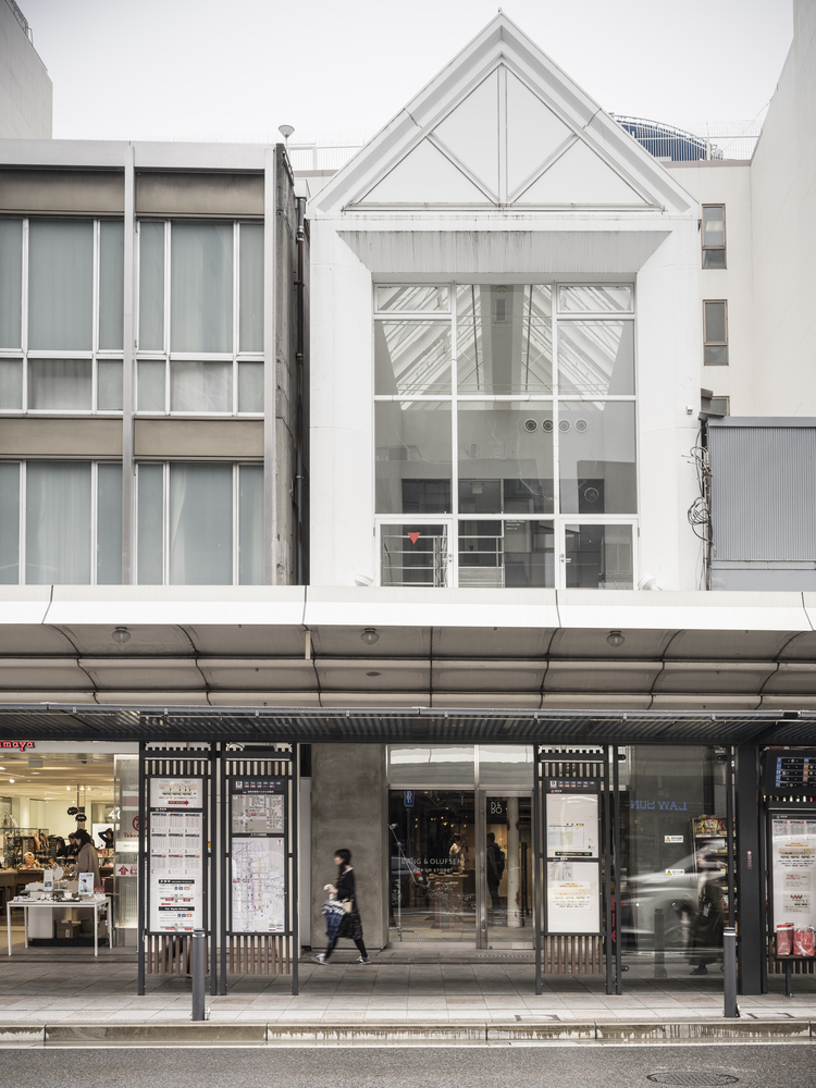
Over the course of three months, this project transformed two floors of a former clothing store in Kyoto into a retail environment for the Danish audio equipment company Bang and Olufsen. The pop-up store filled a temporal gap between the departure of the clothing brand and the building’s demolition, effectively giving a new lease on life to the edifice.
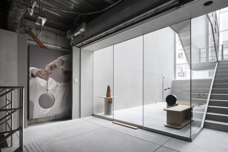
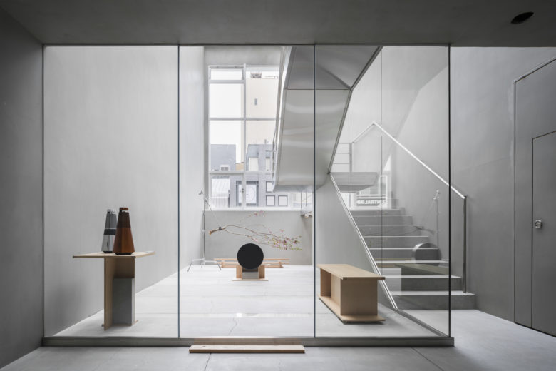
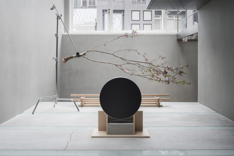
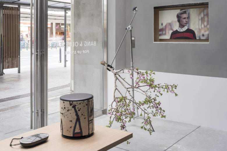
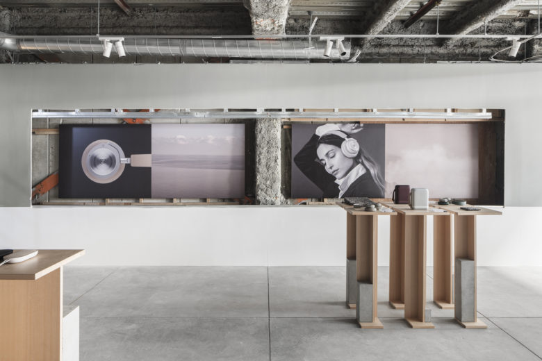
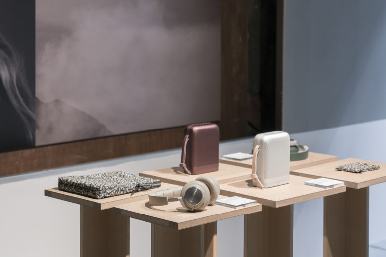
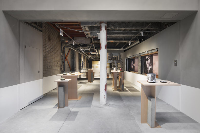
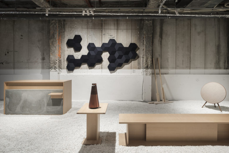
The display tables were designed by Yusuke Seki specially for this space. The concrete blocks weighing them down were not placed there, but rather cast on site. For each, four pieces of wood were first assembled into a mold, then filled with concrete. Upon the concrete hardening, two sides of the mold were removed, leaving the remaining pieces to serve as table legs. The design was an occasion to grapple with an issue that had long been on the designer’s mind: how might one imagine a new use for the wood used in creating concrete, which is otherwise thrown away? To utilize the mold as both constructive element and furniture component was one way to get around this problem.
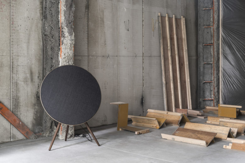
The wood used for this purpose was tsuga, a relatively expensive material that is often seen in Japanese shrine architecture, thus underlining the new value given to this byproduct. Moreover, the removed mold elements, rather than being thrown out, were subsequently displayed in the store as a narrative trace of the construction process.
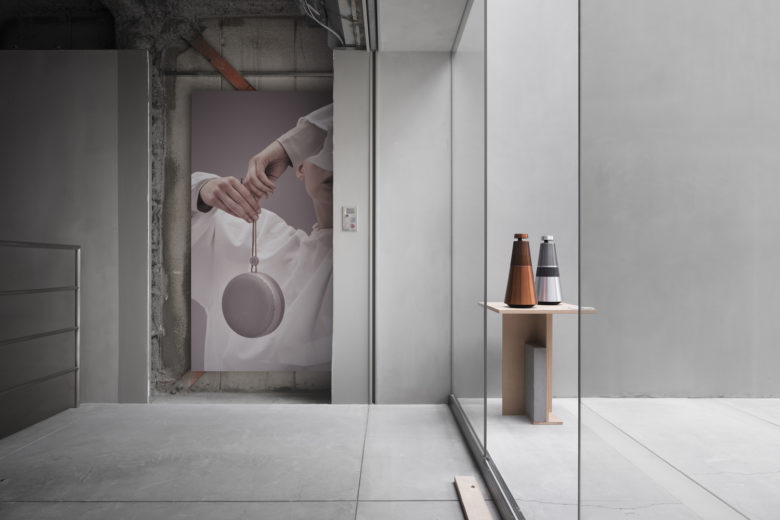
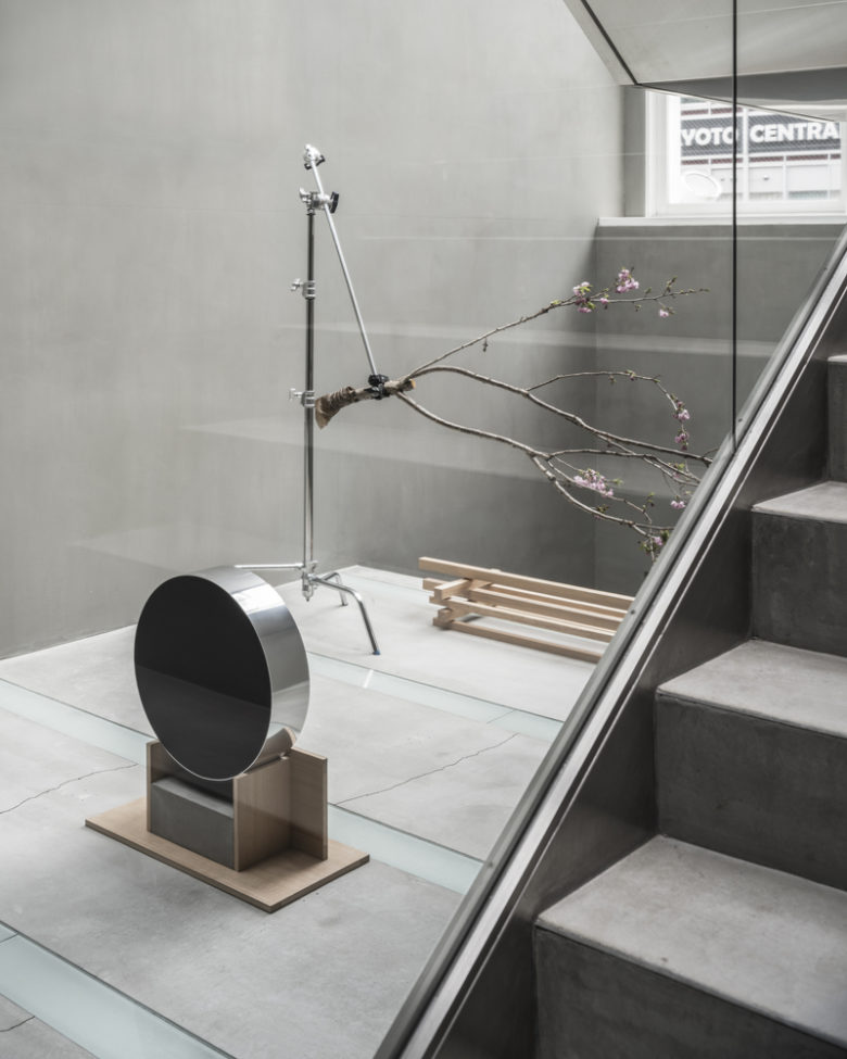
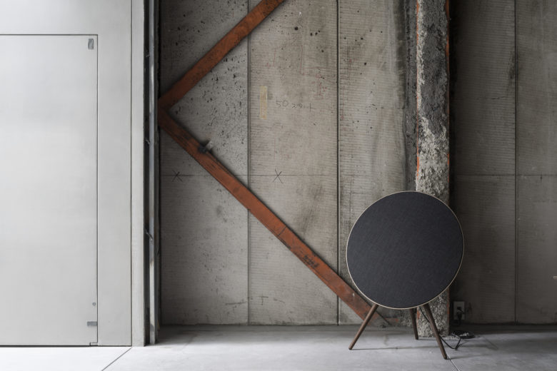
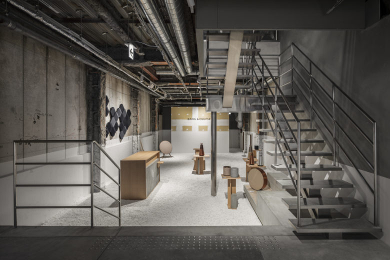
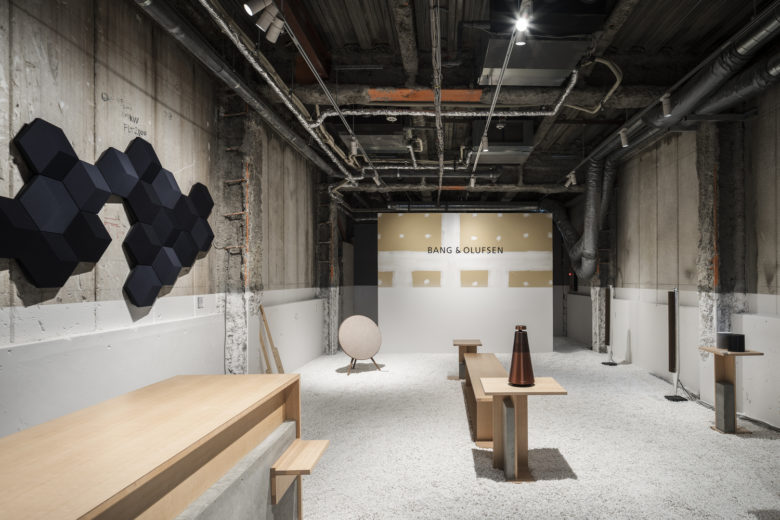
A concern with recycling materials and minimizing waste also informs the design of the space. Conscious of the store’s temporary nature, Yusuke Seki has strived to reuse as much of the original substance as possible and to achieve maximum effect with minimal means. The walls and ceiling have been left in a state of mid-demolition, with photographs installed in the cavities left by where shelves once were. In the back part of the first floor, the addition of white gravel, a reference to a common practice seen in Jinja shrines around Kyoto, transforms this part of the space into a sort of sacred compound – mirroring how the experience of listening to music can at once be a spiritual one.
A single application of white paint on the wall on the first floor serves to unify the two disparate halves of the first floor with a simple gesture. On the second floor, the removal of a single pane of glass has similarly transformed a formerly inaccessible atrium into another space for reflection.
Designed by Yusuke Seki
Lead architect: Yusuke Seki
Photography by Tomooki Kengaku
Add to collection
