Add to collection
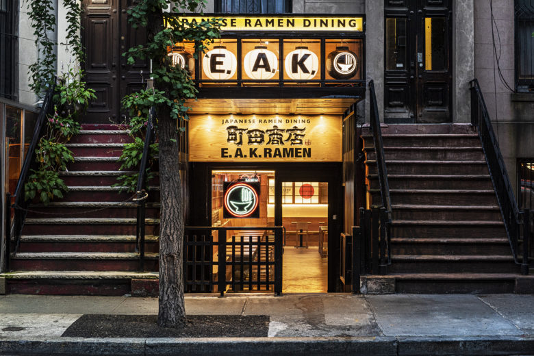
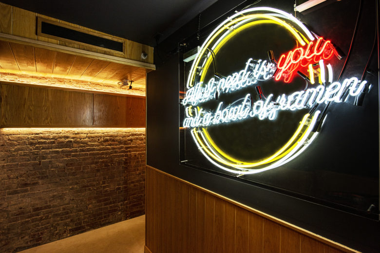
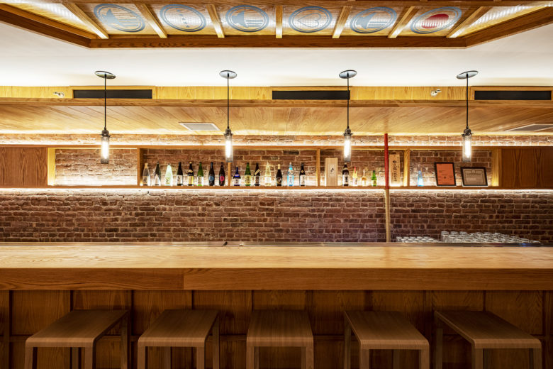
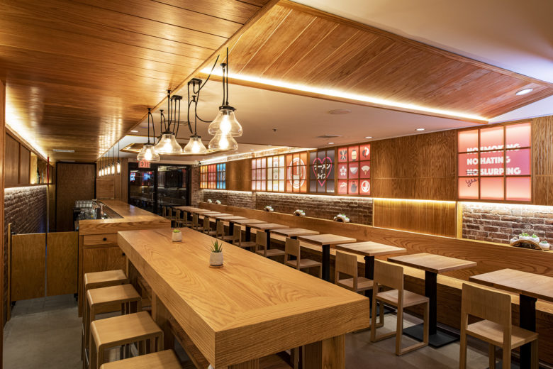
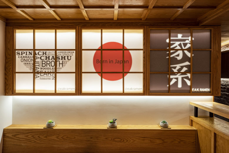
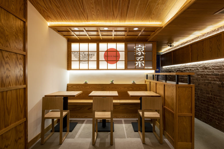
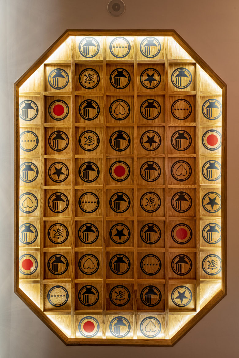
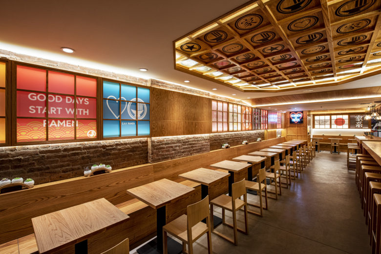
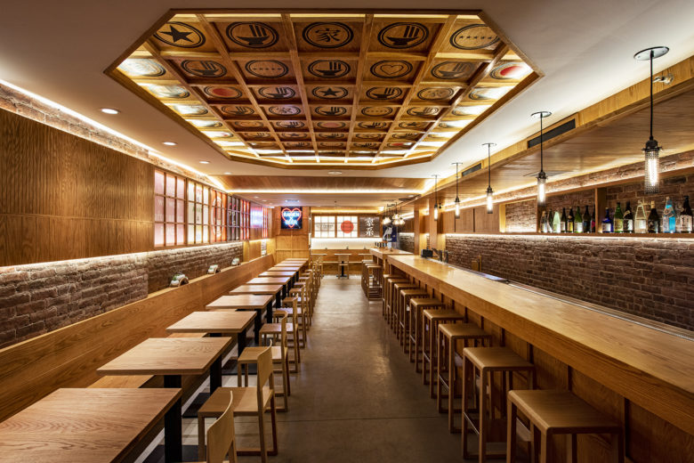
The usage of Japanese lanterns and wooden grids creates the
Japanese feel, and the cute logos and neon lights are inherited from the already existing stores to
create a sense of unity and continuity from the other two locations, which are already popular and
successful. The new design adds Japanese validity and cheerfulness to the brand, and hopefully is
more welcoming to the more diverse neighborhood in New York City.
Designed by Makoto Ishii

Add to collection