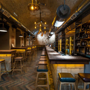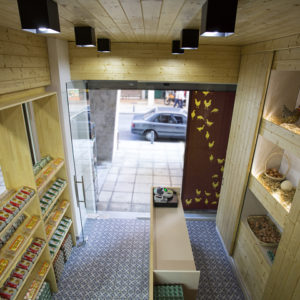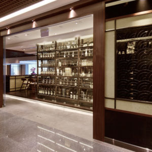
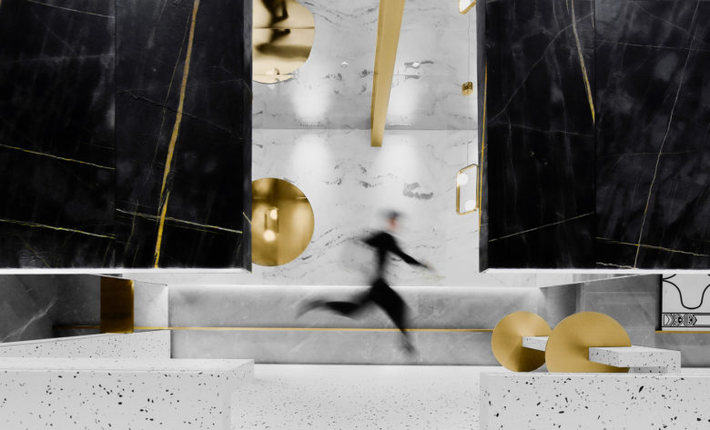
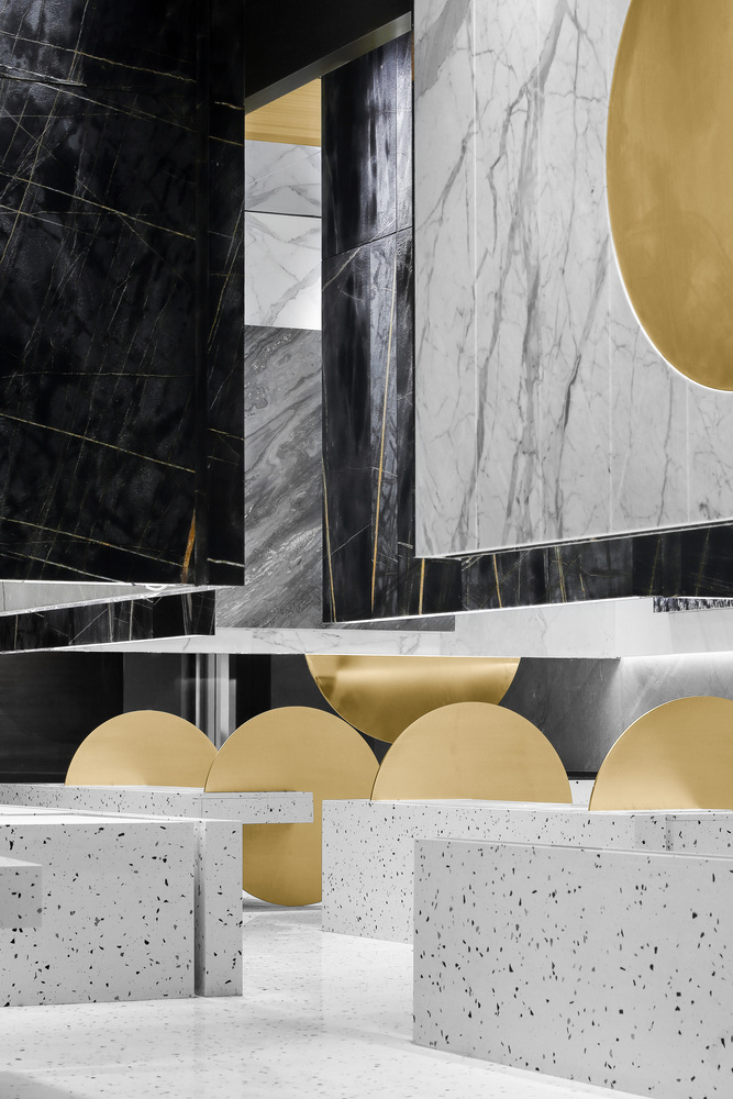
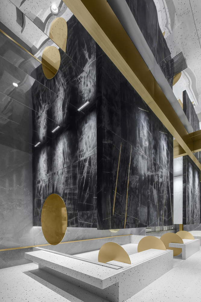
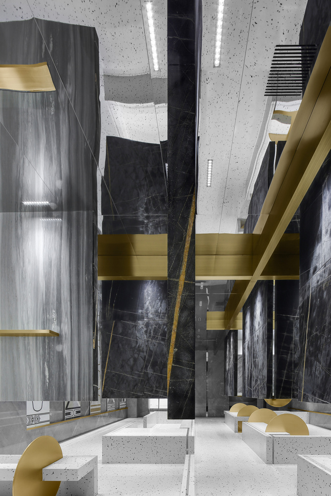
In this design, we aim to use visual inertia to “get rid of” gravity, and break through the shackles of the earth’s gravity to make the marble, which was originally heavy under people’s inertial thinking, suspend in space.
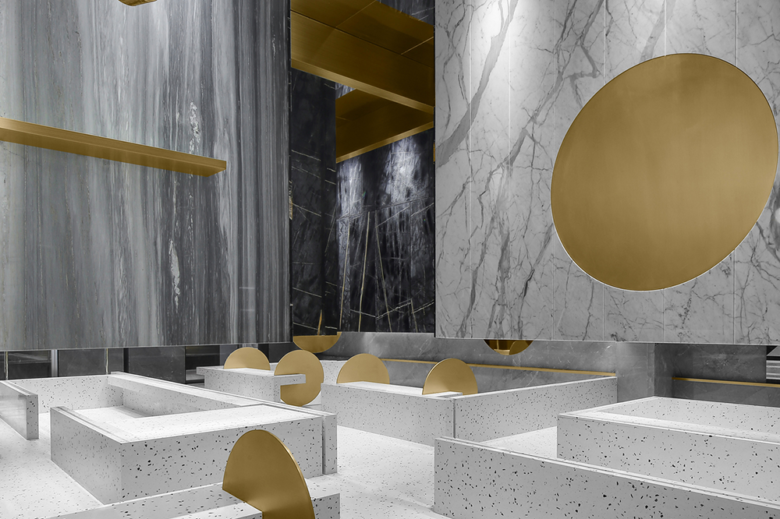
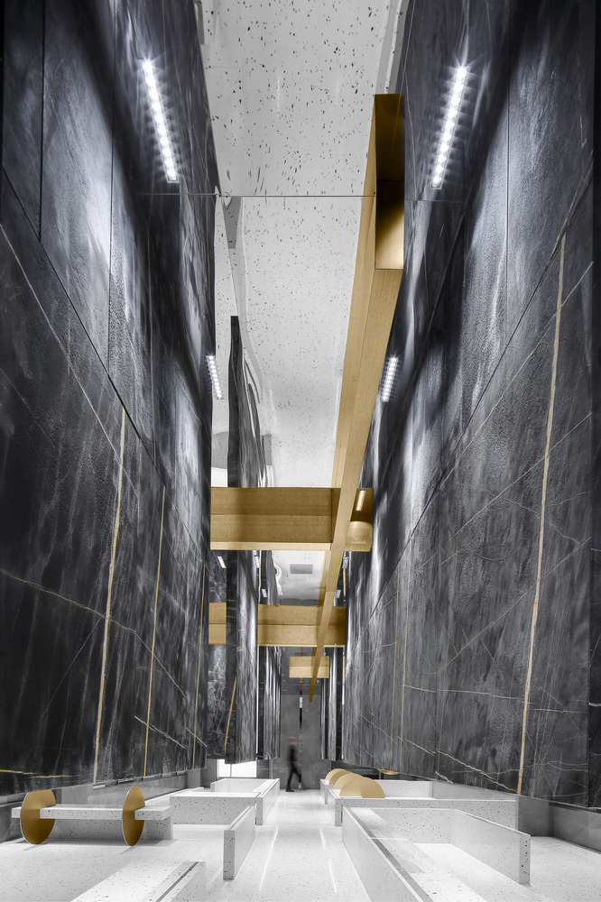
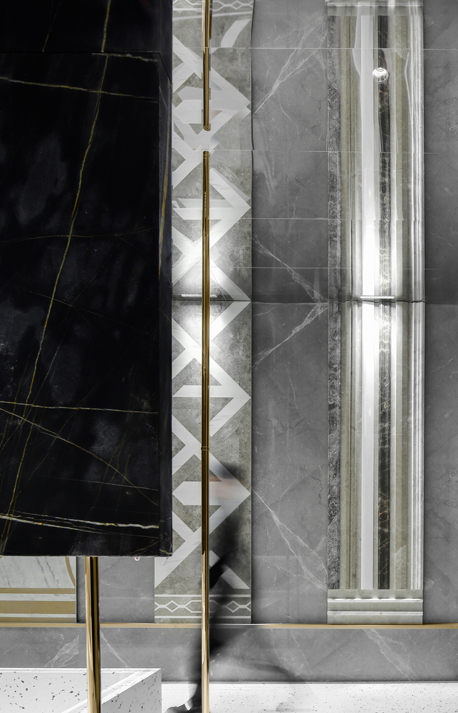
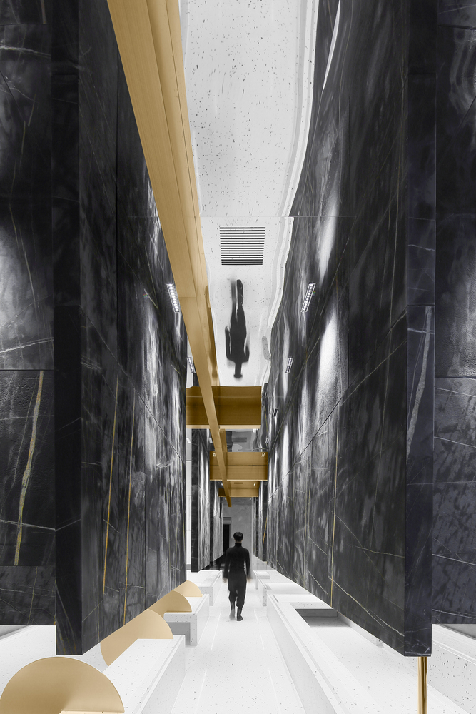
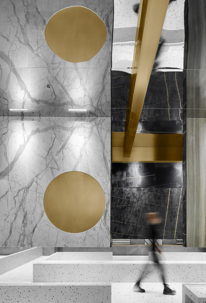
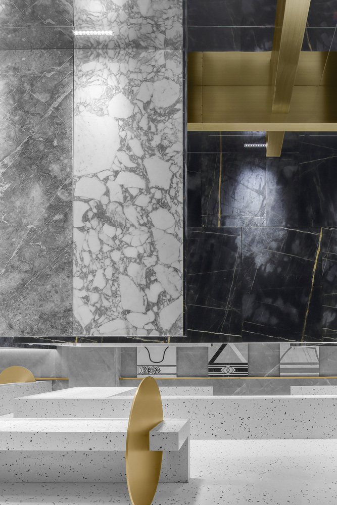
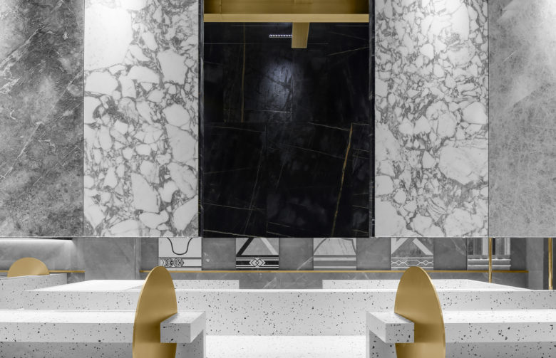
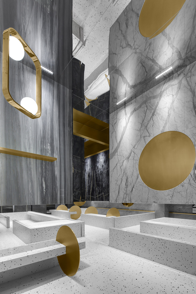
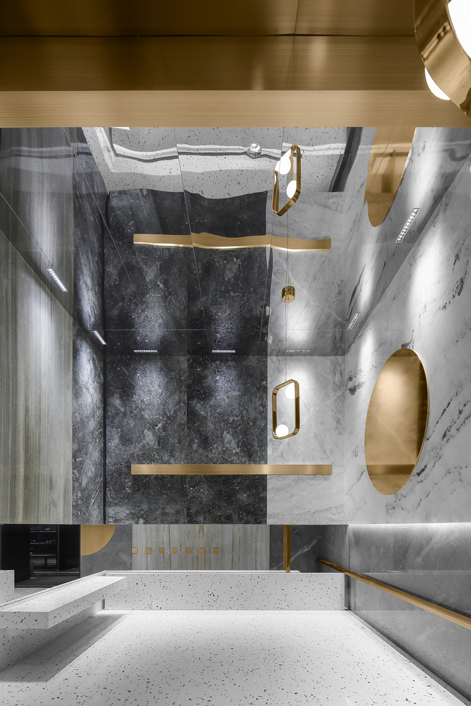
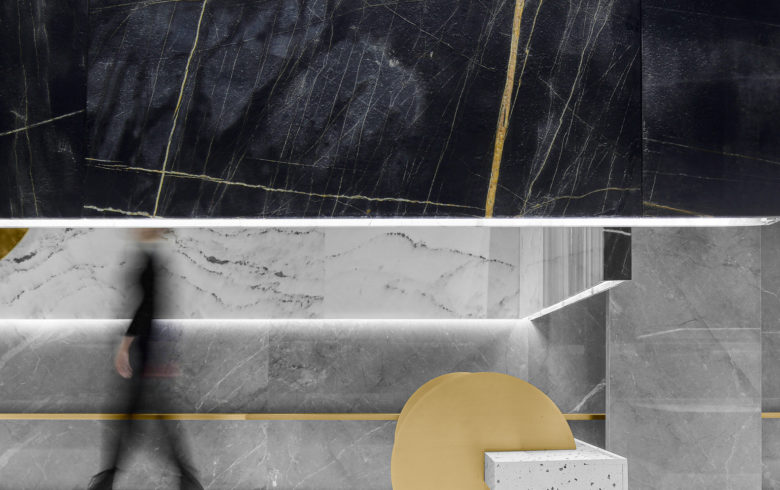
We choose black stone as the skin color of the corridor facade in the central area of the marble exhibition hall. Black will increase the weight and mystery of the object. Black stone is used to wrap the surface of the box structure, while gray stone is used for the surrounding walls and the ground, which will further enhance the contrast and visual sense of gravity suspension.
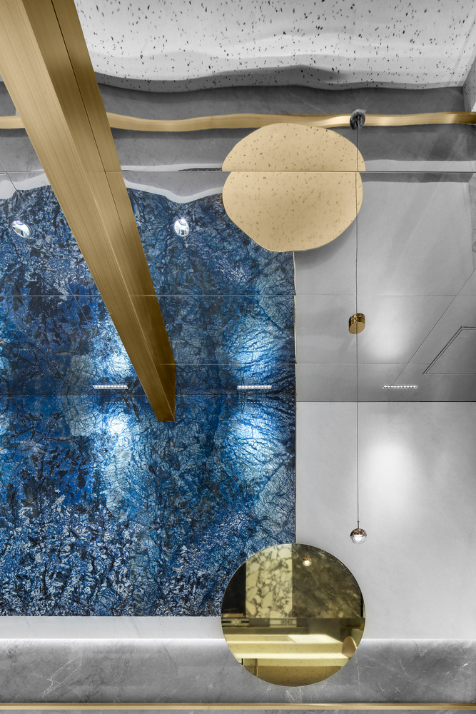
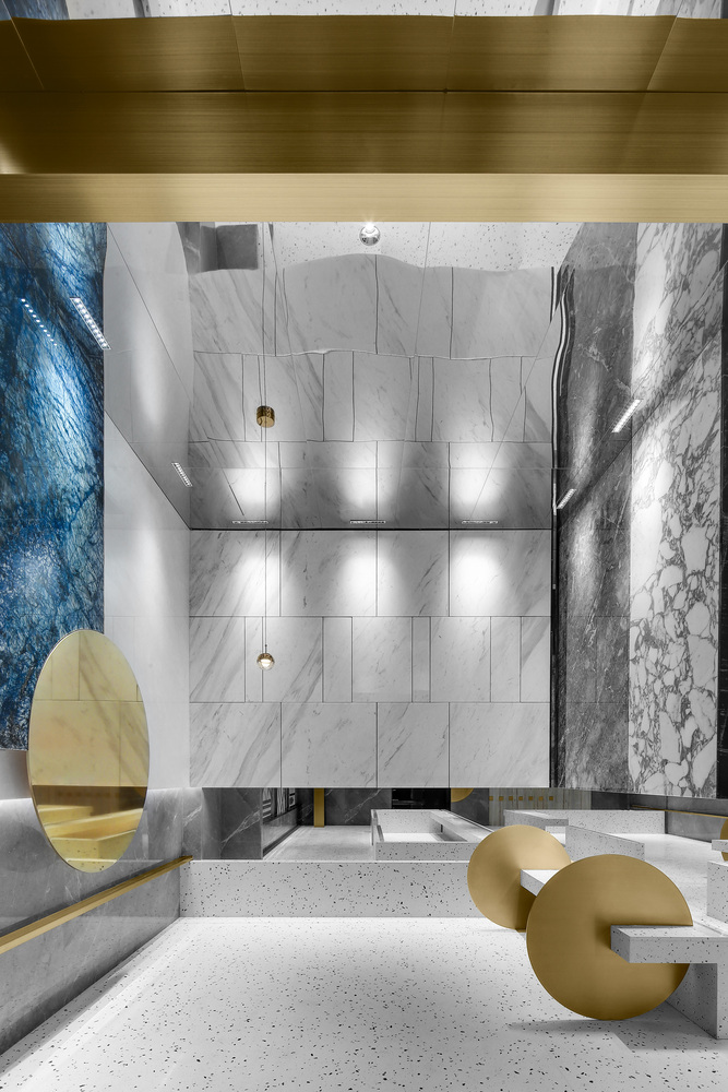
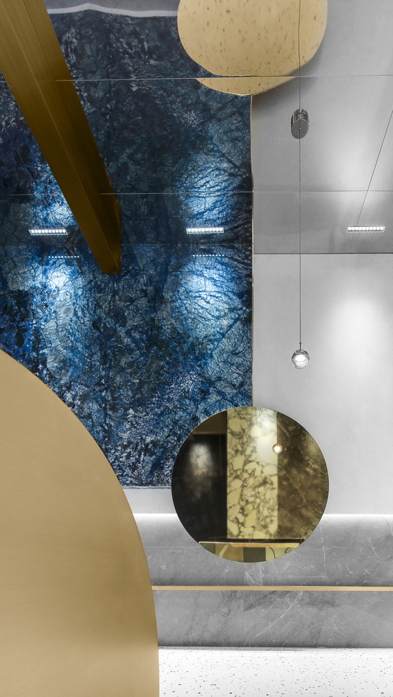
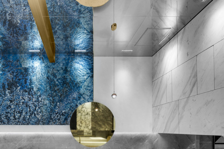
By using the mirror image principle of top mirror stainless steel, the whole space is raised, and at the same time, the wrong visual effect of no top connection and no ground connection on the center black box body is created. As if standing solid stone floating in the air, it seems that everything has lost its weight.
We have been thinking about the commercial value attribute of design. Design should bring commercial value to the owners and show their thinking about space, products and human relationship. In order to increase the display area of marble as much as possible, and increase more sample categories, we will expand the original space of only more than 100 flat to more than 800 flat marble display area through segmentation and arrangement. No matter from the perspective of visual perception, or consciousness and space perception, they all bring different experience perception as much as possible. At the same time, they can realize the mission of exhibition hall, display and sales in the most elegant and comfortable way. Because of the suspension, the middle and lower floors are not covered. The stone space that should be closed is transparent, and the breathing is more free.
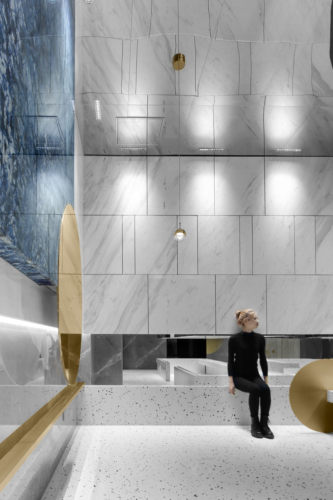
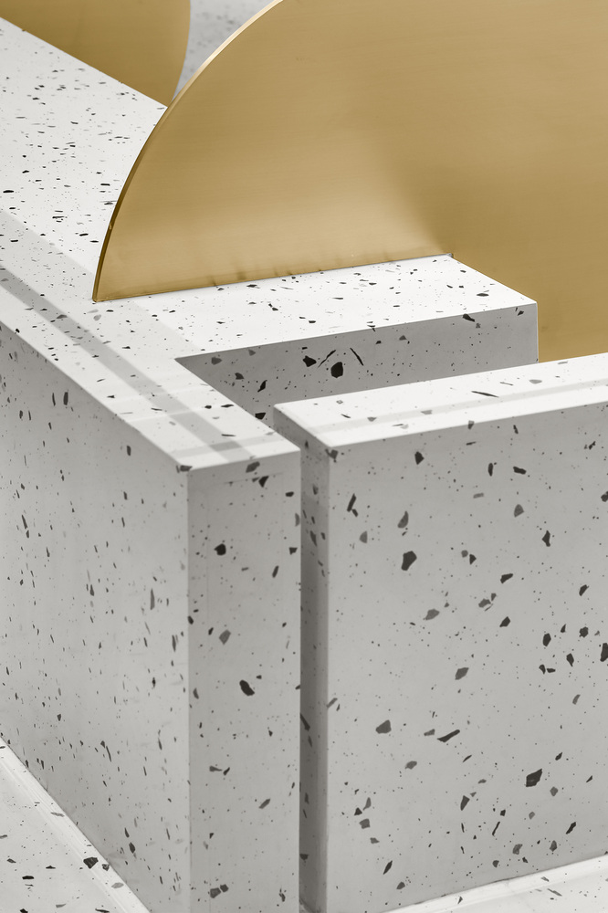
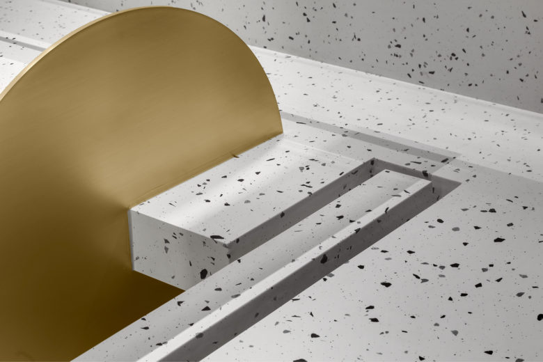
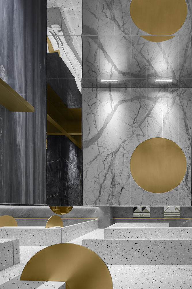
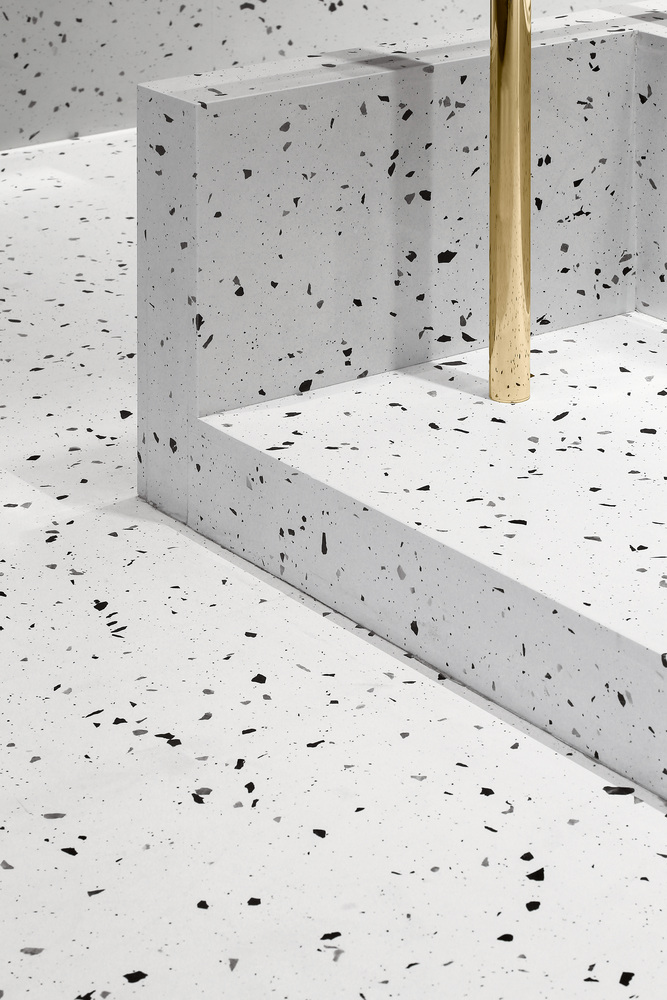
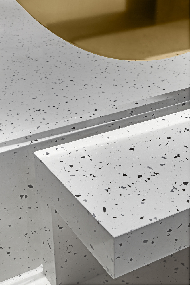
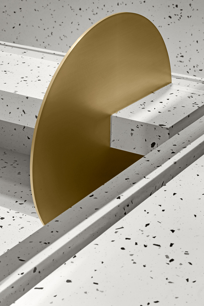
The use of white terrazzo and metal materials enriches the exhibition and sales categories of the exhibition hall. At the same time, it will further display the excellent detail technology. The whole white terrazzo floor is highly integrated with the platform. Complete as a whole, it forms a strong perceptual contrast with the suspended marble.
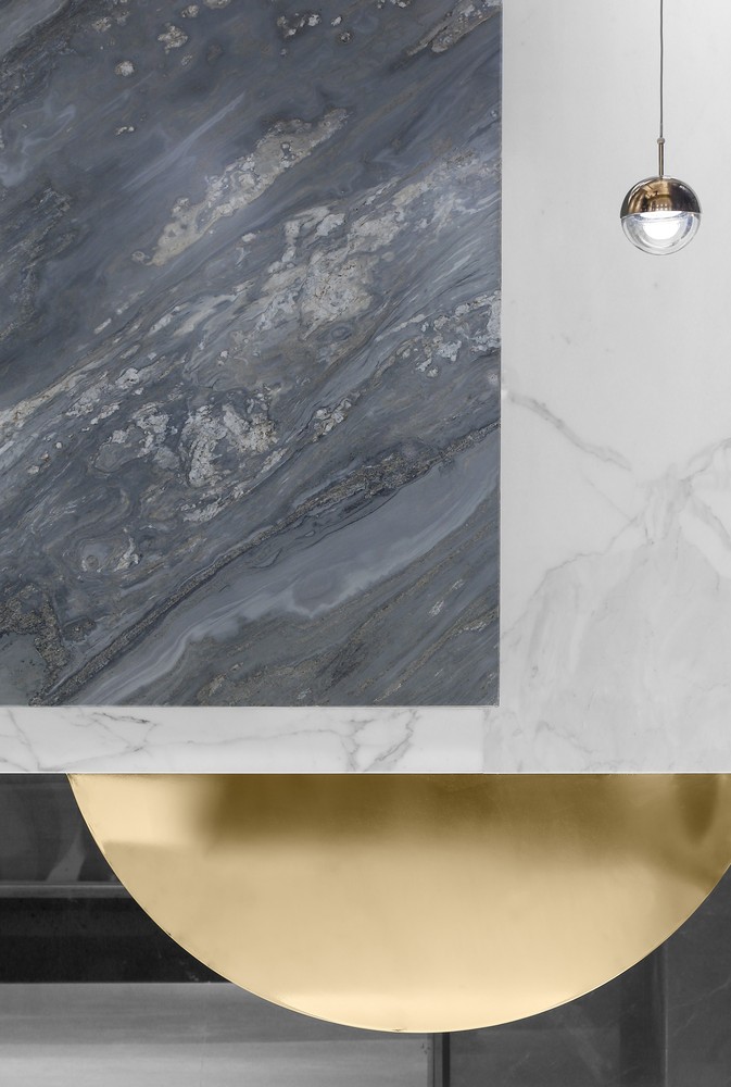
The variety of marble is rich. If you want to show as many kinds of stone, marble lines and mosaic series as possible in the exhibition hall. We need to keep the whole space visual center simple, and display different categories and colors of stone in four enclosed spaces according to the style. By using the method of plane composition, the relationship between stone materials can be formed into different combinations and arrangements, and the core goal of simultaneous display of many kinds of products is formed.
Architects: Inch Condensation Design
Photographs: Huaihua Wang
Main Case Design: Zhichao Xu
Design Team: Qing Yan
Add to collection
