
Add to collection

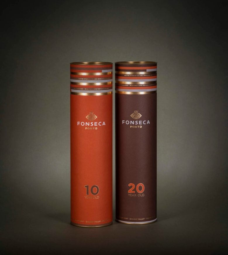
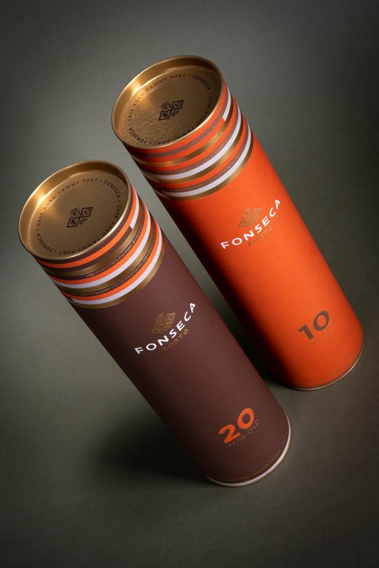
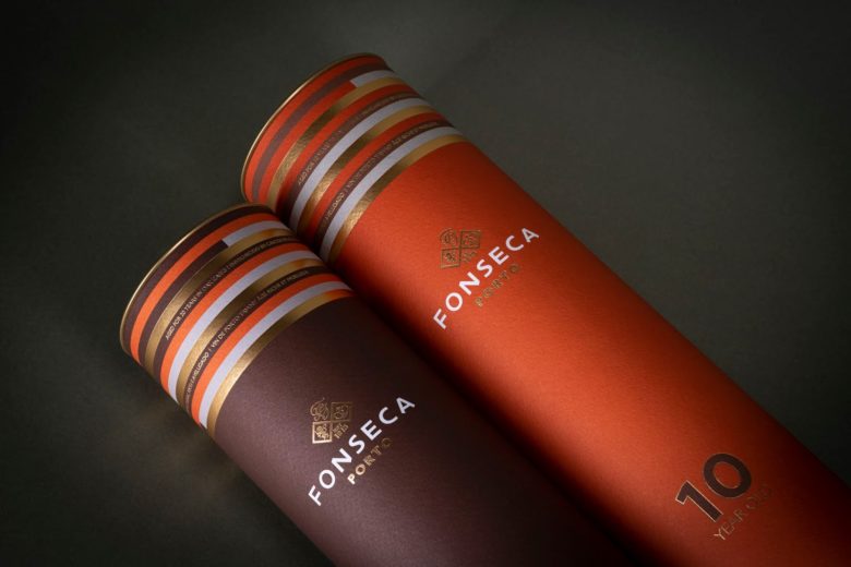
Packaging project for Fonseca Port, 10 and 20 years old. The goal was to get an attractive price packaging, while still appealing, attracting a younger audience. The inspiration was based on the colors of the wine itself and wooden casks where it ages. Through a simple and dynamic approach we seek a good balance that enhances the simplicity of the packaging, a tube, punctuated with details in the gold foil stamping.
What’s Unique?
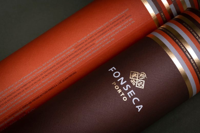
There are some points that turns this ordinary tube in a very special one, small details make the difference.
At first glance, we are called to attention by the vibrant color, the modern look and playful lines on top. When you look closely you can see the characteristics of the wine written on the lines, alternately and with foil stamping. We also have more text on a vertical orientation, following the height of the tube, which once more shows how dynamic a tube composition can be.
Designed by Pendão&Prior
Add to collection