Add to collection
Rapscallion started punting handmade soft drinks down an alleyway in Glasgow back in 2016. Their goal was simple: make the best tasting drinks possible without using artificial ingredients. Fast forward to 2020 and Rapscallion are growing, moving into a 1500 sqft railway arch in the Gorbals, more reminiscent of a scientific lab than a brewery.
Consumer tastes have also changed. They’re now actively seeking out low-sugar, well-crafted alternatives to mass-produced sugar-laden brands. The time was right to redefine the Rapscallion brand.
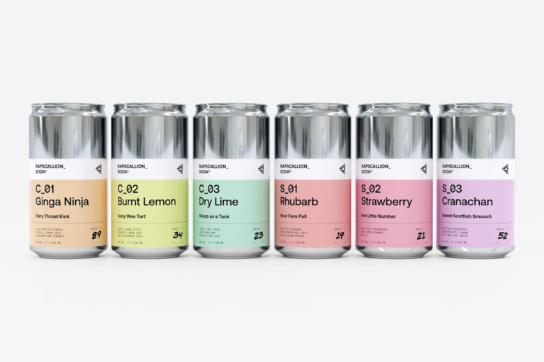
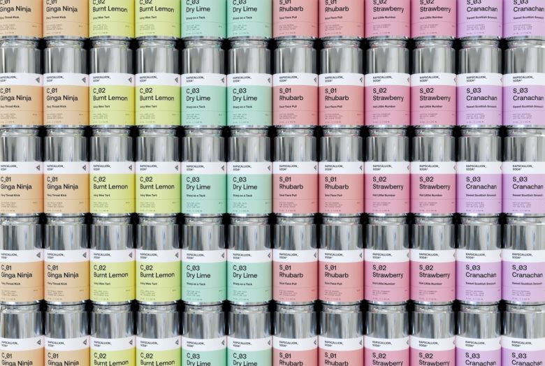
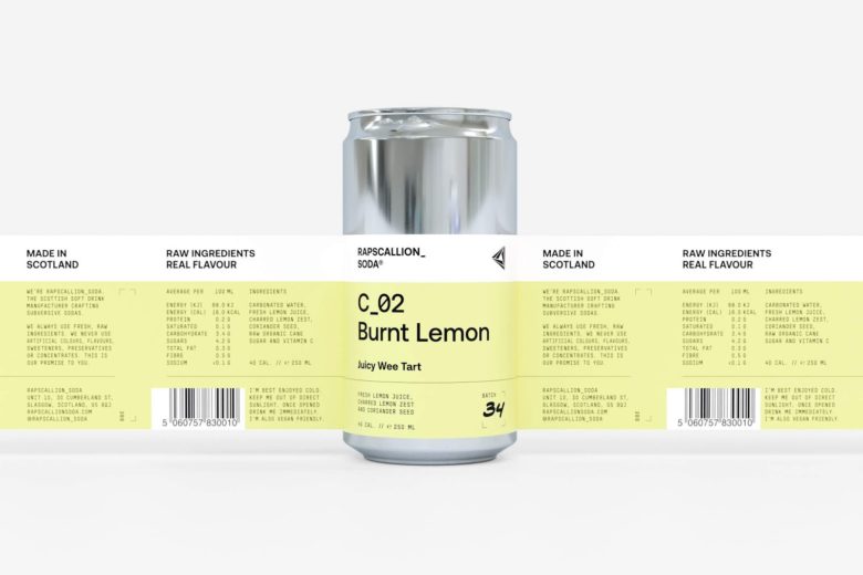
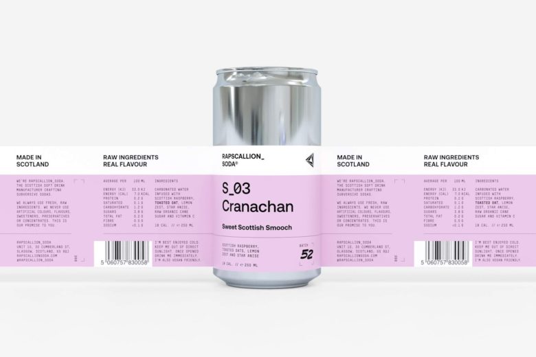
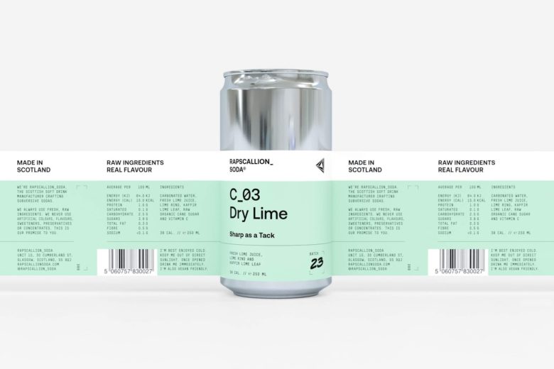
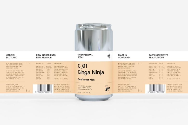
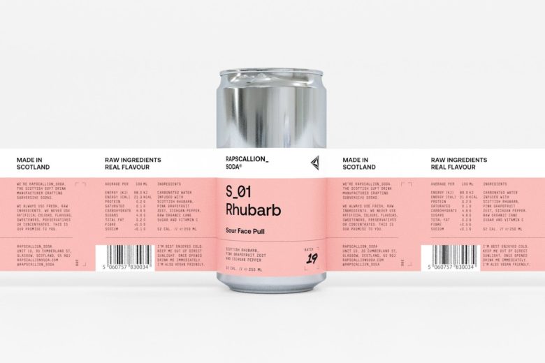
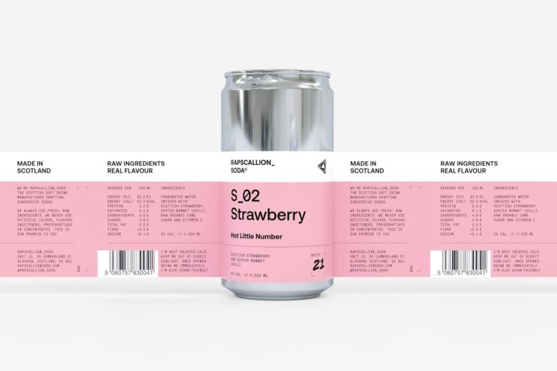
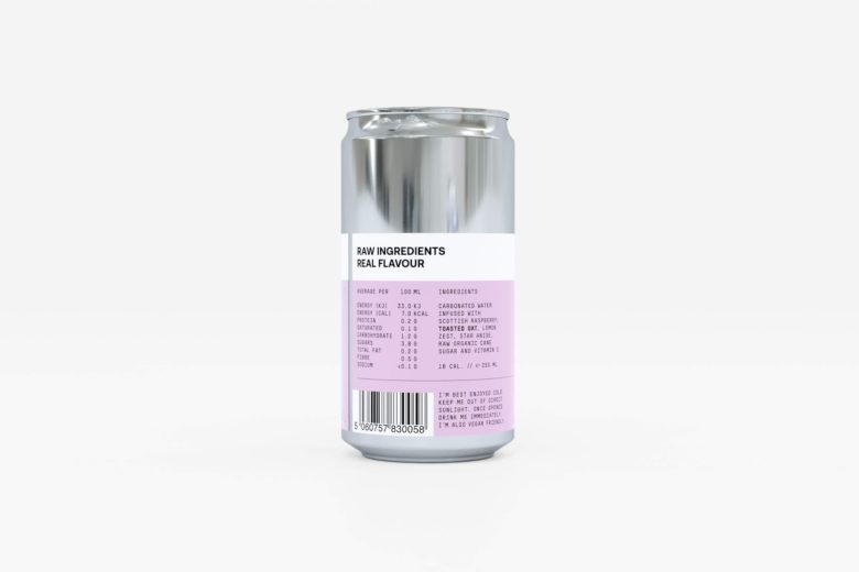
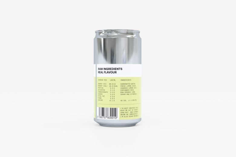
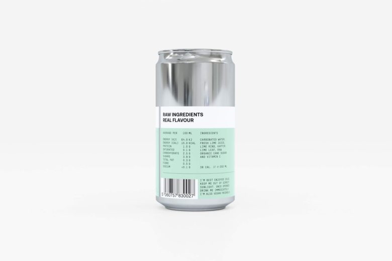
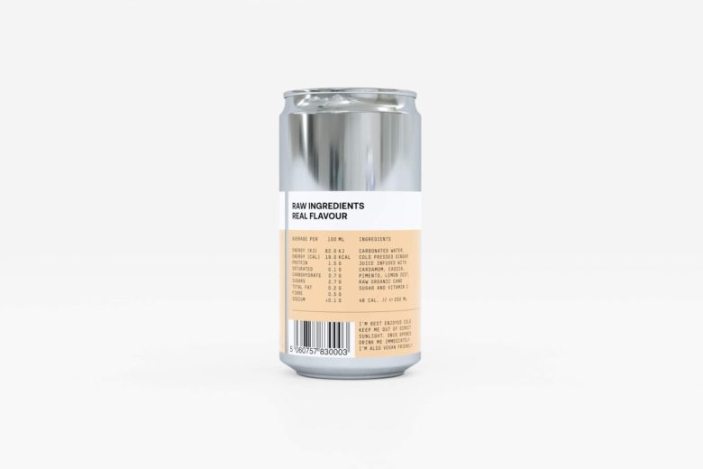
We worked with founder Gregor Leckie to create a punchy new packaging design (new 250ml can) with a real shelf standout. We wanted to build on the subversive nature of the Rapscallion name, better communicate the all-natural ingredients and also hint to the science behind the soda itself. A product naming strategy was developed to work alongside a distinct and rebellious brand voice.
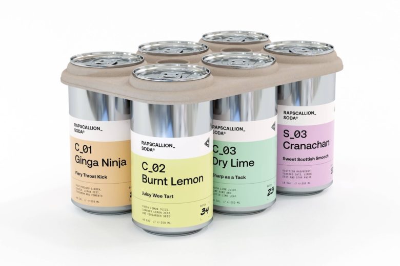
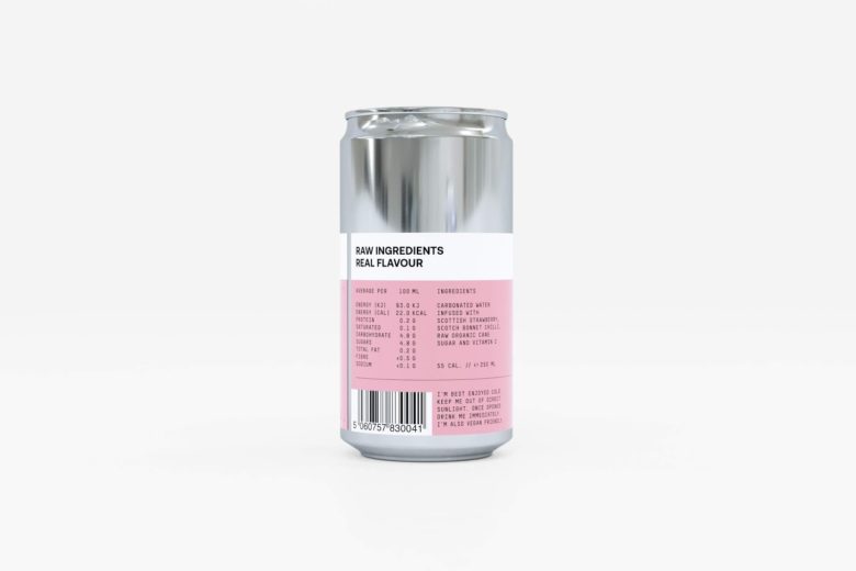
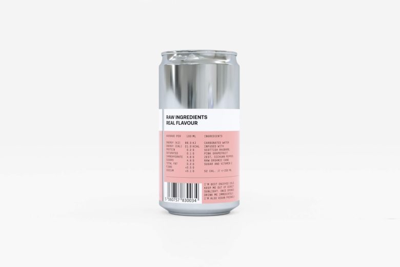
A sterile approach to layout, bold use of colour and minimal type treatments help to differentiate core range and seasonal product lines. The deliberate short stop label highlights the cans base metal, hinting at a more clinical and scientific approach to production.
Designed by Freytag Anderson
Add to collection