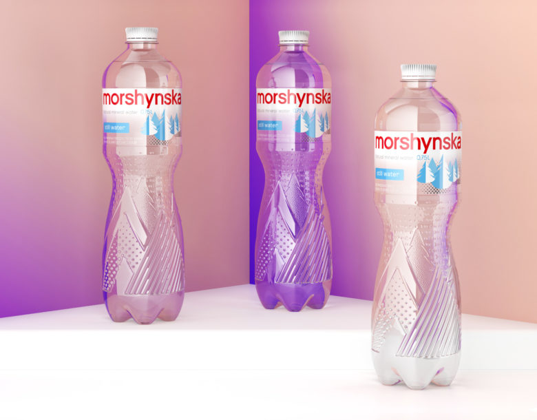
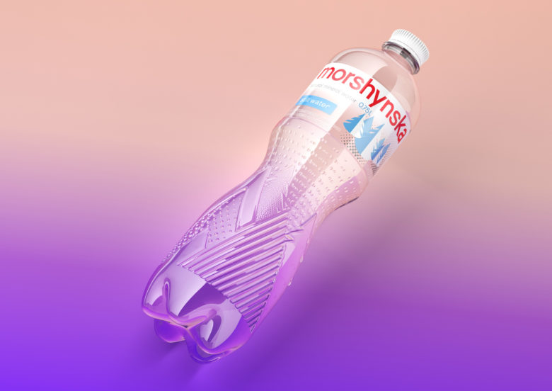
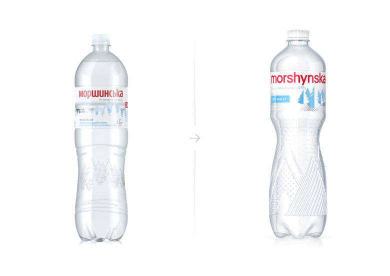
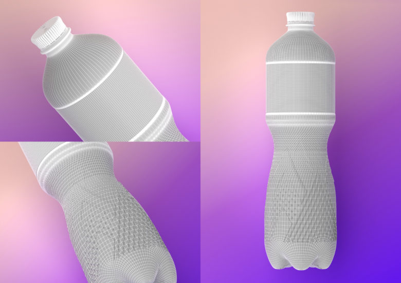
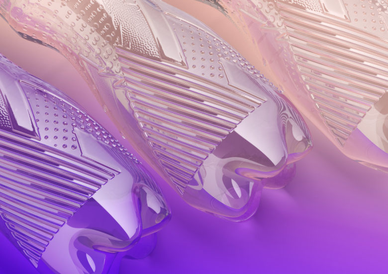
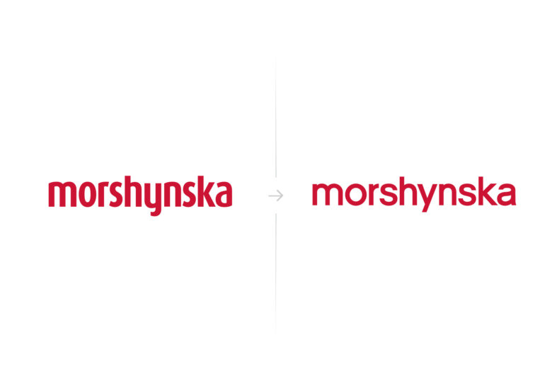
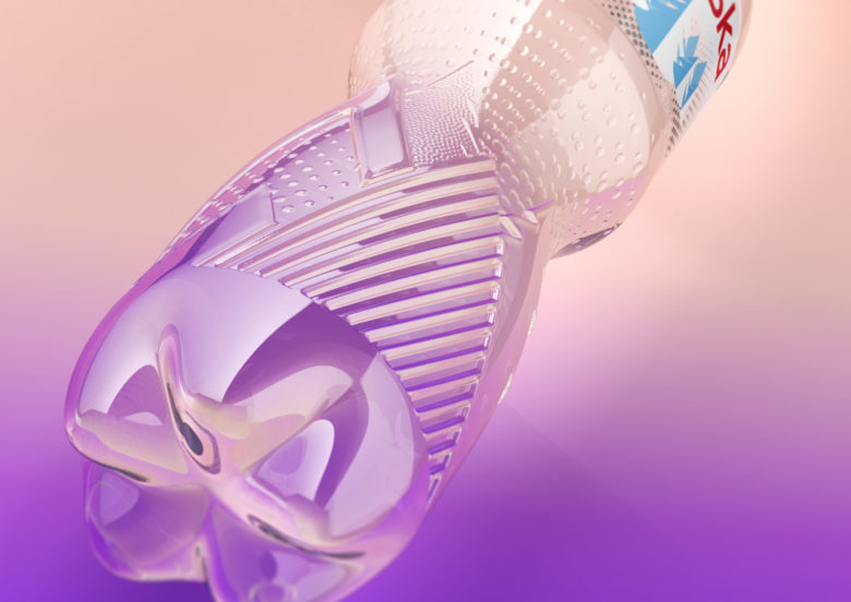
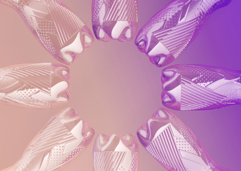
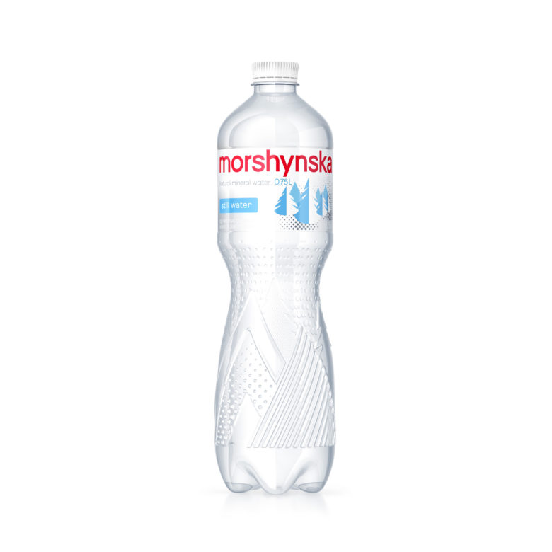
Morshynska, one of the most expensive brands in Ukraine and timeless leader of the water market, has completely updated its visual image. The new bottle is much more comfortable and pleasant to hold in your hand and now contains 15% less plastic. The brand has received an evolutionary redesign. Nearly two years were spent on implementation and testing. Most customers will not even notice the difference, but if you put the two bottles side by side, the difference is evident. The logo is now larger and simpler, the embossing of geometric spruces and mountains looks more modern and noticeable, and the size of the bottleneck and the crown-lid was reduced to make the bottle lighter. Only elements key to brand recognition remain.

Add to collection
