


Add to collection

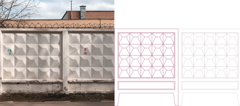
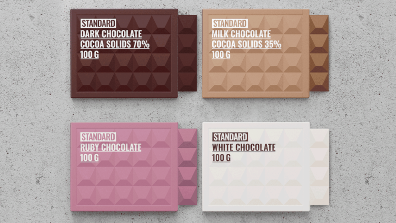
In the 70s in the USSR, Boris Lakhman created the design of a concrete fence. It was so functional and durable that in the 80s it gained incredible popularity. Everything was fenced by it — from construction sites and enterprises to kindergartens and parks. Few can remember a childhood without this fence.
What did he mean to us? It was a symbol of isolation, forbidden territory, brute power. It was a symbol of poverty and domestic disruption.
What’s Unique?
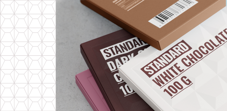
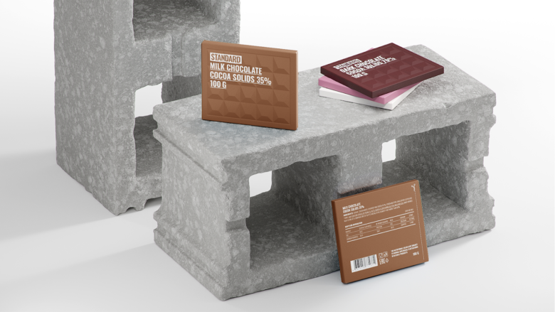
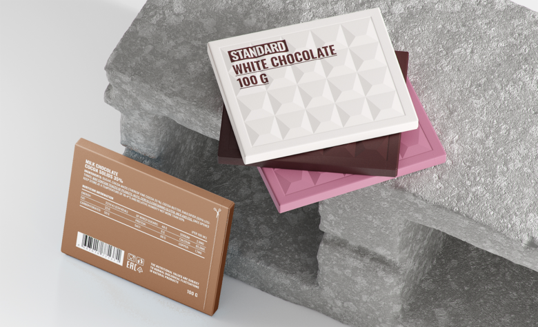
In this concept, I have the task to clear this fence essence from negative perception. I want people to pick up this package, recognize the shape and smile. This is no longer a concrete heavy monster on metal reinforcement, but a bar of chocolate packed in recycled cardboard. This is a hymn to a passing era, which I hope will never return.
Designed by Olga Prokhorova


Add to collection