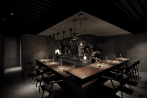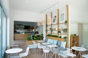
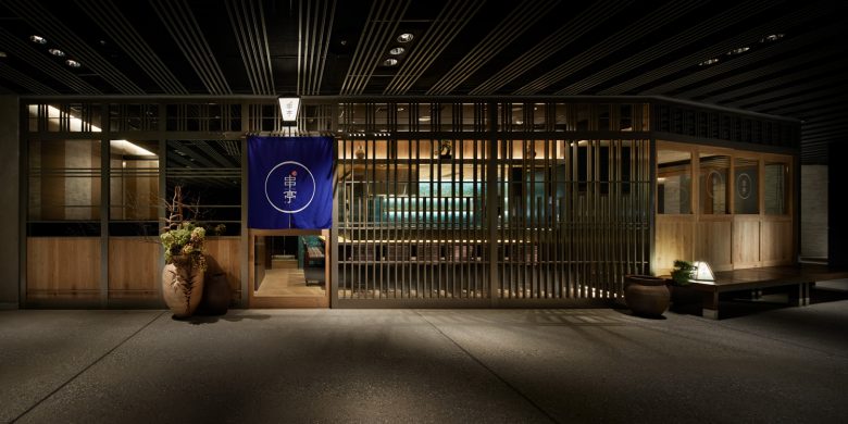
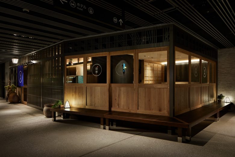
Kushitei Shibuya was planned as a commercial facility designed with the concept of integration with the outside where wind and air flow.
I wondered if it would be possible to create an interior design that would bring the flow of integration with the outside into the store and also incorporate a common passage.
The request from the client was Japan with an oriental taste.
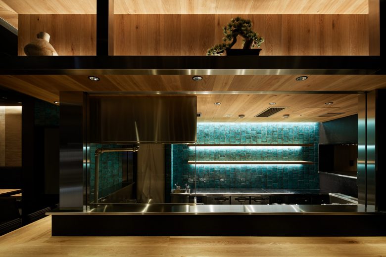
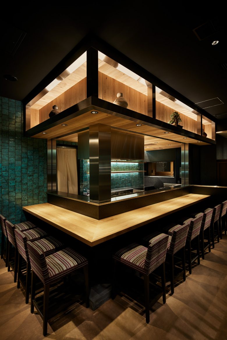
The Japanese composition is made from contemporary materials and European tiles are inserted as accents.
For the small-rise seats, the outside of the communal area is pulled into the store as it is by stretching the rim side of the store as it is on the floor of the store.
After opening of the store, I’m happy to see customers freely creating their own scenes.
Photo by http://www.nacasa.co.jp


Add to collection
