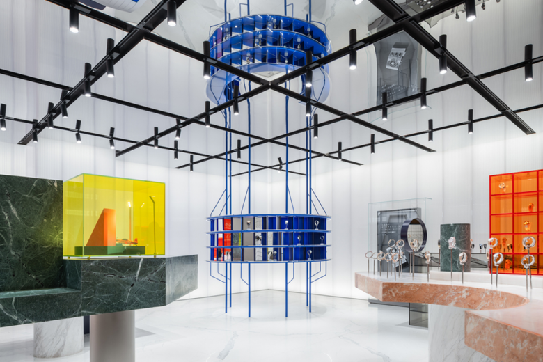
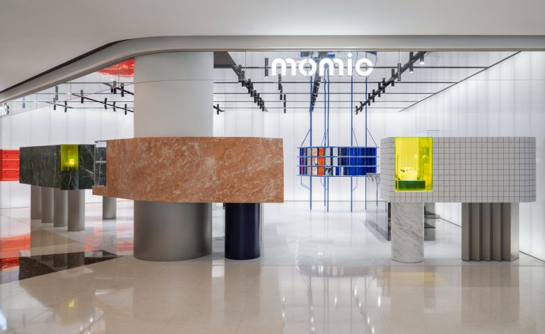
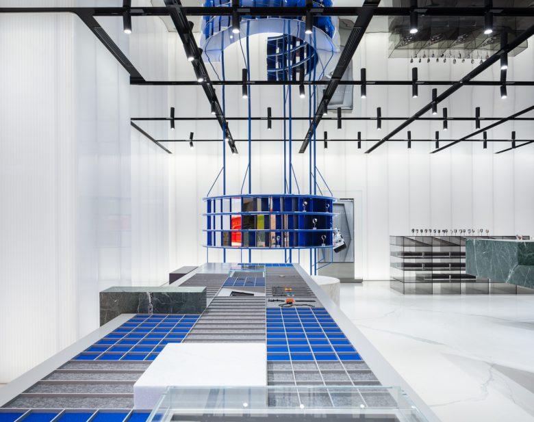
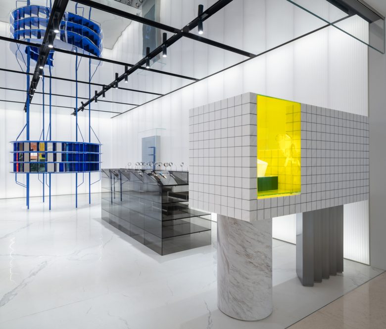
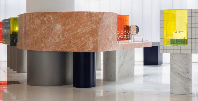
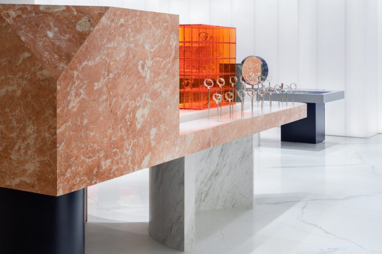
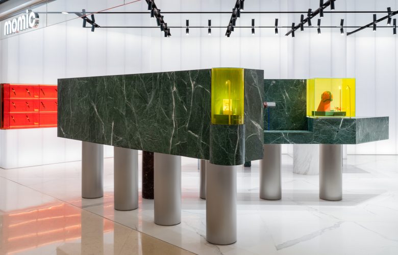
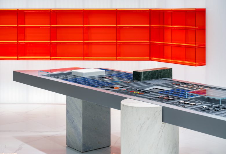
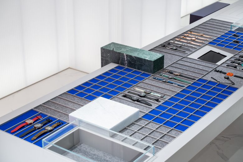
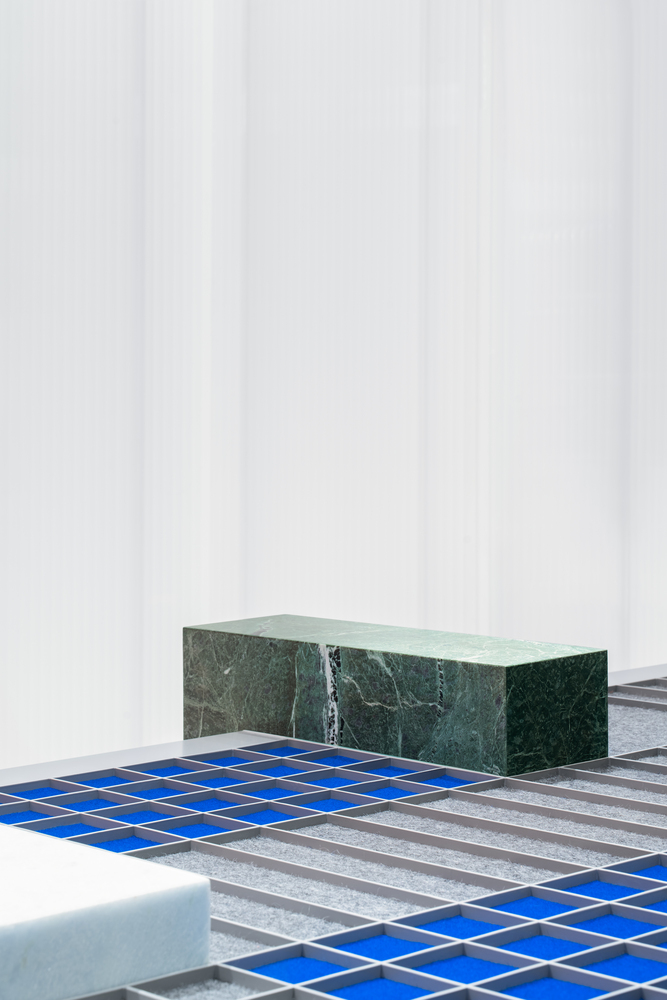
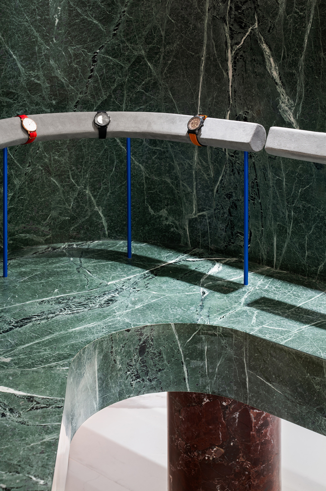
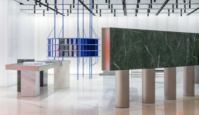
Dark green, honeydew, and white marble blocks, interspersed with accents of orange acrylic and blue metal, the first concept store designed by atelier tao+c for an emerging watch assembly brand MOMIC (Moments of Magic), featured simple and unique geometric volumes, superimposed on the precise combination of colors, enduing the space with a radical and straightforward and expressive force, capturing customers’ attention from the beginning of their journeys into the store.
Planning the spatial movement line becomes the starting point of the design: six scattered and restrained compositions of display stand are placed randomly in the space, but in fact, the shape of each stand is divided according to the elaborated planned paths. Upon entering the customers are immediately guided by the paths generated by different “props”, inviting them to meander around, and establishing their own shopping order.
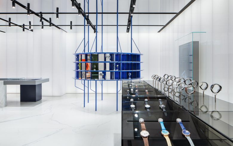
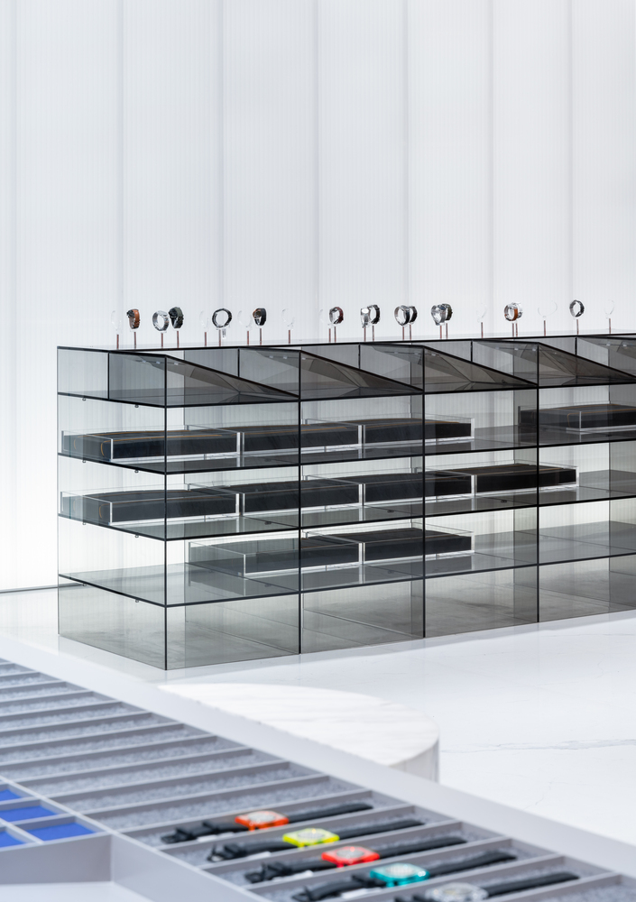
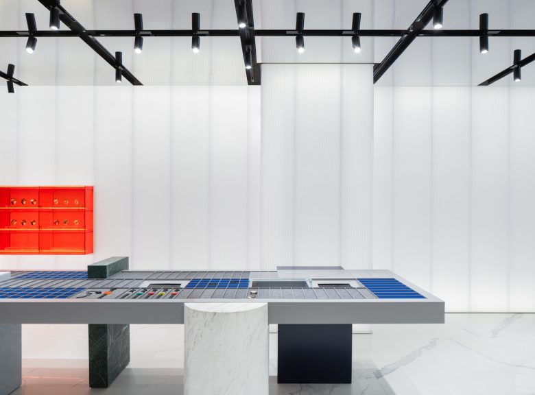
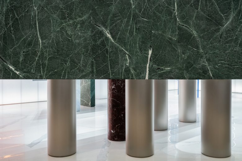
The designer has also limited the display interface between 1.05 to 1.65 meters based on people’s actions and gestures when buying watches, and the most comfortable sight angle when browsing watches, in order to liberate the upper and lower spaces and form a sense of transparency. Therefore, although each display stand has been arranged separately, the bottom height and the top height of the plinths are consistent, in responding to each other to form a continuous visual scene.
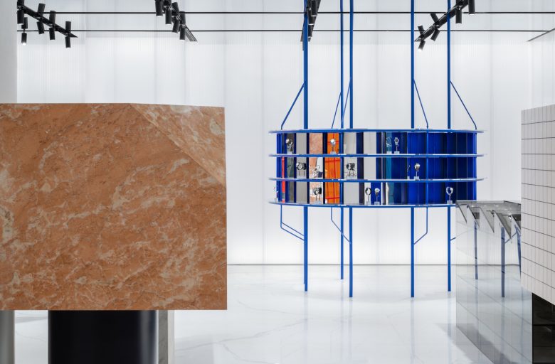
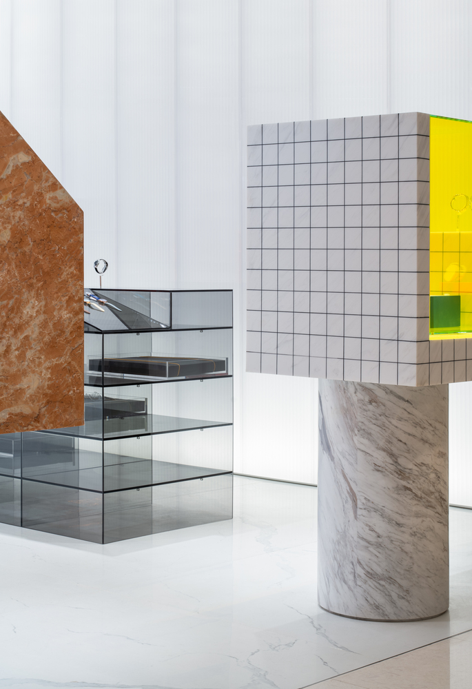
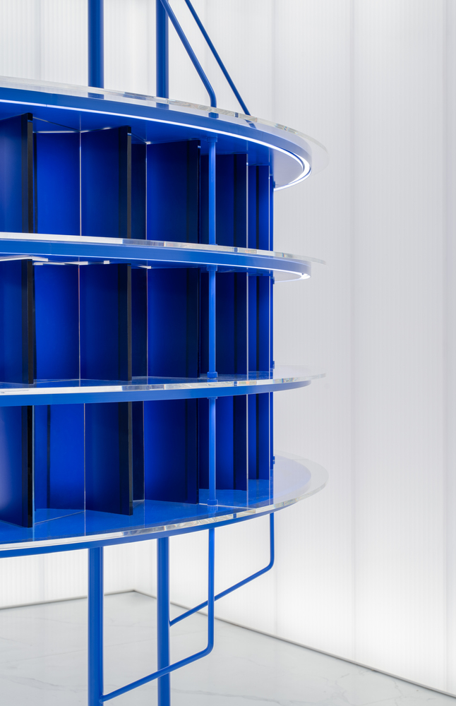
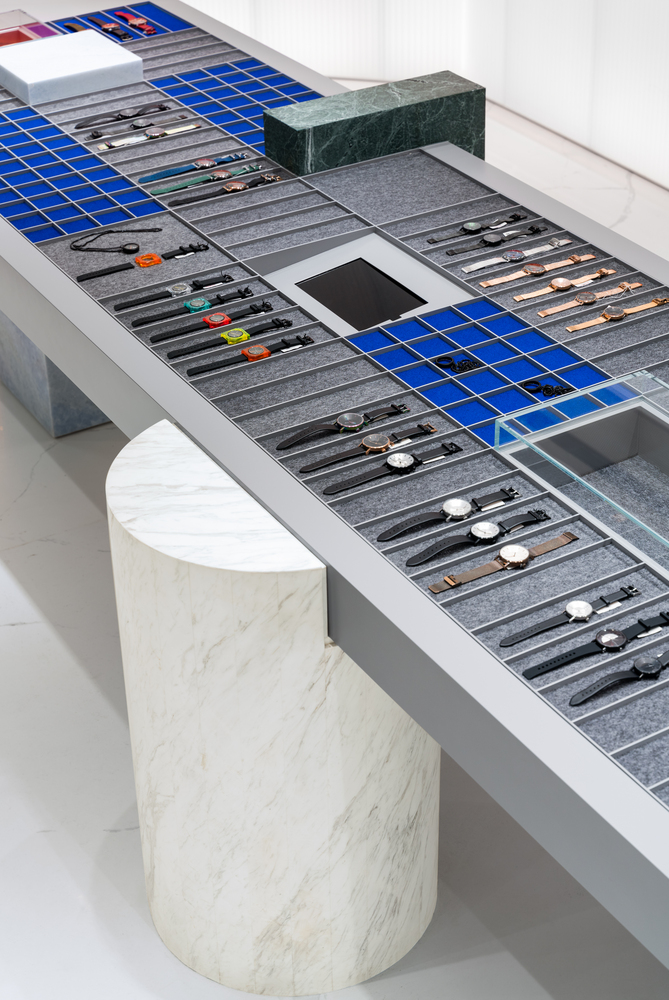
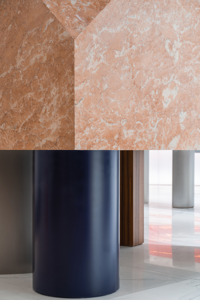
Each plinth is held up by a few cylindrical legs with different sizes and materials. The repeated cylindrical bases remind people of the architectural column prototypes. With the combination of stainless steel and acrylic materials, the overall image is endowed with a twisting touch of contemporary ambiance. The heavy platform contrasts with the lightweight supporting components, expressing the conflicts between lightness and gravity, seem as the playful sculptures, stimulating people’s feelings towards space and volumes. The circular column made of blue metal is vertically divided into independent display stands. The vertical line is ingeniously connected with the reflected image on the top surface, generating a visual extension.
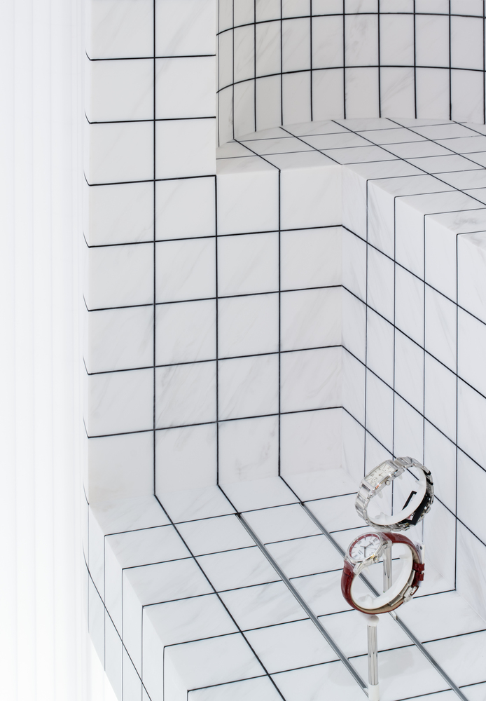
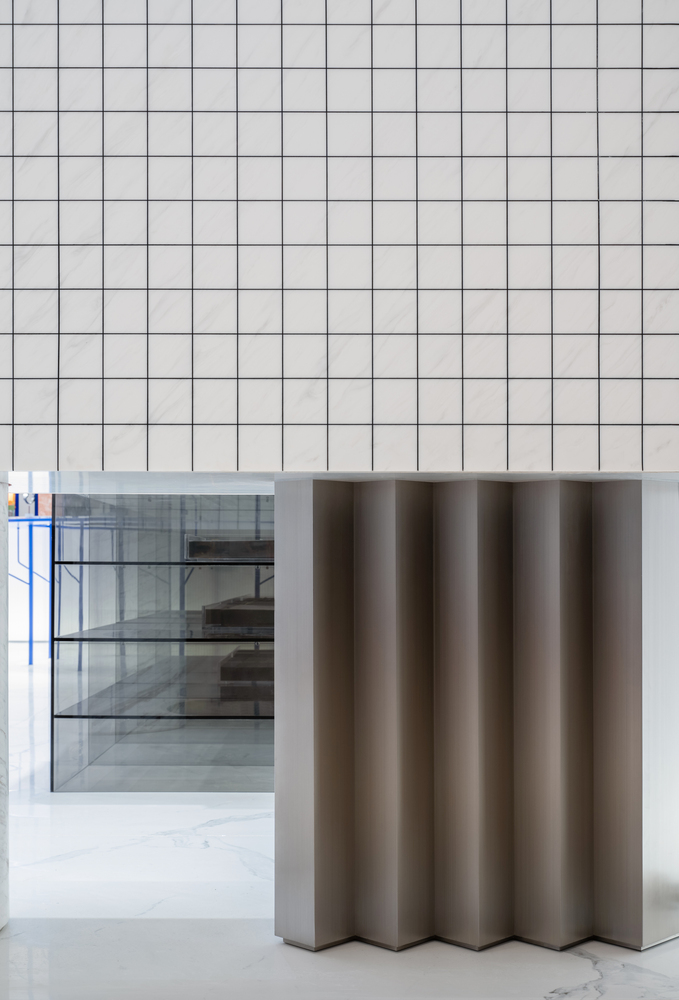
The use of materials also represents the designer’s thinking towards time and space: the acrylic brings in a sense of futurism, while the marble spanning the history of human construction represents the tradition, and the blue metal shelf is the illustration of modern industrial evolution. Different material textures have been incorporated to express the sense of time collision, which is also suitable for displaying different sets of watches. Green and honeydew marble stands are respectively used to present sports and slim watches while the gray acrylic stands and blue shelves are for showcasing the conceptual and futuristic watches. Meanwhile, the gray lattice table designed as the DIY operation platform is employed to enhance the vibrancy within the store.
In the end, the luminous wall and the glossy mirror hovering over the ceiling blurred the boundary of the space in between, created a soft and fuzzy atmosphere that reminds us of Kubrick’s retro-futurism aesthetics.
Interior Designers: Atelier TAO+C
Design Team:Tao Liu, Chunyan Cai, Haojia Song, Lin Guo
Photographs: Wen Studio
Add to collection
