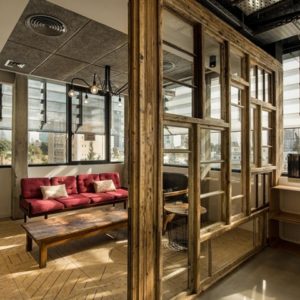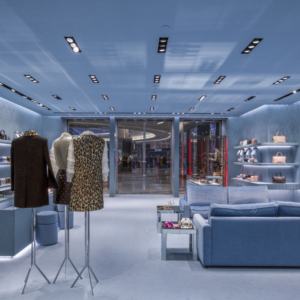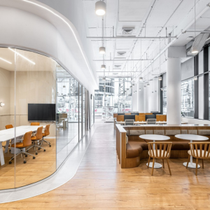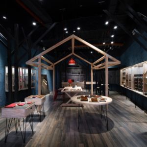

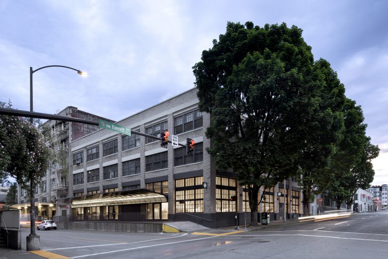
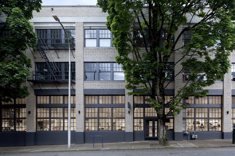
Built within a historic warehouse building in the Pearl District, the new showroom for the furniture company Blu Dot was designed to preserve the spirit of the existing architecture, while creating a distinct, crafted intervention for the new display environment.
At the start of the project, the existing space was a mixture of historic features and an eclectic set of additions. While the building had a clear underlying organization, characteristic of pre-war warehouse structures, a series of renovations over its lifetime had complicated this clarity, dividing the interior space, and disrupting the logic of the exterior. Rather than try and compete with or overwrite the old, our intervention instead attempted to work in concert with the building strategically, creating clear elements that together could bring to light the building’s framework.
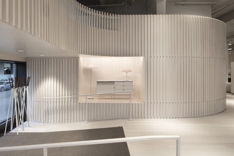
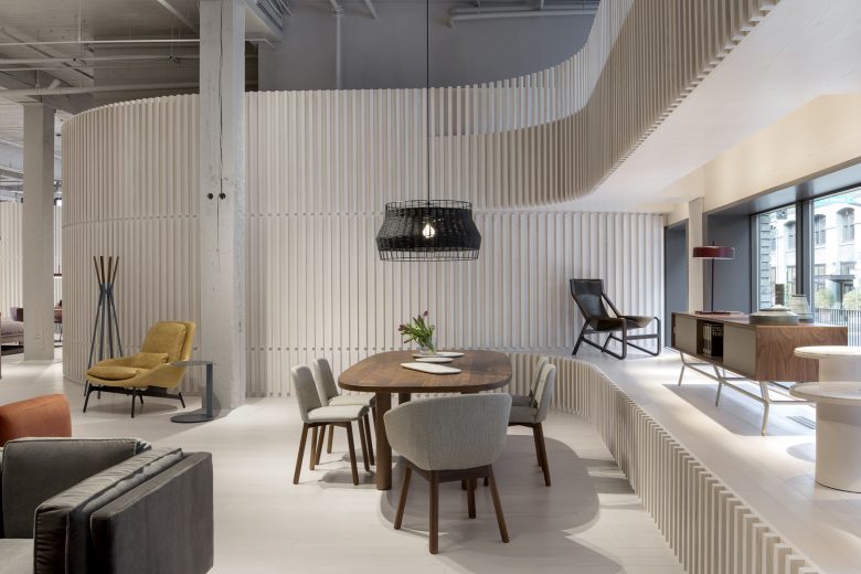
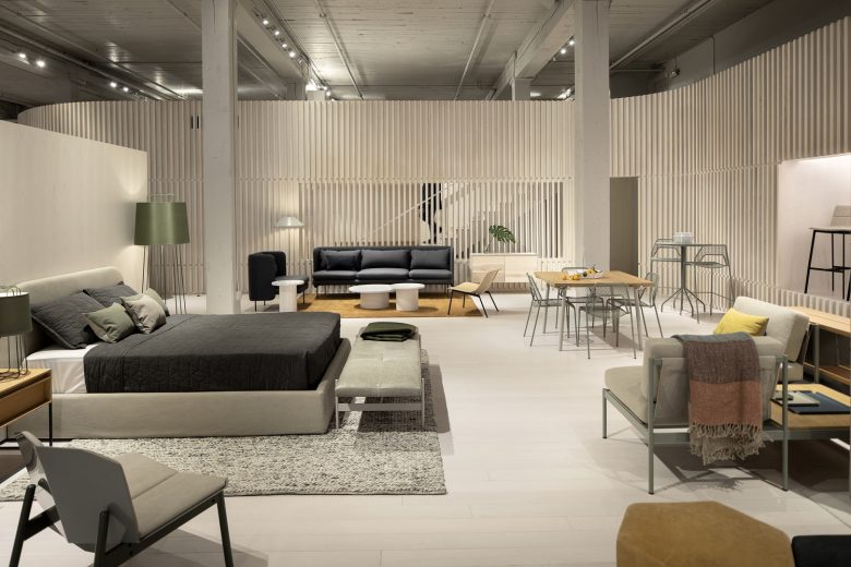
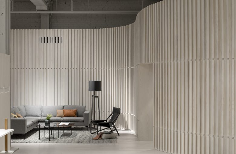
Programmatically and experientially, the showroom needed to create a calibrated neutrality that wouldn’t compete with the rich materiality and color of Blu Dot’s furniture. Envisioned almost like a crafted object inserted into the building, the intervention sits within the space but is set-off from the existing structure. With a white-washed wood finish that carries from floor to wall, the character of this new form is distinct from, yet in dialogue with the textures and construction of the old. Curved corners act both formally and performatively to differentiate new and old, encouraging movement between the two. Discretely scaled zones flow into each other, as the curves lead visitors around the perimeter of the space. The grid of original heavy timber columns in turn becomes highlighted as it touches down within the white-washed display space, shaping the visitor experience and organization of the display.
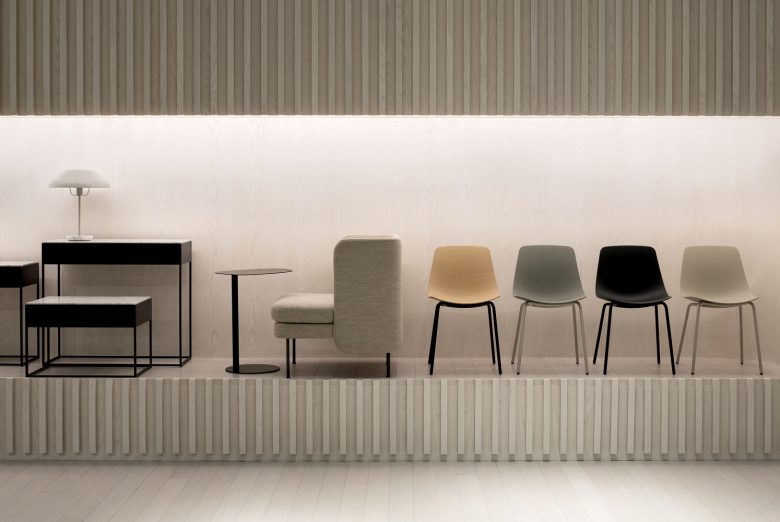
Lined with two-inch by two-inch battens, the curving walls take on a highly-crafted texture. Three horizontal break lines in the battens track key heights as they move through space, denoting display plinths, door thresholds, and the mezzanine guard rails. Display areas and storage are further incorporated into its thickness, as are venting and mechanical systems.
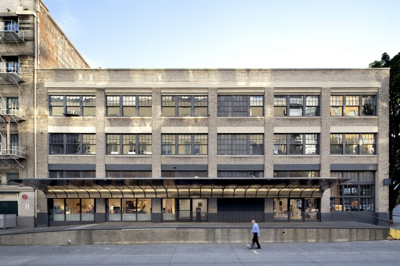
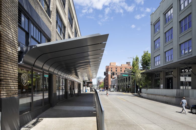
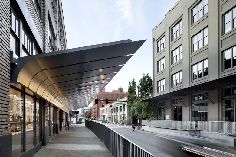
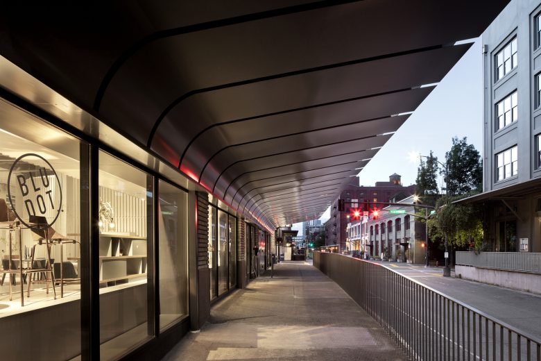
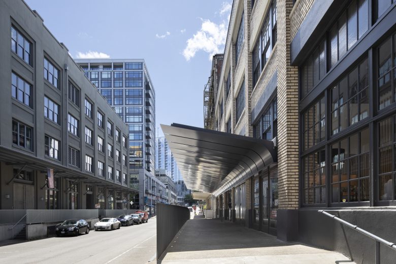
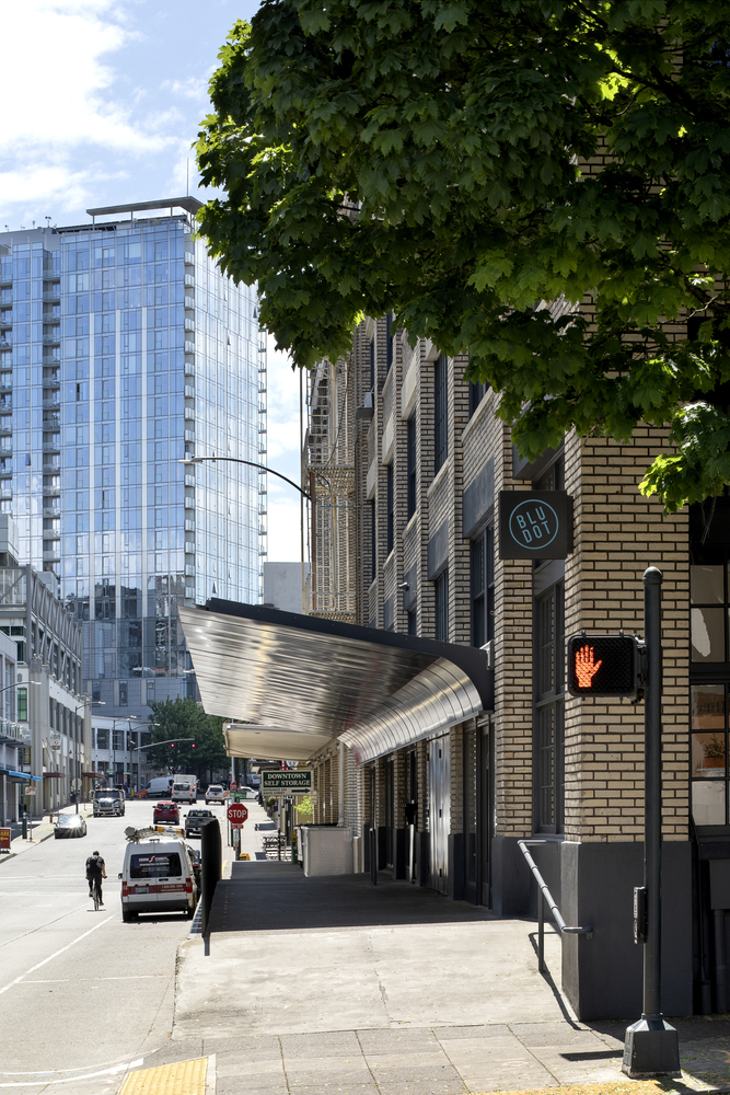
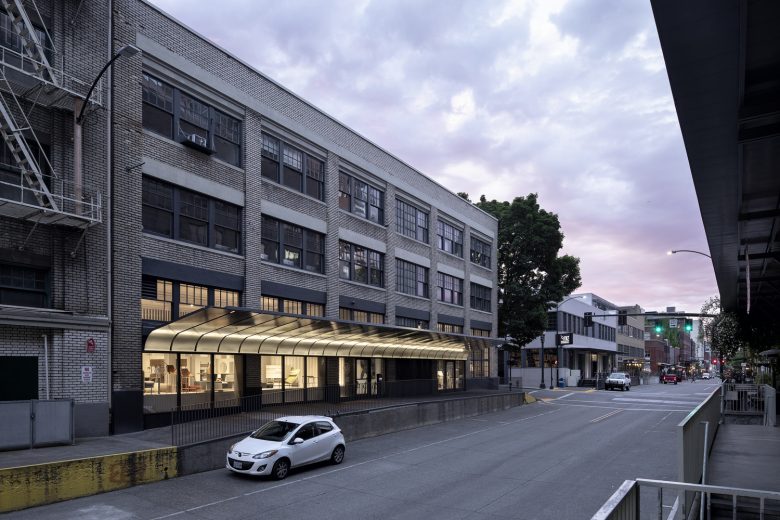
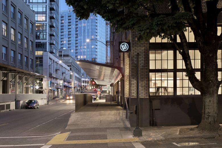
On the exterior of the building, a new awning brings a discrete set of storefronts and loading areas into a singular organization. Referencing the industrial coverings of nearby buildings, the awning nonetheless takes on its own distinct identity, curving downward against the brick facade to frame the new entry to space. This move acts simultaneously to conceal an existing stucco-covered lintel that stretched across and broke up the facade, as well as to incorporate drainage and lighting. New wood storefronts sit at the base of the awning and mark the scope of the intervention. The result is a singular gesture that highlights the character of the building, without attempting to mimic the historic.
Taken together, the interior and exterior interventions redefine both space and the building’s identity as a whole. The result is a showroom in which the architecture stands out in its clarity of concept, form, and detail, yet also happily steps back, acting as a quiet, textured backdrop for the furniture and objects on display.
Architects: Waechter Architecture
Photographs: Jeremy Bittermann




Add to collection
