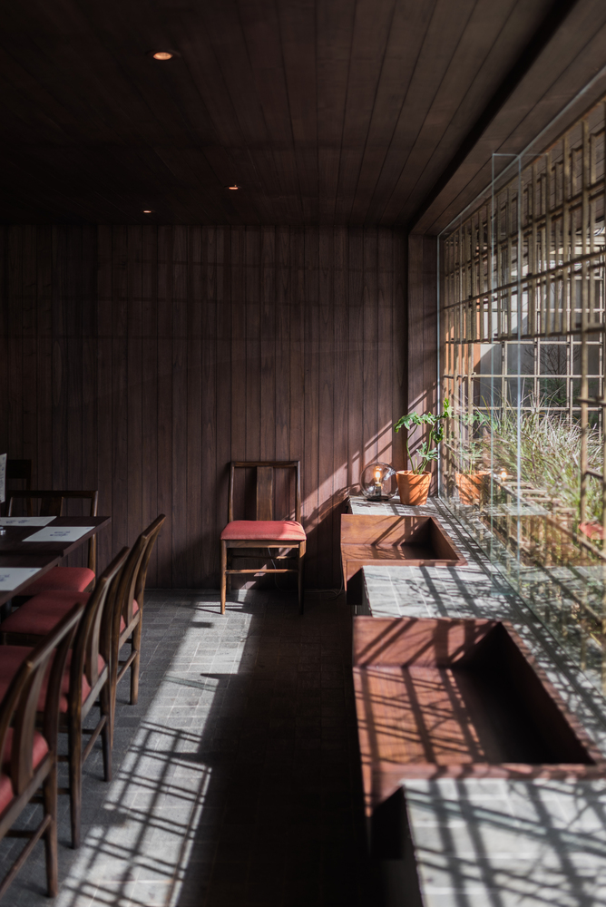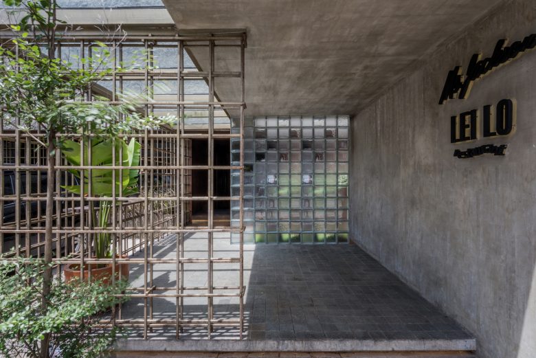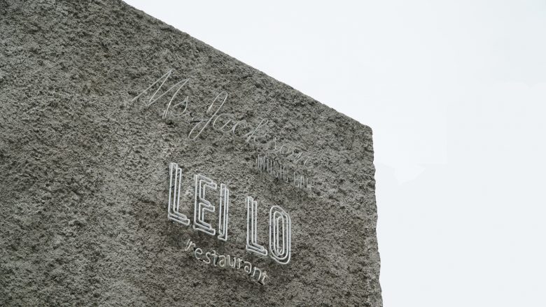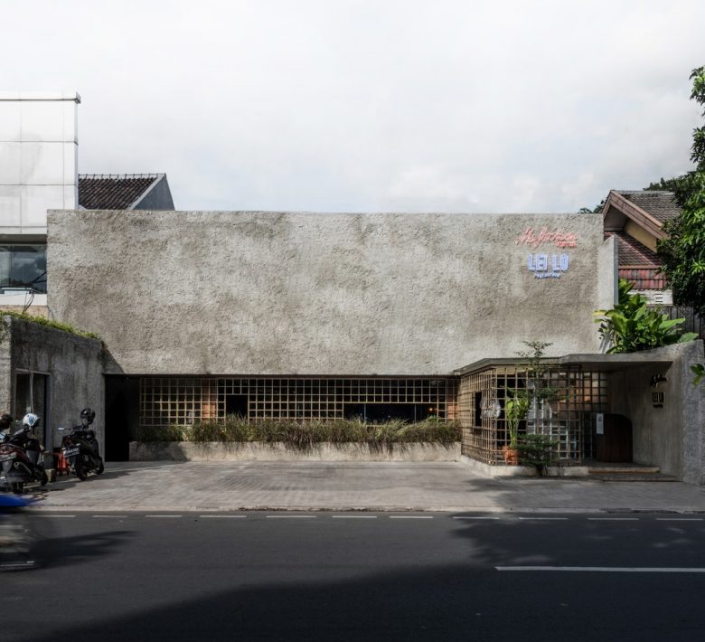
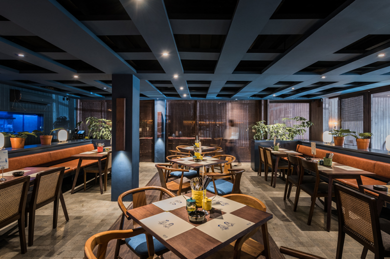
Arti Design Studio, in collaboration with Studio Laurencia, has renovated Lei Lo, an Asian fusion restaurant located in Senopati, South Jakarta. In this project, the architects rethink customer journey using transparency design.
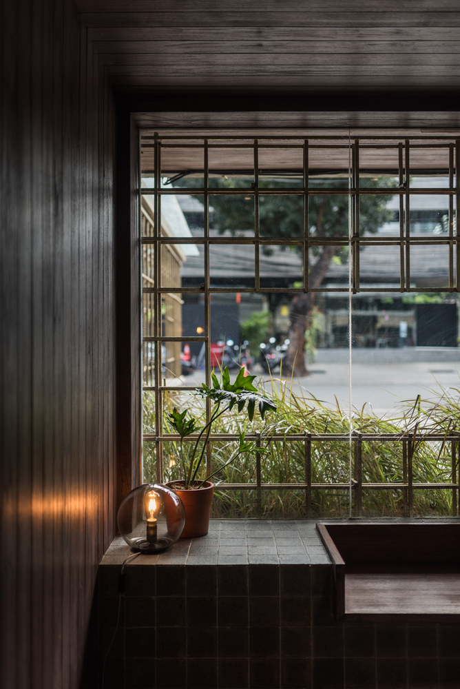
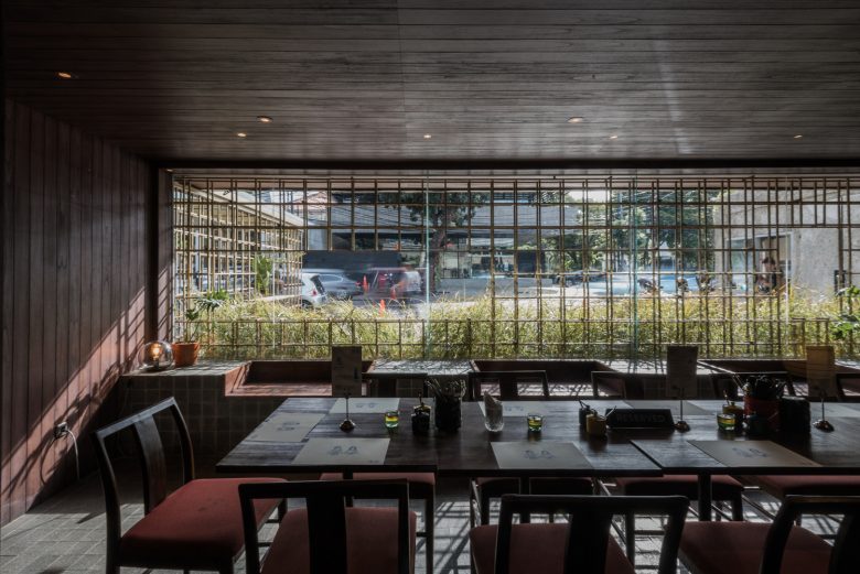
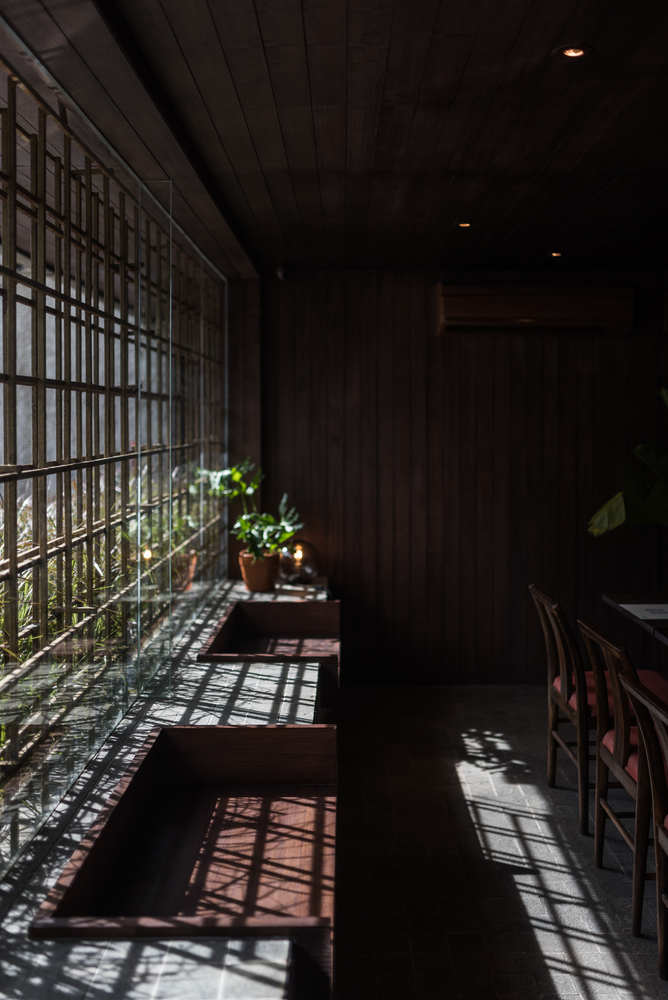
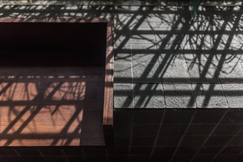
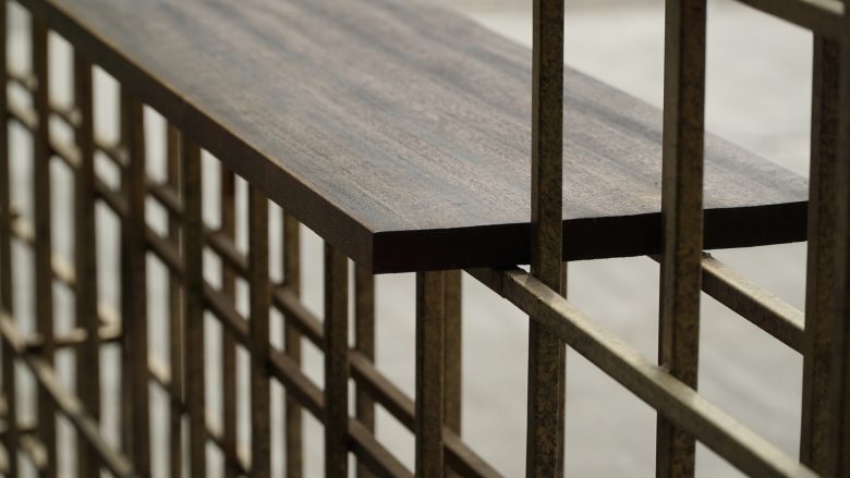
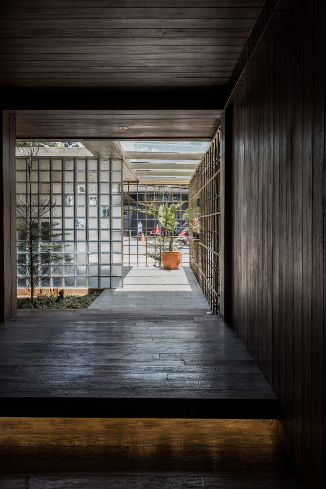
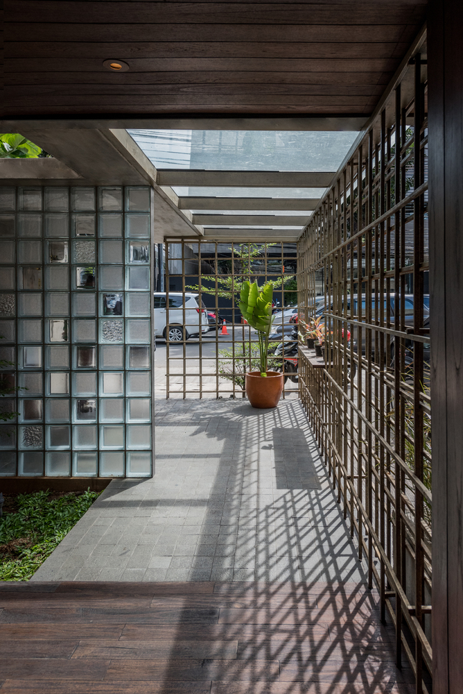
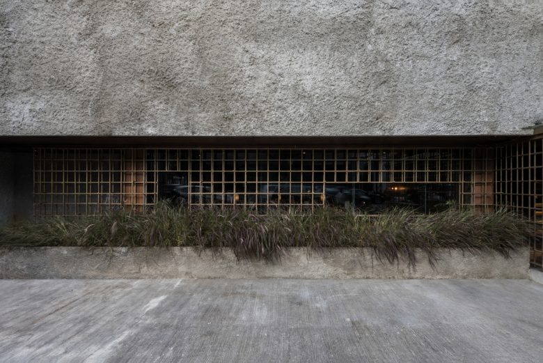
The long entrance pathway introduces the customers to Asian fusion concept, starting with a few of its elements: wood and brass tapestry. Here, the customer get a glimpse and a feel to the world inside Lei Lo. Aside from serving as a transition, the area acts as a waiting area (with wooden seats for comfort and standing tables to place coffee) and a shelter from Jakarta’s weathers, be it scorching sun or heavy rainfall. A touch of nature, long grass grows inside a row of planter pots which protects the building from the occasional rainy season floods. The plants also acts as view buffer from dining to parking area.
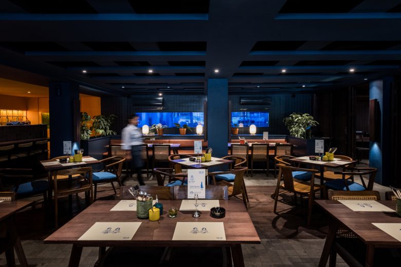
When it comes to the word Asian, generally, the masses think of ornaments, such as red lanterns. Instead of going with it, Arti Design Studio dig deeper to the roots, researching down to the specific materials. The combination of dark wood and stone makes the entire restaurant feels homey, not only looks Asian. This leaves a deeper impression.
Observing customer behavior, upon entering the room, the customers would choose the best seat—the one with the best view. However, the existing spot were deemed undesirable as it faces parking area and basks in Jakarta sun heat. For that reason, the architects design buffers (brass tapestry structure and planter box) hence resulted in attractive view and unique shadow play. Seeing from business point of view, the design increases capacity efficiency.
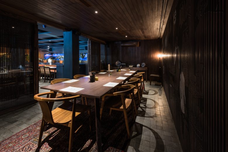
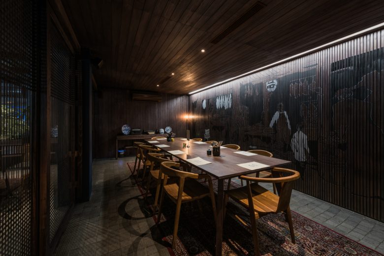
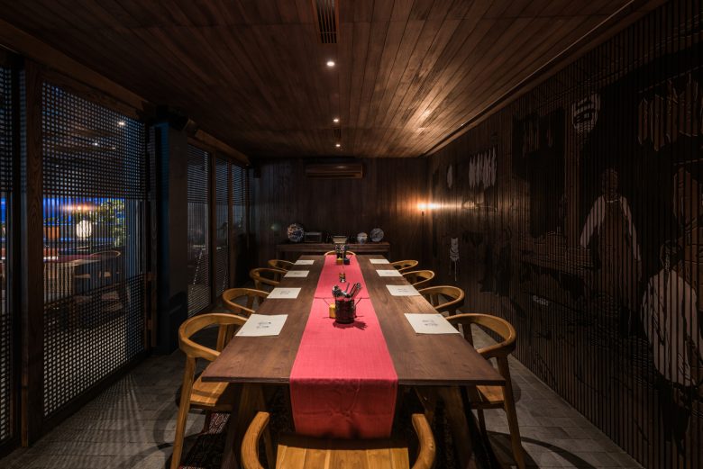
The VIP room was secluded yet lively. Its rattan door allows the VIP costumers to see the silhouette movements from the other side of the restaurant, giving the customers a sense of privacy and belonging at the same time. Arti Design Studio makes sure its design gives the best experience. Aside from giving touches of nature, planter boxes that surround the tables also acts as view buffers to the waiters passing by. The plants also hide service station behind the blue box. This way, the customers’ experience won’t be disturbed by the service scenes.
One of the problems to tackle in the renovation is the existing floor to floor height. To create a taller illusion, the architects designed open plafond with squares to hide air conditioner and exhaust. These squares are repetitions from the brass tapestry outside and ceramic tiles inside. Its overall cohesiveness helps create a strong visual brand identity that is memorable for the customers.
Architects: Arti Design Studio
Architect In Charge:Raynaldo Theodore
Design Team:Natasha Astari
Interior Design:Studio Laurencia, Ethelind Laurensia
Photographs: Jonathan Raditya
