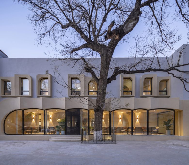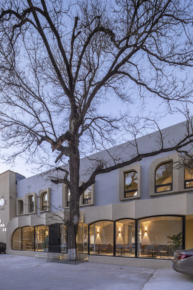
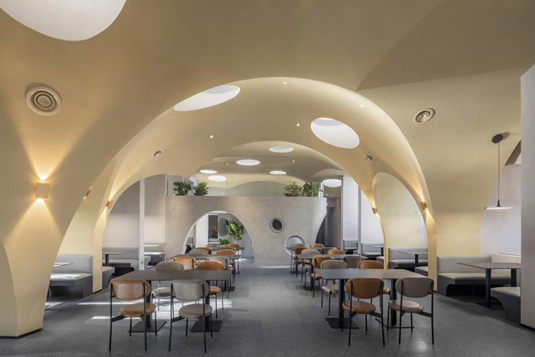
In the summer of 2020, a friend who came to us chose a place to administrate a restaurant, what he expected was to introduce the local hotpot from Hunan, his hometown to Beijing. The restaurant is located in Hepingli, Dongcheng District in Beijing, a compound mixed with offices and old residential areas beside the Second Ring road. The original space is an idle warehouse, the first storey is multi-column, while the second has a higher ceiling, the north and south sides of the room has a dense piece of wall and large windows, the south side of the building has an aged pagoda tree.
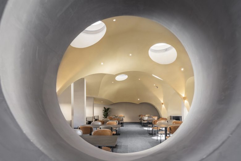
The hotpot is a clay casserole. The friend described the prototype of the restaurant in his mind like this: “It is a plain cavernous space; diners enjoy the food that has been boiled by the simplest way and feel the original flavour of the ingredients.” Under such a unique proposition, we expected to find a way to return to the origin of spatial feeling, and focus on the connections between food, utensils and customs’ experience in a characteristic environment.
In our journey in North Africa in the early years, we visited the white and khakis houses of people living in the oases north of the Sahara. The edges are rounded and straightforward, arched and curved surfaces emphasise a rustic and cavernous atmosphere in the constructions. As human beings originally lived, caves formed the most primitive space experience in human memory. We desired to bring this initial physical experience into this restaurant’s design to visualise the “plain cavernous space”.
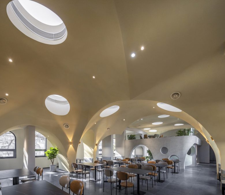
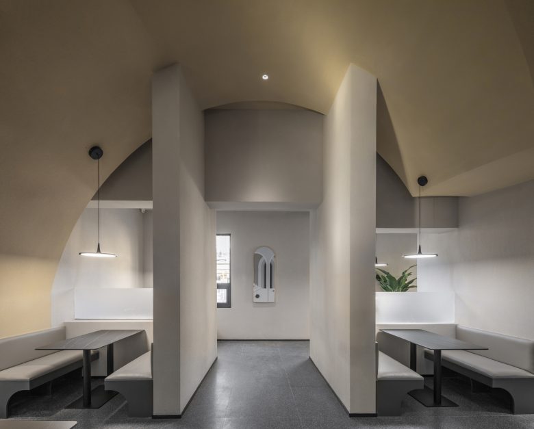
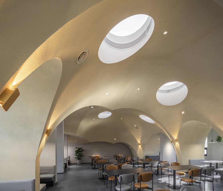
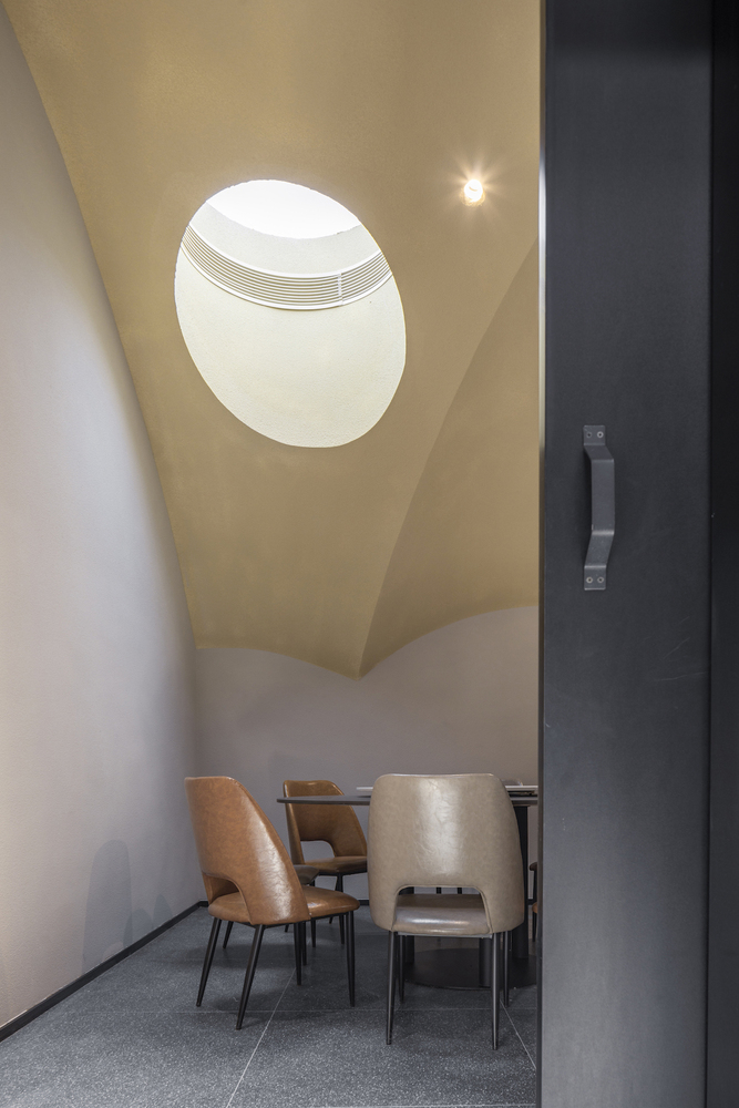
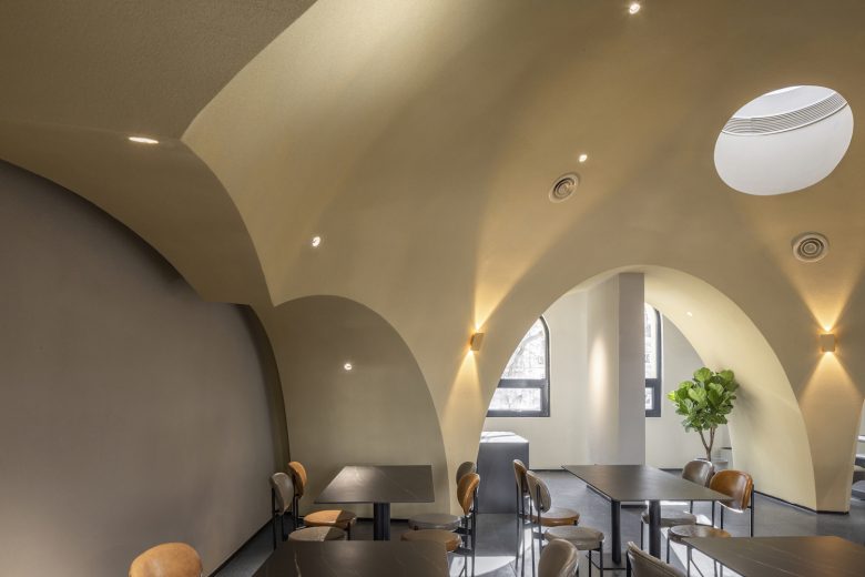
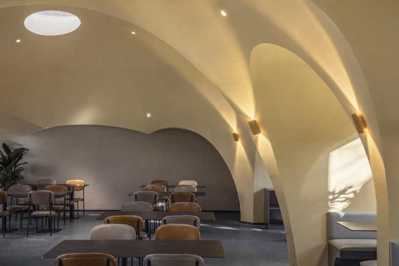
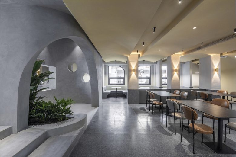
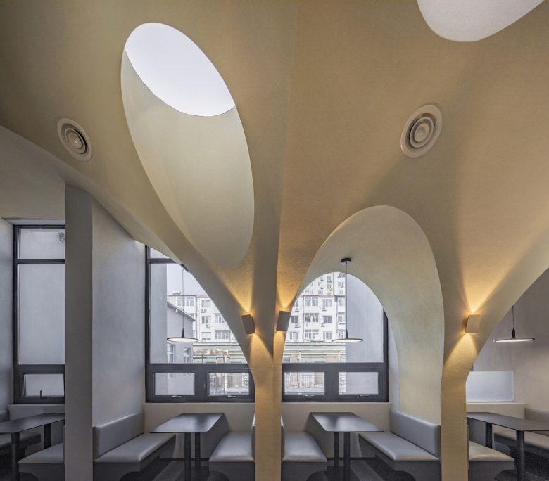
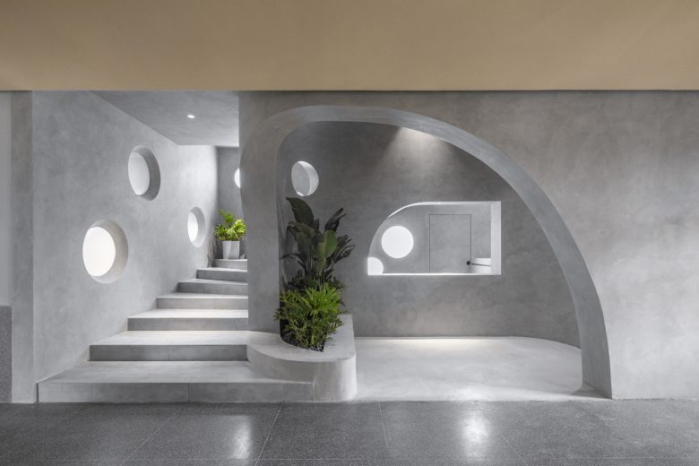
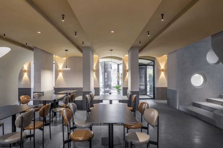
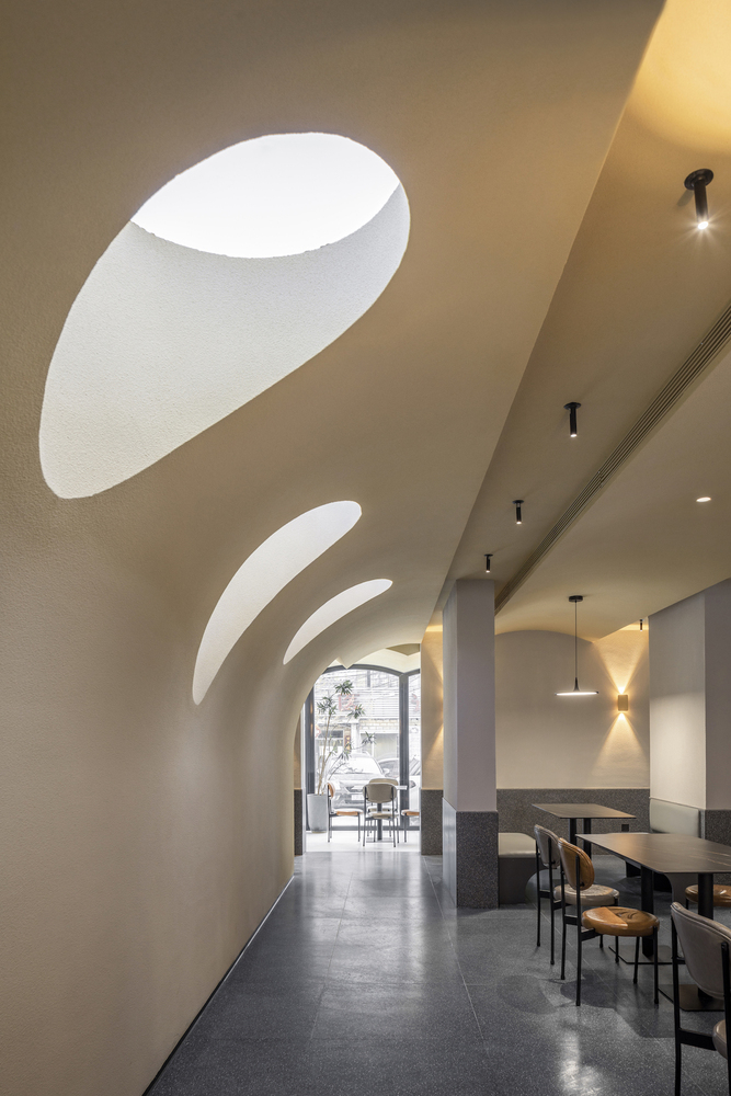
The spatial operation is also the journey of seeking the “cave”, because of the dense blade walls on the south and north side of the space,we decided to delve into space in between. As the primary language on the ground floor, the continuous barrel vault extended from inside to outside that formed the curved facade at the front door. Due to the higher storey height on the first floor, the vault’s unidirectionality is generated to a system of superimposed domes that are evolved from the internalised grid of the spaced and result in the cavernous space. Moreover, “skylight” is used as an element to enhance the cavernous spatial experience.
The implementation of the superimposed domes is also a compelling process. As a result of the cost control in this small-scale project, we did not choose the prefabricated GRG ceiling but manually fabricated by the site workers. Firstly, we determined the centroids and intersection points of the dome in three-dimensional space; then contrived the diagonal ribs based on the arc lengths. After that, connecting the ribs as a three-dimensional mesh and reserving the gaps for skylights. The last step is to use veneer to construct superimposed domes.
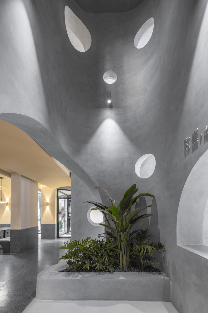
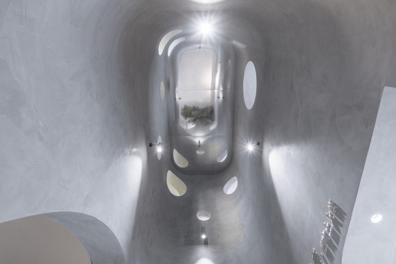
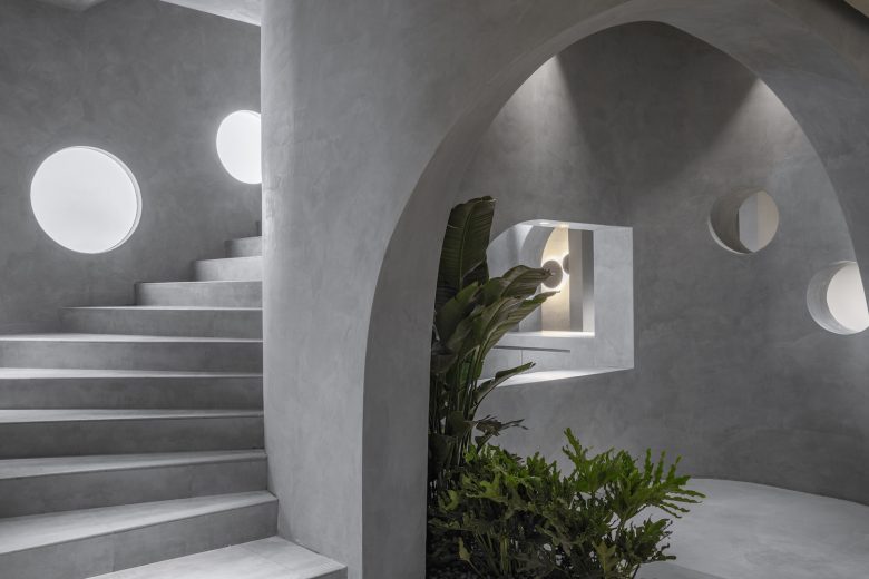
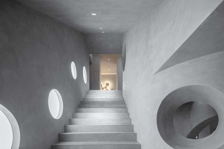
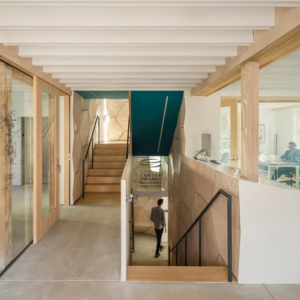
The two floors are associated by the vertical staircase which is also a simulation of a complicated spatial installation that works visually as the centre core of the ground floor and creates the atrium and the mezzanine on the first floor. The atrium is located at the front of the reception, and the mirrored ceiling exaggerates the physical storey height inside the connector, configuring another vertical cavernous visualisation. The first-floor mezzanine is used as a centralised dining area which also creates the opportunity to approach the top of the cave wall and overlook the cavernous atmosphere on the first floor.
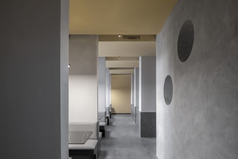
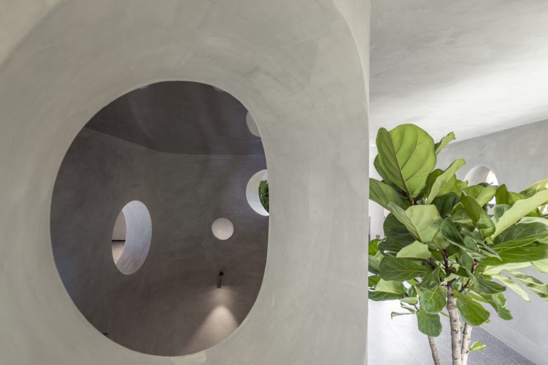
On the ground floor, decks are settled in between the blade walls sequence. To soften the tension from the vertical blade walls to the atmosphere, we chose two different materials based on the arraying rhythm of the walls. The same with flooring, the bottom is fabricated with a terrazzo brick wainscot composed with decks as a dark grey solid; the upper part is coated with light grey. The inside and outside walls are both covered with similar materials, we enlarged the coating’s particles and emphasised the roughness of it to enhance costumers’ immersive experience of “primaeval” and “cavernous”. Additionally, the primaeval could bond with the pots’ terra-cotta materials, thus generating the coherence of gustation, pselaphesia and perception.
Architects: MAT Office
Design Team: Kangshuo Tang, Miao Zhang, Youpeng Liu, Ningyan He, Xiangxun Chen (intern)
Photographs: Weiqi Jin
