Hit is anything that is well known. It was with this in mind that the first lines of the beauty salon located in Porto Alegre, Brazil emerged. The project came up with the idea of creating a young and contemporary space that reflects the personality and the new career moment of the owners.
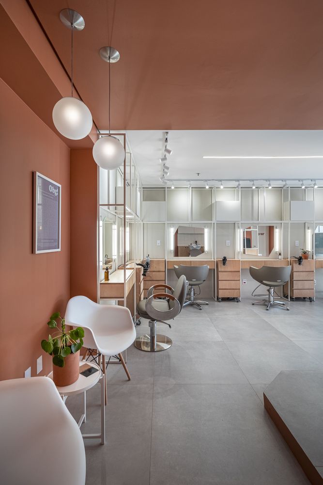
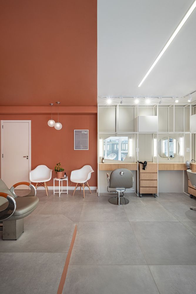
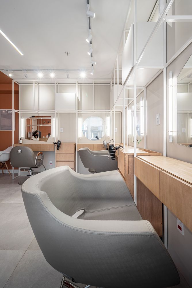
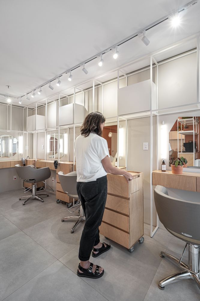
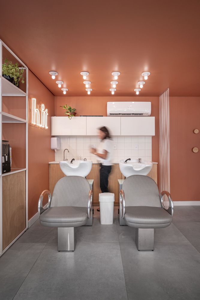
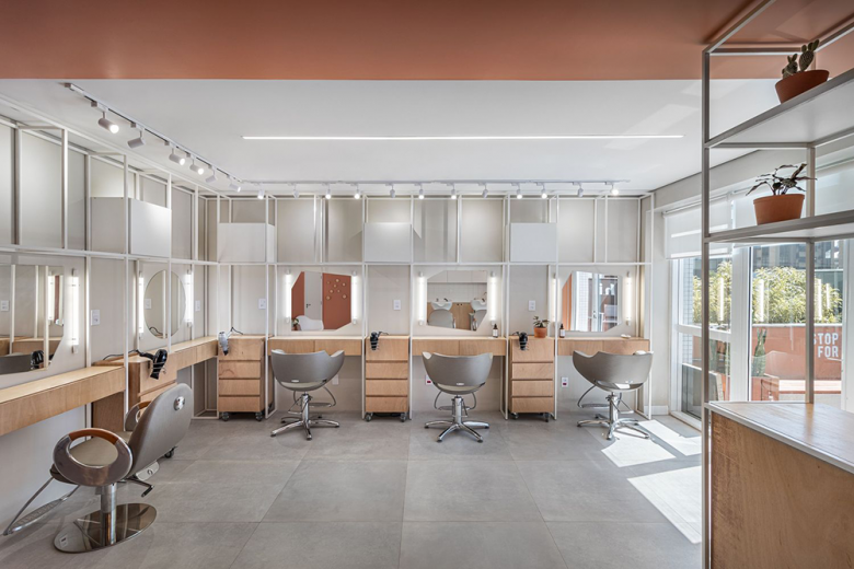
One of the great challenges was to develop the project partially financed through crowdfunding. The chosen room, located on the third floor of a commercial building, has a total area of 53m², with 21m² of terrace area. The necessity program involved the creation of 5 workstations, pantry, washbasin area and waiting area. Being a typical commercial room, with no partitions, the strategy was to delimit the spaces through the use of color, separating the plant into 2 areas: the workstation area and the area of the remaining functions.
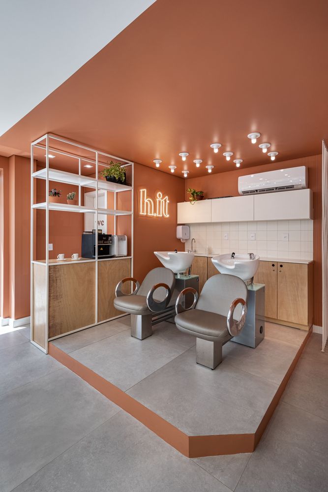
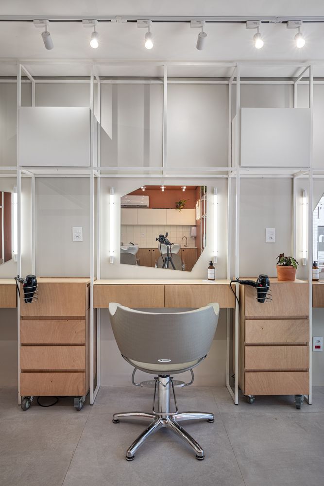
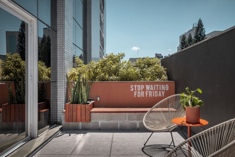
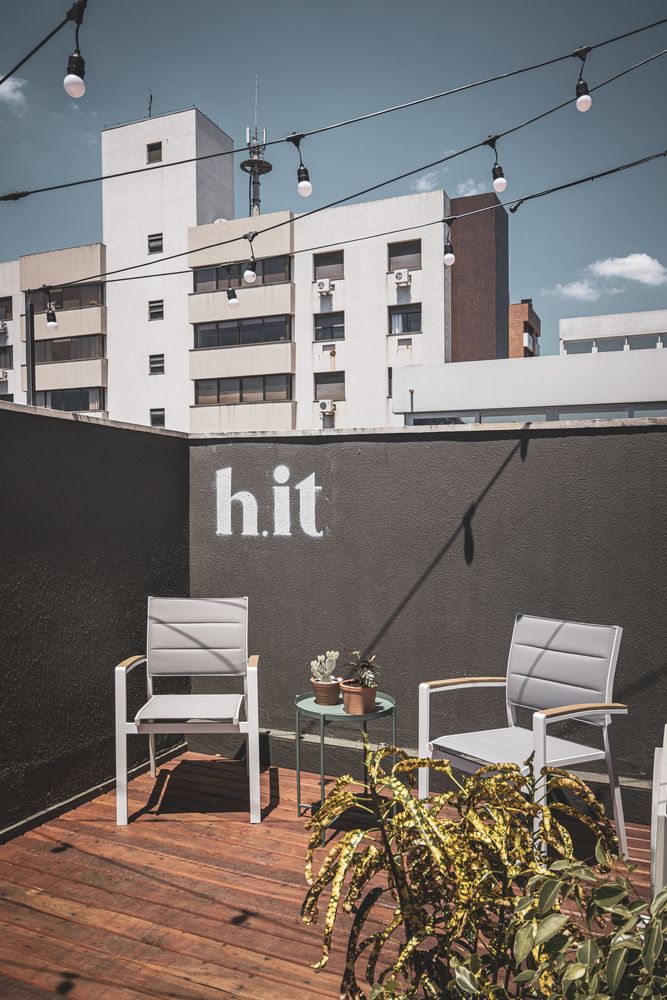
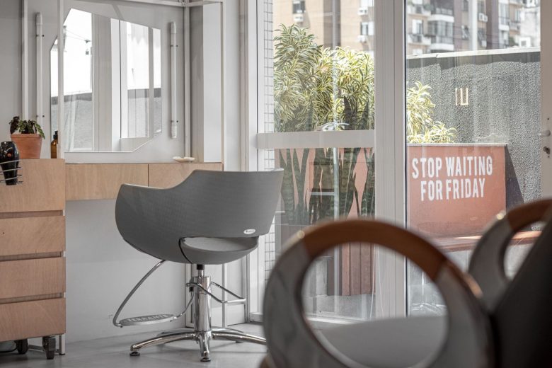
As the main feature of the space, we designed a bookcase in white metalwork, naval plywood and white MDF for the work benches and auxiliary carts for professionals, this materiality is repeated in other furniture in the hall. The laminate floor was replaced by porcelain tiles and there was a need to create a raised platform, covered with the same material, for the passage of the hydraulic piping that feeds the lavatories and the pantry. The toilet was covered with adhesive wallpaper, an alternative to changing the walls coating. The external area was designed as a relaxing space, we designed a bench/chest made with concrete blocks, armchairs, wooden decks and lighting with a string light.
The lighting project is characterized by the use of different types of lighting, the main one being the frontal lighting made by 60cm tubular LED lamps, fixed directly on the wall next to the workstations. Above the washbasins are located 12 sockets with mini bulb lamps, reinforcing the marking between the different areas and functions of the program. The rest of the room receives directional lighting via electrified rails, which accompany the design of the metalwork structure and complementary lighting using a LED profile embedded in the ceiling.
Strengthening the brand identity, a Neon LED sign was used in the main focal point of the room. In the external area, the signaling was done through stencil painting made by the owners themselves, reinforcing the young and urban character of H.it.
Architects: Danielle Martins Arquitetura
Lead Architect: Danielle Martins
