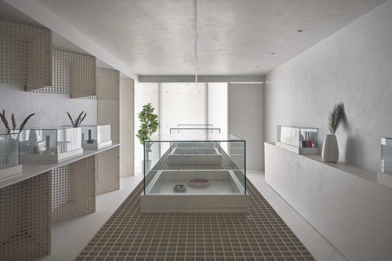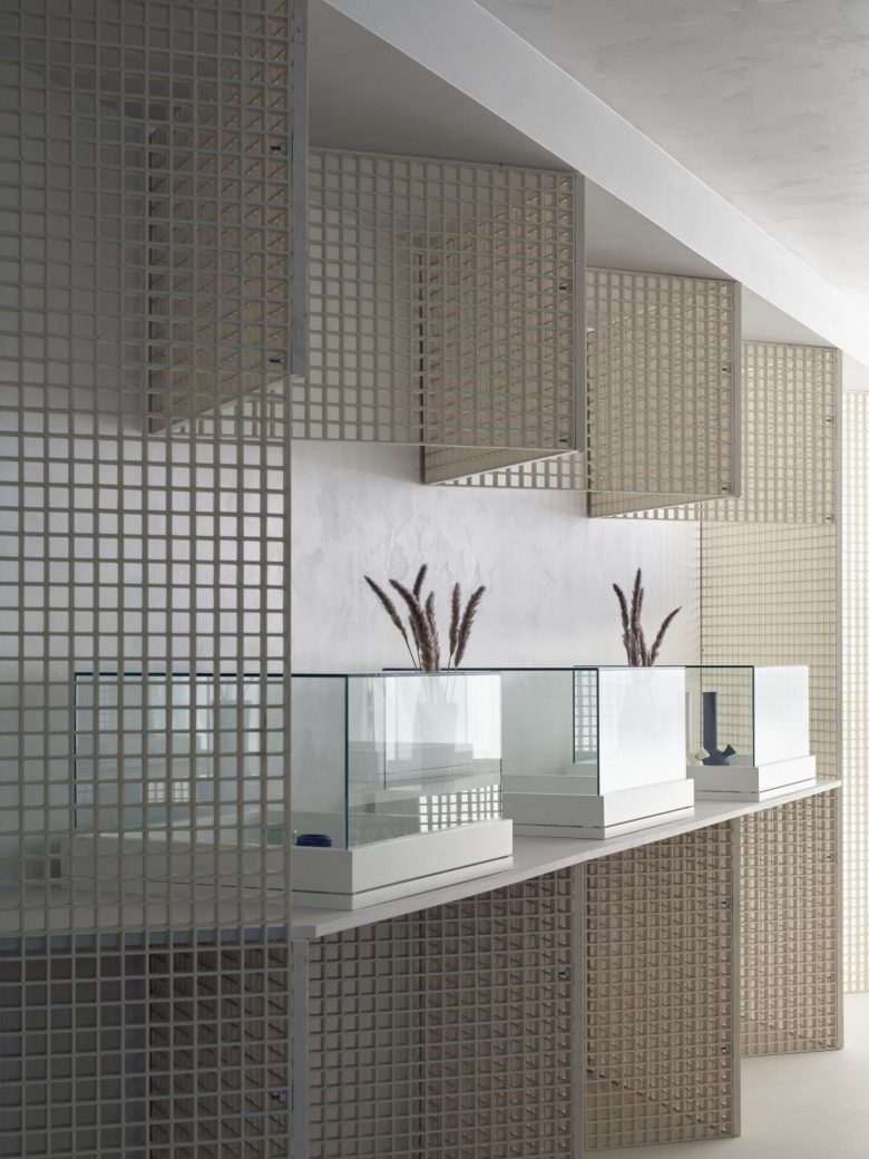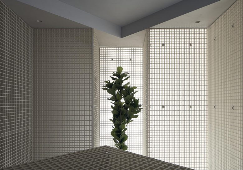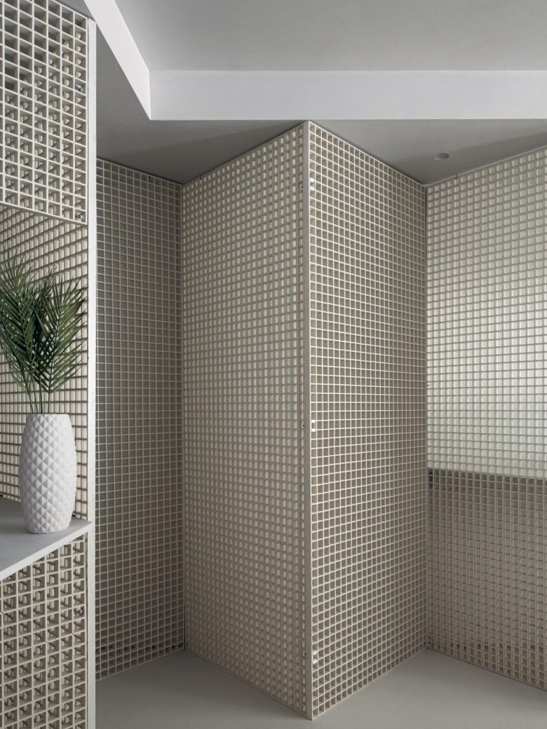
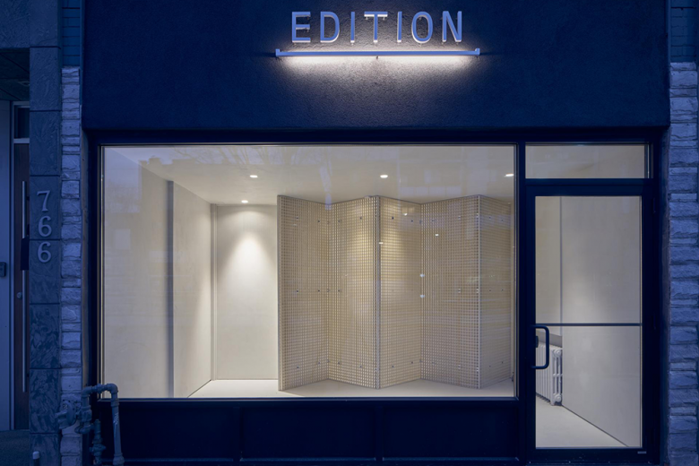
Toronto cannabis retailer Edition has opened its second location, with a minimalistic space designed by StudioAC. The local architecture firm has iterated upon Edition’s first store in the Canadian city. White surfaces, display units, lighting fixtures and décor dress the sleek interior, the most dominant feature of which is cement and fibreglass grating. Supplying a foundation for the furniture and shelving in addition to serving as partitioning, these elements are a signature of the other Edition shop too. ‘Hues, materials and details were replicated while making a clear attempt to differentiate through alternate articulation,’ according to StudioAC founders Jennifer Kudlats and Andrew Hill. ‘Utilizing a simple 90-degree triangulation the industrial grating material becomes its own structure, producing both bracing and support simultaneously.’ The team devised the layout so that natural light would stream in, effortlessly showcasing the room’s curated cannabis products. They explain that, beyond continuing Edition’s aesthetic identity, the geometric lattices provide an ideal monochromatic backdrop for highlighting these goods.
