Apriori Brut by 43’oz
posted by retail design blog on 2021-04-02
Add to collection
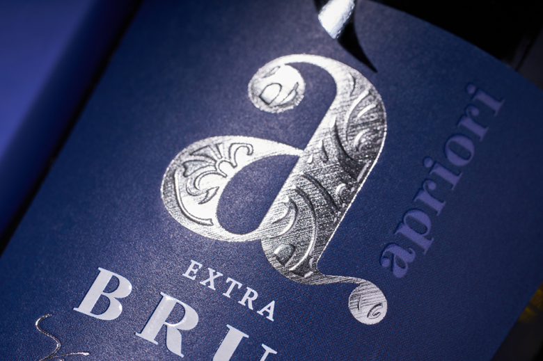
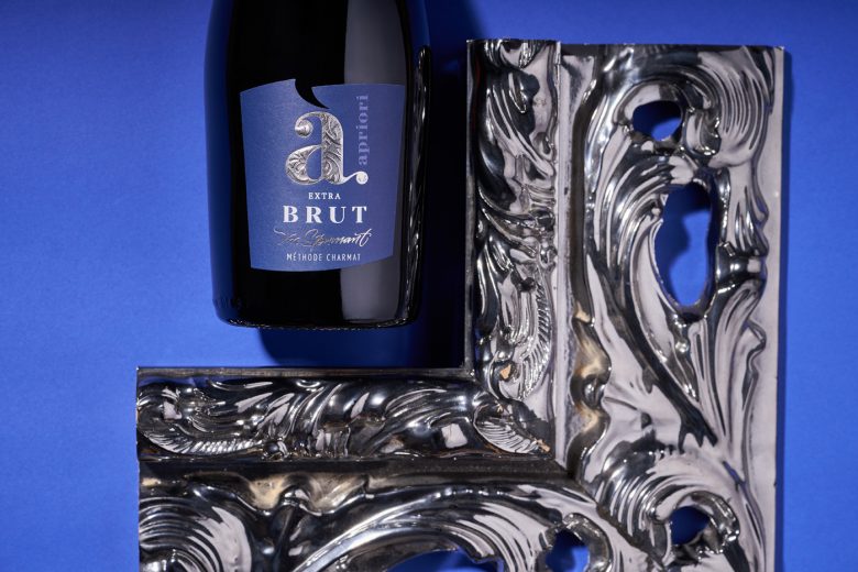
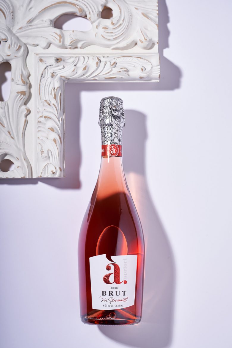
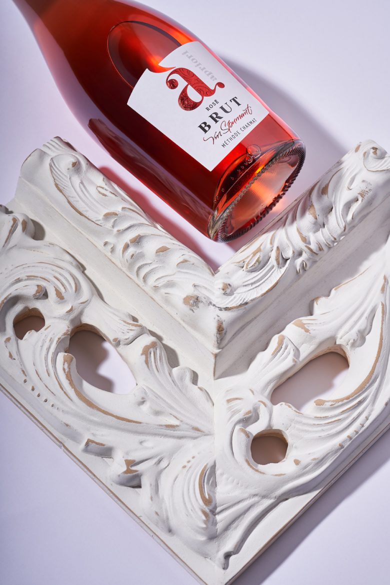
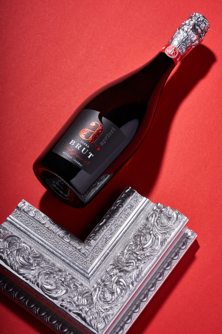
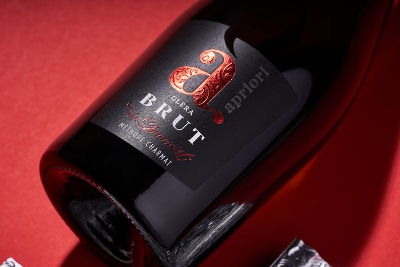
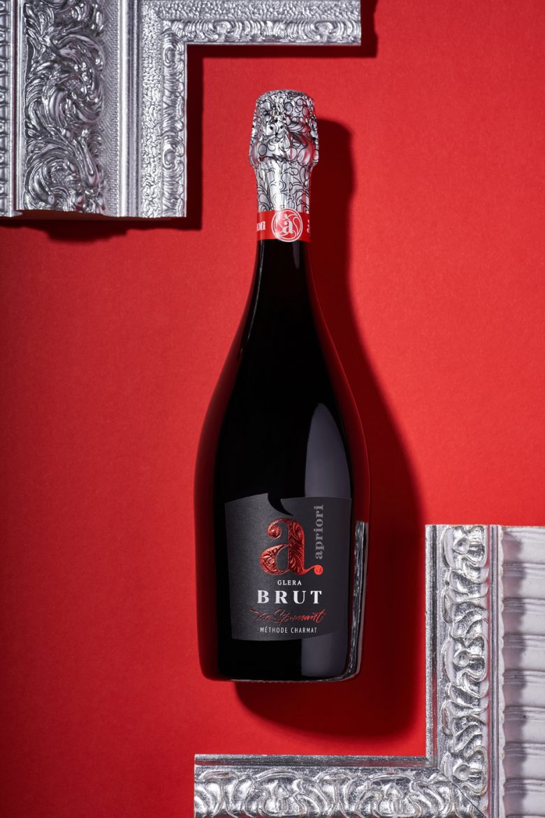
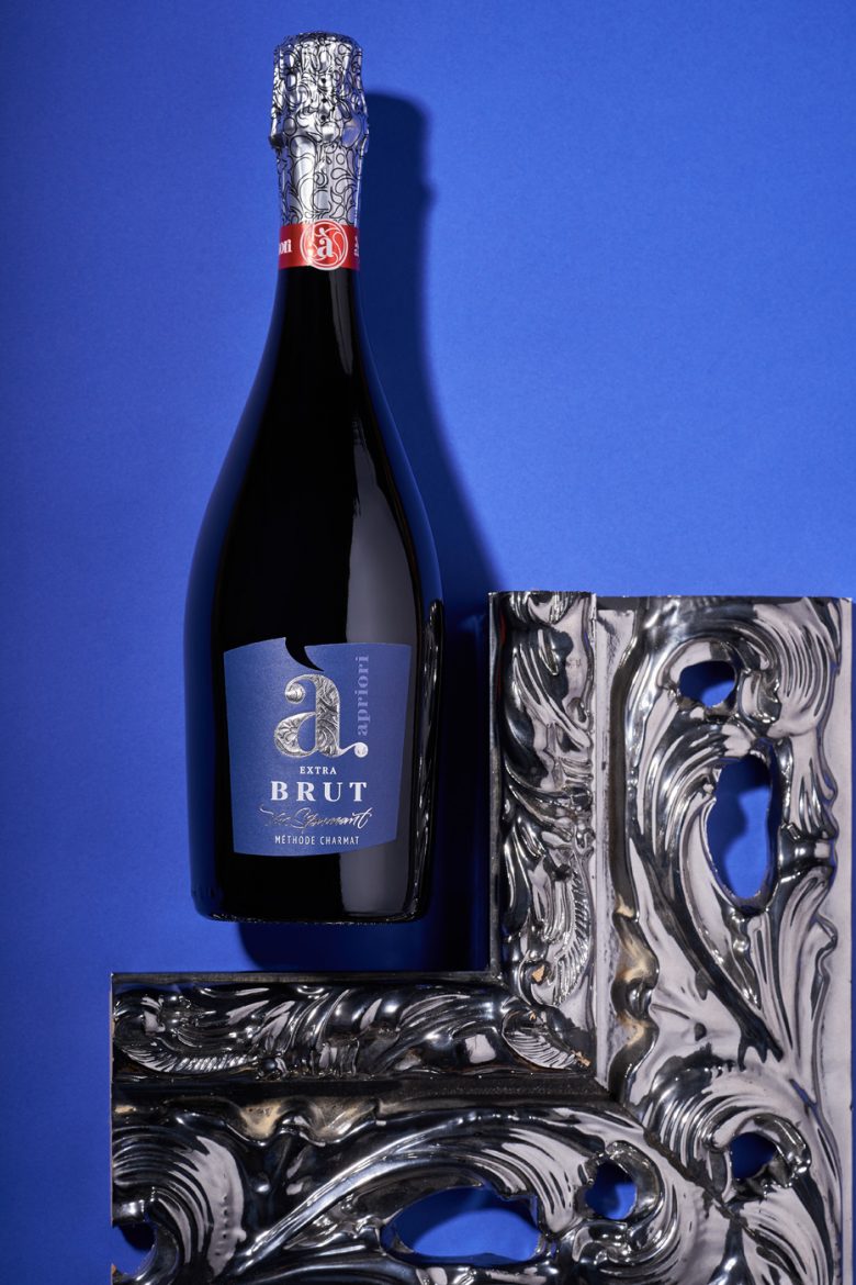
Moldovan wine brand Apriori has established itself in the local market thanks to its affordable yet high quality wines. However, among the company’s extensive portfolio, dry sparkling wines were slightly lost against the background of brighter and fresher products that are not associated with the finesse and restraint of brut. That’s when the company has approached us with the task of modernizing the packaging for their dry sparkling wines, which would emphasize their peculiarity and distinguish them from other products in the portfolio. This is how the Apriori Brut label design project was developed.
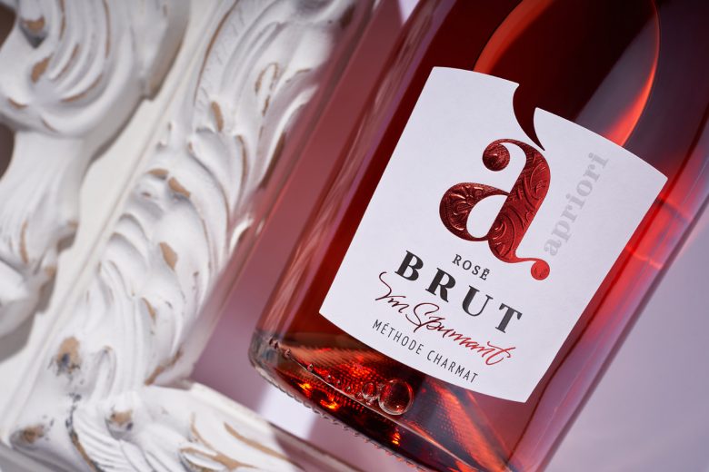
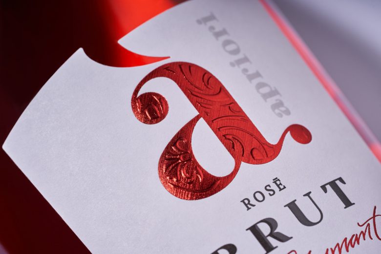
In the course of creating the label design for dry sparkling wines Apriori Brut, a number of decisions were made, which subsequently pushed the company to expand the range of wines of this particular category. Thus, thanks to the transition of the label from ultra-clear technology to classic wine paper, the product became more prominent from the visual standpoint, which made it possible to introduce several alternative positions into the line. The main focus of the composition was shifted to the brand logo and the Brut inscription, while the number of additional elements was minimized. And thanks to the intense use of such post-printing technologies as 3D embossing and foil stamping with micro-engraving, and the original form of label die-cutting, the packaging emphasizes the sophistication and elegance of the drink, which makes it possible to clearly communicate its main distinguishing feature.
Add to collection