Add to collection
Terra is a chocolate specialty store. The chef travels around the world to search for all kinds of cocoa beans, from South America, India to Asia and other places. “From bean to bar” is the brand’s purpose, allowing customers to taste the most original flavor of cocoa at the beginning, and to enjoy its derivative desserts and drinks or chocolate liquor and other products. Dismantling and exploring the essence of chocolate desserts and drinks is actually “experiencing nature”. We turn cocoa beans, the fruit of nature, into various foods. The taste of the fruits produced in different countries and regions vary, reflecting the difference in climate and soil, sunshine and other natural factors. In addition, in the interview with the owner, the owner reflected his experience in the agricultural technology teaching group in Central and South America and living in the forest. These all induced our hope that the design of this room can be more “natural”.
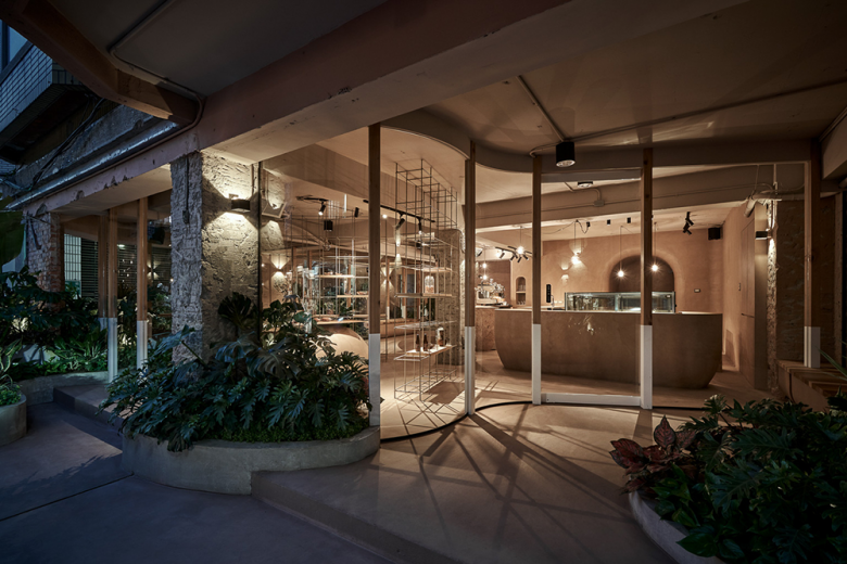
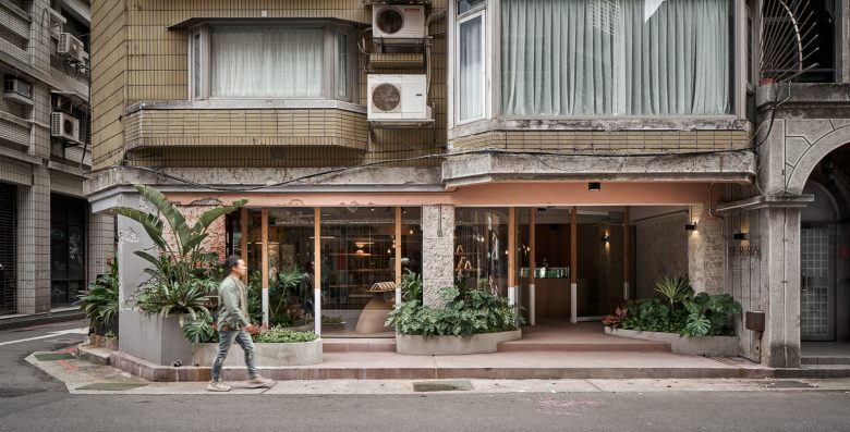
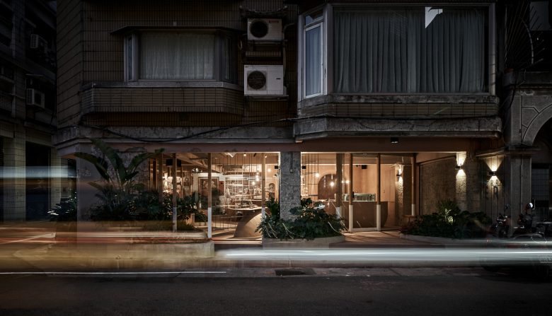
We started designing the first floor of this 30-year-old apartment building at the corner of the old community with the main concepts of “nature invading the indoors” and “BAR in the rainforest”, combining various natural characteristics and elements to present the overall space.
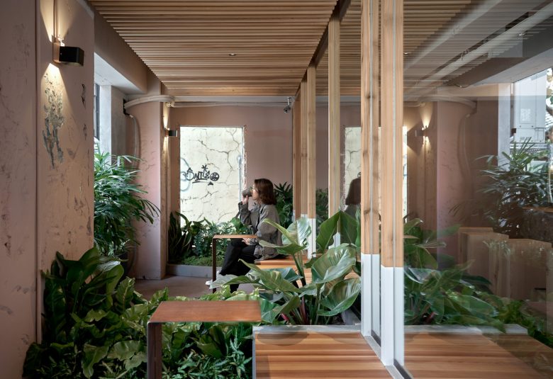
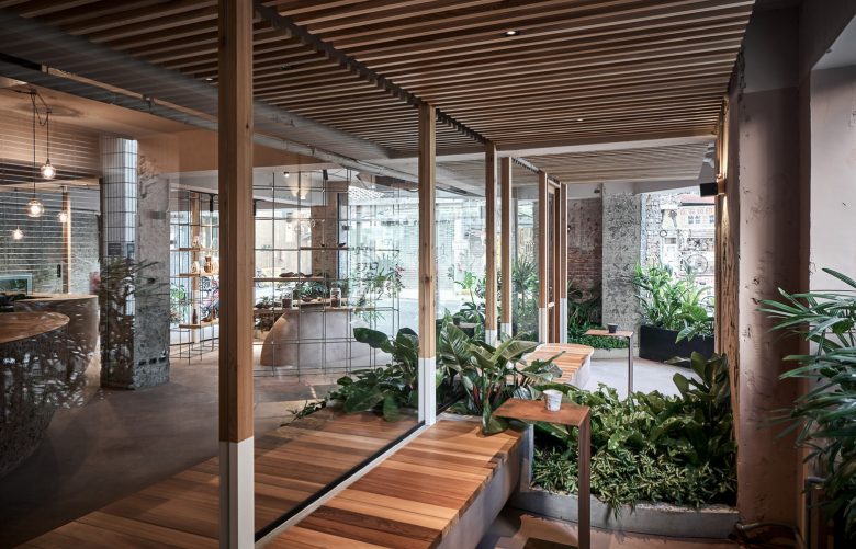
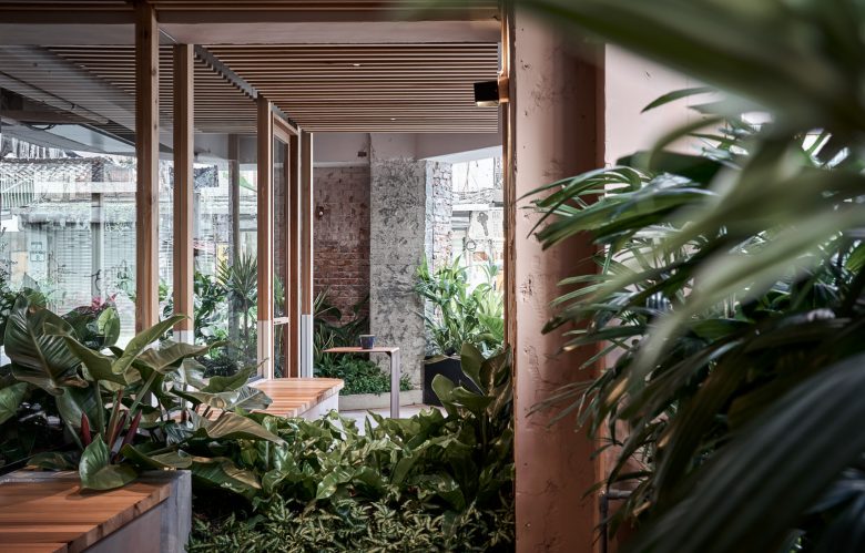
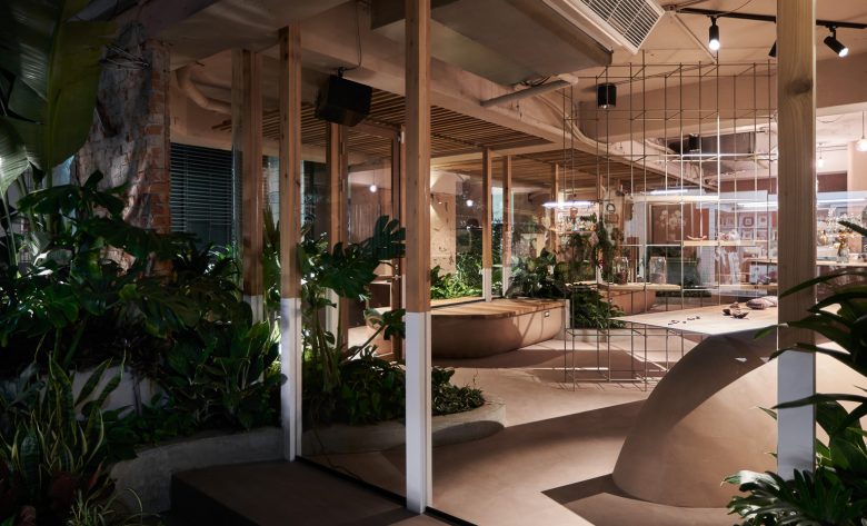
First, we recessed the original indoor area by 1.5 to 2 meters, piled up mounds, planted plants, and used soft design techniques to create a garden-like space on the ground floor of the old apartment. We intend to reshape the image of the corner space and be friendlier to the community. By adding more greenery and landscape, and even leaving the front yard entry for community residents to stop and rest, this allows the new brand to commingle with the community through an inviting image and spatial style, giving the commercial space a much warmer sense of community and locality. (Let the commercial space be more integrated into the local community)
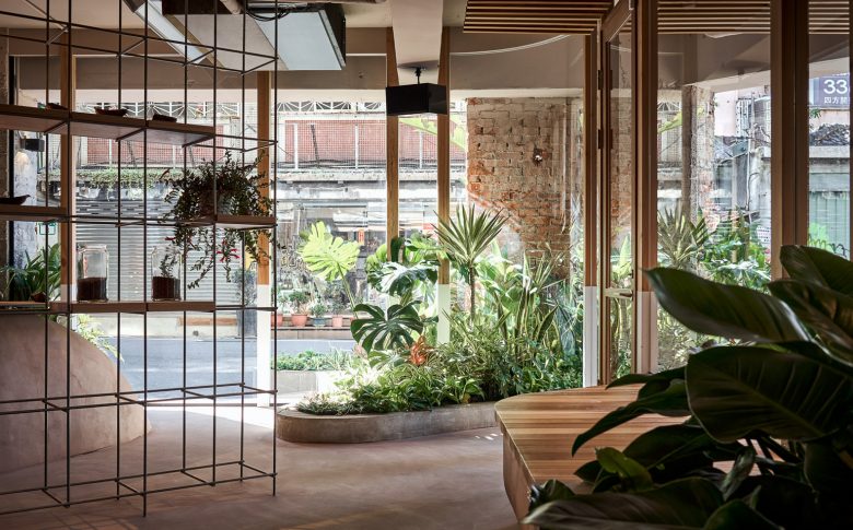
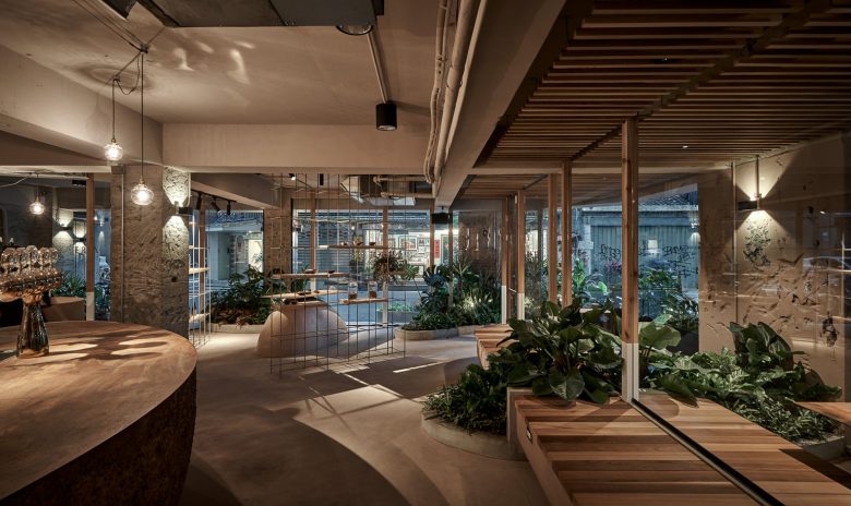
The above-mentioned recess space becomes an outdoor dining area here, using plants and mounds as boundaries, allowing users to experience the feeling of being surrounded by nature, but not excessively dividing the overall space, just the feeling of being in nature. The space seems to have boundaries, but they are connected to each other. In this way, light and wind can easily enter the base through the retracted surrounding corridors. The sunlight flows freely in the space through branches and airflow, creating a more comfortable base microclimate and allowing users to be surrounded by plants and enjoy meal time.
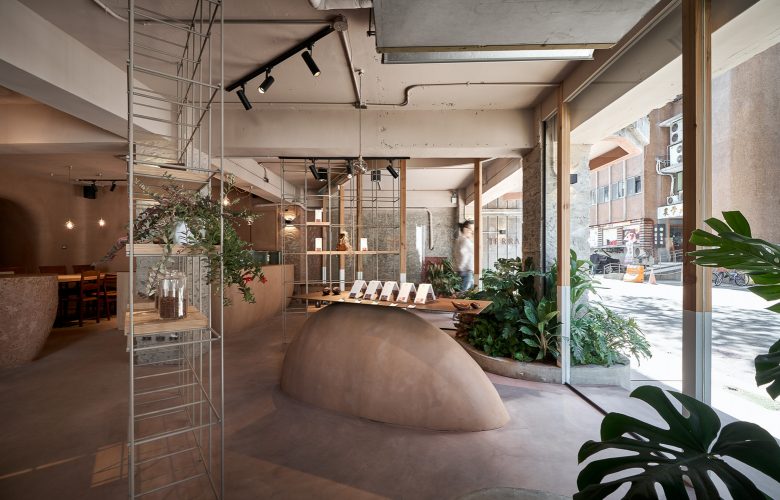
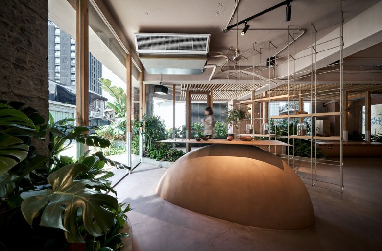
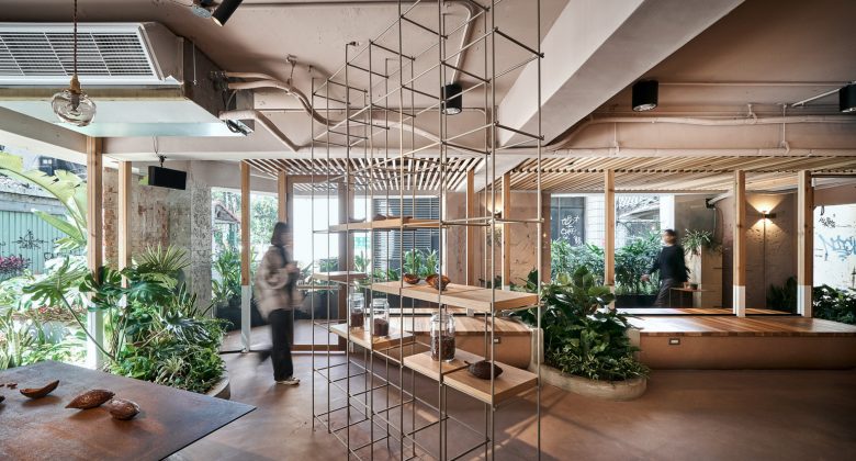
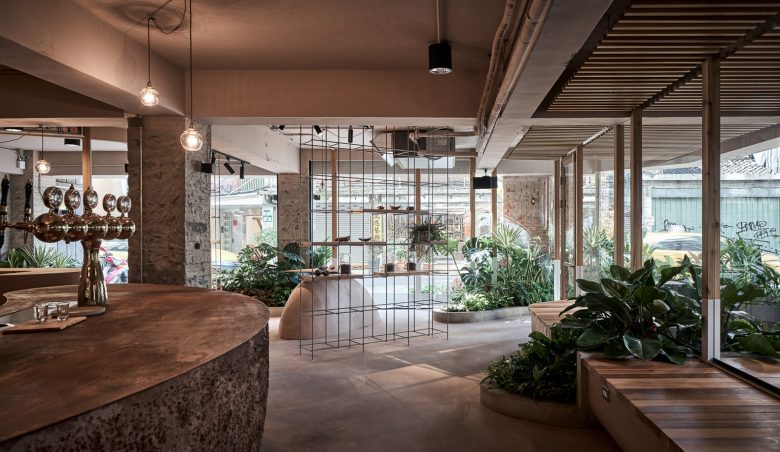
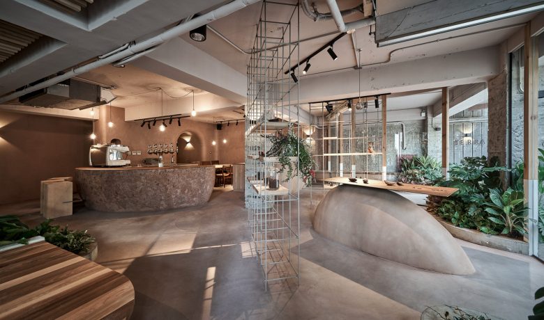
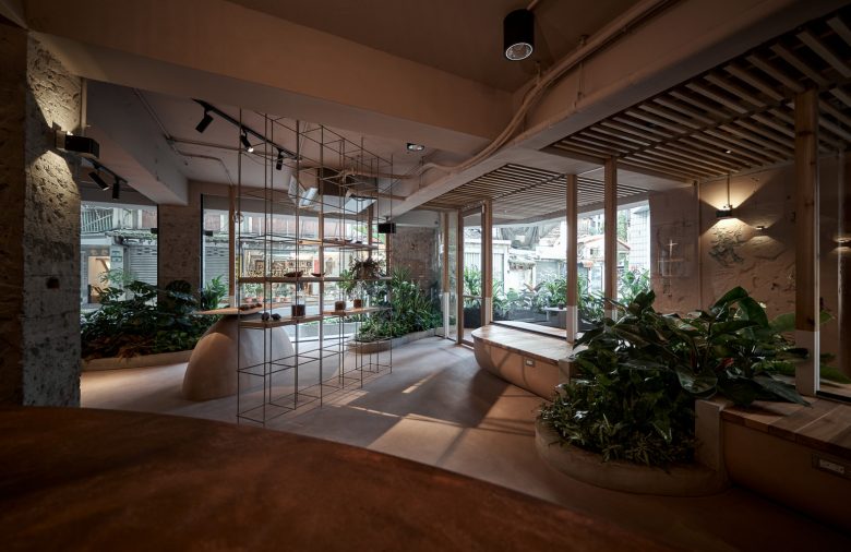
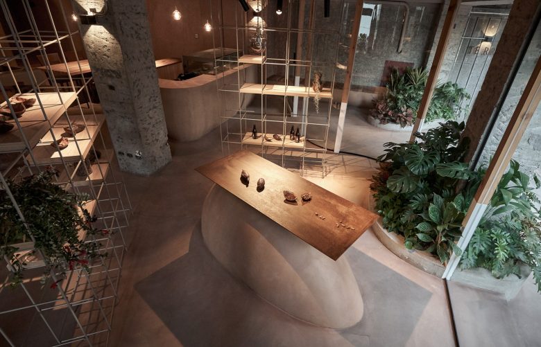
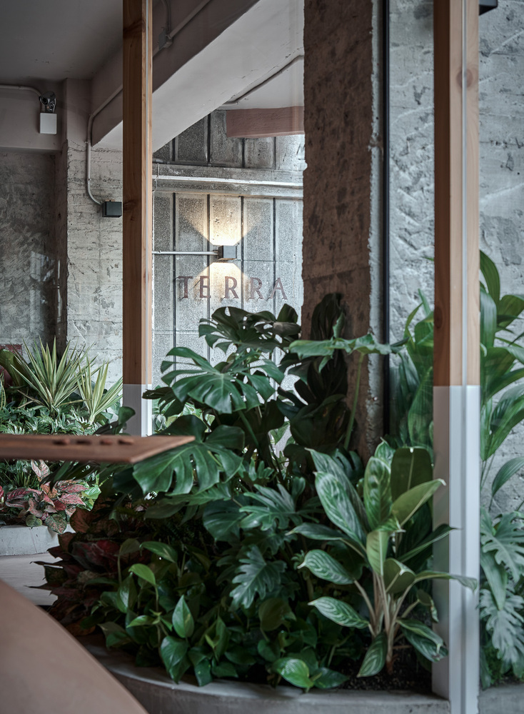
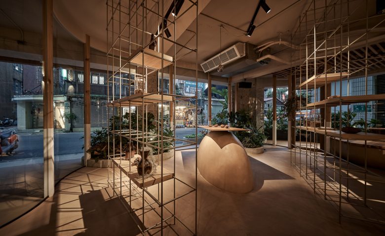
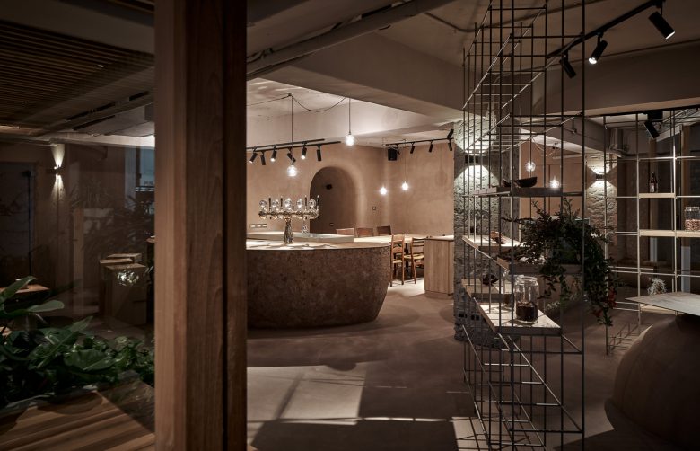
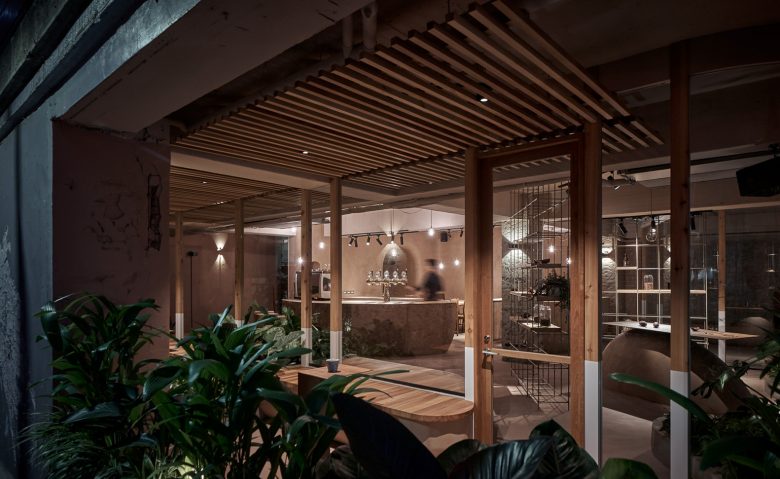
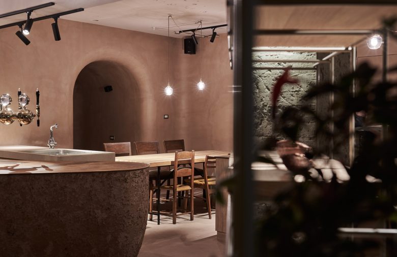
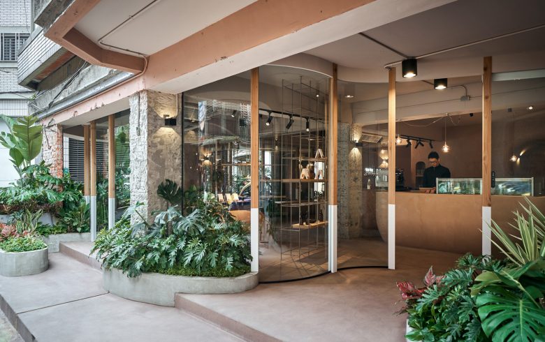
The theme of “Nature Invading the Indoors” runs through the entire venue. We let the outdoor plants and mounds extend into the interior, and the “Natural Spread” design technique makes the indoor atmosphere more natural and blurs the boundary between indoor and outdoor. This extends the sense of vision and creates the feeling of “plants and nature spreading from the outside to the inside” and “being surrounded by nature” for indoor users. Through radioactive graphic design techniques, the planting mounds, display racks, etc. are all directed to the indoor bar, which can also be understood as diverging from the bar as the center. This design technique allows the visual sense of the indoor users to extend outward, resulting in visual fluidity, magnifying the space experience and making the mood more free; while for the outdoor personnel, it creates a visual attraction effect like a single point of elimination, increasing the curiosity of passersby. We deliberately made the moving lines as twists and turns like the “rainforest” path in the natural environment, and the whole scheme is regarded as a combination of several circulating moving lines. The nonlinear walking path in the space makes people unable to directly feel the extent of the space. The walking experience is more natural and interesting, and it also makes the space more fluid.
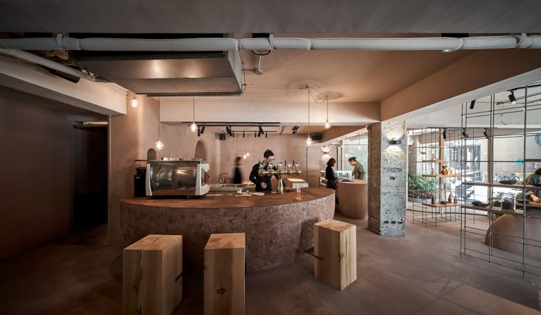
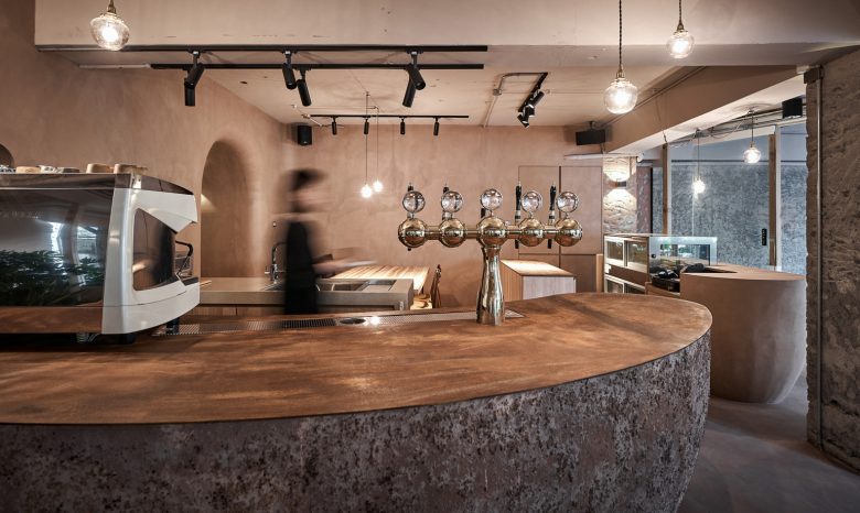
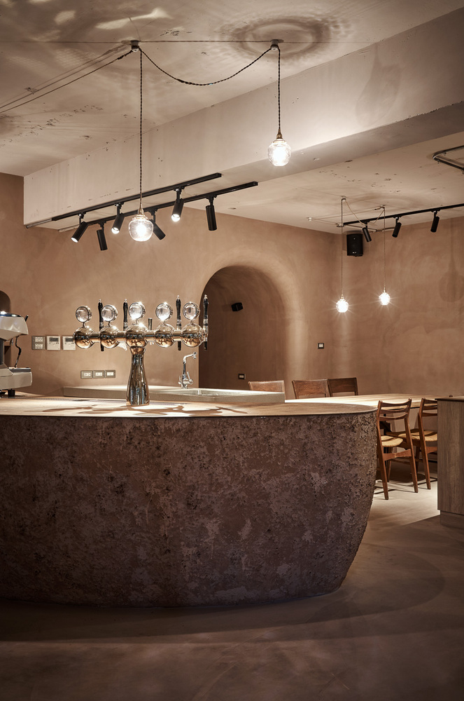
The transparent material (glass) is used as the exterior wall to strengthen the design intent of the connection between the interior and the exterior and the blurring boundary. The solid wood frames and the transparent display shelf symbolize the visual sense of the natural forest, and the curved glass exterior wall reflects the fluidity of the space. The overall color plan of the interior is derived from “soil”, echoing the theme of natural fruits, and used cocoa bean fruit to design display stands, cake cabinets and bar counters. The bar counter is also made using the ground fruits and shells of cocoa beans as paint, which we invited the chef to paint with us by hand, creating more natural texture and adhering to the natural theme.
Extending the concept of the brand “Bean to bar”, we used “from nature to space” to develop a variety of design techniques, from creating a friendly community space, an overall natural atmosphere, to a better base micro-climate, hoping to bring more possibilities to the space and the community.
Architects: Soar Design Studio
Lead Architects: Ray Chang
Detail Design: Jiaxun Wu
Photographs: Hey! Cheese
Add to collection