
Add to collection
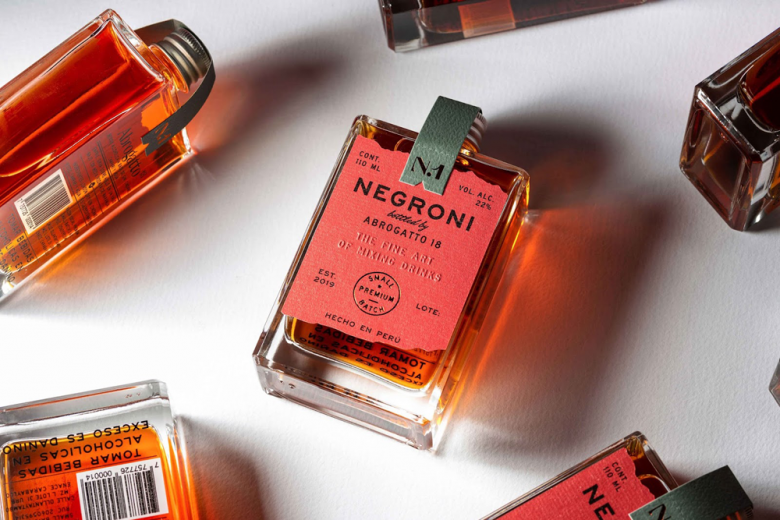
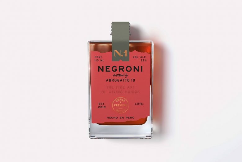
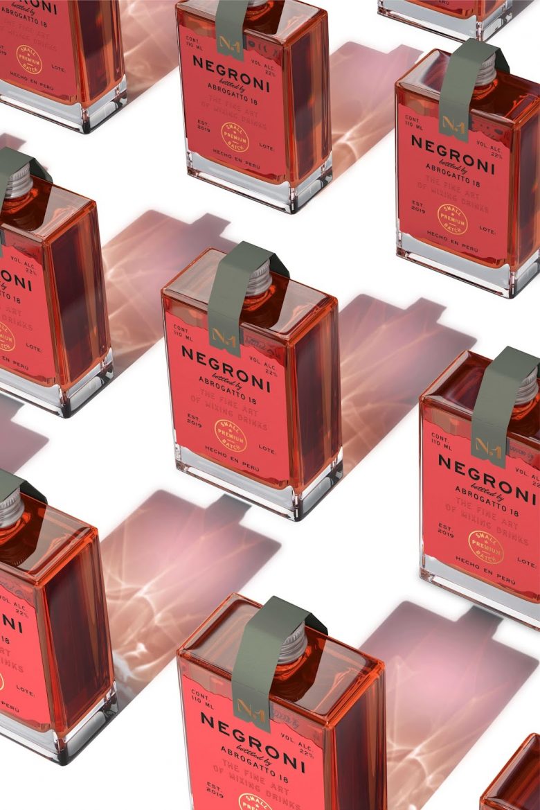
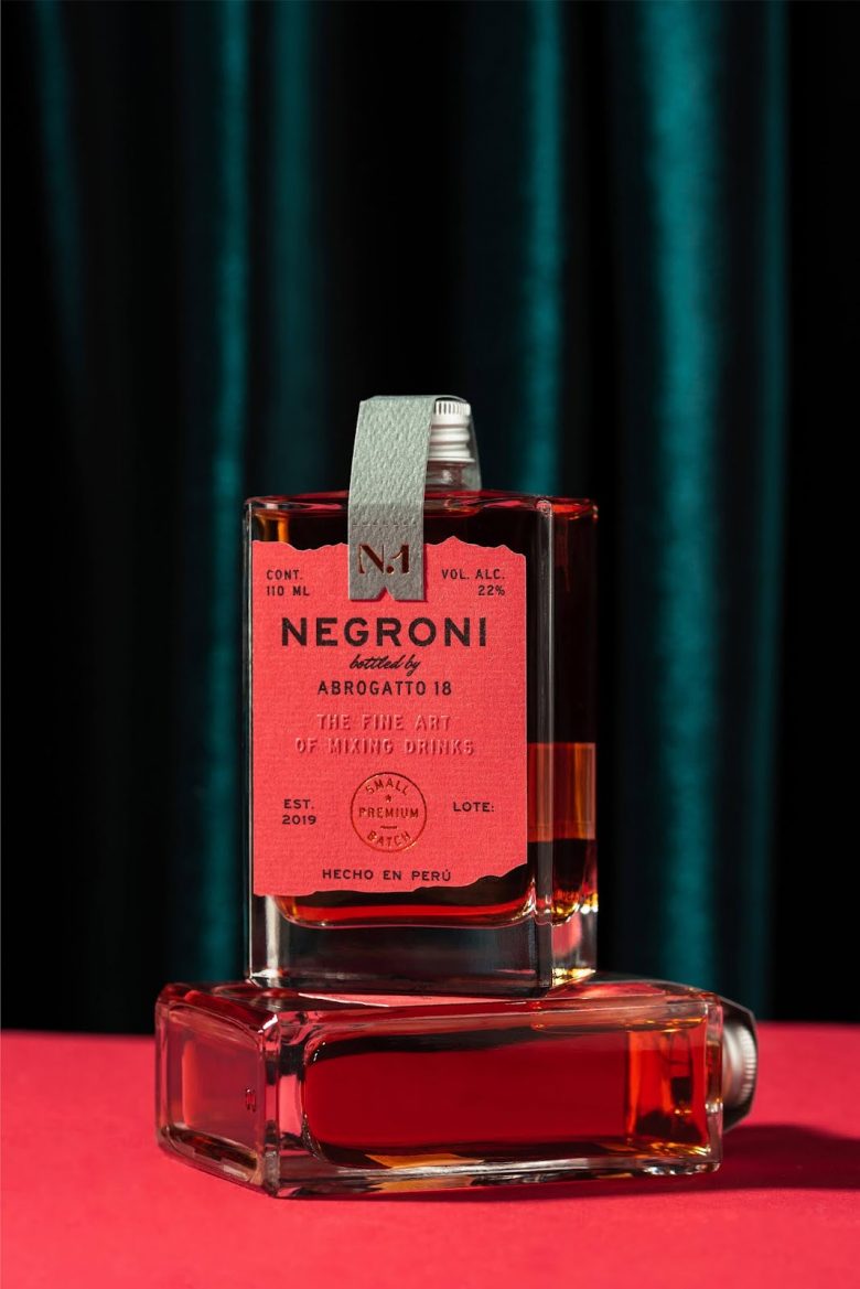
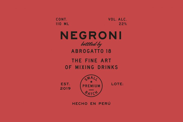
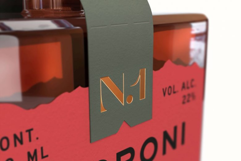
Abrogratto18 is a brand of premium quality, ready-to-drink bottled cocktails. As it is a small company, they have chosen to create collections of small batches of classic cocktails, the first one being Negroni. The visual identity of Abrogratto18 is versatile and neutral so that it can adapt to each collection without losing the essence of the brand. The packaging was inspired by the name of the brand and history of alcoholic drinks around the world. The design had to be sophisticated and classic but adapted to a contemporary context and in line with the values of the brand: precision and quality.
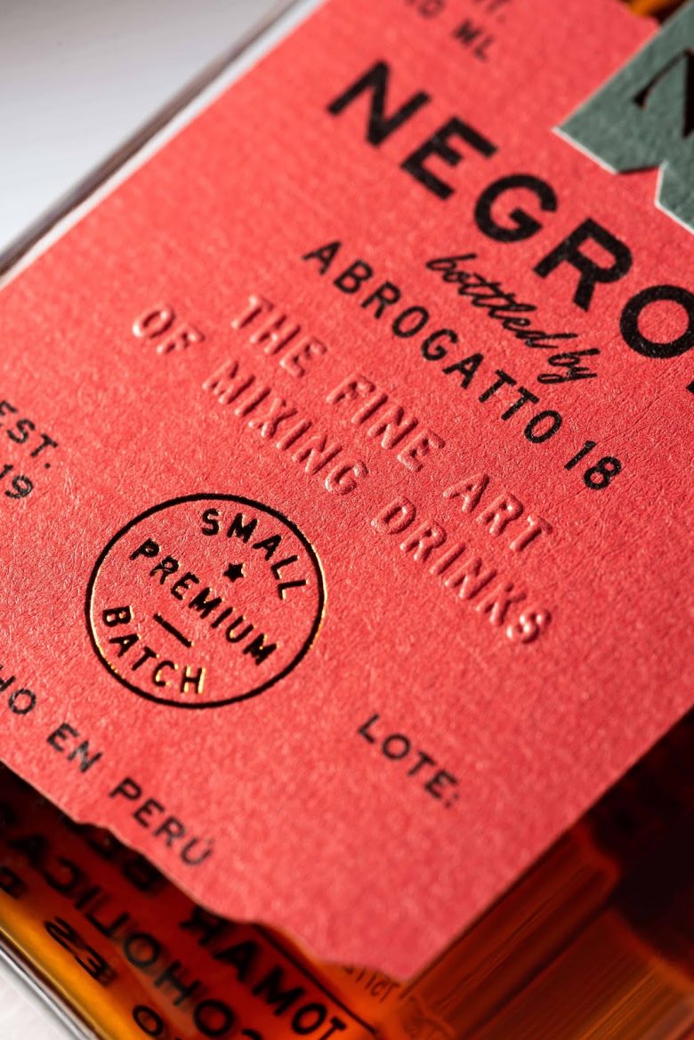
Abrogato is a word in italian that in English, means to abolish, and 18 refers to the amendment that was abolished in 1919 so allow alcoholic drinks to be sold and consumed legally. This idea in reality has a negative connotation and so was represented through the torn edges of the label. This, in combination with the colours and the unique bottle, achieved a packaging that stirs emotions and provokes discovery.
What’s Unique?
It is unique because while Negroni is a drink that has a lot of history, the design was created to convey a modern feeling without losing the traditional and classic vision.
Designed by Alejandro Gavancho


Add to collection