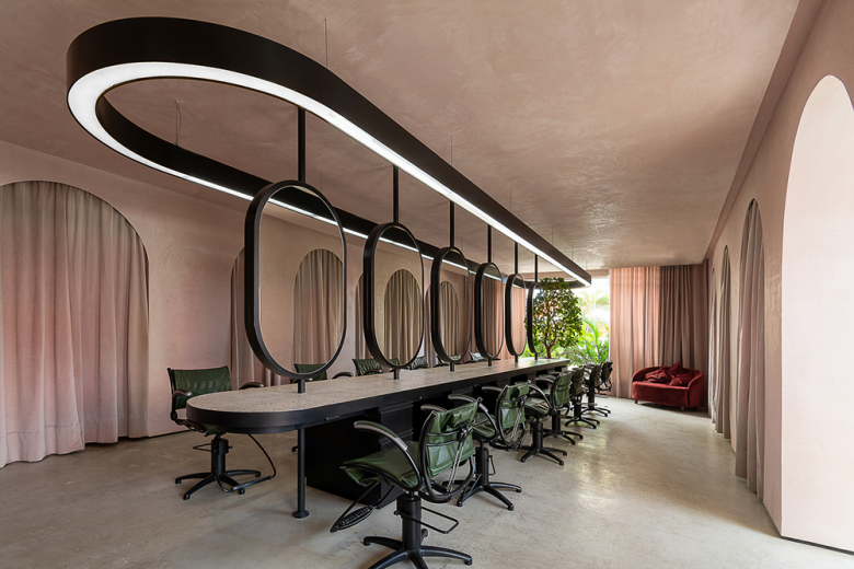
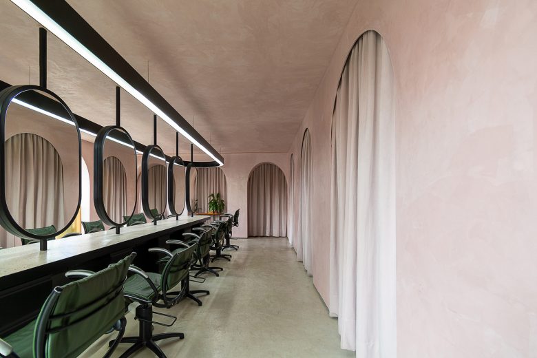
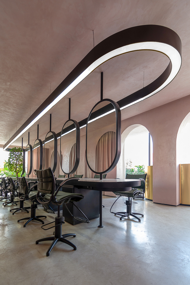
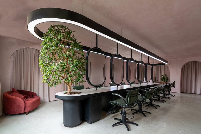
For the design of this beauty salon, we sought to invert the spatial logic common to most beauty salons: hairdressers and workstations in front of a wall with a gap in the middle. For this, we created a large collective table integrated in a single design gesture, filling the middle of the space and leaving the walls empty. The design seeks to maintain a coherent language incorporating all the necessary elements, we designed oval mirrors fixed to the ceiling and to the counter and finished off the space with a large luminaire that guarantees linear and equally distributed lighting for the services. The lack of hierarchy among the professionals, who work side by side serving clients, guarantees the same experience for everyone in the salon, without separate rooms or special chairs.
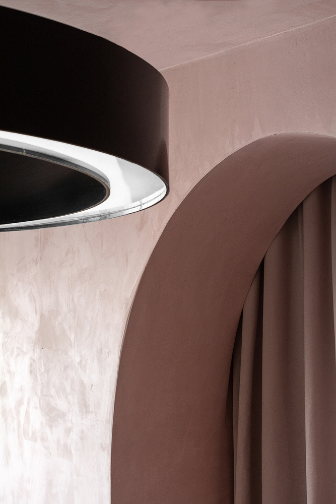
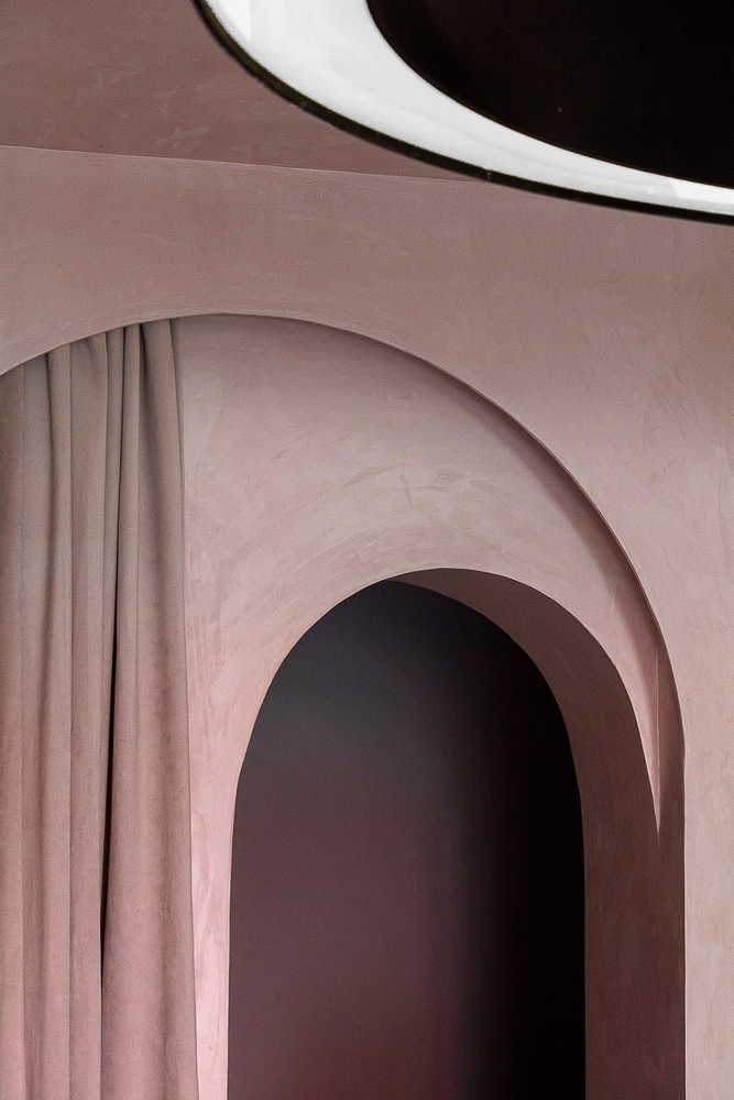
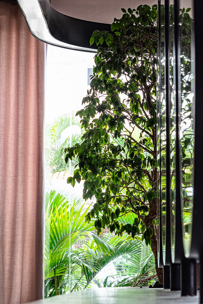
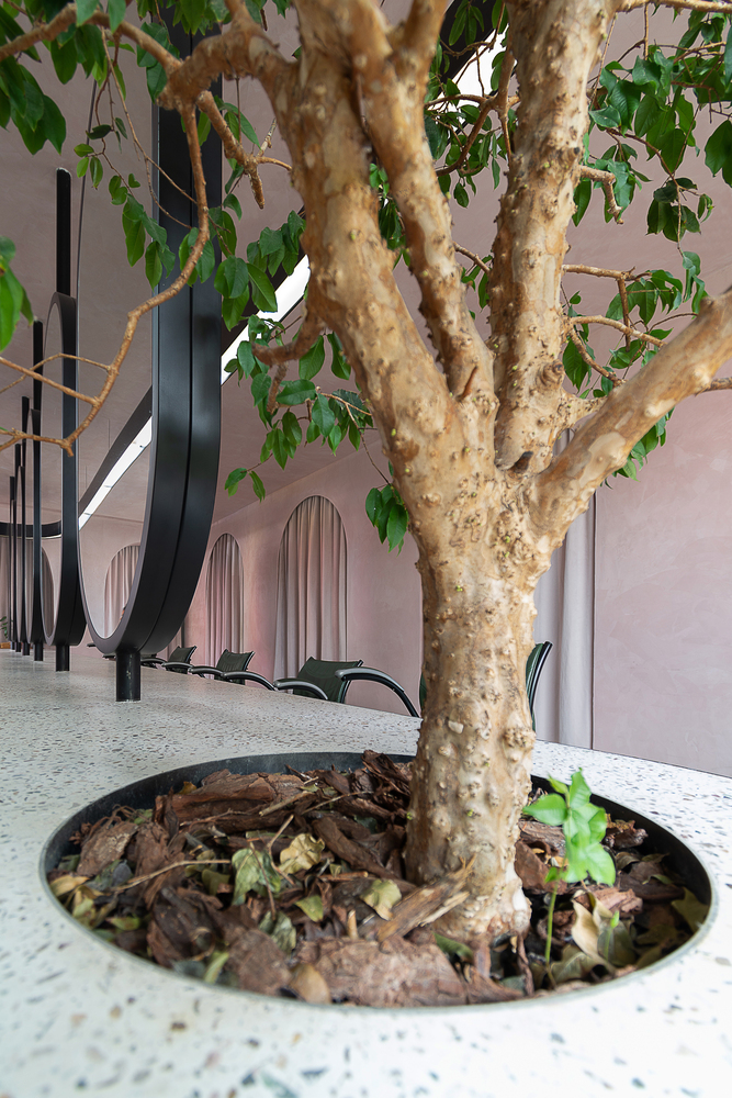
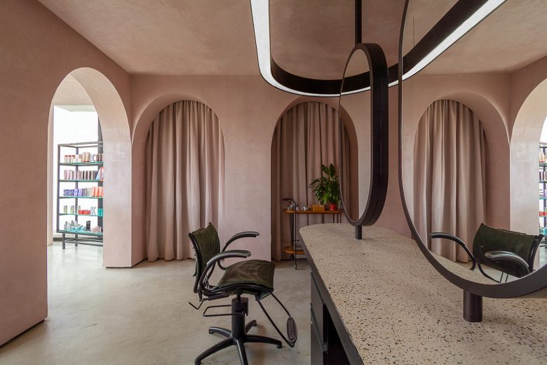
The predominant color is a grayish pink, which contrasts with the dark green of the chairs and the foliage of the plants that are very present in the space, including a small tree integrated into the design of the large collective table. The use of arches proved to be a powerful way of echoing the design and concept of this project, creating a playful environment with rhythmic repetitions, proportions, passages and contemplation; some are passages hidden by velvet curtains, while the others are walls covered with the same velvet curtains in the same shade as the walls and ceiling, giving a playful dimension to the environment.
The reception was designed as an environment that also includes other uses, such as displaying beauty products for sale and a bright space for manicures to work. Another interesting feature of this hall is the multiple reflections of the arches, the lamp and the oval mirrors themselves, which expand the perception of space at different points, transforming the environment at every glance.
Architects: TRPC Arquitetos
Project Team: Adalberto Vilela, Cecília Miscow, Tiago Schultz e Vanessa Sampaio
Photographs: Adalberto Vilela




Add to collection
