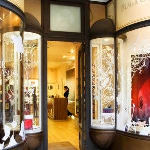
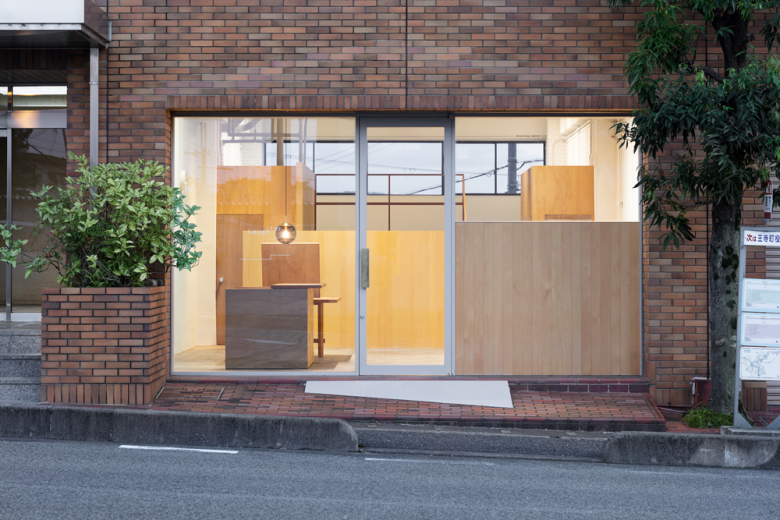
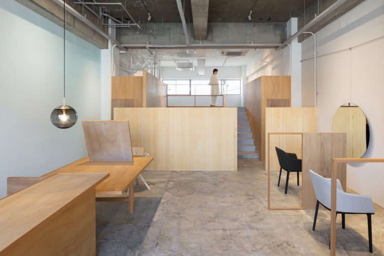
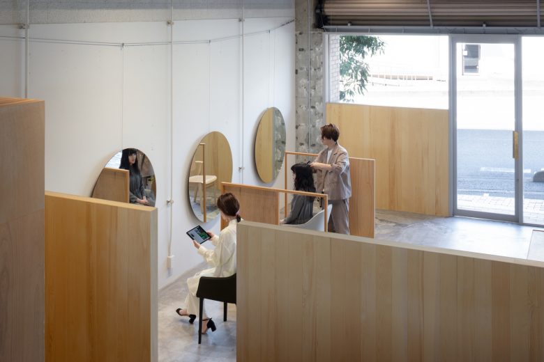
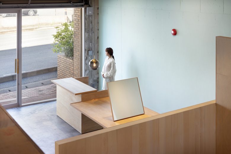
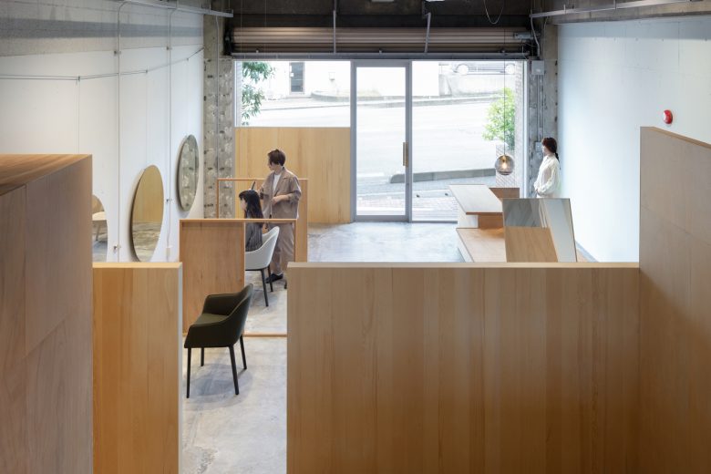
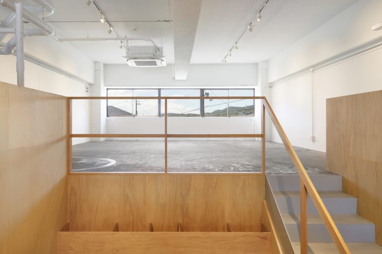
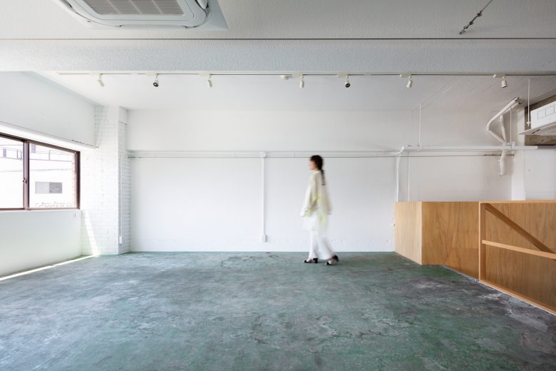
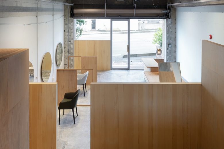
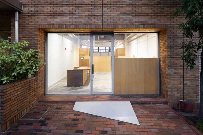
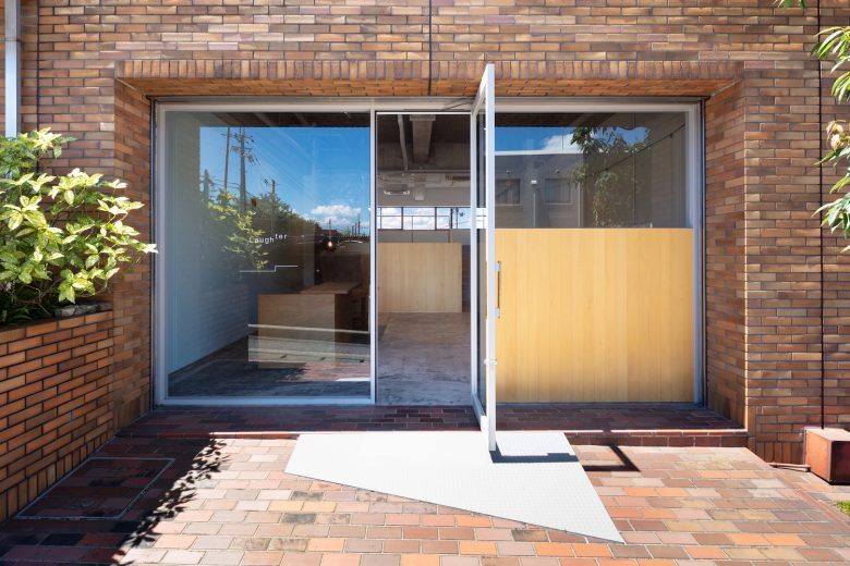
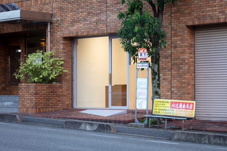
The north entrance faces a main road and features a wide, open space with high ceilings. The south end of the salon has a mezzanine level that rises 1580mm above the main floor. From the high windows, cutout views of the sky are visible. We designed this salon to take full advantage the space, which occupies the full length of the building from north to south.
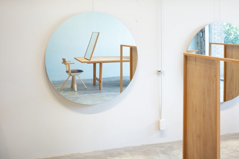
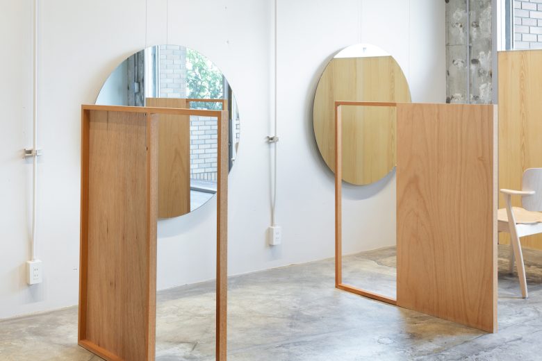
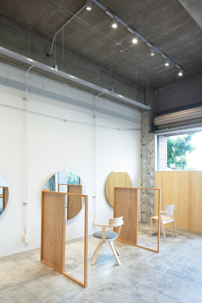
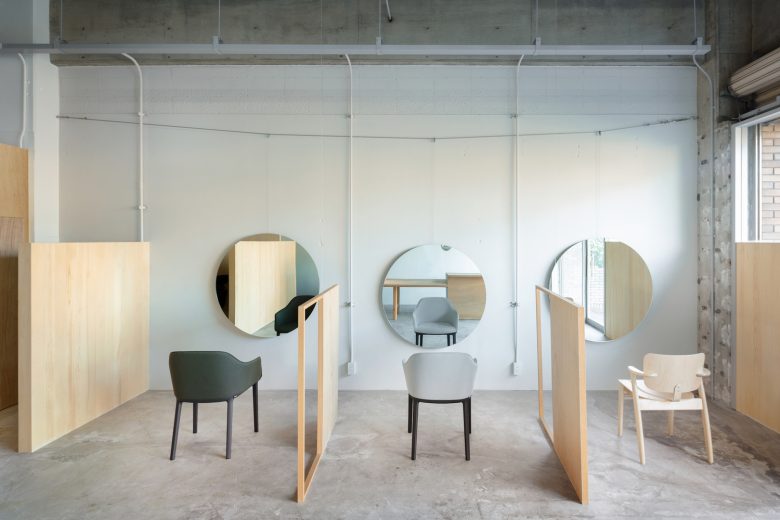
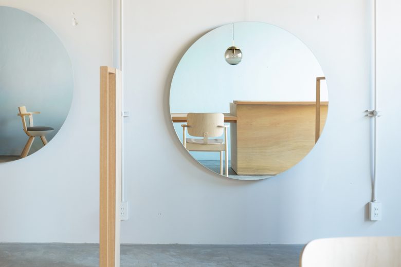
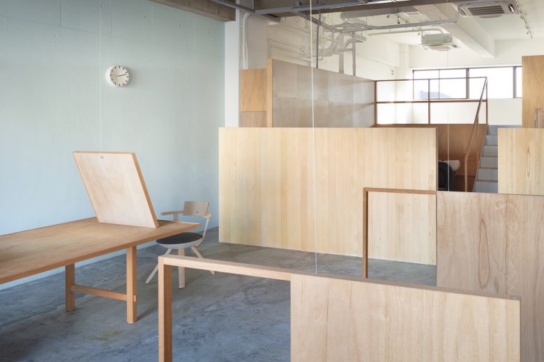
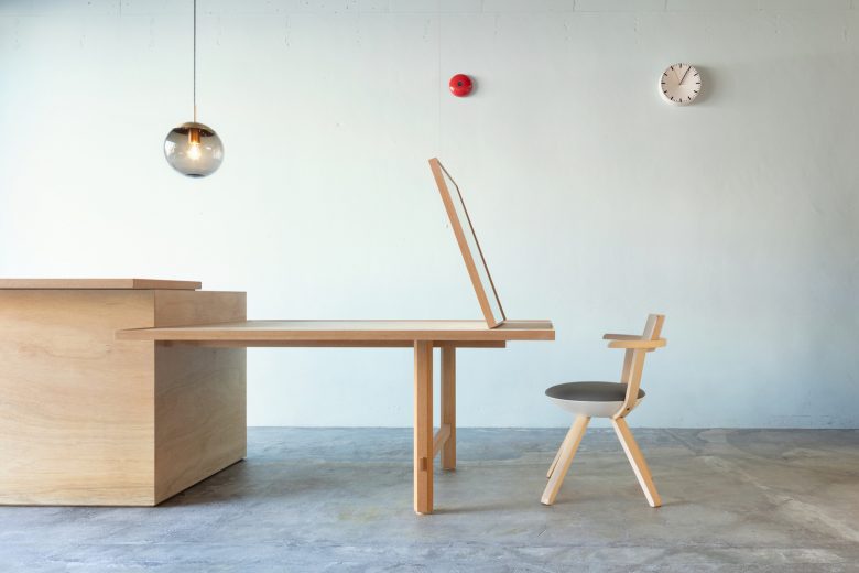
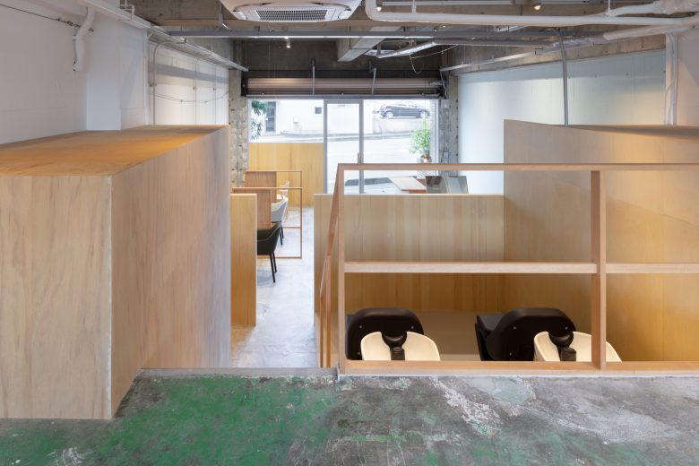
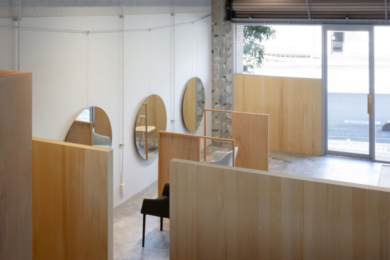
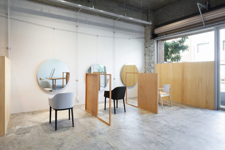
Between the façade and interior, a wall that is the same height as the mezzanine delineates the cutting area. This blocks the line of sight from the main road while still letting in natural light from above. Messenger wires strung near the ceiling run longways into the space, serving as hangers for mirrors and partitions. The wires can be used for a variety of purposes. The parallel east and west walls are rendered a pale, complementary color. When gazing into the styling mirror the change in color creates a memorable sensation akin to that of looking at the surface of water.
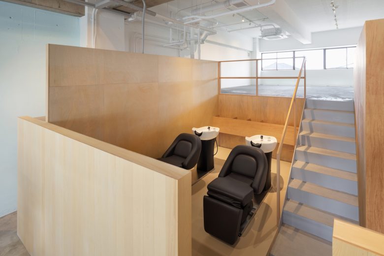
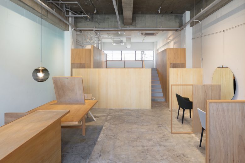
Further into the interior, the shampoo area is housed between the wood-paneled wall and mezzanine, which are the same height. The valley becomes a calm and tranquil space. The shampoo area is flanked by the restroom and back room, both boxy, enclosed spaces. This placement preserves the location’s north-south open flow, one of its defining characteristics.
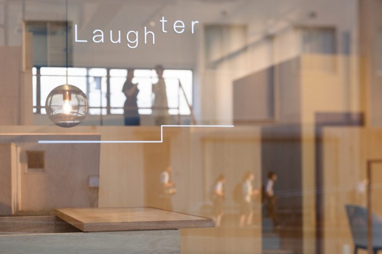
The mezzanine level in the back of the salon services as a studio space to photograph the salon’s hair designs. It could also be a gallery. Messenger wires allow for the future expansion of the salon’s functional space. We designed the salon’s logos and counters with the mezzanine’s step up/level up in mind, a motif with a positive connotation.
The salon’s name “Laughter” reflects the owner’s ideal of making the salon a place that engenders smiles and joy. Fittingly, the salon has been busy with clients since it opened.
Architects: SIDES CORE
Lighting Design: DAIKO, Yoriaki Kokubu, DAIKO
Space Design: Sohei Arao
Design: Sumiko Arao
Photographs: Takumi Ota


Add to collection
