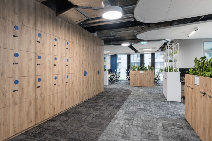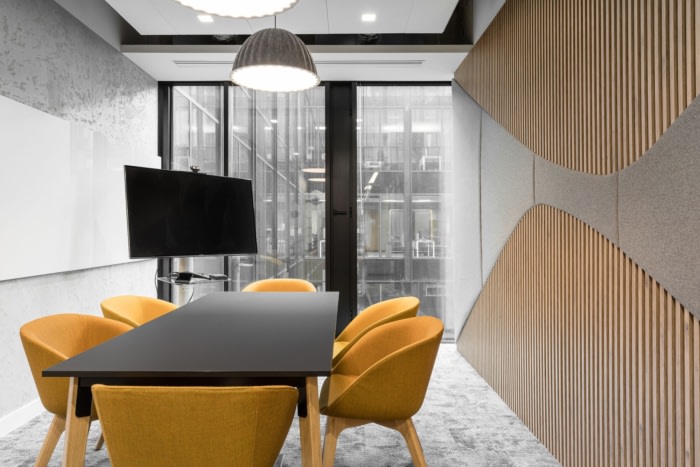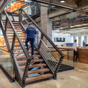
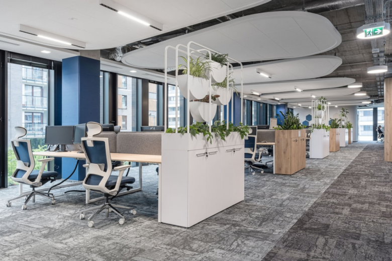
BIT Creative Barnaba Grzelecki was thoughtful in every choice of color, material, and wall finish to give the Solenis offices a warm feel in Warsaw, Poland. The new headquarters of Solenis company is located in Lixa building in Warsaw. The office occupies the total area of 3500 sqm on three levels. The space is designed in the open arrangement with separated conference rooms, single office rooms and some special spaces such as rooms to work in quiet and some social areas which provides the possibility of the integration between the employees.
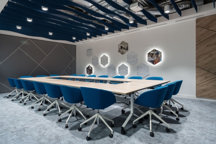
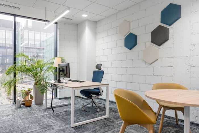
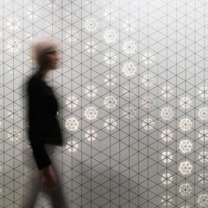
The whole project of the space was inspired by the branding and the company’s field of activity. The cold blue colour has been warmed by the huge amount of wood, natural green of the plants and subdued colours. The hexagonal shape referring to chemical formula (the company produces and distributes the chemical substances) has been softened by rounded shapes inspired by water’s natural fluency.
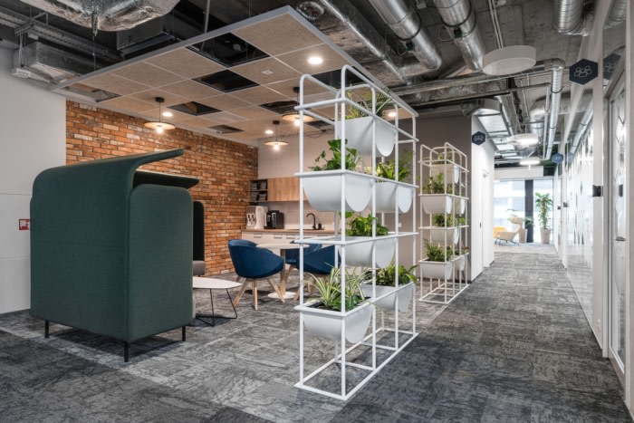
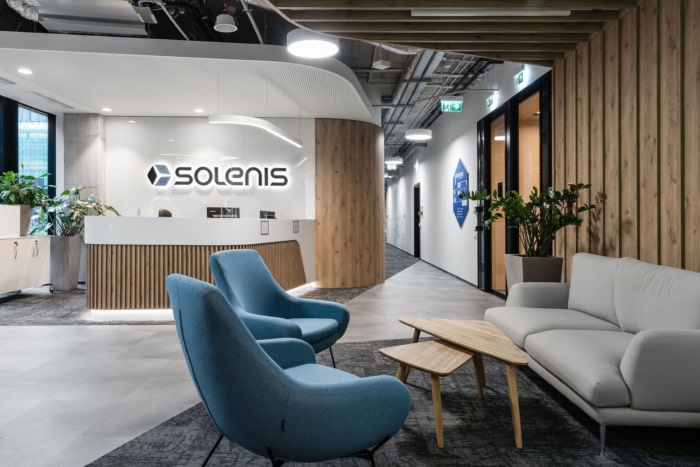
The reception is located on the first floor and directly connected with conference rooms and waiting area equipped with a coffee point. While designing the office for Solenis company we were focused on creating a cosy interior with a good atmosphere, that would be enriched with the accents referring to company’s activity. We decided to use rounded shapes that harmonize with the colours of natural wood and plants. In the entrance area we designed a wall with natural moss which is really well completed by wooden wall as well as the furniture. The additional advantage of the space is the self- service coffee point, where the clients not only can help themselves with the coffee but also get to know the short history of the company which is presented in pleasant graphic way.
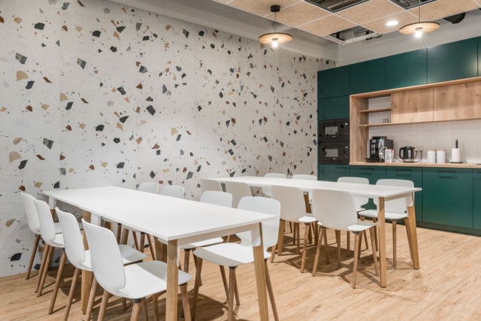
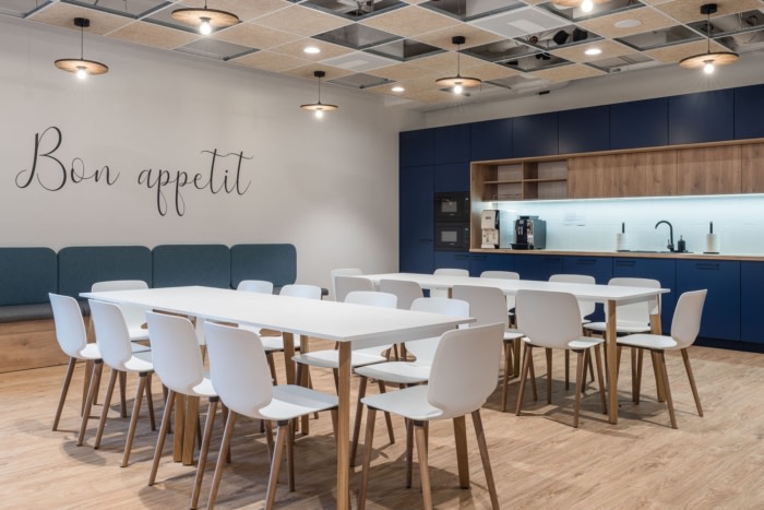
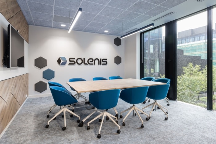
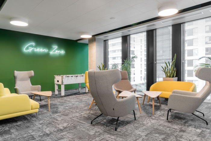
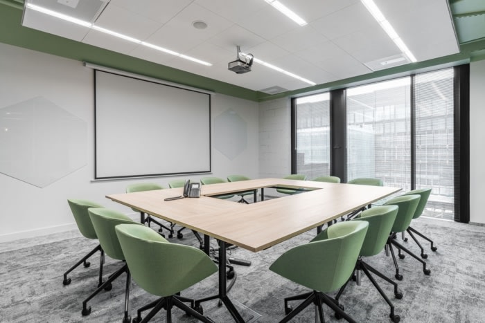
The whole office is designed in the industrial style but with sharp warmth of the wood, brick and colour accents. The chemical motive is present in different shapes and in the wall finishing but as it is the main motive in the design it is still an addition not the dominant. We are thinking that the main success of the project is the great balance of the accents. The rough finishing of the walls, pillars and ceilings stays in contrast with the colours, natural green, concrete and brick. The arrangement has been designed as a totality divided by office rooms. Employees have the possibility of usage the different types of space such us quiet work zone or multifunctional areas on the open space where they can change the routine of their job responsibilities. For example a green zone which is a chillout zone in general but also can be used for other purposes such as more informal meetings. The other special zone is the area around the tree- that is the space for ad hock meetings or to work in different place than usually -at the desk. Apart from that there are many meeting rooms around the core of the building where the employees can organize a small meeting or make a call. On each of the floors we can find a kitchen with a dining zone and a coffee point, as well as three meeting rooms that can be connected with one another to a bigger meeting room in case of conducting a meeting for bigger amount of the participants.
Design: BIT Creative Barnaba Grzelecki
Photography: Fotomohito
