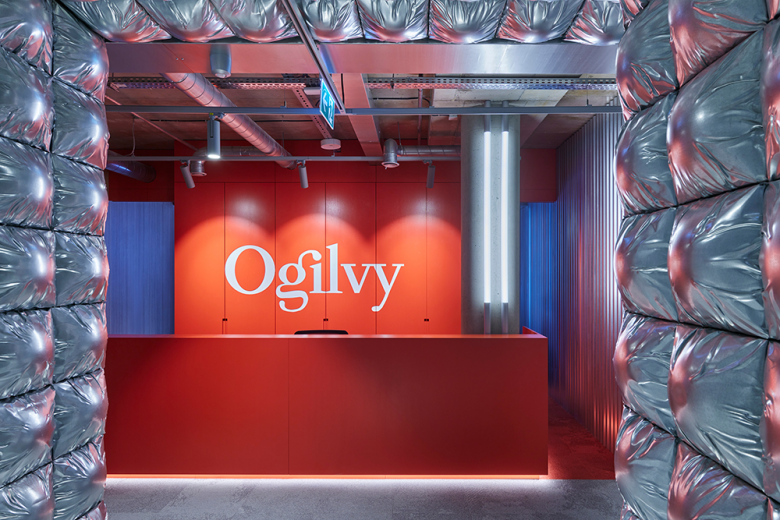
The communication agency’s headquarters in Lithuania’s capital plays up elements of illusion and surprise, thanks to a spatial concept by local firm Toota.
Key features
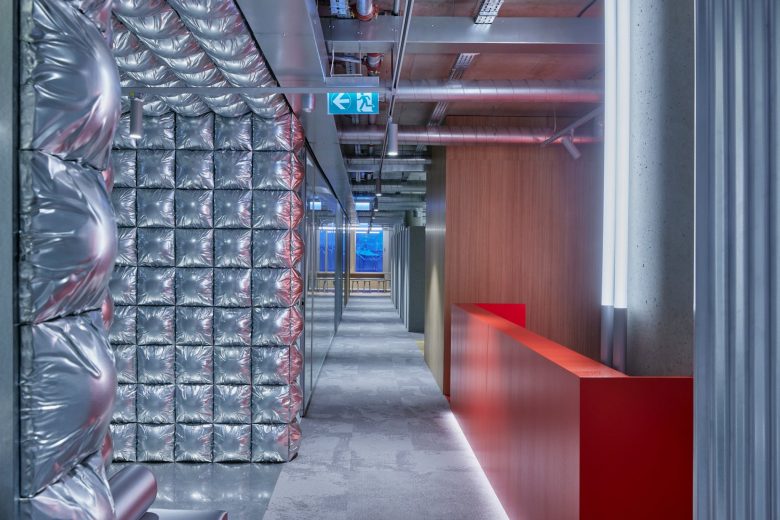
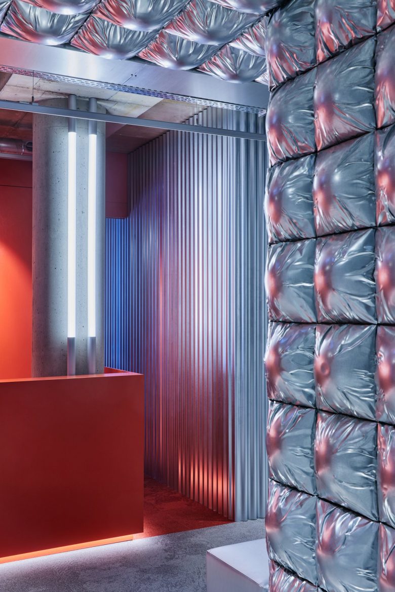
A traditional office door tricks visitors into thinking they are entering a conventional workspace upon arriving at Ogilvy Lithuania’s HQ. ‘The goal here is to create a misleading first impression, an illusion, and to distort the reality if only for a moment,’ explain Toota’s designers. The surprising entryway – a portal fitted with seemingly puffy, albeit solid metal pillowed cladding – plays with tactile perception, leading to Ogilvy’s red-orange reception area. These effects, however, aren’t just intended for guests: they craft a dynamic atmosphere for the office’s everyday users as well.
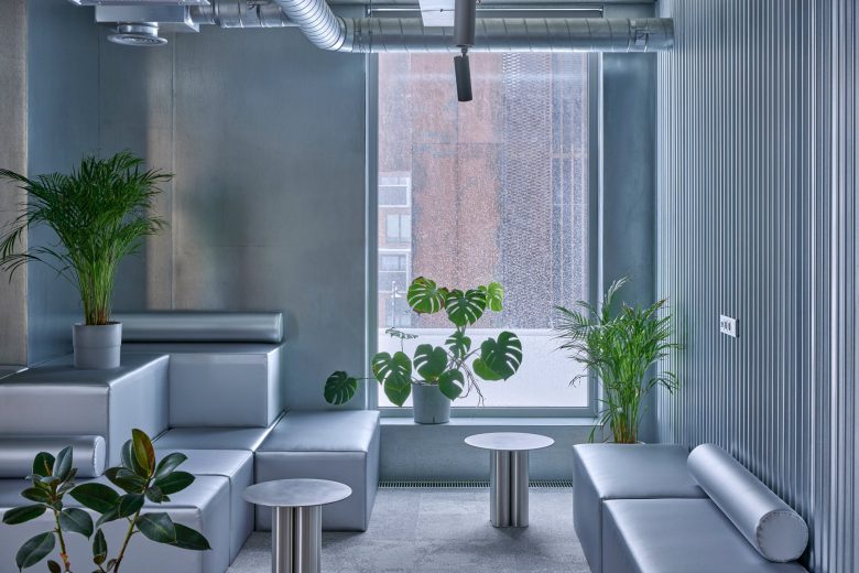
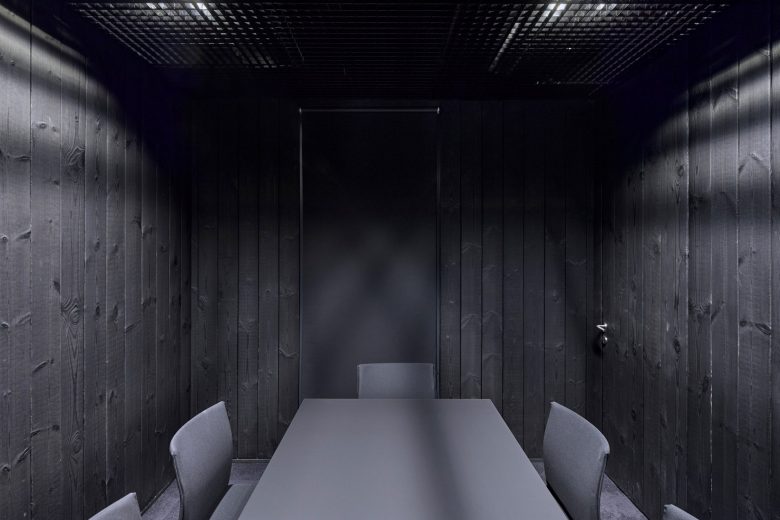
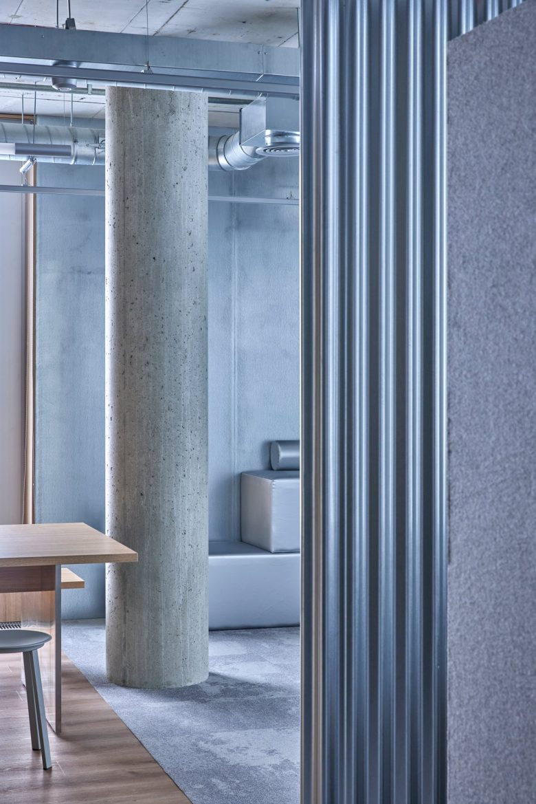
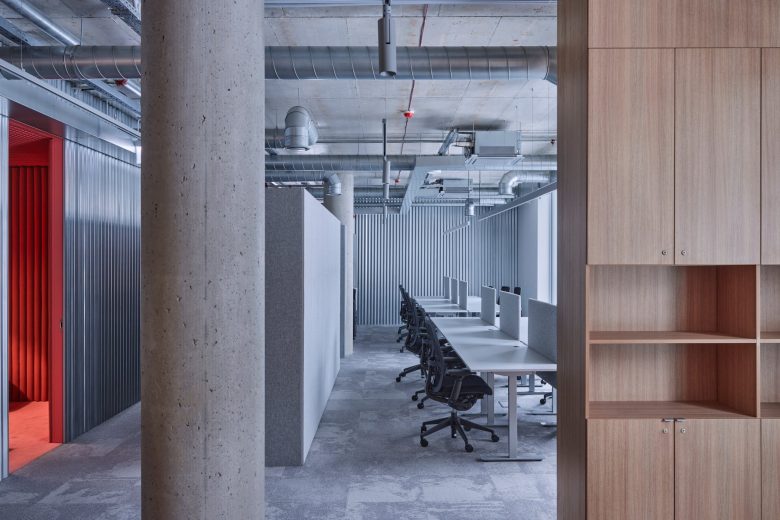
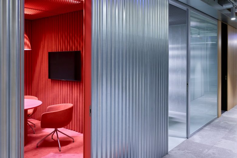
One of the 481-sq-m workspace’s meeting rooms derives its sleek ambience from panels of silvery-white metal. Another, meanwhile, takes on a drastically different look with blackened wood walls. And while ‘stainless-steel’ furnishings in the lounge area look forbidding, they’re indeed upholstered and comfortable. The kitchen, however, uses blonde wood to welcoming effect. Work areas take on a mixture of wood and metal finishes, with textile acoustic elements and ergonomic furniture.
Frame’s take
While the workplace might not be the first environment designers would consider playing with potentially distracting optical illusions, Toota makes a case for striking a balance. ‘This interior does not attempt to hinder the main purpose of the office, which is to facilitate productive work in a most traditional sense,’ the designers say. ‘The spaces with dominating, bright elements are isolated, thus do not interfere with the productive work environment.’ There’s something to be said for offices that engage and excite the senses.
In fact, the project calls to mind another successful workspace project shortlisted for Frame Awards 2021, Studio Alexander Fehre’s office for retailer Breuninger Sax in Sachsenheim, Germany. Taking cues from an unexpected setting – the circus – the office resonated with jury members for its boldness, brand authenticity and creativity-inspiring atmosphere. While expressed much differently, the same qualities can be taken away from Ogilvy’s Vilnius office. It’s a space that shows the power in translating a brand’s ethos and spirit through interior, benefitting the experience of users and guests alike.


