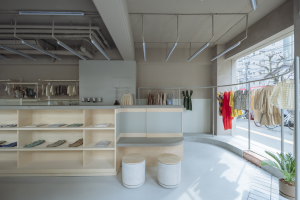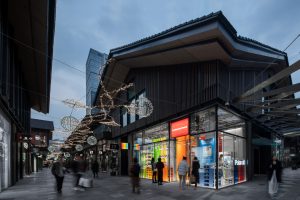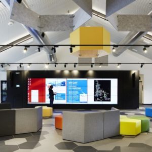
The restaurant is based in Xian, the old capital city of China, where the Chinese culture is present at every corner. The restaurant is located on the rooftop of a hotel building and comprises three storeys. Characteristic of many Xian buildings, our building seems composed of a typical Chinese house elevated from the ground to the 14 floors. Therefore, the rooftop gets a characteristic Chinese roof.
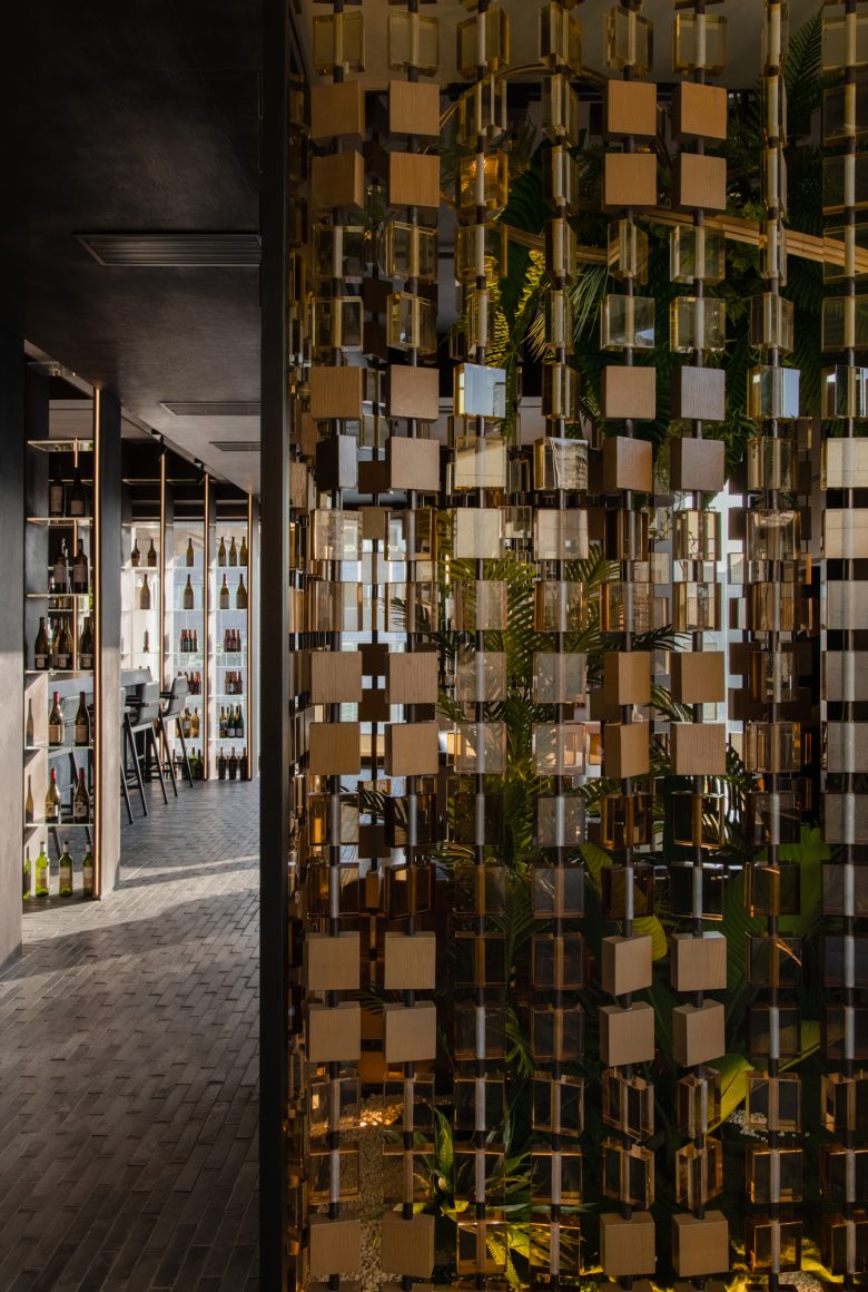
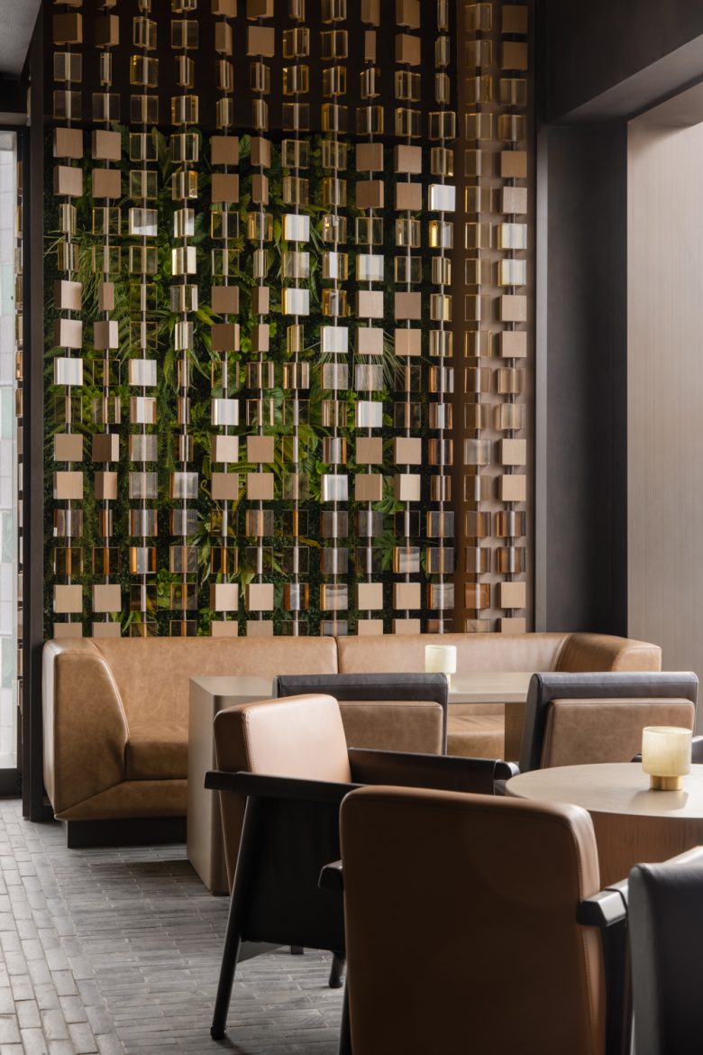
In Xian architecture, many ancient houses use squares elements as an ornament on façades, in the wood beam juxtaposition in the structure or in traditional patterns. The studio revisited this language of squares to blend in the cultural environment. It reinterprets the past into a modern design.
The Chinese house is composed of three layers: a stone base, the core and a roof. Our three storeys restaurant represents those three layers. The functions, such as coffee, dining area and bar, are separated vertically.
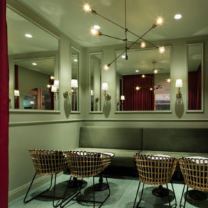
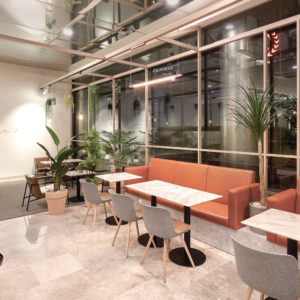
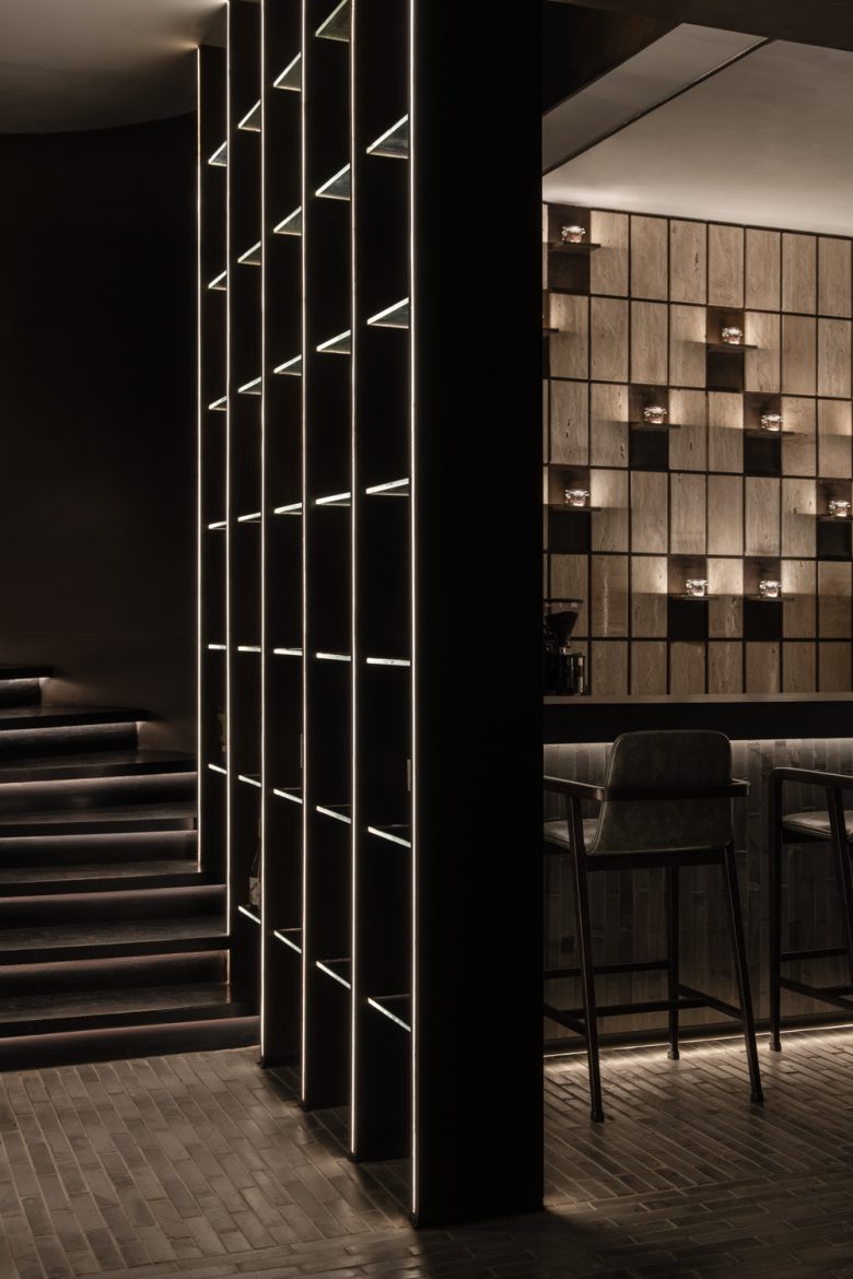
The first storey is the starting point of the customer journey. An indoor waiting lounge with a coffee bar and an outdoor terrace allow customers to sit comfortably and enjoy their first appetizers. Extending the imagination of the stone base from Xian city walls, the designer reused different materials and installation methods to present the visual effect of squares.
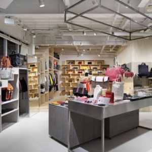
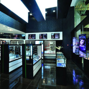
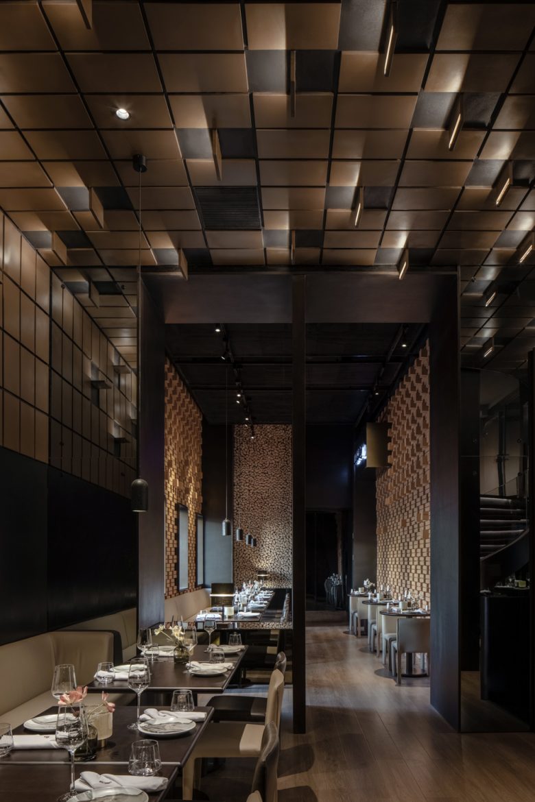
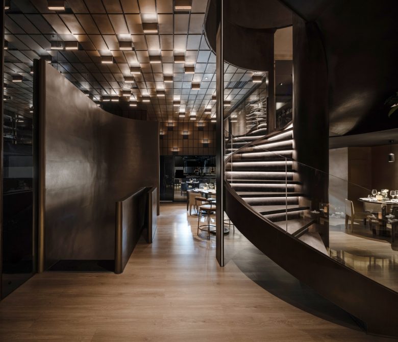
The second storey is the restaurant’s core, where we can find the kitchen and most dining activities. The centre of a house, dominated by windows, doors and wall partitions, is represented by squares tiles on the walls and ceiling. The main dining area lacks direct light, so the designer used those squares as lighting on the wall and ceiling.
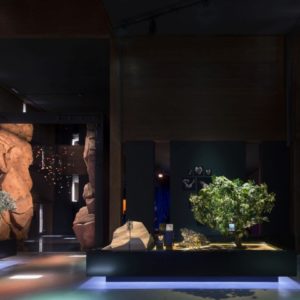
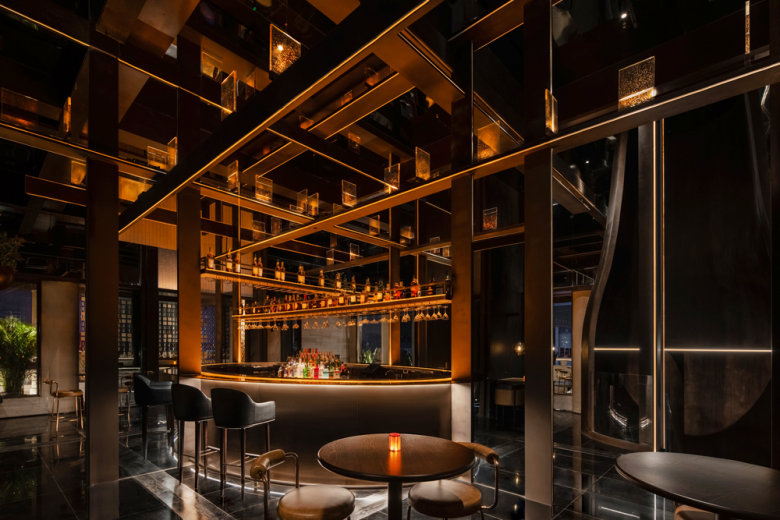
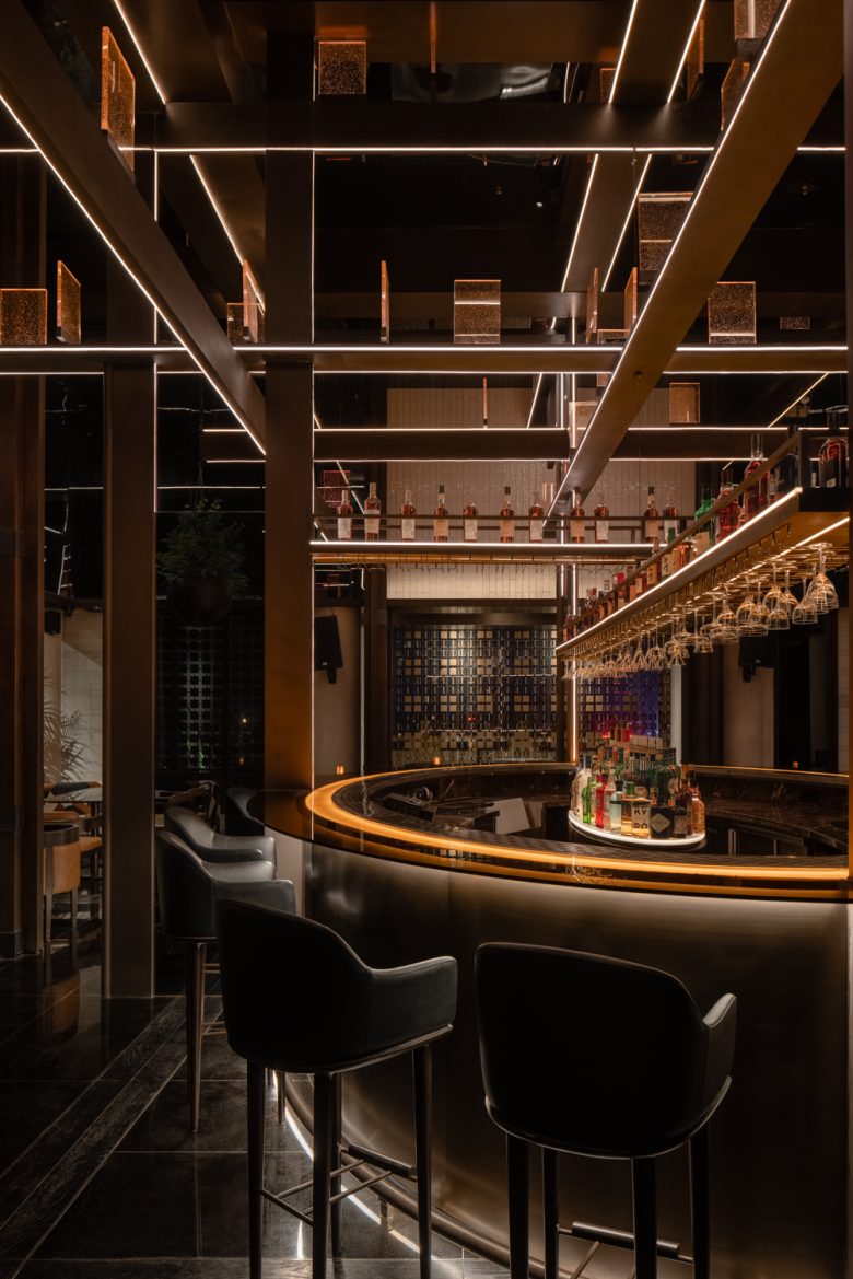
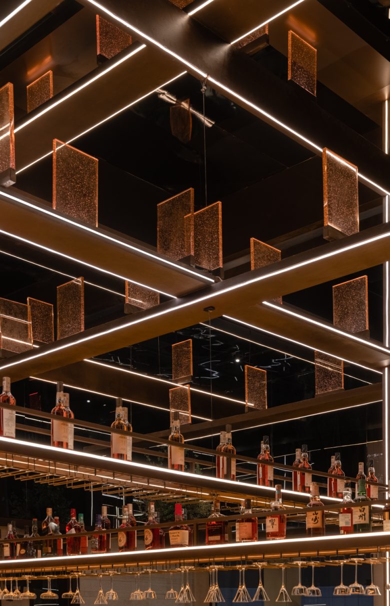
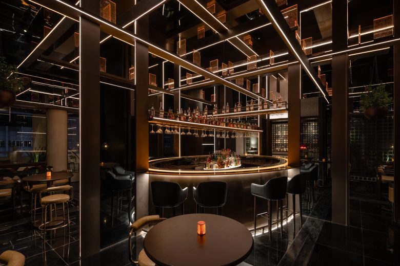
On the third storey, the designer brings wood beams below the Chinese roof, placed in a random order, forming with imagination a tree where our glass squares put on the beams are like leaves on a branch. Like in movement rotating around the bar, the wood beams get closer to the central bar and compose the bar shelves. As a result, we can see our wine bottles and glasses hanging in the air.
This project demonstrates a progressive approach by reinterpreting local architecture into a modern interior design by using squares elements with different materials on every floor. So that every floor feels like having a unique design.
The designer focused on the details, from the square door handle to the square table lamp. A lot of details show small intentions to customers.
The customer journey inside the restaurant is wanted to be unique and special. The design team separated each step of a standard dining process per floor: appetizer, main course and dessert. Once the client is inside the restaurant, he is invited to walk around and connect socially.
Regarding environmental sustainability, the materials used for this project are wanted to be all recyclable. Local materials were used and recycled from local sites, so the grey bricks, orange bricks, and terra cotta brought the local colours to the project.
Designed by RooMoo Design Studio





Add to collection
