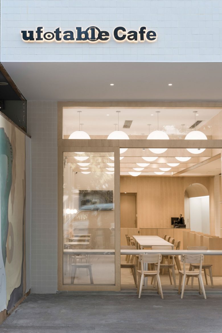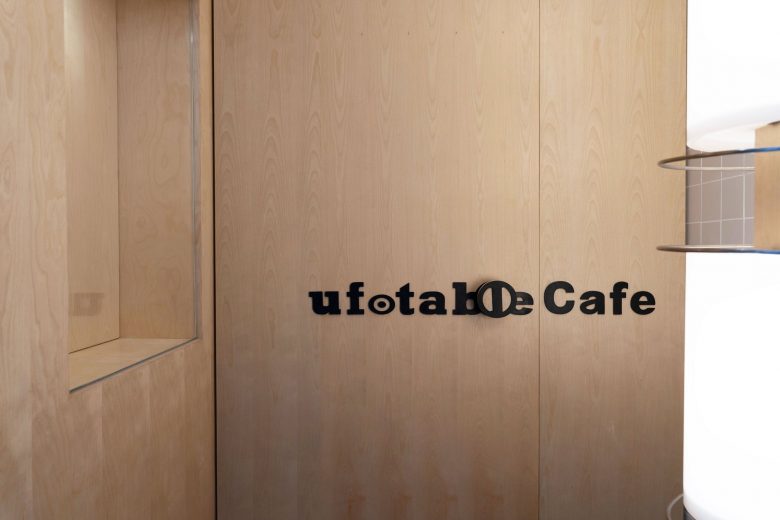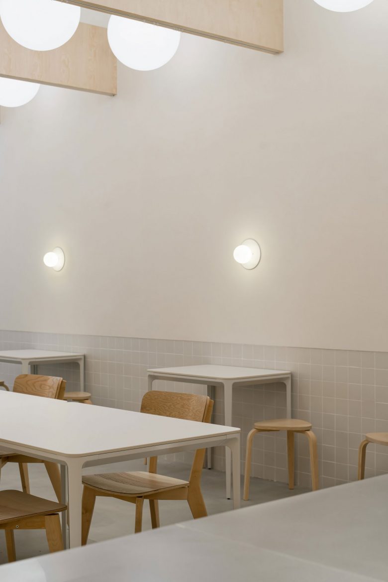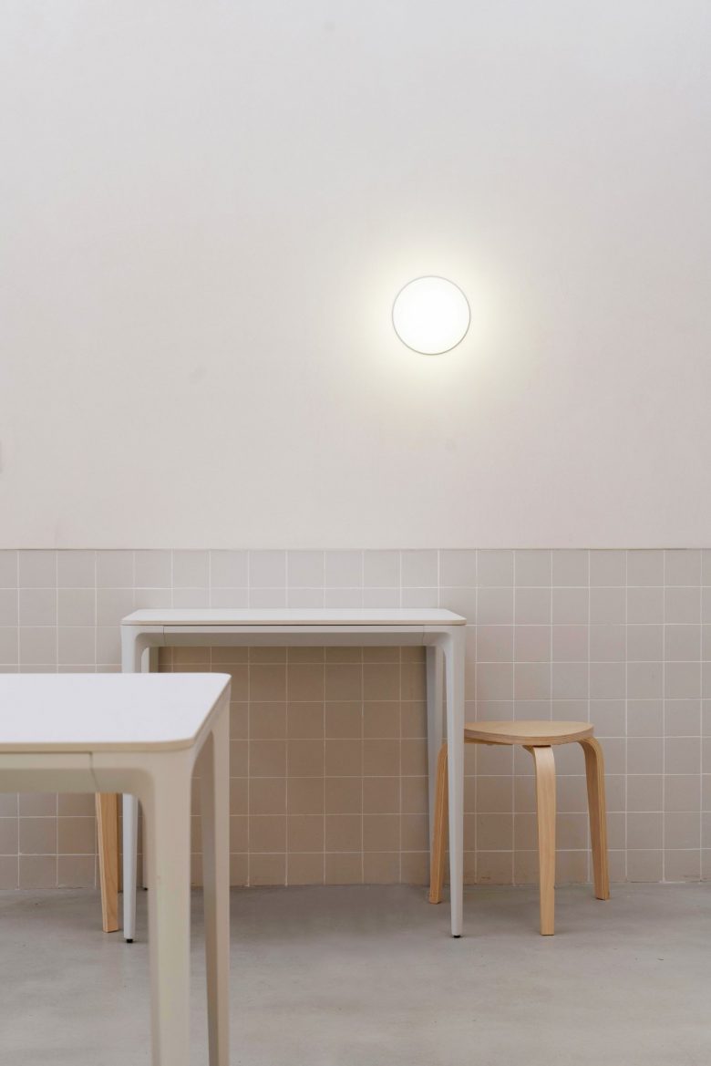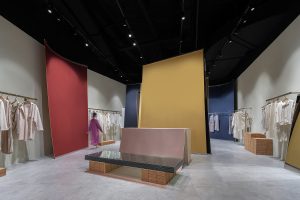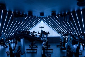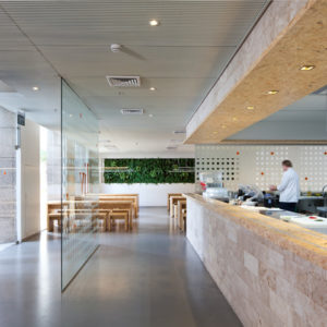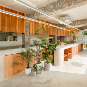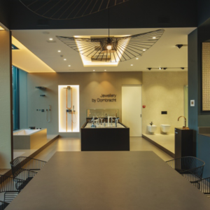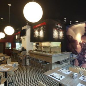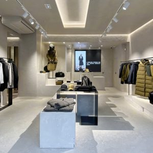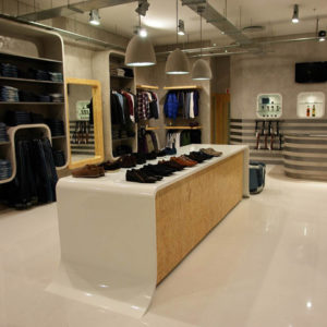
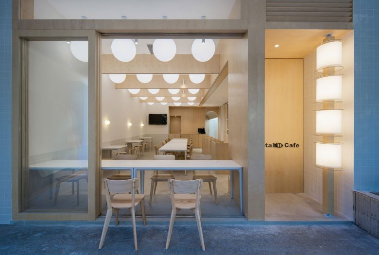
Going through the column of lantern, passing by the shop window, and pushing the door handle in the shape of store Logo, these three actions make up the first impression for the customers. The store is divided into three parts: the products display area, the dining area, and the gallery displaying original manga drafts. Non Studio took the traditional oriental element of lantern and transferred it into a ceiling with geometric order and a column by the entrance door. The gallery with a vault locates deep in the space, like a treasure, waiting for people to explore.
Designed by http://www.studio-non.com/
Images © Non Studio Design & Research
Photography by: An Huang
