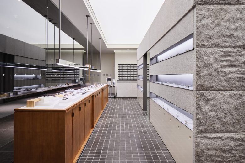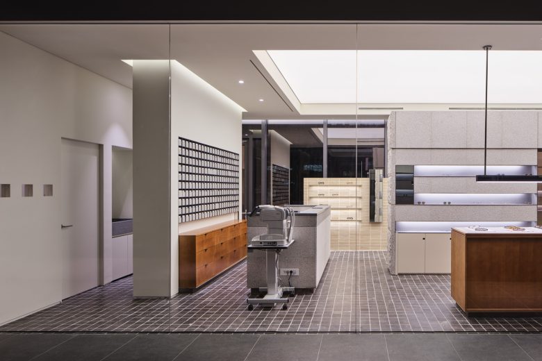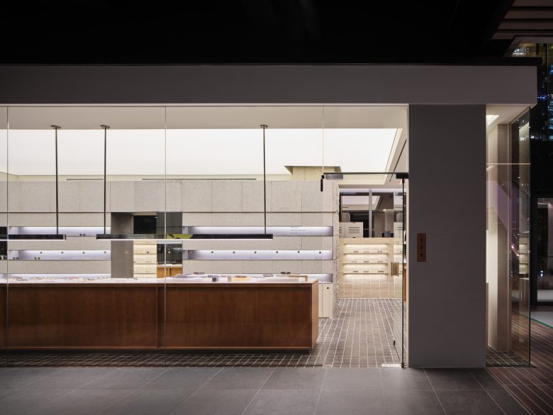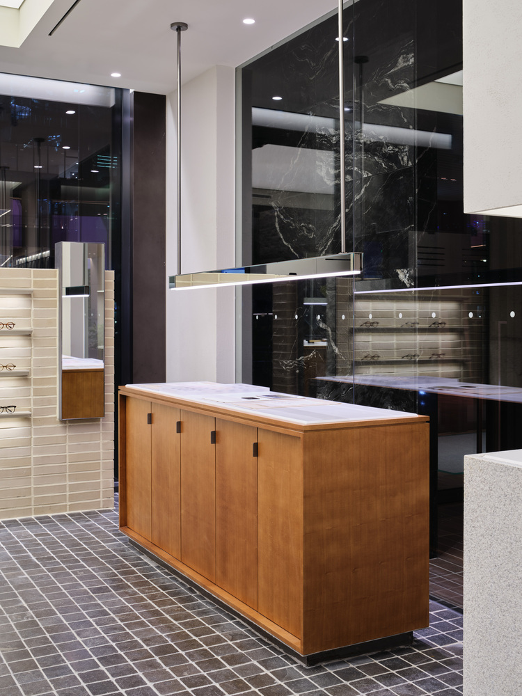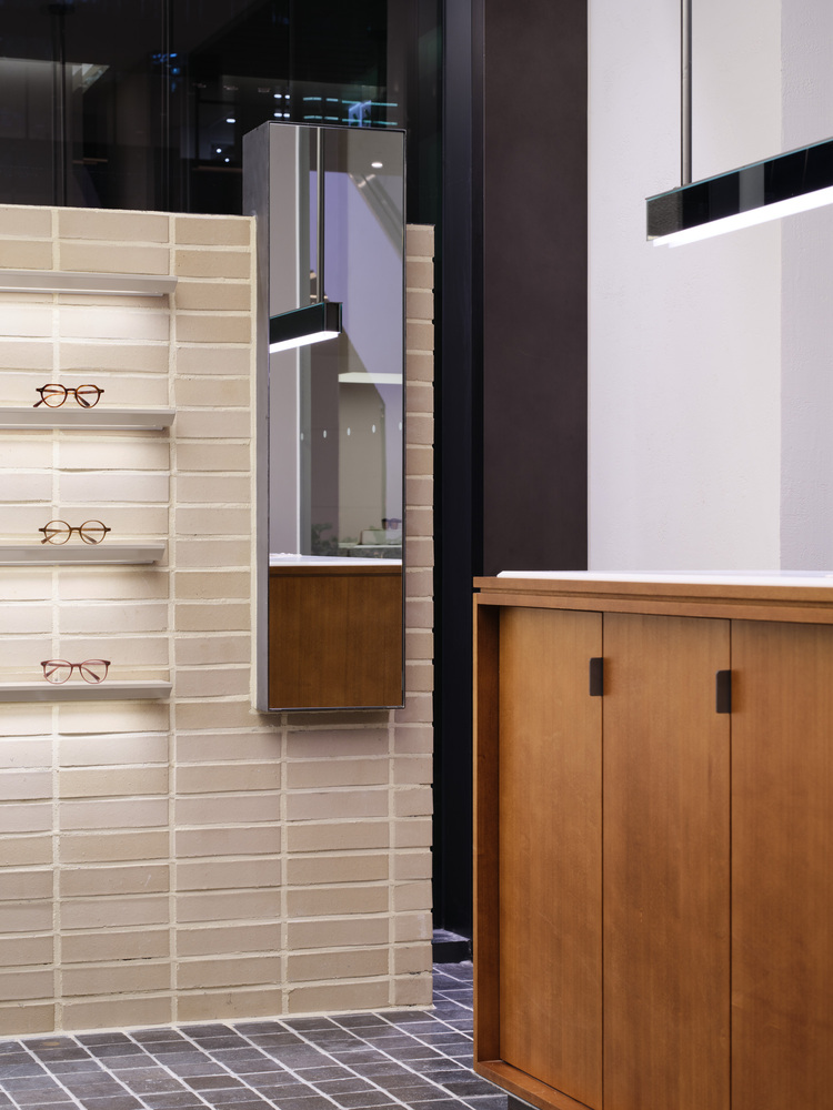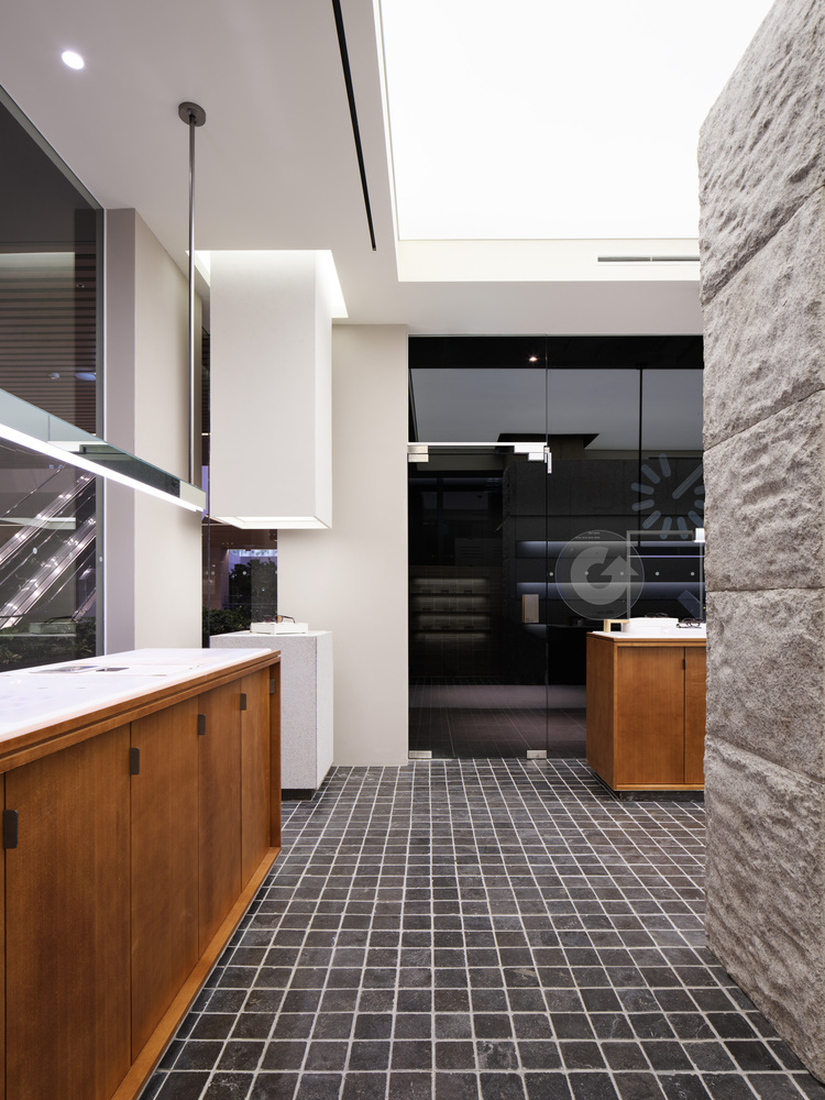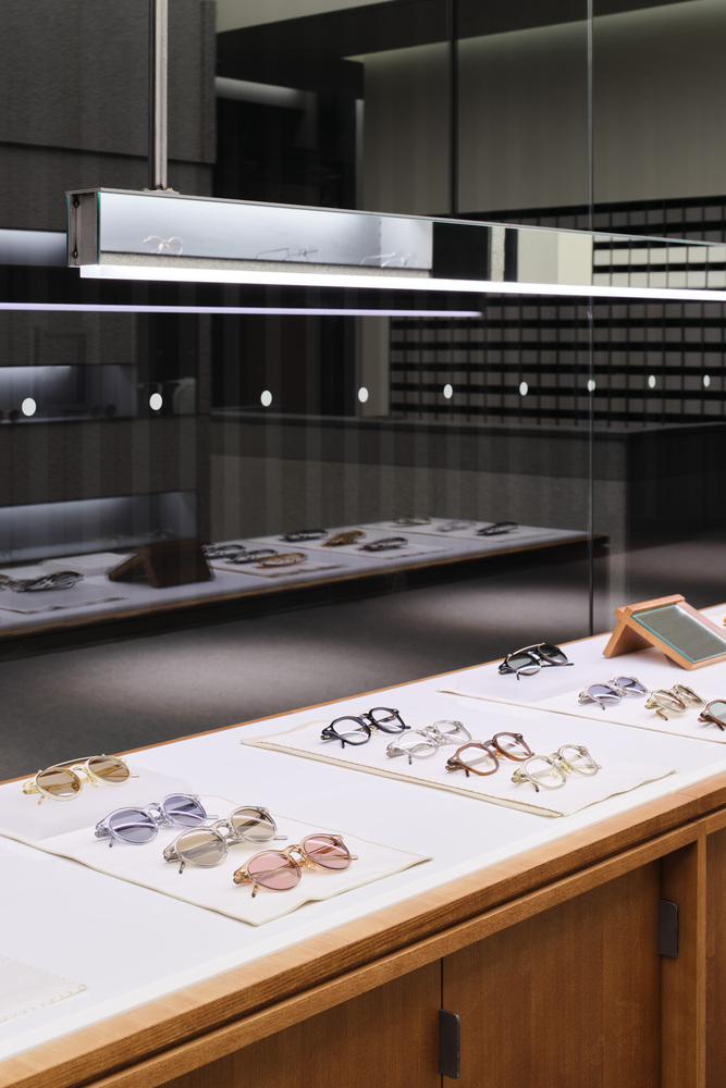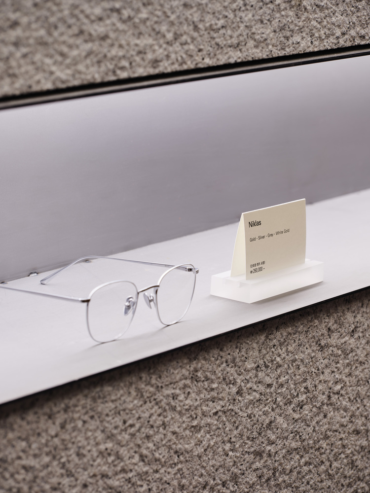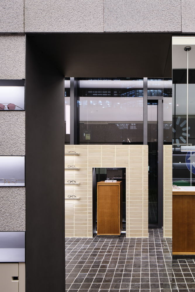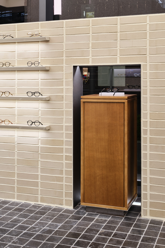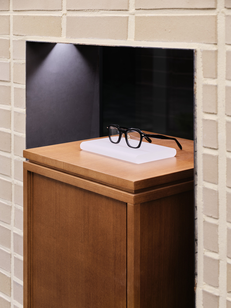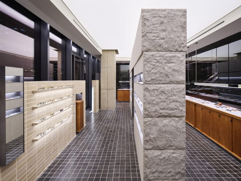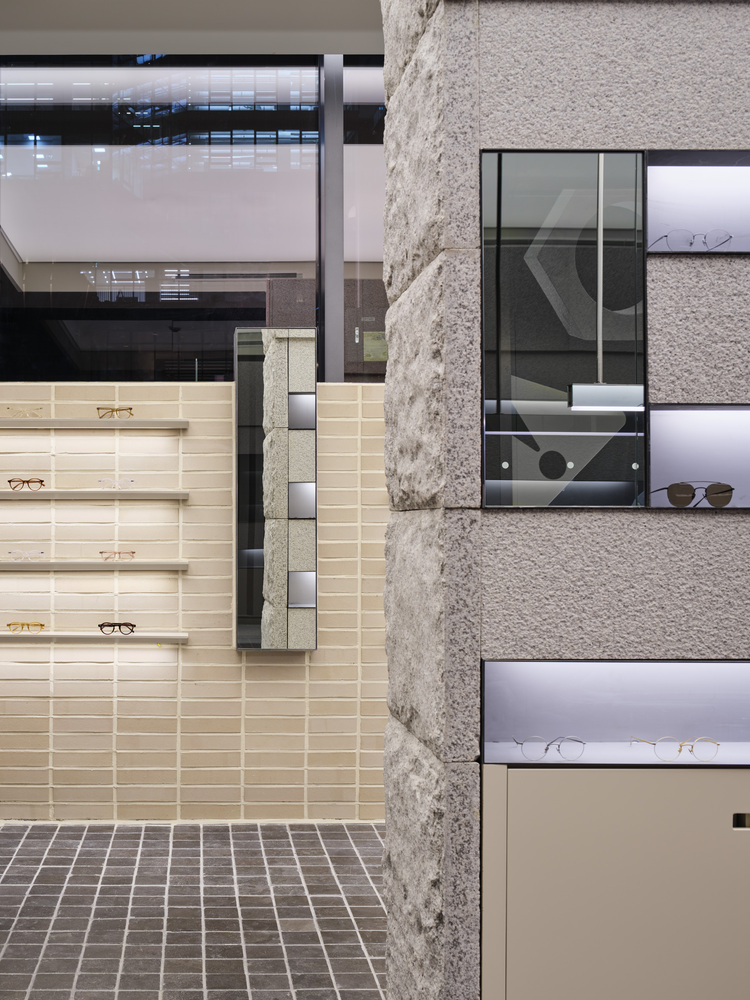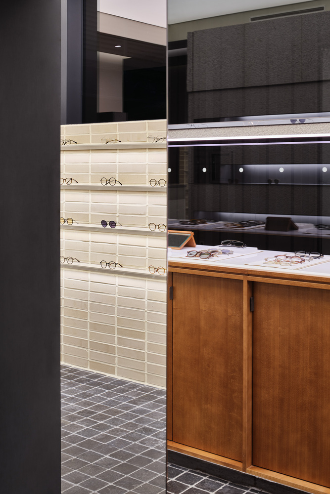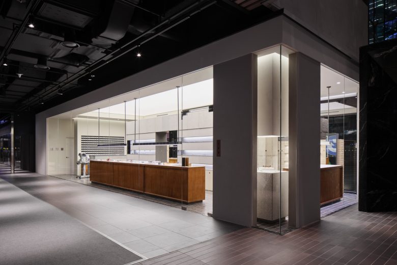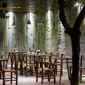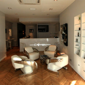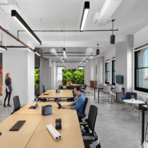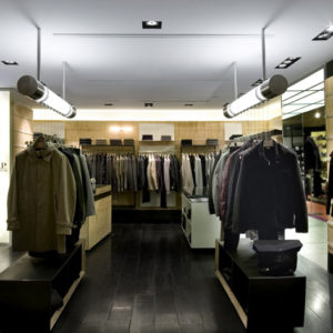
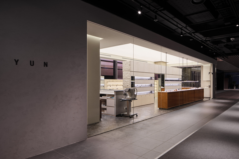
‘Yun Pangyo’ has two sides running together symmetrically in parallel. The scene consists of the two facades running the length like a long rectangle in a simple design. While some may feel that there are many advantages to be gained from exposure to the large area, we believe that there are more drawbacks than advantages in the sound demonstration of the brand story and operational directions due to the dispersal of movement and attention. It was one of the other missions that we encountered to overcome this drawback in terms of the construction of space and to have our customers feel the ‘Yun’ identity while making purchases of our products.
We found the clue for the expression of the core concepts of ‘Yun,’ and for the overcoming of these drawbacks from traditional Korean walls. The traditional Korean house uses the pillars and horizontal angle brace to wholly include the surrounding scenery in the effort to embrace nature, and this shows the Korean attitude towards nature in the past. The outer walls were meant to complement the drawbacks of the houses, and these were also meant to accommodate the surrounding terrain and landscape. Furthermore, the walls not only act as a boundary between the inside and the outside but also as a picture frame that modifies the view beyond the fences. It was also a boundary for subtle communication from the outside to the inside, or in reverse.
As if to accommodate the surrounding space, ‘Yun Pangyo’ includes 3 walls of different forms and sizes. Through these walls, the facades show different appearances from both sides. The customer enters and walks a narrow path between the two walls, and examines spectacles by crossing the wall and walking on a path of a different appearance. We feel that this scene with the customer reflects the ‘Yun’ identity that captures the Korean feeling.
‘Yun’ speaks of everyday life, and therefore parts paths from brands with gaudy and provocative products of recent years. Despite this, ‘Yun’ in its moves manages to capture the minds and emotions of people. ‘Yun’ is currently accumulating results with its brand philosophy layer by layer, and we dare to predict that the true values of our philosophy will become ever more noticeable as a result of the continuous accumulation of experience. We are grateful to be able to participate as one piece in the slow but steady accumulation and hope that we will remain a brand of longevity through steady accumulation.
Architects: By Seog Be Seog
Spatial Design: Youngsung Shin, Miyoung Kim, Seohee Jang
Photographs: Kim Donggyu
