
Add to collection
Inner Signal’s sincerity embodies the technology, its philosophy which is health, and its effect which is livelihood come together and become joyous light.
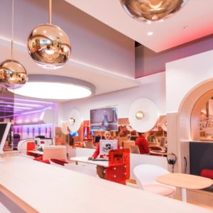
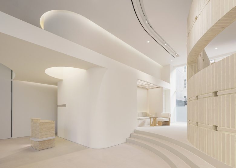
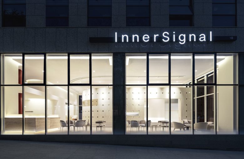
Joyful light fills the face (滿面喜色) – To visually express the joyous light that fills the face, the concept and characteristics of light were variously applied according to the spatial program. The visitors face the light, approach the rising light, and have a special experience in various ways in a space filled with light as the light guides the way according to the flow of the program.
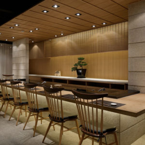
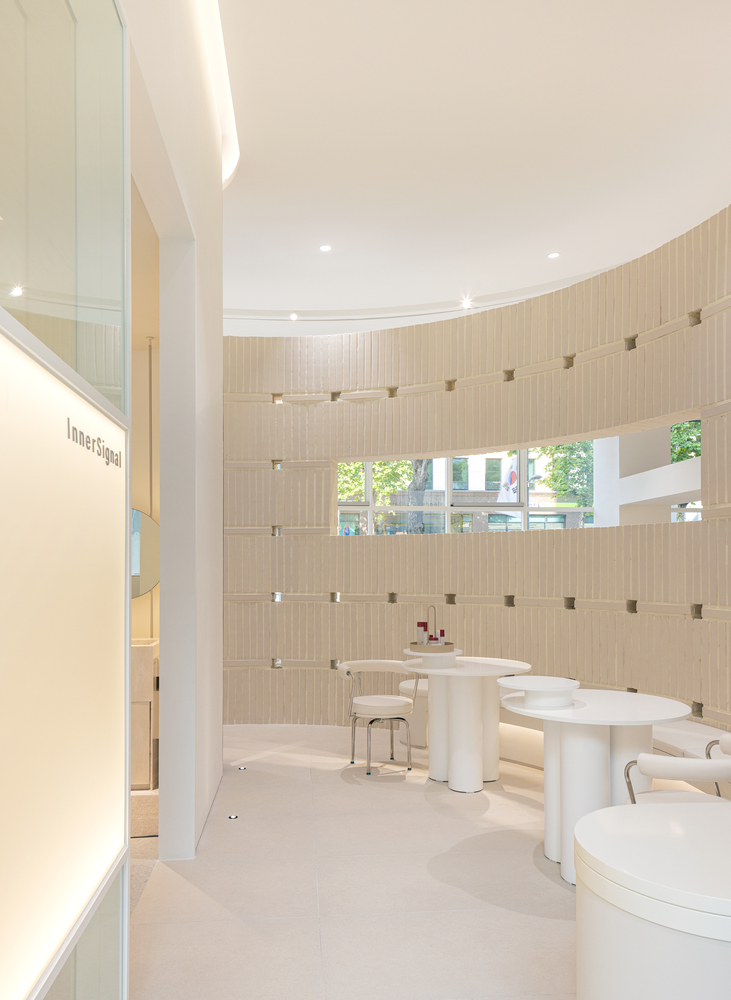
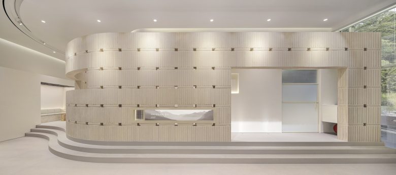
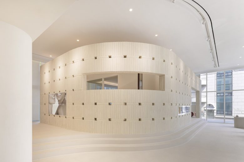
Key material – Just like Inner Signal’s products that create gradual changes with steady use, the bricks that stack up one by one to complete the space, and the materials of natural texture that represent the power of natural skin were carefully selected and used.
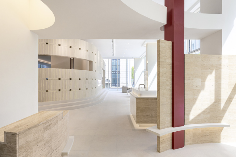
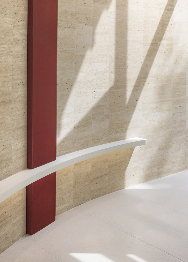
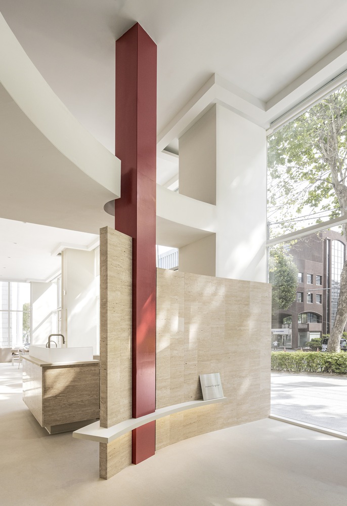
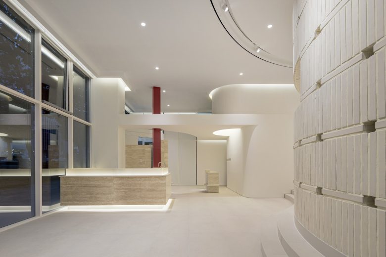
Red point – The red points from the entrance that represents the color of the brand serve as a guide for a series of program sequences, and you can meet new types of red according to the sequence. The red pillar that greets the customers in the beginning, the red cross-section of the wall seen in the care space, the red crystal in the form of a circle that tells the end of the care space and the beginning of the rest space, and the various forms of red seen in each scene act as a factor to capture Inner Signal’s brand color in memory.
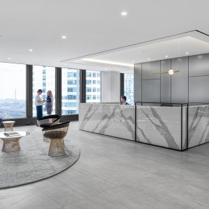
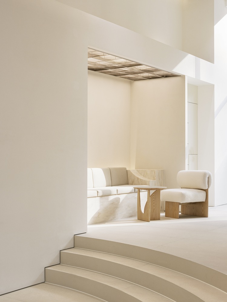
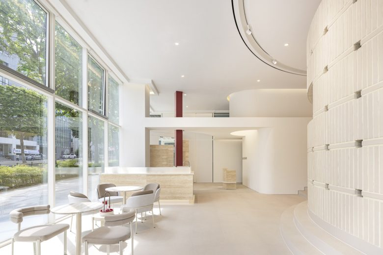
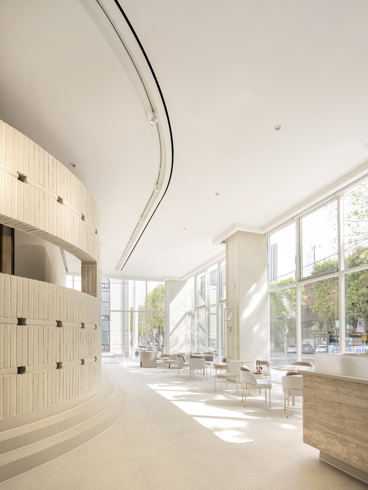
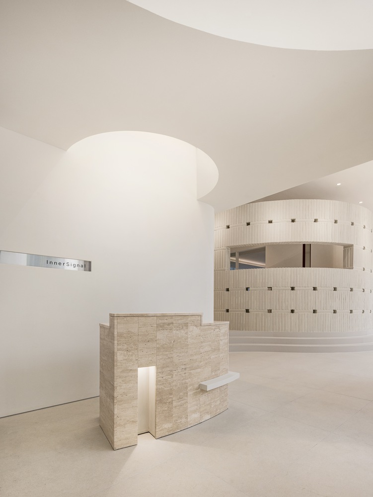
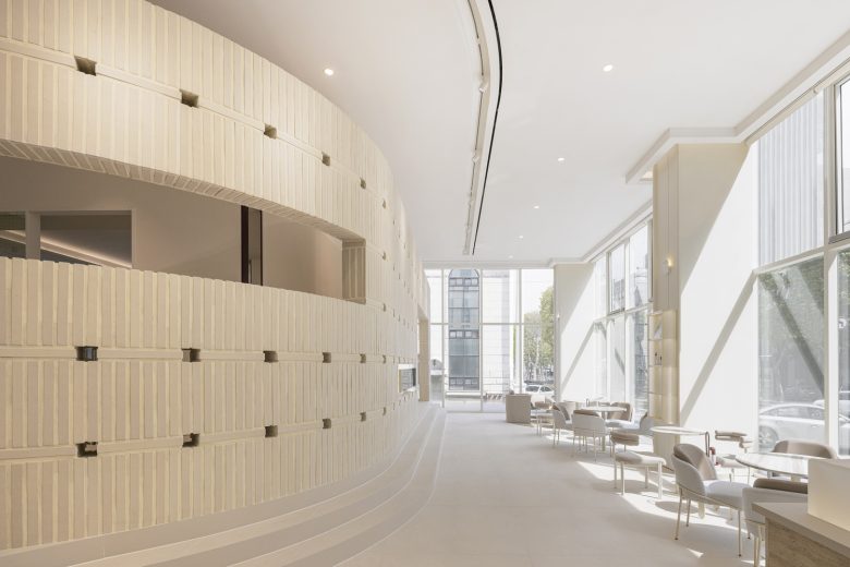
In a space with a calm overall atmosphere, you can feel the livelihood of the moment of the energy signal. The barrisol lighting on the ceiling above the reception makes the space seem roomier. When you pass the entrance of the low ceiling, you face a large space filled with sunlight that seeps in through the windows. Although the rest space and the care space are in the same vicinity, the height of each space is different, and the view and direction of each space are differentiated to ensure privacy.
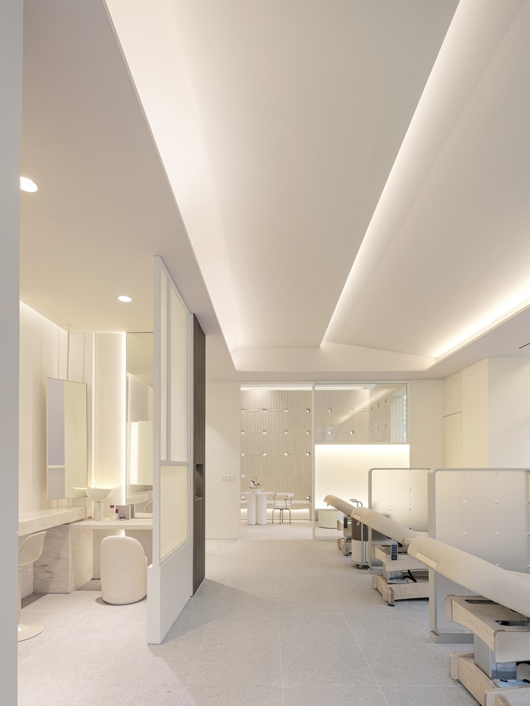
Before going up the stairs to the care program, the customer stays in the waiting space and encounters the light from the ceiling light that exemplifies the brand symbol (representing the skin layer) along with a video showing the brand’s mechanism. After passing the hallway along the brick wall, you will encounter a care space, and this movement creates a feeling of entering deeper into the space, just as the brand’s (product) patented ingredients are delivered to the depths of the skin through multiple layers of skin. Beyond the acrylic partition that expresses the rising light, there is a care space for recovery just for the skin. The sunlight coming through the window mixes with the soft indirect lighting to create a comfortable atmosphere.
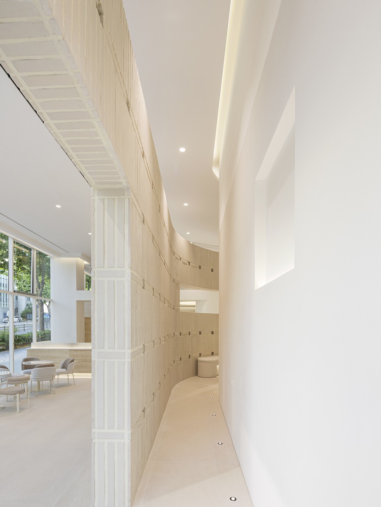
Brick walls – In addition to the step difference, a gap is created between the brick wall and the ceiling, which is the standard for dividing the two spaces, making it possible for the resting space and the care space to feel connected and not completely separated. By using bricks, a material usually used for the exterior, for the inside walls, the brick wall becomes an interior façade that blurs the boundary between the inside and the outside. The light leaking (from the inside) between the gaps created by the unique stacking method is an expression of light rising from within the skin. The lighting on the wall is intended to make the texture of the bricks stand out more in light and to create more colorful daytime and nighttime views of the space seen from the street. The Inner Signal Lounge will bring life and illuminate the entire neighborhood by revealing the skin and self that is becoming brighter from within.
Architects: FLYmingo
Interior Design: FLYmingo
Lead Designers: Junho Kim, Jiyeon Hwang
Design Team: Sujin Lee, Bomin Park
Photographs: Yongjoon Choi


Add to collection