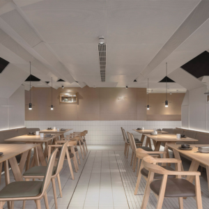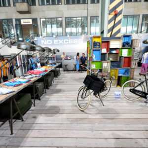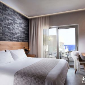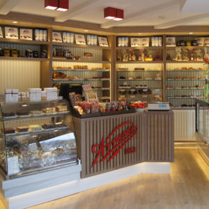
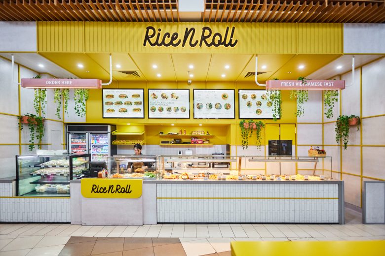
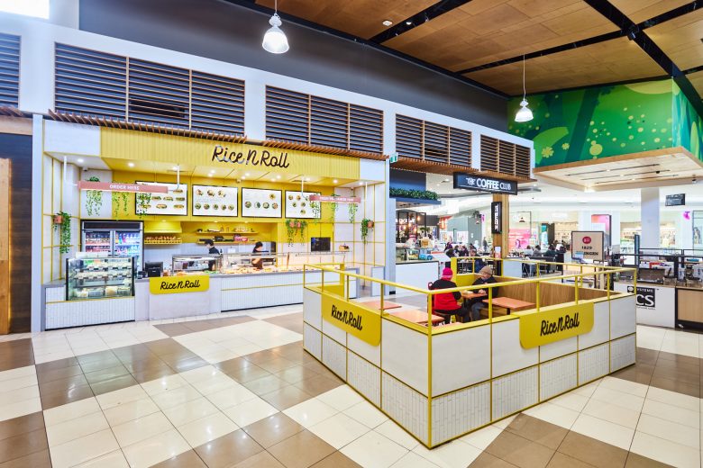
Rice N Roll were initially clients who wanted to refurbish an existing site. This site saw out its lease period – then it was time to start from scratch. This meant – removing the fit-out back to base build. Trialing alternate floor plan layouts, we collaborated and worked with the client to improve operations within the site.
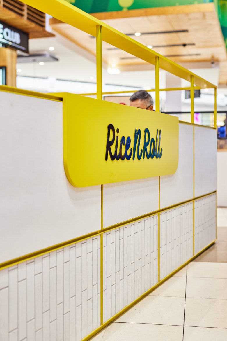
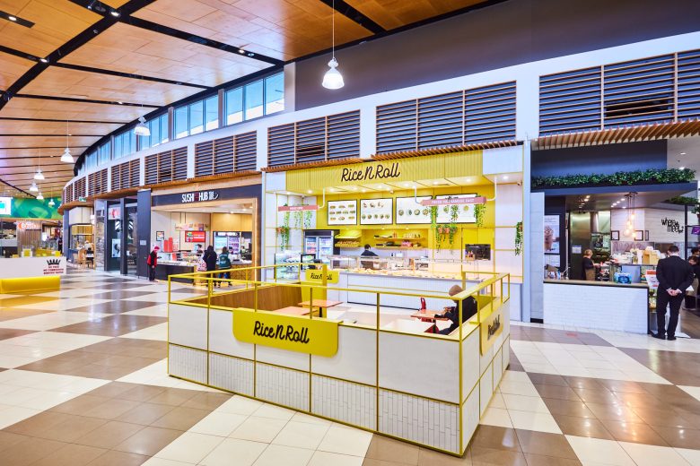
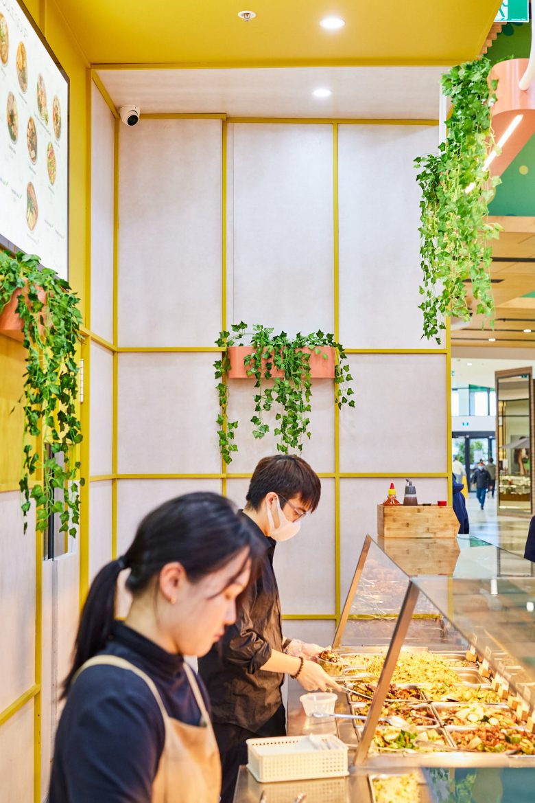
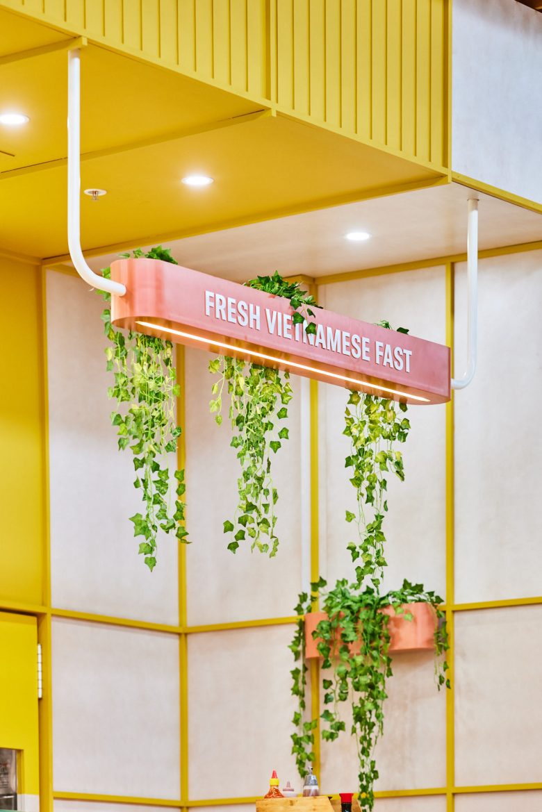
From a design perspective, we retained the original corporate colour – an attention grabbing yellow – this was applied behind the primary signage, wrapping the ceiling & rear wall. Concrete cladding, textural tiles and timber trims in turn, all give the site texture and interest.
Photography by https://michellejarni.com/
Shopfit by https://topfitprojects.com.au/
Interior Design by https://www.studiograyscale.com.au/
Add to collection

