
Add to collection
ABOUT
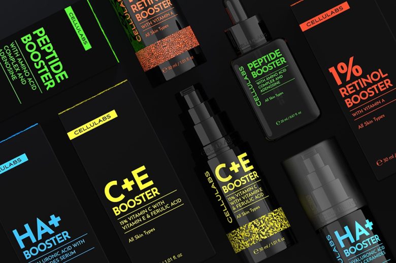
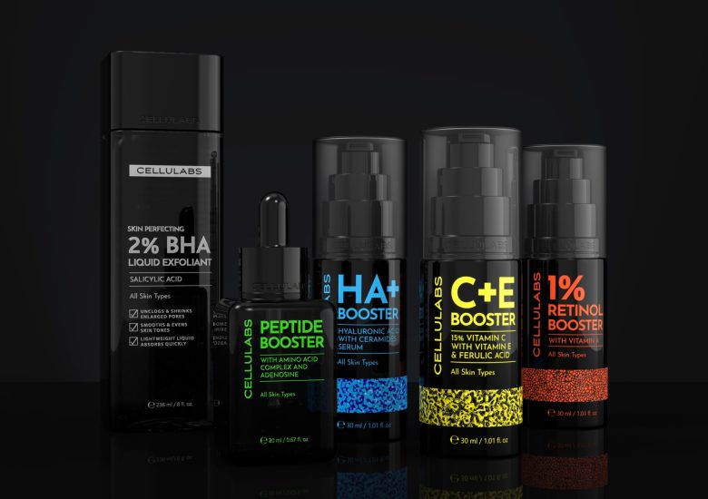
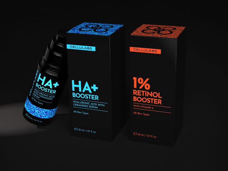
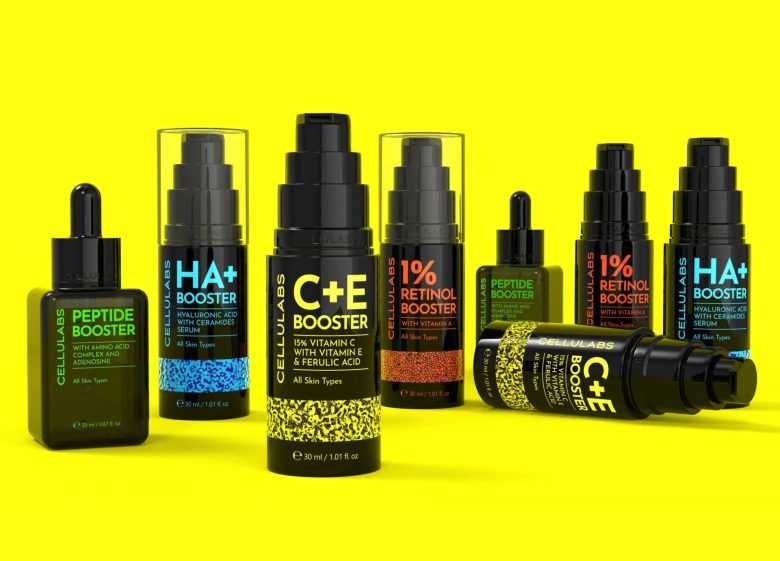
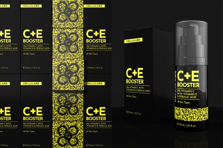
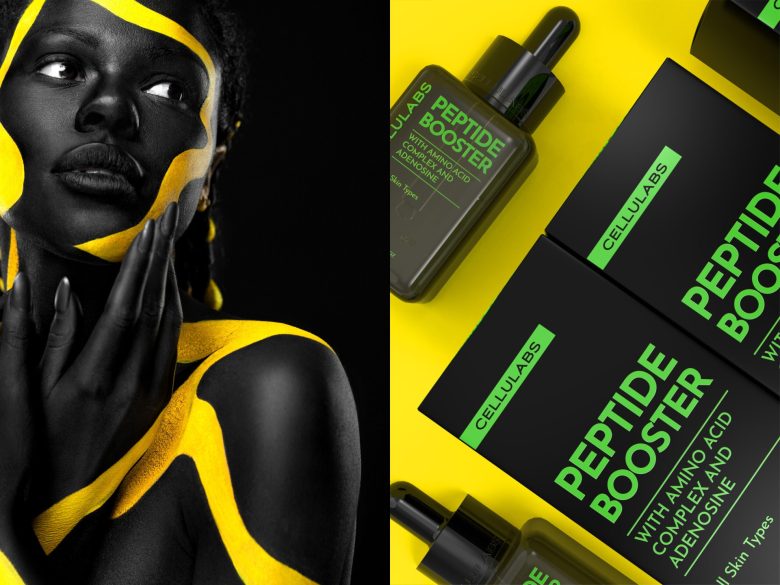
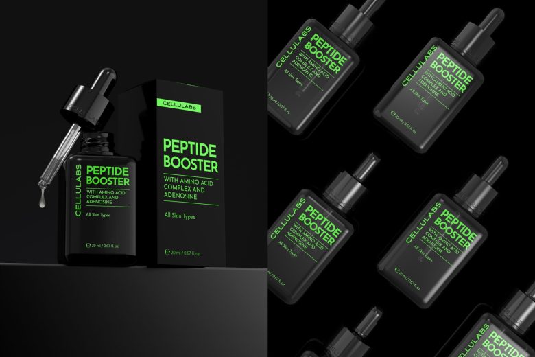
This project showcases the packaging design for Cellulabs, a premium skincare brand that specializes in cutting-edge formulas and luxurious skincare experiences. The design aims to reflect the brand’s innovative approach and commitment to high-quality ingredients, while maintaining a refined and sophisticated aesthetic.
SOLUTION
The primary objective of this packaging design is to communicate the Cellulabs brand values, attract the target audience, and make the products stand out in the competitive skincare market. The target audience for Cellulabs skincare products includes both men and women, aged 25-55, who are interested in premium, innovative skincare solutions that focus on anti-aging, rejuvenation, and overall skin health. The Cellulabs logo is prominently displayed on the packaging, featuring a sleek, modern typeface with a minimalist icon that represents cellular regeneration and innovation. The color palette evokes a sense of elegance and sophistication while remaining gender-neutral. The chosen typography is clean and modern, with a clear hierarchy and legibility, ensuring that the product information is easily accessible to consumers.
RESULTS
The Cellulabs packaging design successfully captures the essence of the brand and its premium positioning. It effectively communicates the product’s benefits and high-quality ingredients, while standing out on the shelves among competitors. This design not only appeals to the target audience but also elevates the brand’s reputation in the skincare industry.
Designed by Matrafox studio
Add to collection