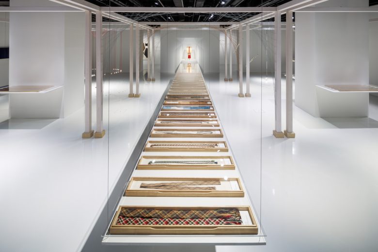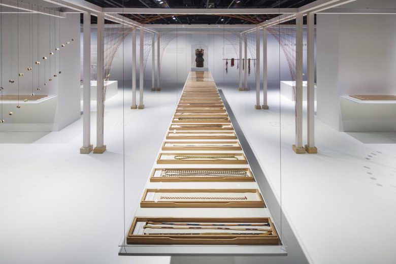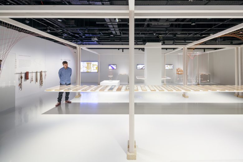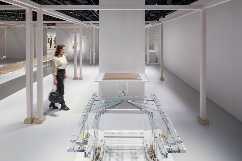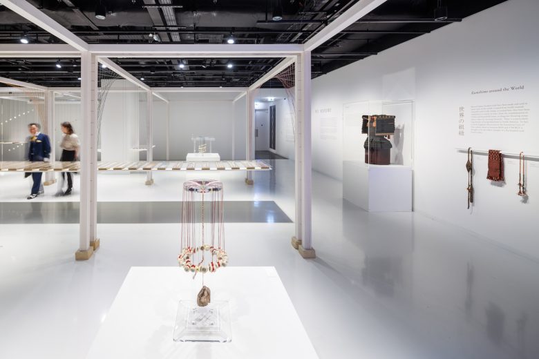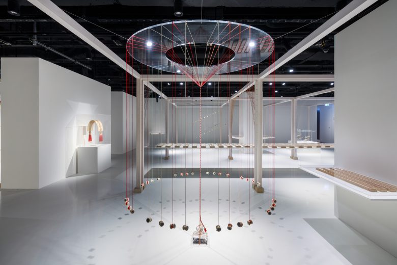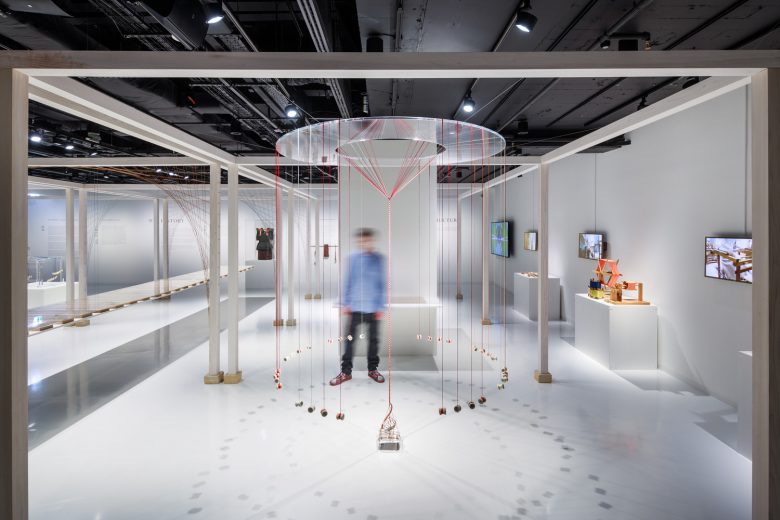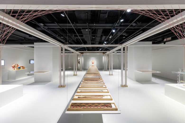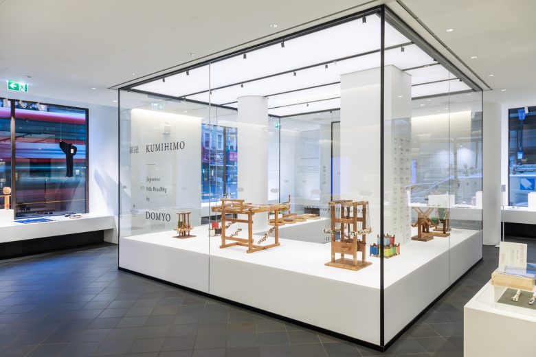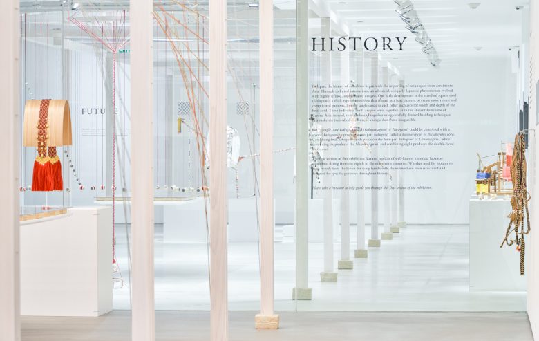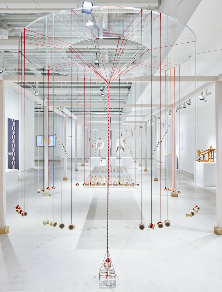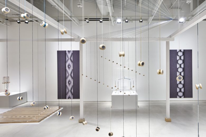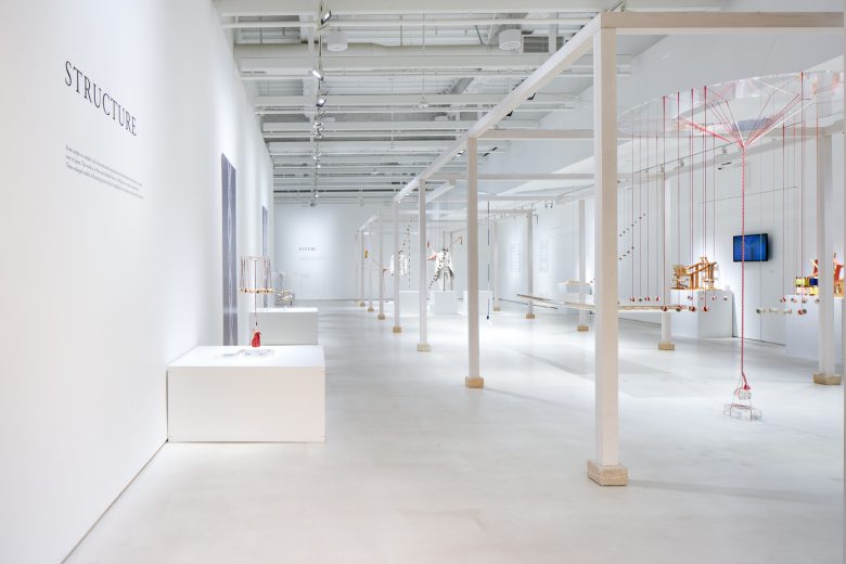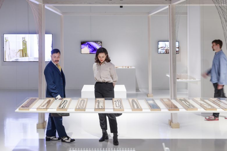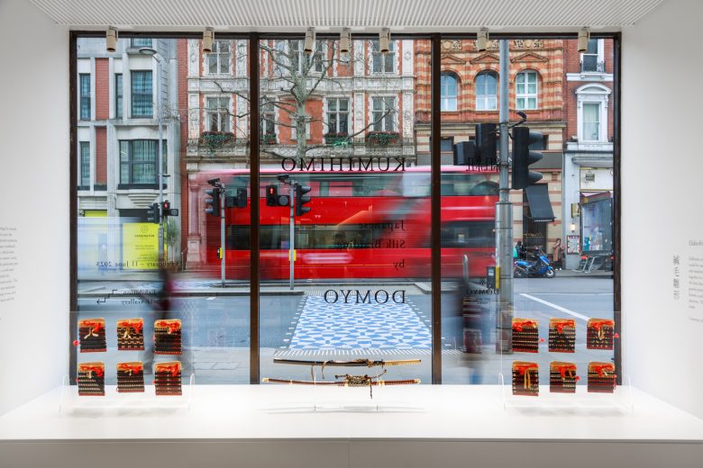
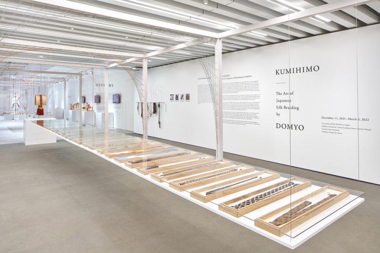
Design of the exhibition space for ‘Yushoku Kumihimo Domyo’ exhibition at the Japan House London, São Paulo, and Los Angeles. As we wondered how best to express the charm of small, delicate kumihimo within a large gallery, our first thought was that we needed a quiet and clear space, to make the small objects stand out and draw attention to them.
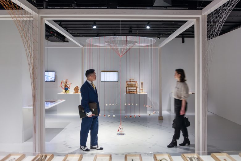
At the same time, somewhere like the White Cube, which is quiet yet inorganic and flat, would not be right for kumihimo. The ideal space had to be something like water, transparent yet filled with vitality. We, therefore, formed a boundary, like a himorogi*, to create spaces where it is possible to focus solely only on the kumihimo. Nothing is present within the white frames other than the kumihimo themselves. All the information panels and other explanatory elements are placed outside the boundary. *Himorogi
A Shintō yorishiro, a place to attract and welcome kami deities. The materials of the himorogi themselves are light and weak, but form a borderland with great significance, showing the presence of the kami.
Spatial structure: positioning- Grid of nine: The frames are arranged in a grid of nine, inspired by mandalas, which show time repeatedly flowing towards the centre.
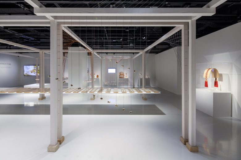
Spatial structure: details – Fine detailing, integrated texture: The frame that forms the boundary is thin and at first glance appears to be just a frame, painted white. In fact, however, it incorporates a lot of intricate detail.
Wood and gofun : The frame itself is made of cedar, with a gofun* coating. We carefully considered which materials would best suit the texture of silk kumihimo. Agofun coating has a grainy feel that is quite different from paint, or oil staining. The layered, translucent texture allows the reddish cedar grain to be perceived underneath the white gofun, adding a sense of depth, as the skin-coated with o-shiroi*. *Gofun
Powdered seashells : *O-shiroi A powder foundation used in traditional Japanese makeup
Earth plinths: We could not conceive of delicate frames being laid directly on the gallery floor. We therefore placed some plinths under each frame. These plinths are made of ceramic blocks. Our aim was to link the gallery’s stark white, industrial space with the delicate frames through a material having the strength and texture of the earth.
Perhaps we ought to provide some historical background on how pillars are erected, to explain the concept of these earthenware plinths. The oldest method of pillar construction is hottate-bashira, which literally means ‘dig and erect’. This is the simplest way to set up a pillar and is found in many other countries too. The history of kumihimo is similarly ancient, so we thought it appropriate to use a combination of materials that would be reminiscent of hotttate-bashira. Of course, digging the floor is not possible within a gallery, so instead we decided to place the pillars on top of earthen blocks that had been hardened and fired.
Architects: Rei Mitsui Architects
Lead Architect: Rei Mitsui
Photographs: Jérémie Souteyrat
