Add to collection
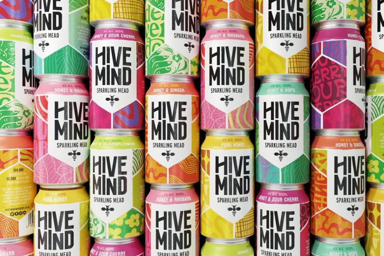
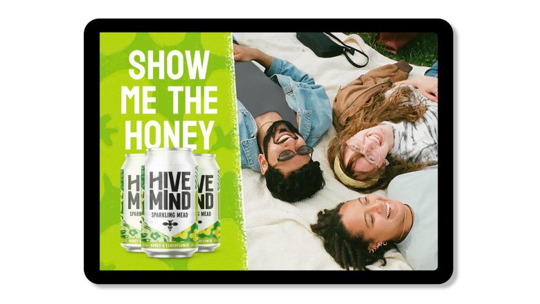
Kingdom & Sparrow create a punchy, vibrant brand for Hive Mind Brew & Mead Co, designed to leave the perceptions of mythology and Vikings behind and appeal to a new audience of mead drinkers.
Kingdom & Sparrow developed a completely new brand for Wye Valley Meadery. We evolved the identity into the more contemporary Hive Mind – keeping some cues from the existing logo to make it feel like less of a leap for existing customers.
Our design approach looked to reflect a sense of traditional craft with modern thinking.
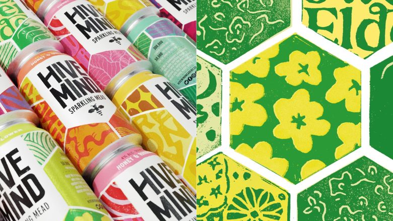
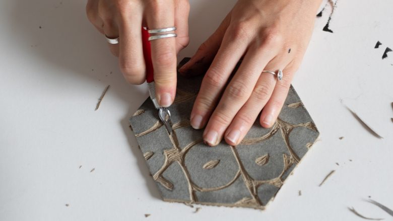
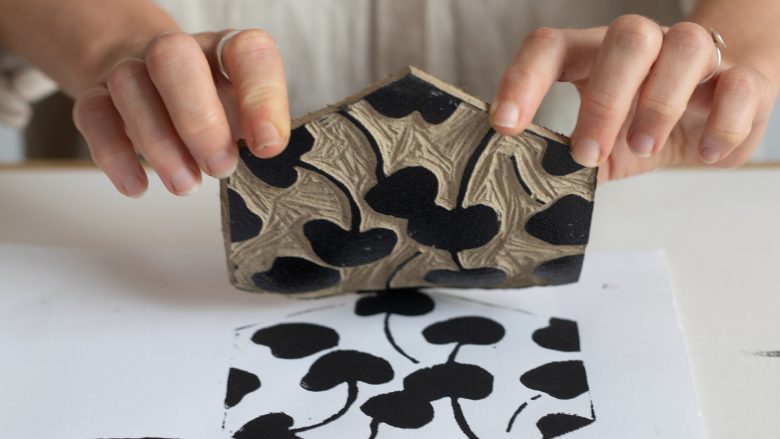
We used traditional craft skills of illustration, lino-cutting and printing to create something completely bespoke for the brand, all developed by our internal studio team.
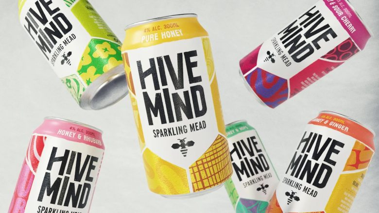
A carefully crafted colour palette brought this craft to life in the brand world, allowing easy range navigation and instantly taking the brand from traditional olde worlde mead, to a space of refreshing flavours and social occasions.
Concept
We evolved the Wye Valley Meadery identity into the more contemporary Hive Mind – keeping some cues from the existing logo to make it feel like less of a leap for existing customers.
The Impact
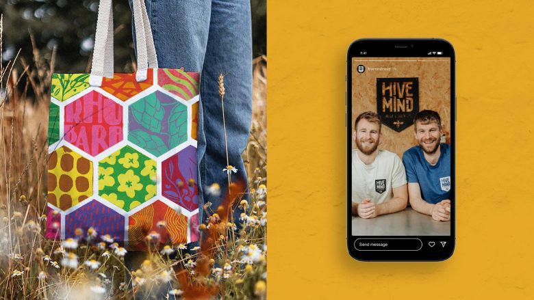
The new design has been well received at various festivals and events across the UK, as well as featuring in The Grocer, bringing growth audiences into the world of mead.
Positive Change
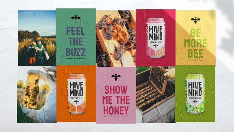
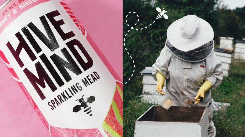
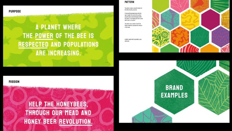
We wanted to reflect core elements of the business and process that owners Kit and Matt had developed: bees were of course central to the purpose of the brand – not only caring for them, but looking to protect and grow numbers as an essential part of nature’s ecosystem; secondly, the craft and care involved in developing an ancient methodology to create something really accessible and easy drinking; and finally, the juicy, tasty flavour options in the range.
Our design approach looked to reflect this sense of traditional craft with modern thinking.
We used the creative skills of illustration, lino-cutting and printing to produce something completely bespoke for the brand, all developed by our internal studio team.
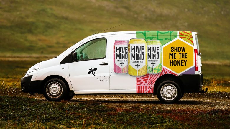
Recreated digitally, the individual linocut hexagons created energetic patterns representing the natural world, bees and the ingredients in the drinks. These became core assets for the brand world, appearing on packaging as well as off-pack.
A carefully crafted colour palette brought this craft to life in the brand world, allowing easy range navigation and instantly taking the brand from traditional olde worlde mead, to a space of refreshing flavours and social occasions.
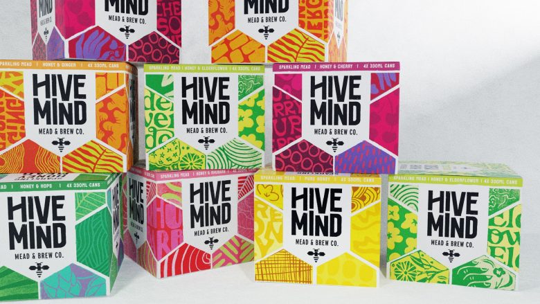
The flexibility of the brand hierarchy, assets and guidelines has been demonstrated as we rolled out the new look and feel from sparkling meads to new product ranges including soft drinks and honey beers.
Curator’s Insight
Kingdom & Sparrow didn’t just create pretty pictures; they blended classic craft with a modern spin. The artistry behind illustrations crafted using techniques like lino-cutting and printing is like merging age-old skills with cutting-edge creativity and the color palette did a really good job infusing life into the brand.
Designed by Kingdom & Sparrrow
Add to collection