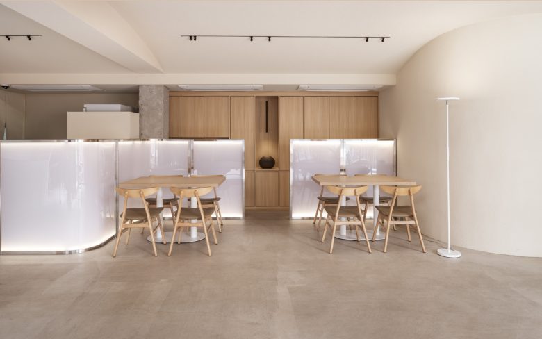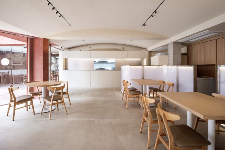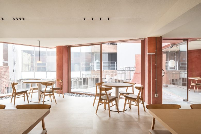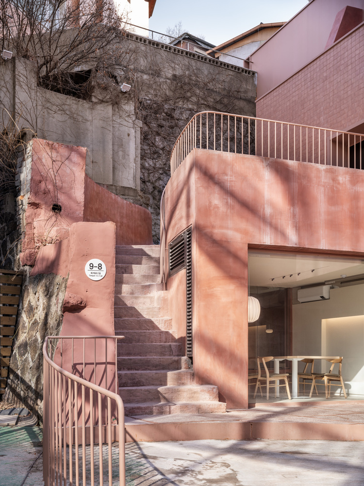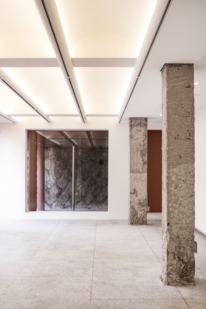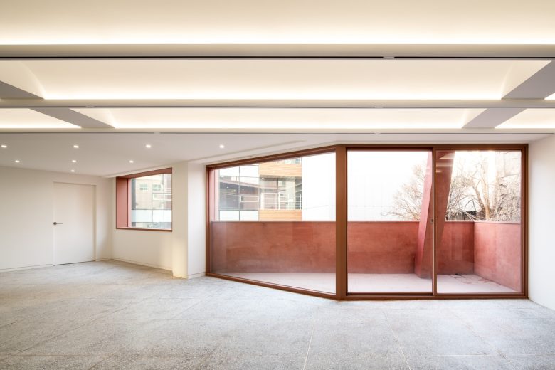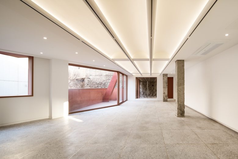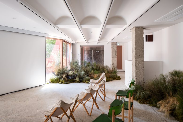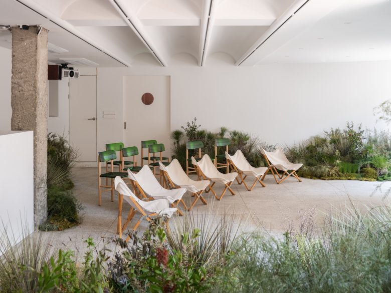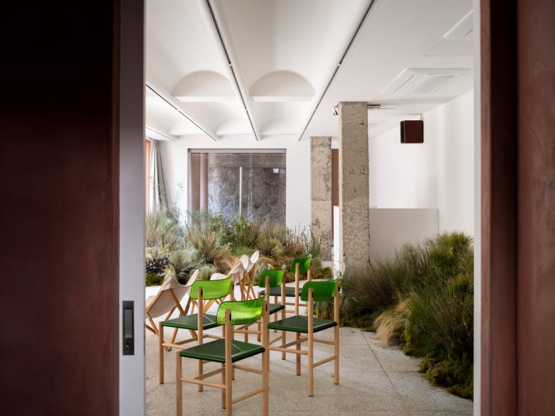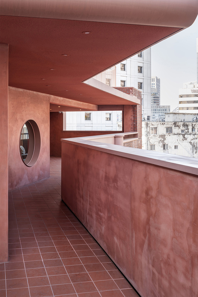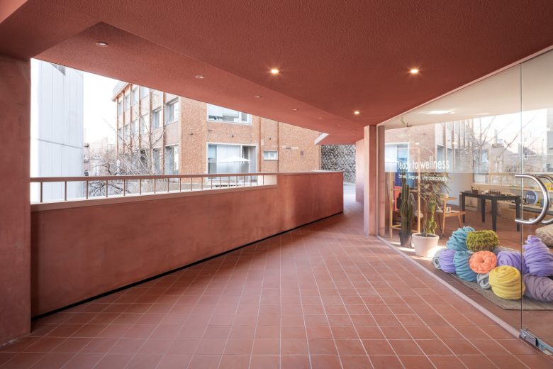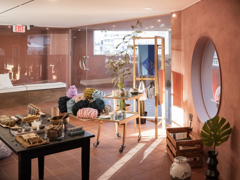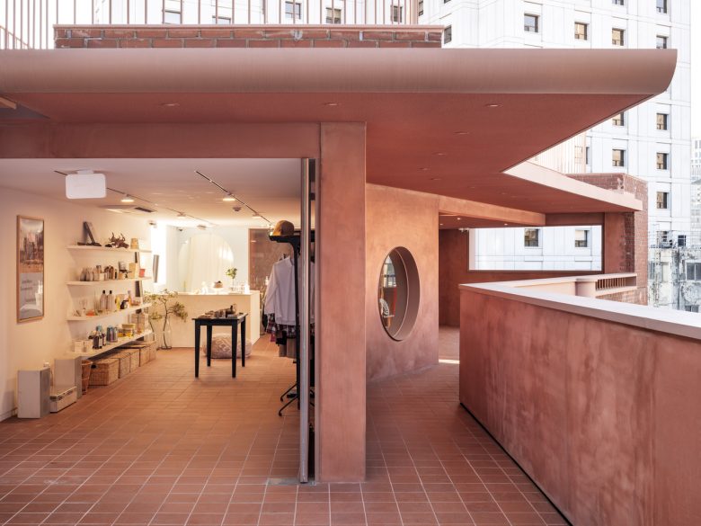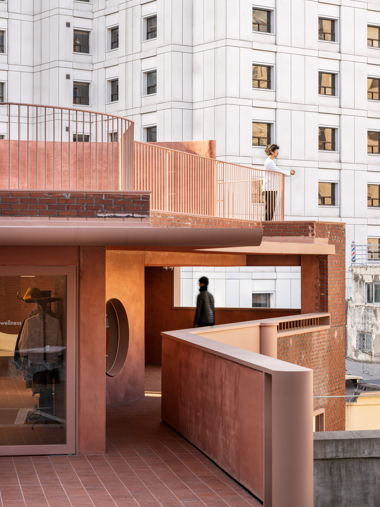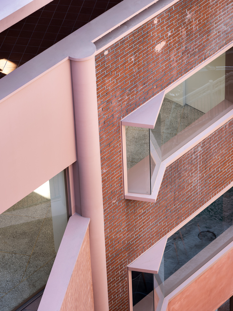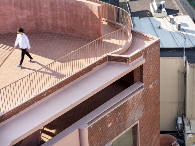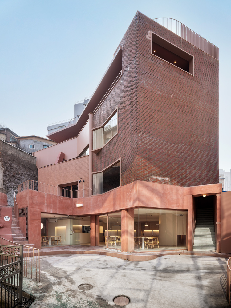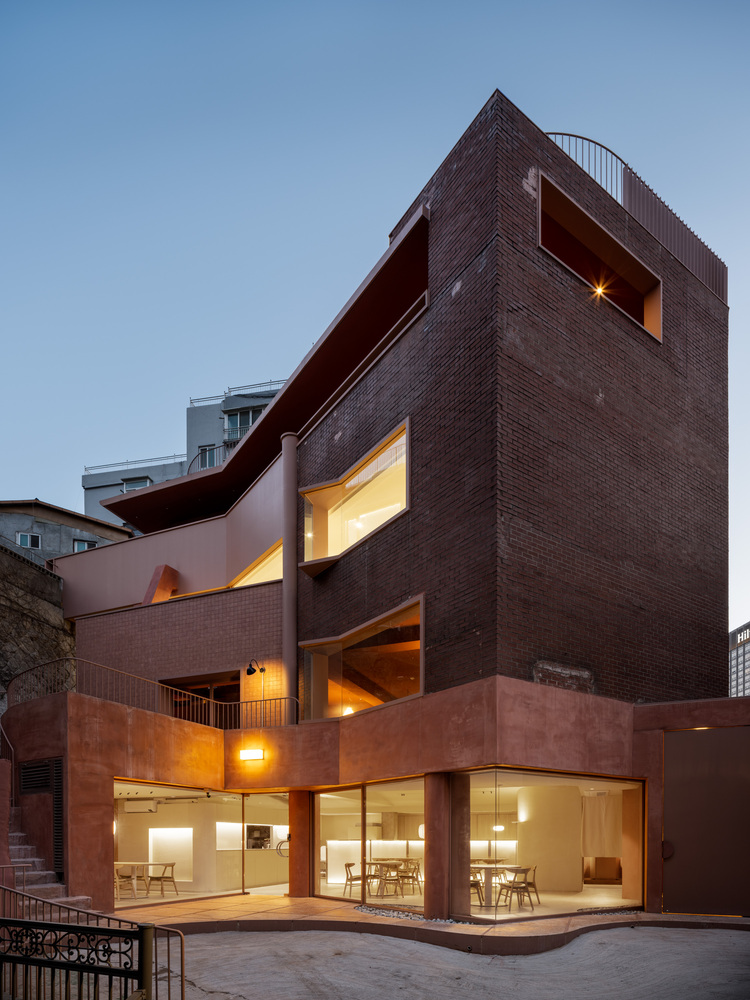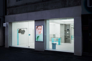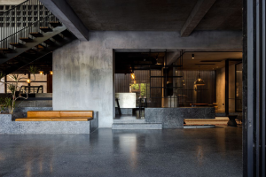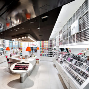
Renovation of A multi-cultural space. We renovated Goshiwon(share house) which was built with red bricks in the 1990s and located at the foot of Seoul Namsan Mountain. The place could remain as just the old past, but we upcycled the place into a complex cultural place coexisting with a cinema room, café, restaurant, and design shops. Architecture put efforts into making a cultural space that can be absorbed with the recent and the futural possibilities as he recorded the time inheritance of the existing building.
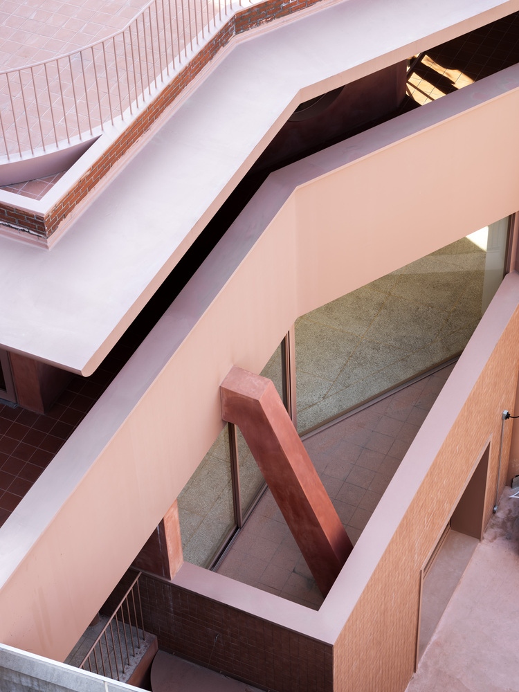
Layers of Renovation. This building was used as Goshiwon with dense rooms. When the old roof and the walls disappear, we can see every single one of the planes of the floors.
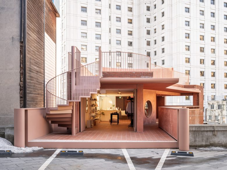
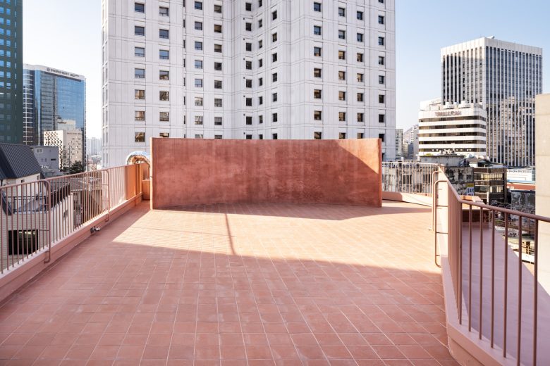
A partially buried first floor, a second floor going up the outer stairs, a third floor facing the retaining wall, a fourth floor meeting the ground level of the next land, and a rooftop with an open view. Each floor not only maintained the identity of a building in harmony but also gathered the facilities in the core (step room) to perform the basic functions of the building well.
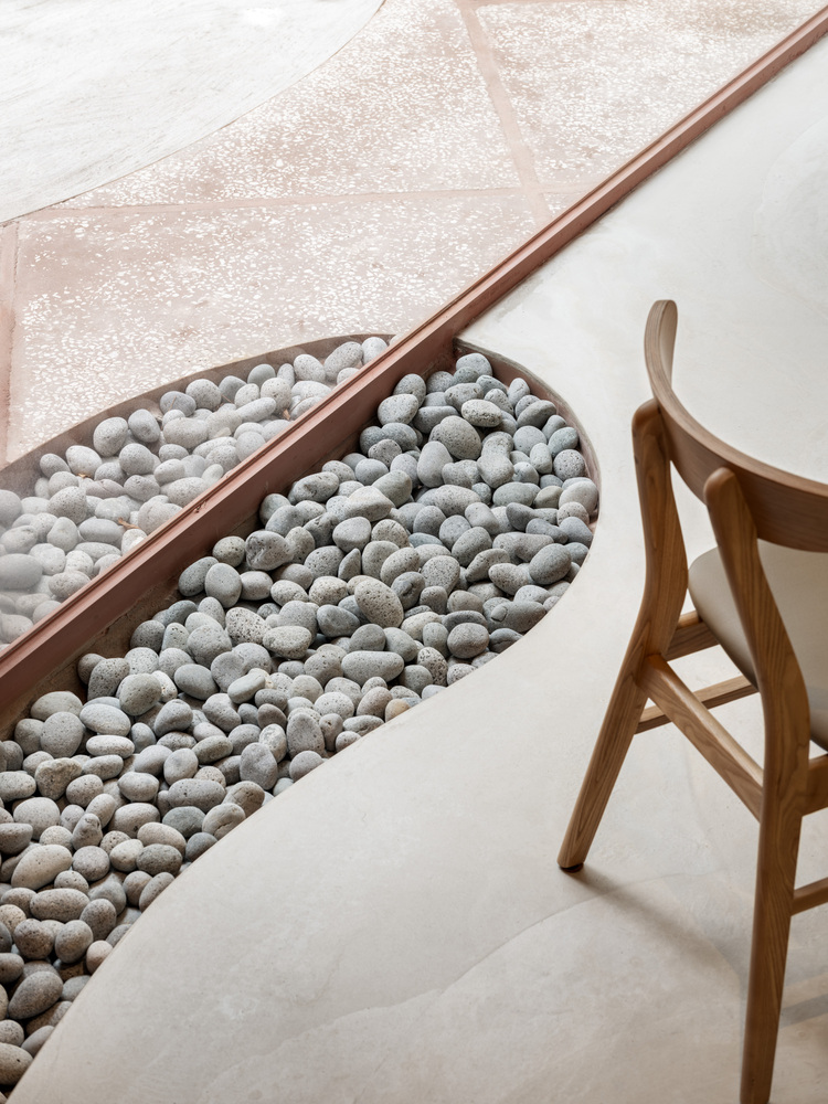
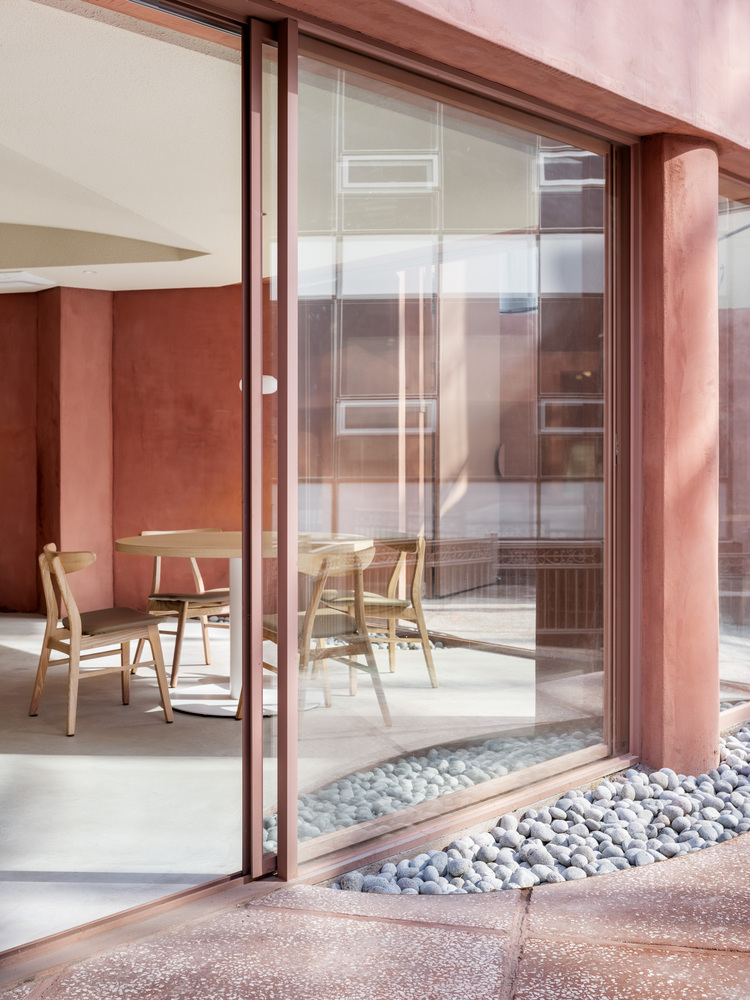
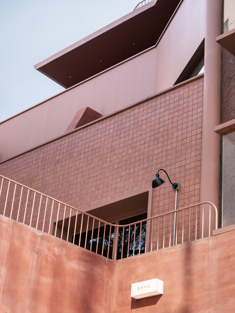
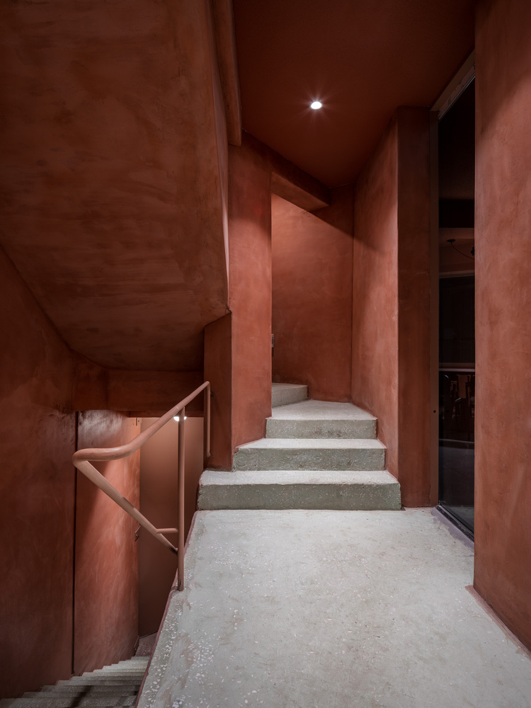
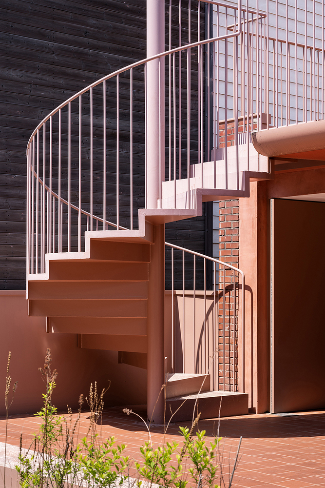
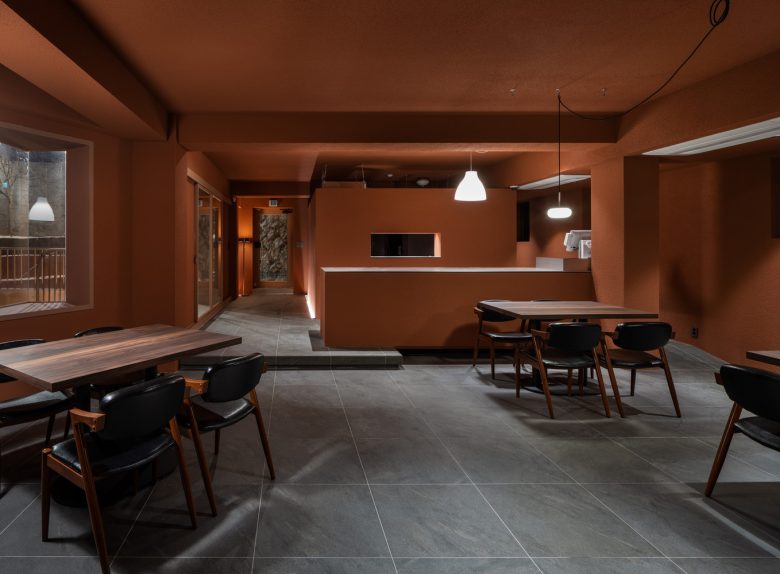
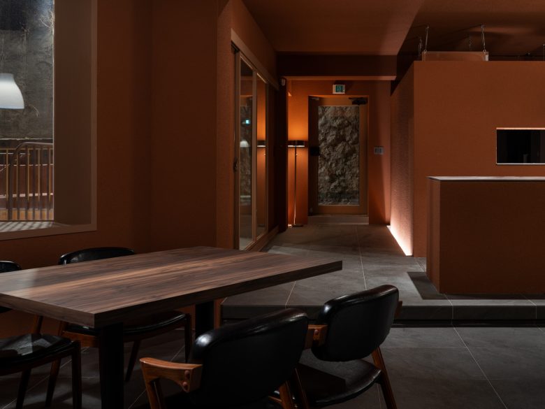
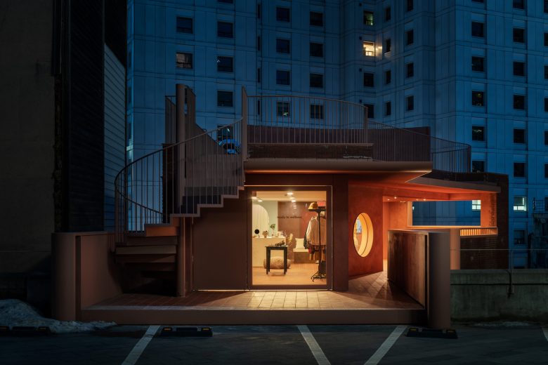
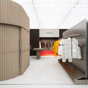
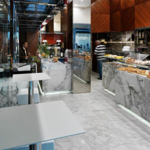
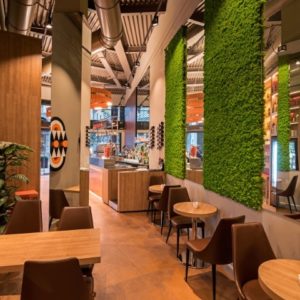
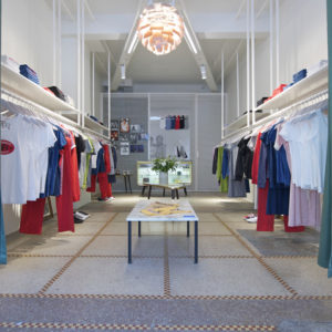
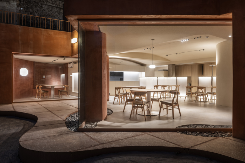
Inside the Piknic, it consists of a Hoehyeon restaurant on the first floor, a cafe on the second floor, a picnic sub-art space on the third floor, an editing shop on the fourth floor, and a rooftop on the fifth floor. The passage of this building was connected to only one stairway entrance, and the accessibility to each floor was a challenge. The first-floor restaurant, which consists of large windows at the entrance, welcomes people with its interior floor extended to the outside. This increased the accessibility of the entrance through a narrow alley. In addition, the entrance of the main stairwell on the first floor was expanded visually, and the entrance of the outer stairwell connected to the second floor was created to enhance the accessibility of the two-story space other than the stairwell of the building.
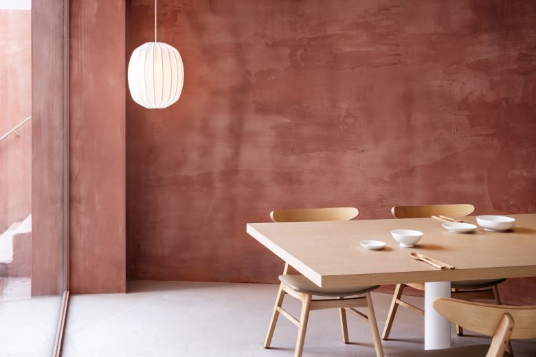
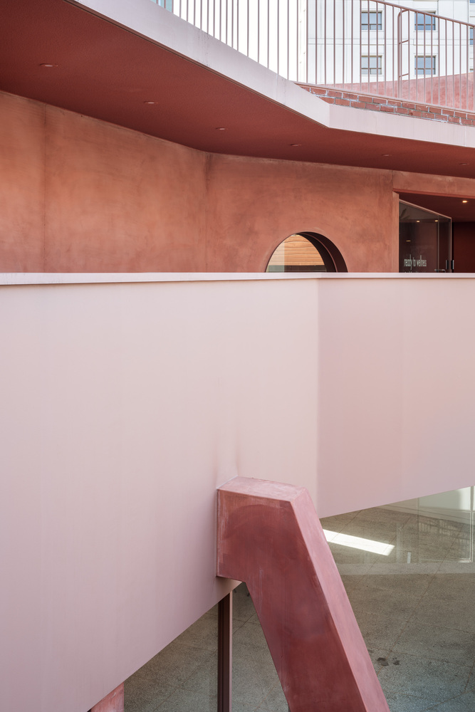
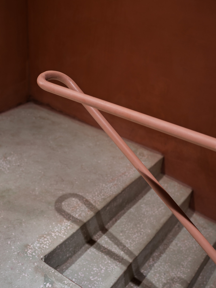
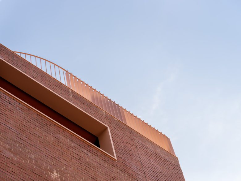
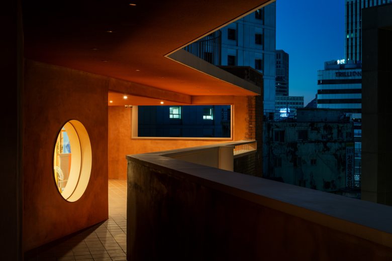
Red brick. The original building color is red with red bricks colored over the years. Originally, Colour in architecture was a medium that gave people an immediate and intense impression and served as a memorized and identifiable marker. Taking over the impressive red identity of the building, it uses trendy, diverse materials and finishes to coat each floor with the new red color of the modern era. In this way, the classic feeling of the original red brick and the harmony of the new red color stand out.
Architects: Indiesalon
Lead Architect: Seokjoon Jang
Design Team: Kyubeen Lee, Yukyung Park
Photographs: Donggyu Kim
