
UwUda Chocolate by moxi-mo
posted by retail design blog on 2023-09-18
Add to collection
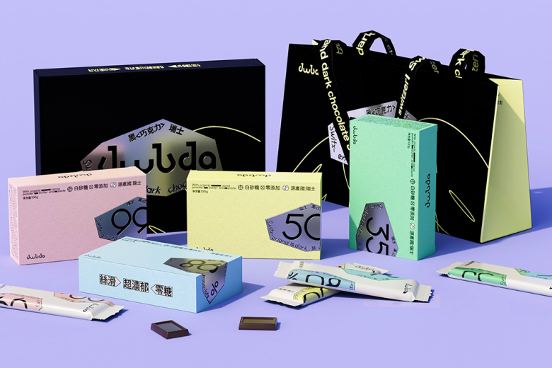
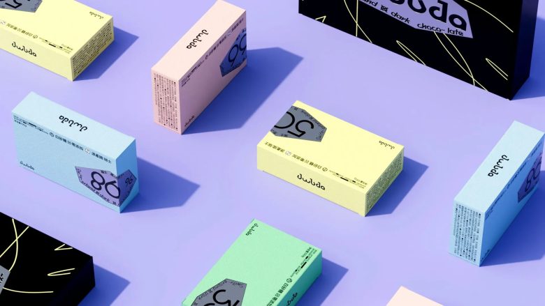
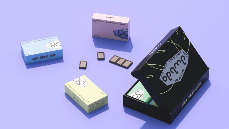
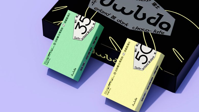
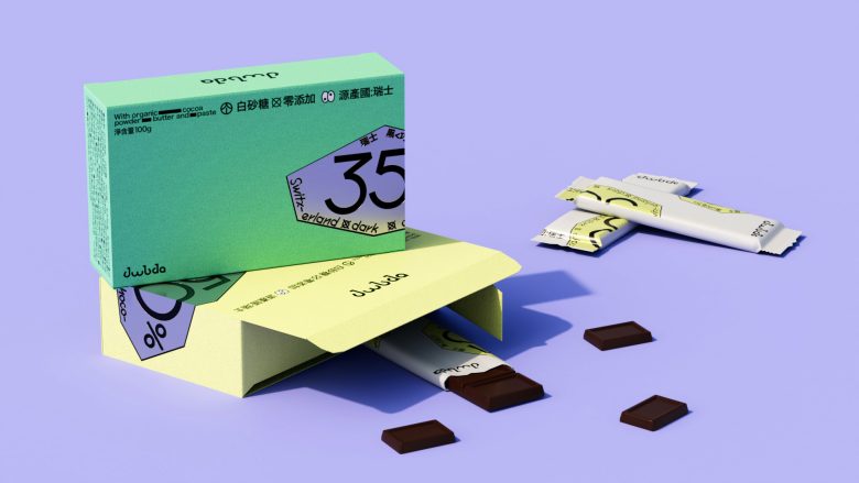
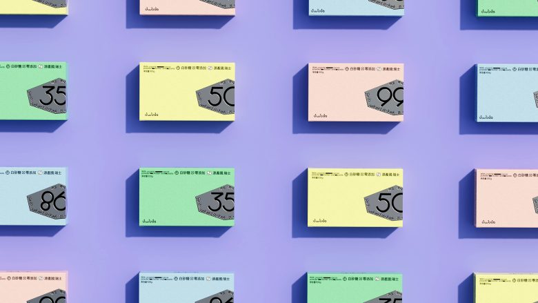
The design embraces the idea that sometimes less is more. It’s refreshingly simple, with a focus on letting the product speak for itself. No fancy frills, just pure chocolate goodness.
The Power of Typography
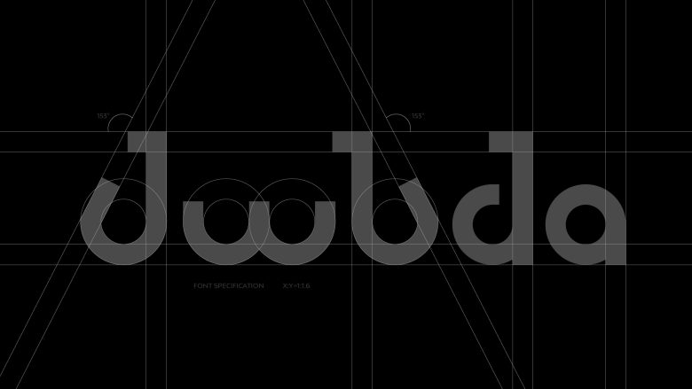
They’ve opted for clean, bold typography. The letters look confident like they’re saying, “We’re all about the chocolate, and we know you’ll love it.”
A Subtle Playfulness
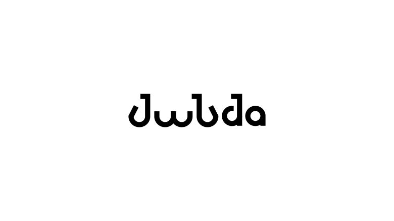
While it’s minimalistic, there’s a subtle touch of playfulness. The lowercase “w”s in “UwUda” almost resemble a smile. It’s like the chocolate is winking at you, promising a delightful experience.
So, in a world of flashy packaging, the simplest designs can make the boldest statements.
Designed by moxi-mo
Add to collection